

Any marketer who has ever done A/B testing knows that small changes in a design can make a big difference. Over the course of a year, the color of a button might influence hundreds more people to make a purchase that they would otherwise put off, for example.
Small design elements have tremendous power, and that’s never more true than with a logo. Whenever people see a new logo, they make instant associations with it and the brand behind it. Those ideas can last and last, even once they come to know the brand presonally.
A logo – including its shape and color – may be the fastest way to evoke the emotions you want.
Let’s dive into logo psychology and figure out just what all those different shapes mean.
1. Circles
Though still outnumbered by traditional rectangles and squares, circles have become a lot more popular as logo shapes in the last few years.
A circle sets a positive emotional tone suggesting relationships, community, friendships, and even love.
2. Squares
Squares are ideal for presenting an image of stability and balance – perfect for B2B enterprises in conservative industries.
Efficiency and professionalism are common associations. However, it’s important to choose colors carefully to avoid seeming remote and unapproachable.
3. Rectangles
Because of their use of horizontal lines (see below!) rectangles could be said to moderate the positive associations of squares.
Strength can be balanced with harmony in these shapes – but designers should be careful to ensure the space does not become overcrowded.
4. Triangles
Triangles are traditionally associated with intellect and power. Science, religion, and the law all have a long history with this shape.
It’s also directly associated with the male gender in some bathroom signs and other contexts. It can be fast, energetic, and purposeful.
5. Curves

Image via WikiCommons
Curves add a dynamic energy to any design. They are easily parsed as feminine and make a good combination with a circular design.
Motion, happiness, rhythm, and pleasure are other common concepts that can be enhanced or contrasted with a wide selection of typefaces.
6. Symmetry
A symmetrical or geometric approach to the logo underscores feelings of organization, stability, hierarchy, and tradition.
When these logos emphasize vertical lines, they can seem strong and definite. Symmetry is great for brands emphasizing their longevity.
7. Organic
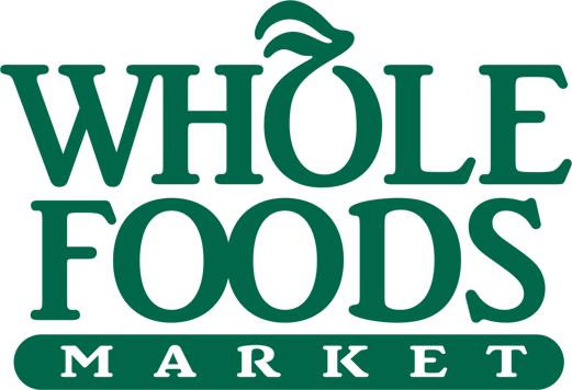
Image via WikiCommons
Not surprisingly, organic shapes with green, yellow, red, and brown color schemes have become the norm for the latest generation of grocery stores and eateries focused on the pursuit of food with integrity.These designs channel pleasure, comfort, and verve for life.
8. Vertical Lines
Vertical lines can be read as a symbolic expression of courage and power, like the mountain climber ascending to the top.
Many logos that put vertical lines in the spotlight also use a “small caps” style font. This ensures text carries on the vertical trend and emphasizes its key qualities.
9. Horizontal Lines
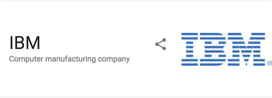
When it comes to corporate logos, IBM is the most memorable user of horizontal lines. These lines marry well with “prestige colors” like dark blue and gray, rather than brighter colors that could appear too busy. Centeredness, tranquility, and calm are the core values here.
10. Fonts
Last but not least, it would be a mistake not to mention the power of fonts. Jagged, angular fonts have an air of aggression to them, while curved fonts and scripts offer a more sophisticated edge.
When choosing fonts, ensure they look good on the Web and in a variety of sizes!
Do Logo Shapes Really Matter? The Answer is Yes!
As the most instantly recognizable symbol of your brand, a logo’s influence is both subtle and profound. Logo shapes probably won’t make the difference between boom and bust for your business, but they will be a big part of the lasting ideas you seed in others’ minds.
That influences the psychology of everything your enterprise does.
The first impression made by logo shapes can carry into all your interactions with your prospects and customers. You can always switch to an updated logo in the future, but it’s best to get it right the first time. Go through multiple iterations and get plenty of feedback to ensure you‘re on the right track.
Choose wisely and someday, your logo might even be known worldwide.
Rob Steffens
I am the Director of Marketing here at Bluleadz. I'm a huge baseball fan (Go Yankees!). I love spending time with friends and getting some exercise on the Racquetball court.