

Your company’s brand lays the foundation of how the world will perceive your business. Quality branding can drive your business, increasing brand awareness. Or, if handled poorly, it can harm your reputation and create a negative mythos that will have lasting impacts.
Your brand is what makes your business recognizable. What makes your customers feel proud and loyal. It can even spark trust.
And, oftentimes, your logo is the first thing people visualize when they think of your brand.
4 Elements of a Logo
Logo Elements
- Imagery
- Color Palette
- Typography
- Context
Your logo is the symbol attached to your brand that’s meant to help identify it. Usually composed of images and text, it’s unique to your company. And even though it’s a visual representation of your company, it’s meant for a lot more than to just be pretty.
A logo communicates to the world what it is you offer, what your values are, and what sets you apart from other businesses in your industry. They’re meant to be personalized to your brand. Even so, there are some key elements that every logo should possess.
Imagery
If you think of a popular brand’s logo, you probably come up with a picture or icon first, right? In most cases, logos are largely built around a single particular image.
Lions, crowns, an apple, a giant marshmallow man that is occasionally possessed by ghosts. These are all specific icons attached to a company name.
And the beauty of a logo is that there are limitless possibilities when it comes to the imagery. Whether you want something more organic or geometric, line art or something more punctuated, it can be whatever matches your brand best.
Color Palette
Color can be just as important as the actual image since color can actually communicate purpose or intent.
Black and white or monochrome palettes are often perceived as more industrial or professional, whereas multicolored logos are typically associated with products or entertainment.
There’s a lot of thought that should be put into what colors you choose for your logo. Depending on the industry and what value a business provides, colors can either work for or against a brand. Going too “off-brand” can create a false persona that will have customers perceive a business incorrectly.
via GIPHYRegardless, a logo’s color palette should always be complementary or consistent. It has to make sense or no one will get it.
Typography
Not every logo has text included, but the ones that do usually have a unique typographic element to them. It, of course, has to be related to the company, but it’s not uncommon for the text to be some form of abbreviation of the company name.
Fonts are important in the same way that colors are. They need to be unique, legible, and contextual all at the same time. They should all pair together for a consistent image that will send the right message to the business’ audience.
Context
Speaking of the right image, all of the elements above have to work together to provide context to the logo. The color and typography should work together with the imagery to successfully communicate what the brand stands for and what it offers.
Logos are everywhere. Online, on napkins, the back of phones, pens, you name it. And they’re taken very seriously.
Are Logos Important? The Benefits of an Awesome Logo
In a word – duh.
The right one can do so many things for a business.
A Logo Communicates Value.
If constructed accurately, your logo should be able to tell these four details in just one image:
- Your industry
- Your services
- Your demographic
- Your values
That’s why nailing it is so important. Audiences will often use the logo as a quick reference of what they can expect from a company.
Now, that’s not to say that every business directly implements those elements into their logo. But usually, those business’ services speak for themselves enough where their logo inherently begins to stand on its own.
Who knew an apple would stand for technological advancement, right?
A Logo Builds Brand Awareness.
And that’s the ultimate goal for a brand manager: for a logo to speak for itself.
via GIPHYWhen a logo leaves such a strong visual impact on an audience that the image immediately sparks a correlation to a company, then that’s a logo well done. It’ll keep that business in customers’ minds any time they see something even remotely similar to it.
That’s some serious brand power.
A Logo Makes a Company Unique.
How many companies do you think of when you visualize the orange swoosh? One.
Why do you think that is?
In highly competitive industries, like retail, brand recognition is what sets you apart from your competitors. The right logo will keep you from being lumped together with the potentially hundreds of other businesses selling similar products or services.
7 Common Logo Types For Businesses
Common Logo Types
- Mascot Logo
- Combination Mark
- Emblem Logo
- Lettermark
- Pictorial Mark
- Abstract Mark
- Wordmark
1. Mascot Logo
Probably the most engaging type of logos, mascots act as a sort of spokesperson for your brand. Who else would the Kool-Aid Man be advertising for besides Kool-Aid? The two are one in the eyes of the consumer.
via GIPHYMost mascots are illustrated and incredibly colorful. They’re meant to delight and build a positive relationship with customers. Most companies that leverage this style are family brands, appealing to parents and kids at the same time.
The only real pitfalls that come with mascots are the inconsistencies in branding that can occur. It’s not easy to include a fully designed character across every type of marketing material.
2. Combination Mark
A mix between a wordmark or lettermark and any of the other symbolic logo types, the image and text combo does a great job of communicating exactly what a company stands for.
There are multiple formats for this style: layered on top of each other, side-by-side, or merged together.
The text, which is usually the company name, and the picture work together to have audiences begin associating a name and a symbol together. They’re often the easiest to trademark since they list the company directly.
3. Emblem Logo
Most emblem logos are designed as seals, crests, or badges, consisting of a specific font within a symbol. More traditional in appearance, they command a much stronger level of authority than the other types though.
Schools, organizations, or agencies usually resort to this style, as it’s more “official” looking.
via GIPHY
They’re a lot more detailed and intricate than the other symbolic logos, which can translate to them being harder to replicate in marketing consistently. But, if designed well, they are bold choices for any brand looking to make a statement.
4. Lettermark
Monogram logos consist of only letters and they’re typically the brand’s initials. Companies with long names, like Home Box Office, better known as HBO, leverage this style more often than other, less lengthy brands. They’re easy to replicate too, so branding can be consistent across channels and products.
It’s not always safe to assume that an audience will remember a two or three word title, so shortening it makes sense. And that abbreviation often takes on the weight of the brand, becoming a personalized logo.
5. Pictorial Mark
Usually composed of a single symbol, pictorial marks are graphic-based icons meant to stand alone in representing a brand. Just the icon should bring the company or its services to mind.
Think the Target bullseye or the Twitter bird. Neither require people to work very hard to make the connection.
Picking the right symbol can be tricky, especially for companies that don’t have a lot of brand awareness yet. It isn’t uncommon for a company to pair their logo down from a combination mark to a pictorial over time as their recognition grows.
Target is a great example of this technique, where the company’s name was dropped from the logo as it reached a new degree of popularity in 2006.
6. Abstract Mark
An abstract mark is a subset of a pictorial mark. They differentiate in the sense where a pictorial logo is a recognizable image, while an abstract one has a more geometric form that may not reference to an actual, existing image. It’s custom made for a business, making it truly unique.
This type of logo works incredibly well because it condenses an entire brand into a single image, unreplicated by anyone else. There’s no mistaking the Pepsi circle for another company.
With an abstract mark, you can develop a unique way of communicating what your business does without relying on external references. You, essentially, build your own culture around your brand.
7. Wordmark
Wordmarks are font-based and often iconify a brand’s name. For companies that have a distinct name, this is the best bet.
The catchy name will stand out on its own, but pairing it with a great color palette and the appropriate font will take it to the next level.
It’s important, though, that companies consider the length of their names when deciding on this style. Too long, and then they fall into the same danger zone as those who resort to lettermark logos. It’s a fine line that should be researched and tested thoroughly.
30 of the Best, Most Recognizable Brand Logos
1. Nike
![]()
Source: WikiCommons
Nike was founded in 1964, but its iconic “swoosh” logo wasn't introduced until 1971. In 1971 "Blue Ribbon Sports" expanded into producing their own footwear and changed their name to Nike, which was inspired by the greek goddess of victory, Nike.
Designer Carolyn Davidson created the “swoosh,” which implied speed and movement, and one of the most iconic brand logos in history was born. By the way, Davidson was paid a total of $35 dollars for her work!
2. The Coca-Cola Company
![]()
Source: WikiCommons
Founded by John Pemberton in 1886, The Coca-Cola Company logo was created by his bookkeeper. It was a simple logo in the principal typeface of formal handwriting at that time called Spencerian script.
After a brief redesign in 1890, which featured swirls and what may have been cherries hanging from the “C's,” the original logo was brought back and has become one of the world's most recognizable brand logos!
3. Google
![]()
Source: WikiCommons
Every day millions of people open up their browser and see this logo. As the centerpiece of a website that gets more than 100 billion visits a month, Google is known for being a fun company, and their multicolor logo reflects it!
4. Apple
![]()
Source: WikiCommons
Some say it was inspired by the apple from the biblical story of Adam and Eve, while others say it is a homage to Isaac Newton.
Rob Janoff, the designer, tells a much simpler story. The bite was added for “scale” and so the Apple didn't look like a cherry. Either way, it's an iconic brand logo that is instantly recognizable!
5. Microsoft

Source: WikiCommons
The four color Microsoft logo represents the four products of the company. The blue square represents Windows, and the red represents Office. The green represents the fun of Xbox, and the yellow represents Bing.
6. Pepsi
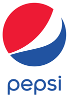
Source: WikiCommons
Caleb Bradham founded Pepsi Cola in 1893 and scribbled the design which would become their logo in 1898. The design remained in place until 1962 with only minor changes, until the “cola” was dropped and it just became Pepsi. Between 1971 and 2005, the logo was modernized five times, each time becoming more defined.
7. eBay

Source: WikiCommons
eBay's recent logo was conceived in 2012, replacing the old logo that was in place when “Auction Web” changed their name to eBay in September 1997. The new logo uses fun colors to convey energy, while implementing a thinner variation of the original font.
8. FedEx
![]()
Source: WikiCommons
FedEx is probably the best example of subliminal advertising among the brand logos here. If you look closely at the white space between the E and the X, you can see an arrow. It's a subliminal message conveying speedy service.
9. 3M

Source: WikiCommons
Minnesota Mining and Manufacturing Company's logo is as simple as you can get. Two simple red characters in a sans serif font. While it looks like it took seven seconds to create, it has actually evolved numerous times since 1906, each time becoming simpler and simpler.
10. The Olympics
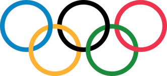
Source: WikiCommons
Recognized around the world since 1912, the five connected rings of the Olympic logo represent the joining of five continents, the Americans, Asia, Africa, Europe, and Oceania, and the colors of the logo represent the flags of all of the participating countries.
11. Disney
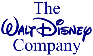
Source: WikiCommons
The Disney logo is the actual signature of legendary founder Walt Disney. It's appeared in the opening credits and on Disney memorabilia for several decades.
12. United Parcel Service
![]()
Source: WikiCommons
UPS has been delivering packages for over 100 years. Fifteen million packages are delivered in 220 countries every single day.
Since it's founding, UPS has used four logos. Three contained the letters UPS in a shield. The logo was most recently changed in 2003 during their worldwide rebranding initiative.
13. GAP
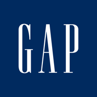
Source: WikiCommons
Founded in 1969, the original Gap logo consisted of the words “the gap” written in simple text, which was switched to the blue box logo in 1984.
During rebranding in 2010, Gap attempted to make their logo “sexier,” but customer outrage on social media caused the company to revert back to the old logo.
14. Honda
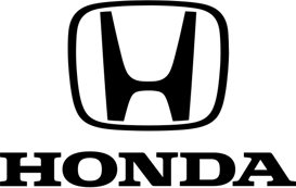
Source: WikiCommons
The bold letter “H” in the Honda logo depicts confidence and durability. Named after founder Soichiro Honda, the logo still uses the original “H.”
15. Hewlett Packard
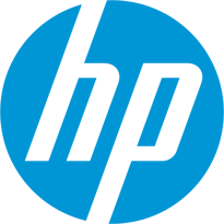
Source: WikiCommons
The HP logo combines the surnames of both founders in blue and white denoting excellence and grace. The “tailing out” of the H and P in the logo symbolizes innovation.
16. British Petroleum
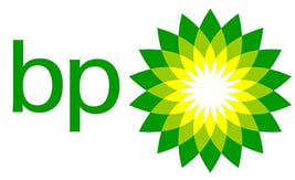
Source: WikiCommons
The BP logo has its significance within the colors used. The green and yellow combo is that of Helios, God of the Sun, signifying all forms of energy.
17. Colgate
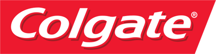
Source: WikiCommons
Colgate's red and white colors signify dynamism (red) and sincerity (white). The logo is relevant to the wide acceptance of Colgate's products based on their quality.
18. NASA
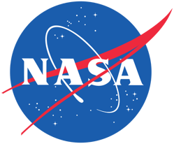
Source: WikiCommons
Founded in 1958, the National Advisory Committee on Aeronautics changed its name to NASA and introduced their three logos: The NASA insignia, the NASA logotype, and the NASA seal. The original seal was approved by President Eisenhower and then modified by President Kennedy.
19. MTV

Source: WikiCommons
From the first day in 1981, when viewers turned on MTV to check out “Video Killed the Radio Star,” the MTV logo has remained the same block “M” on which the “tv” is scrolled.
It has changed colors throughout the years until it was rebranded in 2009 with the “M” being filled with different images and the “tv” becoming a non-distracting white.
20. Rolex
![]()
Source: WikiCommons
Rolex's iconic logo, consisting of a pointed crown above the company name, is meant to symbolize prestige, perfectionism, and victory. It has not changed much since its introduction in 1908. The logo is a visualization of the company's slogan, “ A Crown for Every Achievement.”
21. Starbucks
![]()
Source: WikiCommons
When Starbucks opened in 1971, the founders went in search of inspiration for their logo. The came across a 16th century Norse woodcut featuring a bare-chested two-tailed mermaid. This siren with an intricate crown and tail became the logo.
In 1987, designer Terry Heckler turned it into the demure, smiling mermaid with a simple crown and tails. In 2011, the logo was once again revised, and the circle around the mermaid was removed. The color was changed from black to Starbucks green.
22. World Wildlife Fund

Source: WikiCommons
Probably the “cutest” logo on our list, the WWF logo was introduced in 1961 with only the iconic panda and no logo type. Created by chairman Sir Peter Scott, it has remained the key branding element of the company. In 1986, the panda was simplified and the WWF was added to the design.
23. Kodak
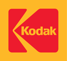
Source: WikiCommons
First introduced in 1907, the Kodak logo claims to be the first integration of a company name into a symbol. The logo, which features a red and yellow color scheme and logotype, was used by the company until a rebranding in 1987.
24. Dunkin'
![]()
Source: WikiCommons
Dunkin's original logo was a script version of the name, which was used until the “donut man” made his first appearance in 1955. After a few more changes in 1960 and 1976, the recognizable logo was created.
In early 2019, though, the company rebranded to just the first half of its former Dunkin' Donuts in order to shift toward being a "beverage-led" brand.
25. Subway
![]()
Source: WikiCommons
The Subway logo features two arrows on the “S” and “Y,” symbolizing entry and exit. It signifies a move and having food on the go.
26. Lacoste
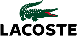
Source: WikiCommons
The Lacoste logo was born out of a bet between Rene Lacoste, the founder, and the French Davis Cup team captain. The captain promised Lacoste a crocodile suitcase if he beat him. After the game, the iconic crocodile logo depicted the victory.
27. Verizon
![]()
Source: WikiCommons
The Verizon logo is done up in the masculine red and black combination. The red checkmark represents the company's excellence.
28. National Geographic

Source: WikiCommons
Simple and strong, the National Geographic logo is the company name next to a yellow rectangle that represents a door opening to a sea of knowledge. The door is yellow to depict the Sun, which is light and knowledge.
29. McDonald's
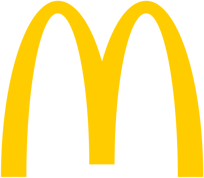
Source: WikiCommons
The “golden arches” have come to represent convenient, fast food. It draws in over 60 million people a day and can be spotted from a mile away on a sign-filled highway!
30. Target
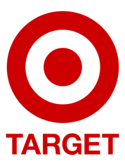
Source: WikiCommons
Target's logo always focused on the simplicity of the bull's eye. Until 2006, the logo always included the name. This is the year the name was scrapped because the logo was so well known.
Your logo is the face of your company. These 30 companies all feature minimalist, simple designs that use color and symbolism to effectively represent their brand. Through the years, many have evolved but have always remained consistent in their visual message.
When creating your logo, draw inspiration from these iconic companies and their stories.
Micah Lally
I’m a Content Writer at Bluleadz. I’m a big fan of books, movies, music, video games, and the ocean. It sounds impossible to do all of those at the same time, but you’d be surprised by the things I can accomplish.