The colors used in website designs are crucial, and you probably picked up on that even before receiving formal web design training. Pleasing color combinations make people want to linger on websites, while ugly ones might cause them to recoil and never come back. So, what’s the secret in choosing colors for a website?
Often, it involves complementary colors, which are the hues opposite each other on the color wheel. Keep reading to discover numerous benefits to choosing complementary colors for your web design projects.
They Can Drive Emotions and Capitalize on Themes
When used properly, complementary colors make people feel emotions — ideally those that connect to whatever’s being advertised. For example, a website that is mostly blue but has orange letters might have a calming effect on people who see it, making it a good choice for a dentistry practice.
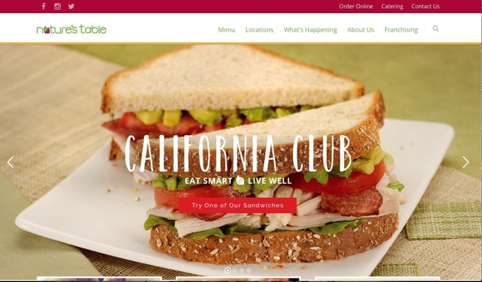
For restaurants, color can have a big impact as well. Check out the website for Nature’s Table, a healthy dining option:

Pay particular attention to the use of red and green in the header. If you hover over one of the menu options, a darker green list drops down. There is also a tiny strawberry that comprises the second letter in the word “Nature’s.” Green is a common color in nature, and especially in healthy foods like lettuce, broccoli and green beans. You can also see how the main picture has a light green backdrop that gives a cohesive look.
The beautiful ways the color green is represented on this website could make people excited about eating green produce. Similarly, the color red is not just present in strawberries, but also in tomatoes, peppers and more. The red stands out when used with green and carries on the strong, all-natural theme.
Complementing Colors Increase Readability
Complementing colors are also worthwhile because they make your website’s text easier to read. Consider how frustrated a person with limited sight abilities might get if they can’t read all or most of what’s on the site. In that case, they may leave instead of asking someone for help. People who are just tired and dealing with eyestrain also welcome easy-to-read websites.
Also, keep in mind that it’s not always necessary to have highly saturated complementary colors on your website. The homepage design for Haynes Plumbing is a case in point.

Blue and orange complement each other, and the soft shades of each are very pleasing here. More importantly, they also boost visibility, especially when accompanied by the white block-letters.
Each color promotes overall readability, so whether people want to get estimates or find out more about available services, they aren’t likely to misread the text. You’ve already learned how blue is a soothing color, so that’s also advantageous if a person is finding it difficult to focus due to plumbing-related stress, rather than an eyesight issue.
These Colors Attract Attention
If you’ve ever attended a major college sporting event, think back to the other people in the venue. There’s a good chance cheering fans surrounded you, all decked out in attire to support their teams of choice. Through body paint, noisemakers and team apparel, the fans hoped to capture attention and find support from other sports lovers.
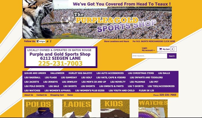
That’s the same effect the website below is going for, which sells merchandise related to Louisiana State University, an institution known for its official color scheme of purple and gold.

This website’s complementing color scheme is as loud as the sports fans it appeals to, and that’s okay. Notice the thin gold bar immediately below the purple box that includes product categories. It has links to a shopping cart and contact information, plus company details. The purple letters on a gold background call attention to portions of the site that people probably deem crucial, especially as first-time shoppers.
Try the same tactic, especially if you have information-heavy content and don’t want people to feel lost. Here, the colors help people stay oriented by making them more likely to notice essential elements.
These Colors Are Memorable
Complementing colors can give truly unforgettable results. When hues don’t look nice together, people may remember them for all the wrong reasons. But, when colors stand out in good ways, individuals are more likely to say, “Wow!” When figuring out out how to make your designs stick in viewers’ minds, complementary colors could become key elements.
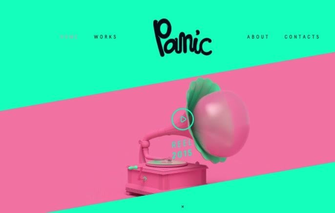
Let’s explore how Panic, a Latvian animation studio website does that with a bold pink and green color scheme.

The pastel colors make major impacts without being jarring. Also, considering that since this is a website for a design firm, its creators probably spent a lot of time determining how best to show potential customers the company has what it takes to create hard-to-forget results.
Think about taking a similar approach, especially if you’re trying to urge people to purchase things online or create compelling CTAs. You may be surprised at just how powerful color can be when driving conversions.
Use Complementing Colors to Support Your Brand
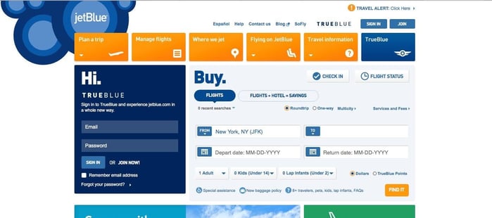
Don’t overlook ways you could depend on complementing colors to strengthen your brand’s image. There are some colors people automatically think of when certain brands come to mind, such as gold in association with McDonald’s, because of the famous arches. There’s a similar effect with JetBlue, a budget-friendly airline, which is capitalized upon with the brand’s homepage.

It would definitely be strange if an airline with “blue” in its name didn’t utilize that color on the homepage, and thankfully, this one does. Several shades of blue are featured in the circular brand graphic on the upper left, and a nice sense of contrast is achieved with the orange rectangular buttons.
This website successfully does several of the things already discussed, such as using color to boost readability and attract attention to certain areas of the site. However, it also highlights the airline’s brand by using blue in beautiful ways.
You’ve just learned several ways complementing colors can help you reach your web design goals. These tips and examples might motivate your best work.


Lexie Lu
Lexie Lu is a freelance graphic designer and blogger. She keeps up with the latest design news and always has some coffee in close proximity. She writes on Design Roast and can be followed on Twitter @lexieludesigner.