
A website is your virtual storefront or office. It is often the first thing people check when doing research about your business or businesses like yours.
This means that you need the best possible website design to pull them in and start building a relationship with them. The more they trust you, the more likely they are to take necessary actions, like downloading your content offers, submitting forms for demos, or contacting you via email or phone.
To convert the best clients and job seekers for your staffing and recruitment business, check out some of these must-have elements for a good website and best practices with 10 awesome website examples.
7 Elements of a Good Website
A well-planned staffing website improves your company’s credibility and makes the whole recruitment process much simpler and faster.
Here are the seven elements that make up a good website:
They Are SEO Friendly.
Your website design may be beautiful and professional, but none of that matters if you don’t get traffic to your site.
Your site must be SEO friendly to reach a good majority of your audience. Some basic elements that can help you climb rankings in search engine results are:
- A unique meta description describing your webpage content.
- Keywords in your content related to your business that people may search for.
- Internal links and backlinks from authoritative sites.
They Include Testimonials.
Testimonials are crucial to a staffing and recruiting website because they help your potential clients trust in the work that you do to match them with the right position.
via GIPHYThe testimonials on your page should not read like the rest of the copy on your website. Instead, they should be specific and answer quantitative questions.
They Contain Good and Up-to-Date Content.
A good website always has good copy. Good copy means written content that is free of grammar errors and spelling mistakes. It also means content that is well organized so that it doesn’t distract from other key elements of the website.
Additionally, a website’s content should remain up-to-date. Businesses with blogs should not have a six month old blog post as their latest article. Rather, a good website posts and refreshes old content regularly.
They Have Several CTAs.
You can have several calls to action on your website homepage without overcrowding your site or begging for people to get in touch. The best recruiting and staffing websites have various CTAs throughout their homepage to entice people to sign up to request more information or to start looking for jobs right away.
A good site makes it easy for visitors to get just what they need.
They Showcase Eye-Catching Visuals.
Engaging websites must have visuals of some sort to help them tell their brand story in an impactful way. Some companies use videos and infographics to describe their offerings, while others use simple pictures to showcase what they do.
via GIPHYEither way, visuals are important, and using them helps to distinguish your website from the rest.
They Have Smart Job Listings.
A great element of an effective staffing website is the use of smart job listings. Jobs are categorized by department, location, skill set, and other categories to help candidates find jobs relevant to what they are searching for.
They Are Easy to Navigate.
Websites are not only made to look nice; they are made to be used. This means they must be easy to navigate. Potential clients can be easily turned off by a slow-loading site or a site with a confusing layout.
Great websites include navigation menus and search bars that are visible to users within the first few moments of landing on their page.
To include all of these elements in your website design, consider reviewing and applying some best practices that successful businesses use.
7 Website Design Best Practices
Here are seven important best practices for you to consider when you design your website:
Make Sure Your Navigation Menus Are Clean.
Your visitors should not have to search for what they need on your navigation bar. People aren’t likely to be patient enough to search through your erratic navigation or jumbled layout.
Most people are going to bounce from your site if they can’t find what they need in the first few minutes or possibly even a few seconds.
Place your navigation across the top or down the left side of your website. People expect menus to be there, and it makes your site simple, clean, and easy to use.
Include Prominent CTAs.
The purpose of your website is for people to be able to get in touch with you. Make sure it is easy for them to do so by having CTAs that are prominently displayed.
Your calls to action should be customized to fit your target audience, and more importantly, they should be simple, but not simple enough so that they fade into the background.
via GIPHYYou may even include more than one CTA with different copy at various points throughout your website.
Remember that a visitor may not want information right away, but as they become educated about your business through your site, they may change their minds.
If they have to scroll all the way back to your main navigation to get into contact with you, then they may decide to just go to one of your competitor sites instead.
Break Up Your Copy.
You may notice a trend in this article: Clutter bad. Simple good.
Visitors don’t want to go to your page only to find that they must read through a whole heap of content just to get the gist of how you can help them and why they should choose you.
Your copy should be clear, concise, and to the point. If creativity is associated with your brand image, then include creative wording. Just make sure it is not overbearing.
Your tagline should be at the top of your page along with a clever blurb about your business. Then, you may go into detail further down on your webpage.
Make sure to use visuals to help you describe the functions of your staffing or recruiting agency. This should help you cut down on the amount of words you need to describe.
Plus, if your visitors find your site interesting enough, they will be likely to contact you for the details. So hold back some text if it is not absolutely necessary or valuable to your site.
Add a Meet The Team Section.
You want your candidates and clients to know who they will be working with. This may seem like an unnecessary add-on, but seeing the faces behind the nice professional website helps you to present your agency like it is an open book.
via GIPHYDisplaying your team members and their contact information may even make visitors more likely to get in touch with you. This human element is important because it reminds visitors that your company is made up of real people who care about helping, not robots.
Select a Reliable Web Host.
Your web host can help or hurt your business. A good practice is to go with a trusted and well-known host that can provide you with ongoing support.
They can help you ensure that your website is speedy and functional. This can reduce frustrations for you and your visitors since your visitors are more likely to stay on a functioning, fast site, rather than a slow and clunky one.
Track and Test Web Performance.
A website is never truly finished. As long as you have a website, you should be working on it to optimize and improve it. The best way to do that is to track the results your website gets.
You can use analytics tools to help you do this. When you look at the reports, you may notice that some of your marketing efforts work better than others.
This helps you to know what to continue or discontinue doing in the future. You may also use A/B testing to try out different CTAs or web layouts.
Optimize Your Website for Mobile.
Most people browse sites on mobile devices in today’s world. You need to make sure your website is mobile ready so your users have the best experience possible without waiting for things on your site to load.
You also need to make sure your site has short menus and limited full-page pop-ups so your users can navigate your site with ease.
10 of the Best Website Examples for Recruiting and Staffing Agencies
The best way to get inspired is to study staffing and recruiting agencies that have awesome websites. Here are 10 of the best recruiting and staffing website examples:
1. HireDNA
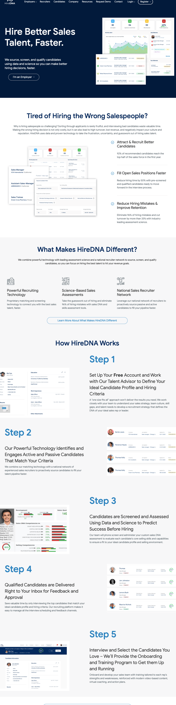
HireDNA has a clean and beautiful website with a great layout that is easy to navigate. Their website is also highly informative so site visitors can get to know their services better. They even have steps all the way down the homepage that explain how to get started with HireDNA.
They also include several visuals that add value to the website and demonstrate their services well. CTAs are present up to three times on the HireDNA homepage, and they are targeted with drop down boxes within the call to action, one for employers and one for employees.
2. Clarity
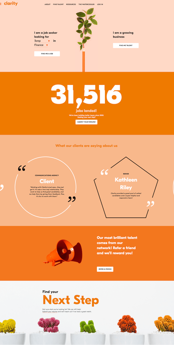
Clarity is one of my personal favorites on this list because of its bright colors, excellent use of white space, and visuals. This staffing website demonstrates how fun and personalized a staffing or recruiting website can be while still maintaining a level of professionalism.
As soon as you visit Clarity's page, you can see the distinct CTAs for employees vs. employers. They shamelessly self-promote by offering a rolling scale of how many jobs have been landed thanks to them.
They also have a well-placed call to action included in this section, calling visitors to submit their resumes.
Below the large number of people they've helped, they have testimonials to demonstrate their expertise. Each section is simple but impactful, which makes their website an excellent example!
3. Salt
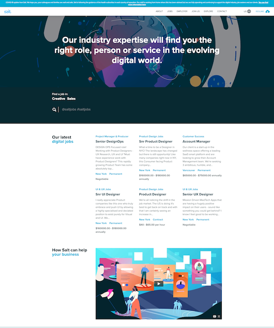
This super creative and animated website is full of attractive on-brand bright colors that immediately capture visitors' attention. Salt informs visitors of the exact ways they can help people find jobs, using simple copy that entices visitors to search for jobs or employees on the website.
They even feature some of their latest digital jobs to showcase some of the great positions they are recruiting for. Salt's design and user experience makes people want to sign up to start browsing their amazing job offerings.
4. Freshminds
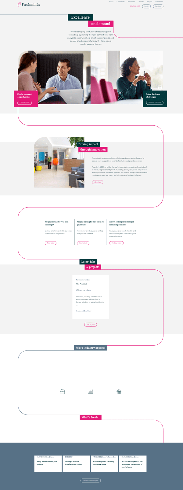
Freshminds has a unique website that operates almost like a flow chart. The pink line zig zags down the webpage from one point to another to provide users with short snippets of information in a quick and easy way.
The layout on this website is easy to navigate. They include more than five CTAs on their homepage at various touchpoints.
Their copy is simple, up-to-date, and consistent throughout the well-designed site. They also feature two of their latest jobs, and they include icons for all of the industries they specialize in.
5. Venture Staffing
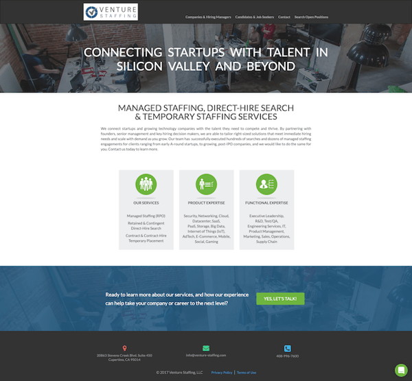
Venture Staffing features a more traditional website that is professional and simple. They have an simple navigation menu at the top of their page, and they explain their areas of expertise with easy-to-understand copy.
They also have one clear CTA and a customer support chat feature that allows visitors to get in touch and ask questions easily.
Even though this site doesn't have a visual as the focal point, they still include images of an office in the background, which adds to the overall feel of the site.
6. Apollo Technical
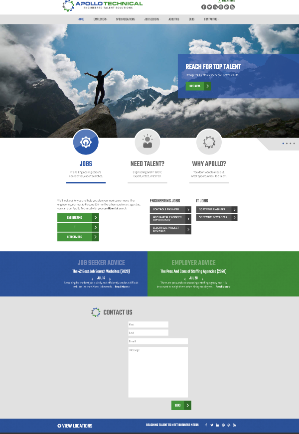
Apollo Technical uses their color palette well to differentiate between job seekers and employers. They have an eye-catching hero image that gives visitors the sense that they can be on the top of that mountain when they use Apollo Technical's services.
Their copy is broken up in a creative and attractive way, and they display the precise areas that they specialize in right below. They also have prominent CTAs and a simple form for visitors to fill out if they want more information.
This easily navigable website contributes to the overall look and appeal of the site making it one of the best staffing website examples.
7. Hiregy
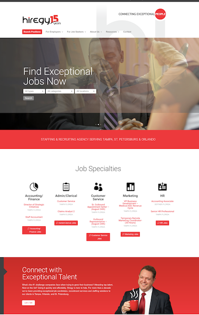
Hiregy has a great website that is consistent with their brand and tagline. Their copy often mentions the word "exceptional" to describe their jobs and services.
This is something that can differentiate Hiregy from their competitors. They have their specialties clearly labeled, and each one has its own CTA.
They also don't make their visitors wait to get to the job search page. It is actually the first thing you see when you enter the site. This way, their visitors can get started right away!
The website colors are attractive, but not overwhelming, and they have pictures of their team members located on their about us page to give people an inside look on who they'll be working with.
8. CIMA Staffing
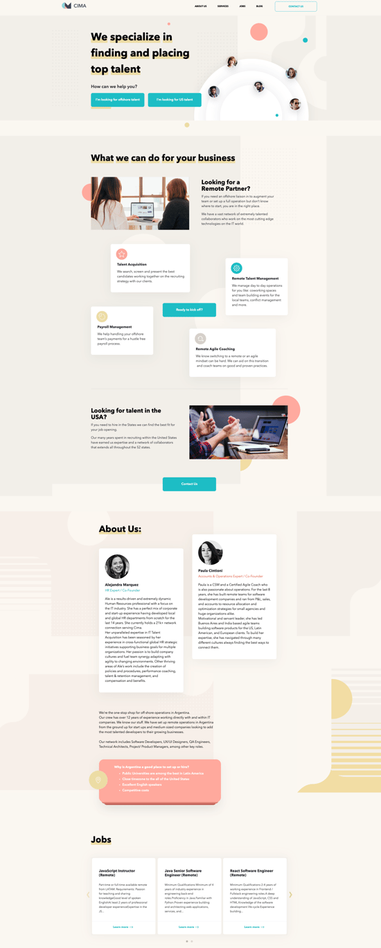
CIMA has a whimsical and inviting website that is fully functional and easy to use. They have two CTAs that are easy to see as soon as you land on their homepage.
Their images break up text, and they have small icon illustrations to add color to the website.
They also have a couple of pictures of staff members right on their homepage with short snippets of information under the about us section. This adds some personalization to the site and helps to build trust with their visitors.
9. JDM Talent
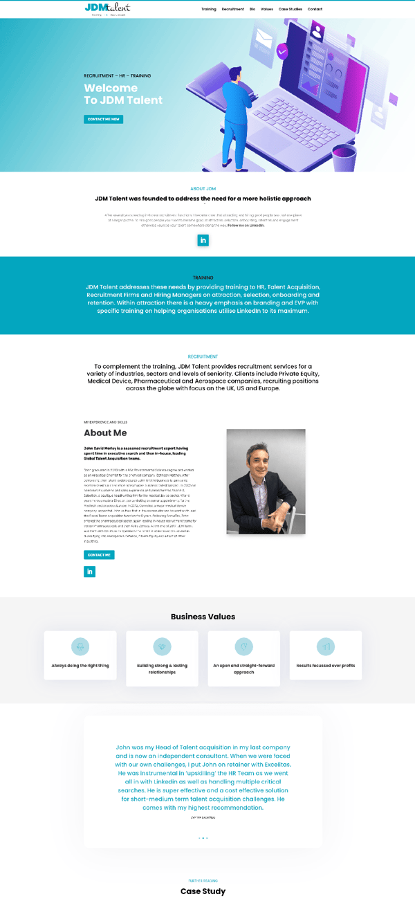
JDM Talent has a very informative site that allows visitors the opportunity to get to know their organization in a deeper way. They include information about their various services, their founder, and testimonials, all without overwhelming the user or overcrowding the webpage.
The navigation menus are clean, and everything on the site is laid out in a methodical and user-friendly way. They include two CTAs and a form at the very bottom of their site, so people can get in touch with JDM right away.
10. The Recruitment Crowd
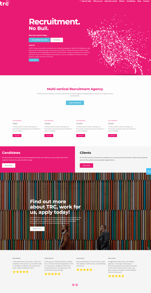
This no mess, no stress website has an untraditional approach to recruiting websites. The Recruitment Crowd site is modern with bright pops of color throughout that captures visitors' attention immediately.
They display over five prominent CTAs as you scroll, and each one is distinct for clients or for employers. At the very bottom, they show their testimonials using text and stars to show how happy their clients were with their services.
Your website should be designed to appeal to all of your visitors. It should look nice and professional with unique elements that don't take away from its usability.
A great way to start gaining leads and improving your ROI is through optimizing the design of your staffing and recruiting website. Use these examples to inspire you while you update your site design.


.png)
Comments