Your navigation structure sets the tone for your entire website. Visitors don't always start on your homepage and take a predictable path through your website.
A navigation bar sits unobtrusively at the top of your page and guides them where they need to go. It is a point of direction no matter where a user lands or what journey they take through your site.
via GIPHY
In the last year or so, more sites have gone to a hidden navigation structure where the menu is hidden until the user mouses over it. This may not always be a good option. If you do go with a hidden menu, make sure the user knows where to find it by adding a single button with the word menu or a hamburger symbol.
Most sites go with a traditional navigational bar, but you can make your bar one of the best around, or you can create something that falls a bit flat. Here are seven ways to ensure your menu meets users' needs and exceeds their expectations:
1. Stay Consistent
Don't try to create something different for various areas of your site. You may have two faces come to your site with very different purposes, but the navigation menu should stay the same.
Cross-over customers who use both sides of your business personality will expect to find the same locations in the same spot each time they visit. No matter where a visitor goes on your site, they should look back to the nav bar to orient themselves and trace their steps back to where they started.
Freshware offers a very simple nav bar just under their company logo. Anywhere you go on their site, the same structure appears with the logo in the upper left and the navigation just under it.
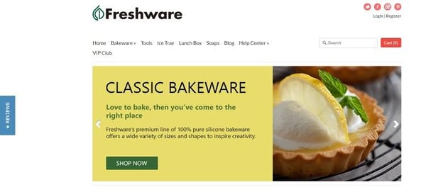
The logo links back to the homepage, and the menu choices highlight their most popular topics. A double sideways arrow indicates their most popular category.
2. Go Bright
One color trend of 2019 is bold, vivid color choices. If you want your site to look on-trend, update your colors and go with something bright and eye-catching for your navigation bar.
Even if the rest of your page is pretty bland, you can always add a splash of color to your menu text or the color of your buttons. You can even use some bright icons to add a trendy color and easily change them as design preferences shift.
3. Showcase Buying Options
Ecommerce websites benefit by showing popular buying choices directly in their navigation. For example, if you are famous for products that cost $10 and under, then you should include a tab that says "$10 and Less" or something along those lines.
You can also highlight bestsellers, popular categories, new arrivals, or anything else your internal data shows is important. Know your audience and what their behavior is once they land on your site, and you can better serve their needs through your navigation.
Great Eye Glasses uses their nav bar to highlight some of their more popular products. You'll find choices such as "$20 & Under," "New Arrivals," "Sunglasses," and a breakdown of choices by age or gender.
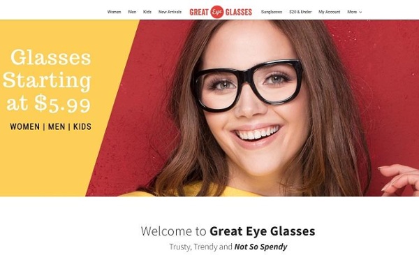
If you click on the tab for women's frames and decide the selection is too large, you can easily hop over to the latest arrivals or filter the choices down in the right sidebar.
4. Place Important Items First
The Serial Position Effect is a theory that's been around for many years and states a person puts the most importance on items that appear first in a series.
If you want your site visitors to visit your new-arrivals page, then place a link to your latest offerings on the far left of your navigation bar. Things that visitors aren't as likely to use as often should go to the far right, such as your contact page button.
5. Contrast With the Page
Your navigation bar should be aesthetically pleasing and go with the rest of your color palette. At the same time, you want it to contrast with the rest of your page, so it stands out and users can easily find your menu.
If a site visitor has to hunt for a link, they are just as likely to leave and go to a competitor's website or find another solution for their problem. Make it easy to find your nav structure.
6. Make It Sticky
If you have a particularly long page where the user must scroll to get information, go ahead and make your nav bar sticky. The menu then follows the user as they move down the page.
If they decide they've found what they're looking for or are simply tired of scrolling, they can move elsewhere with a fast click of a button.
7. Animate the Buttons
Want to make your navigation stand out even further? You should add motion graphics of some sort.
There are many ways to add animation to your menu. You can simply change the color of the background or make text hover. You can even add actual elements that appear or move around, such as striking out letters when they get moused over or having a splash of color appear behind the word.
Binaryblocks does something unique with their menu. They add a small blue dot when you get close to the option on the nav bar.
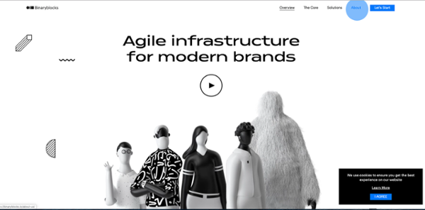
As you move in closer to the test, the dot grows into a full circle and eventually encompasses the entire selection. The process is very interactive and fun for the site visitor.
Meet Expectations
Users expect your navigation to be near the top of the page or on the top left of the page.
Try not to deviate out of the expected norms too much while still improving your nav bar in small but effective ways. Keep in mind that some users will access your site via mobile, so keep the wording short and to the point.
With a little practice and a lot of testing, your navigation will stand out from your competitors. Visitors might not fully understand why they prefer your site, but they will.
.png)
Comments