You can drive all the traffic in the world to your website, but if those site visitors aren’t converting into customers, then your efforts are for naught. The navigation bar itself reduces your overall conversion rate if not done correctly. It can serve more as a distraction rather than a sales funnel.
There are many different factors to consider when creating a navigation bar — from where you place the nav bar on the page to how many categories you include. However, we narrowed the list to six different things you can focus on today to improve your overall conversion rates and your navigation bar.
1. Limit the Number of Links
Only 16 percent of landing pages lack a navigation bar which proves designers still see a need for this type of navigation even if it can water down your sales funnel. One smart move is to limit the number of links in your nav bar, particularly for larger sites. This narrows the focus and sends the site visitor exactly where you want them to go.

Take a look at how narrow the navigation above the fold is on MINDBODY. Their core focus is on starting a discovery or getting information. There are two call to action navigation links on this page with smaller links that are less noticeable to log in at the top right or contact info, info on careers and more information at the bottom of the page.
2. Have a Hierarchy
Your navigation bar should make the hierarchy of your site as clear as possible if you want to send those who land on your page toward additional information. For example, if you have a website that focuses on healthy recipes and healthy eating when dining out, then you might have two main categories in your navigation bar — recipes and eating out.
However, you would likely have additional categories under those two main categories. These can be drop-down menus or secondary menus when the visitor lands on that category page. So, under recipes, you might have dinners, snacks and breakfasts. Figure out how to organize your site and what the hierarchy is to help create a stronger and leaner navigation bar.
3. Highlight What’s Important
Your navigation bar should highlight what is most important to you and the site visitor. The best way to figure this out is to know what your purpose is for your website and what your target audience wants to know most. When your typical site visitors land on your page, what are they looking for and how can you highlight that information so it is easy to find?

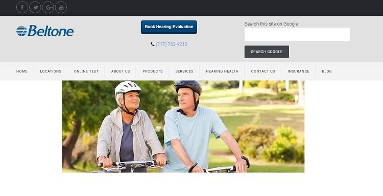
Take a look at Beltone’s navigation structure on their landing page. Note how they place the information people are most likely to seek when they land on the site toward the top left. The navigation links include locations and an online hearing test. This focus on these two areas hit on the main reasons a visitor likely lands on their page.
4. Give Each Link a Purpose
Each of the links in your navigation bar needs to have a very specific purpose. Ideally, every link would lead to a conversion.
However, that simply isn’t practical when you also need to leave a breadcrumb such as a home page link, or contact information. Still, even those types of links have a specific purpose. If the link doesn’t serve a purpose, then it should go.
5. Make It Consistent
This might seem obvious, but placing the navigation bar in a consistent and predictable place is a smart move. Most visitors who land on your website immediately look for the navigation bar to orient themselves to your site.
Once they find where the navigation bar is and what elements are on it, it needs to remain the same throughout your site.

Take a look at how consistent the navigation for The Kennedy Center is throughout their site. No matter which page you land on, the links remain in the same location, with the same look and in the same order. Consistency in your navigation bar allows the user to quickly get oriented and move from one area to another with ease.
6. Add Responsiveness
In 2018, most American consumers spend more than three hours a day on mobile media devices. One key factor to focus on for your navigation bar is making it responsive to mobile devices. While a horizontal navigation bar that stretches across the page works well for a desktop browser, this does not translate well for the average mobile user.
It’s much smarter to provide different navigation bars for different devices to create the best and most streamlined look possible for each user. This type of custom experience prevents the user from bouncing away from a page that isn’t meeting their needs.
Landing Better Conversions with Nav Bar
Your navigation bar sets the tone for your entire website. It is a constant source of information for your site visitor. As such, it should be predictable, easy to find and easy to understand.
When it comes to nav bars, simple truly is better. Beyond that, you just need to make sure the elements of the bar each have a very specific purpose.


Lexie Lu
Lexie Lu is a freelance graphic designer and blogger. She keeps up with the latest design news and always has some coffee in close proximity. She writes on Design Roast and can be followed on Twitter @lexieludesigner.