

What Is Mobile Optimization?
Mobile optimization is a process used to ensure that your site visitors can view and engage with everything on your website when accessing it from a mobile device the same way they do on a desktop or laptop computer.
via GIPHYFor instance, when you access Target’s website, the site should be easy to use and functional on a PC, Android phone, iPad, and any other device.
Mobile optimization benefits your business and your users alike. Some of the major benefits of mobile optimization include:
- Enhanced user experience
- Faster load speed for your website
- Decreased bounce rate
- Improved SEO
To benefit from mobile optimization, your site needs to take advantage of responsive design. A responsive web design assists you with having one site that changes based on how your users access it.
Review some essential factors of excellent mobile websites to gain a better understanding of what yours should have.
12 Essential Factors of Excellent Mobile Websites
When you begin optimizing your site for mobile speed and efficiency, ensure that your mobile website includes all these essentials. This way, you know you're building a great user experience.
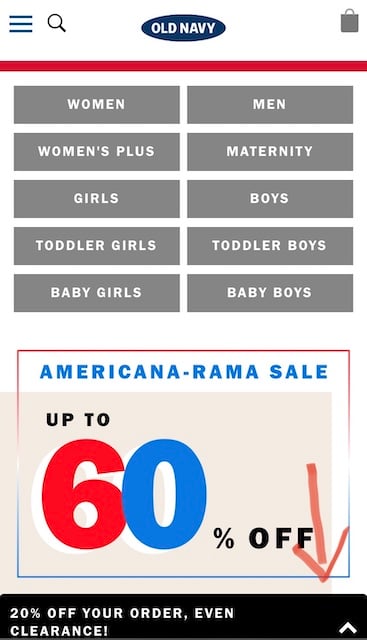
No Full-Page Promotional Pop-Ups
Full-page promotional pop-ups on mobile are frustrating. It makes it difficult to perform tasks on a mobile site and turns off your users.
Stick to small banner promotional items instead, or give them the option to tap a button to see the day’s promotions. For example, Old Navy allows its users to select the banner at the bottom if they want to see promotional items or coupons.
Short Menus
Mobile users want to be able to have quick access to the information they need. Translation: Keep your menus short so they don’t have to spend too much time scrolling through all of your endless menu options.
via GIPHYReorganize your menu to narrow your items down as much as possible.
Easily Accessible Homepages
The logo in the top left corner of your website should take your users back to the homepage no matter what page they are on.
When it is unavailable or not functioning, your users will become frustrated and may exit your site.
Visible Site Search Bars
Users who are looking for something specific typically turn to the search bar to help them find what they need quickly.
Make sure site search is visible on your mobile site so it is one of the first things users see. For example, Wayfair has a search bar that is easily accessible so their users can search through thousands of their products to find just what they are looking for.

No Required Sign-Ins
Requiring users to sign in before you give them access to your mobile site is incredibly frustrating for first time users who may be unaware of your brand.
Excellent mobile websites give users the option to sign up, but they don’t lock their entire site if they don’t.
Streamlined Entry Information
Great mobile sites make sure that forms are auto-filled with pre-stored data for returning users. This makes it easy for users to fill out the information and helps them accomplish what they need to get done in less time.
For instance, shipping and billing addresses should be on autofill so users don’t have to fill it out each time they purchase something from your site.
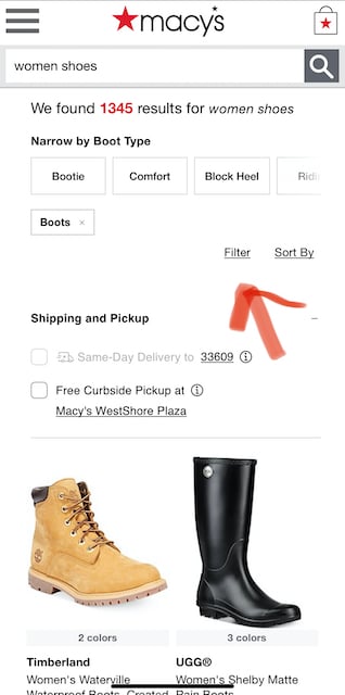
Accurate Filters
Users will abandon sites that don’t have effective filters. Filters should be accurate enough to allow users to see only what they want to see.
Sites that are optimized properly for mobile place their filter icon near the search bar and display the number of results so users can further narrow the results if they want to.
For example, Macy's shows how many results there are after a search is conducted for a specific item, and they provide additional filters to help users find what they are looking for quickly.
Visual Calendars for Date Selection
Mobile sites that are optimized properly allow users to see start and end dates in a calendar on their site. Users shouldn’t need to exit your site to check their calendars to schedule a date.
If your site lets people schedule dates for service, shipping, etc, make sure you have a drop-down calendar with dates for users to select.
Expandable Product Images
Retail websites that allow their users to zoom in and expand product images are more likely to delight their customers and increase conversions.
Many users who have visited websites that don’t allow product zooming became frustrated and felt like they couldn’t see what they were buying.
Clear Location Requirements
Users want to know why you are asking for their location. Excellent sites let their users know why their location is needed and allow them to decide if they want to share their location.
For example, you can provide them with a “Find Near Me” CTA to help them search for physical locations close to where they are located.
One Browser
It’s easier for users to stay in one browser when using mobile devices. Avoid using CTAs that open new browsers.
If you have coupons or discounts, make sure your users don’t have to search the web for them. Keep them on your site so they don’t end up looking for information on other businesses that fit their needs.
For example, Michael's, the craft and art supplies store, often has coupons. They keep their coupons on their site so users can find them easily without having to go to a different browser or to an external coupon search webpage.

High Mobile Site Speed
Lastly, mobile websites that delight their users have excellent mobile site speed so that users don’t have to wait for each page to load. No one wants to stare at the endless loading icon and wait for what they want or need from your site.
If you struggle with speed on your mobile site, then you may need to measure your site speed and take action to improve it. Keep reading to find out some helpful tips and tricks to measure and improve website speed.
How to Measure Mobile Website Speed
Before you can optimize your mobile site to boost speed, you need to measure your current speed to know what aspects of your site to focus on. Here are three things that can help you measure mobile site speed.
1. Use Speed Testing Tools.
There are several free and affordable speed testing tools out there to help you gauge how fast your mobile website is currently.
Using speed testing tools helps you pinpoint the problems with your site that slow it down, so you can save time by focusing on only what needs to be fixed.
Here are a few great testing tools you can use to test mobile website speed:
GTMetrix
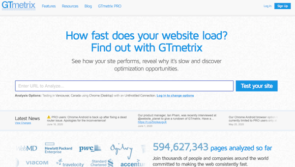
GTmetrix is a free speed testing tool that offers insight into your webpages’ performance. All you have to do is visit the website, copy your page URL, and paste it in the proper place, then you get access to results. To monitor your site more frequently or to receive a detailed report, you can sign up for the paid version.
GTmetrix also allows you to look at details such as page load time and the number of requests.
Google PageSpeed Insights
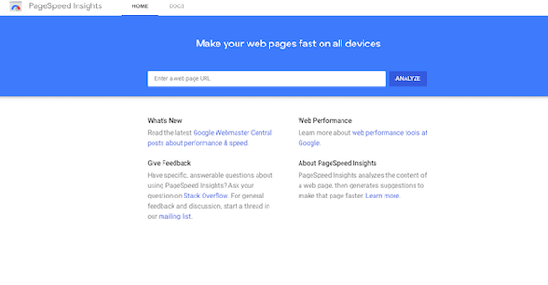
Google PageSpeed Insights is another free tool that provides you with an overall score for page speed. This score tells you if your webpage is slow, fast, or about average. PageSpeed gives you a score based on desktop versions and mobile versions of your website.
It also gives you advice on how to optimize your site for time.
Pingdom
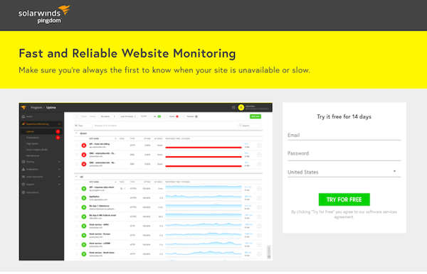
Pingdom is a great testing tool for businesses. It gives you access to website performance monitoring and provides you with alerts during uptime.
You also gain access to in-depth insights regarding page speed and performance expectations via email or text notifications. Pingdom does not have a free version, but it does provide you with a 14-day free trial.
2. Run Several Speed Tests.
Your mobile site speed changes over the course of a day depending on several factors. If you would like an accurate representation of your connection, run many speed tests throughout the day.
This helps you gain a better understanding of the total average speed you are actually achieving.
3. Try Different Servers.
Speed testing apps and sites often have a selection that allows you to change the test server. You can select a different server for your site to communicate with and then test that communication.
Testing out different servers allows you to rule out strange results and causes to see if they are isolated incidents.
In general, your speed tests should be using the same server during your comparison. This is because an overloaded server can make one connection appear to test slower when it could possibly be faster.
How to Boost Mobile Site Speed
Mobile site speed can help you increase conversions and improve customer satisfaction. It is essential for your business to have a speedy mobile website to maintain success. If you struggle to boost your mobile site speed, here are some tips that will help you:
Measure and Minimize Server Response Times.
Your website will slow down when your server has to wait to receive data from your customers’ browsers. The reasons for this can range from memory starvation to slow database queries.
via GIPHYYou should aim to reduce your server response time to less than 200ms.
You can elevate your server response time to speed up your mobile website in many ways:
- Improve your web server software or change the configuration.
- Reduce the resources your webpages require.
- Consider a different web host for your site.
Avoid and Minimize Redirects.
When your customers travel from one page to another, it takes time because your pages have to load. As they wait for your pages to load, they may become dissatisfied with their user experience.
Redirects also generate more HTTP requests, which also reduce your webpages’ loading speed. This means it is best to either avoid redirects or to keep them to a minimum.
Measure Round Trip Times.
Round trip times are defined as the time needed for a data request to be transmitted from a mobile device or computer to a core destination, such as from a remote computer, and then returned. You can measure round trip times by pinging an address.
via GIPHYEvery RTT adds more time to your mobile load time. It is best to decrease the number of roundtrips to help speed up your website. You can do this by combining scripts and uniting as many files as you can, such as:
- External JavaScripts
- Images using CSS sprites
- External CSS
Enable Browser Caching.
All modern browsers have the ability to keep a copy of your website’s files.
The first time a user lands on your website, your files will get stored on their device. If the user returns to your site the next day or even a week after their initial visit, your site will load faster.
This is because some of the content from your site is stored and downloaded in the browser’s memory. This process is called browser caching, and it can help you speed up your mobile website for returning users.
Enable Image Compression.
All images should be compressed for the web. The recommended amount is at least 30 to 40 percent.
via GIPHYHere are some tips to help you compress images:
- Size your image to match the space provided exactly.
- Resize images in a photo editor.
- Consider file sizes and try out different image formats to see which format provides you with a decent balance between quality and size.
Minify Resources.
To minify resources, try to get rid of unnecessary and unwanted code. This should significantly impact the speed of your mobile website.
After you complete this step, check Javascript to see if you have any scripts or files that you can remove.
Next, remove extra spaces and line breaks. This can be done manually, or you can use a tool that automates the process for you.
Minification benefits your styling sheets and the coding used to display the page, which speeds up your mobile site.
Some tools you may use for minifying include:
- PageSpeed Insights will help you generate an optimized version of your HTML code.
- YUI Compressor and CleanCSS assist in minifying CSS
- Closure Compiler, JSCompress, or the YUI Compressor help you minify Javascript.
Mobile isn’t going anywhere anytime soon. Think about the number of people you see glued to their phones as you sit in a restaurant or in any public transportation.
A large dose of speed is the recipe for a great mobile site that helps you achieve your objectives. Take the time to ensure your speed is up to par with the competition so you can come out on top and delight your customers!

Erika Giles
Erika is a Marketing Copywriter at Bluleadz. She is a huge fan of houseplants and podcasts about conspiracy theories. She spends most of her free time reading, writing, and enjoying the outdoors.