
With technology being where it is today, it's safe to say that for most consumers a website is their first form of interaction with a company. And that first impression is everything.
How much time do you give to a site that's either disorganized, low quality, or just not that attractive in general? Consumers have become used to engaging, interesting, and even interactive sites that appeal to both their needs and their interests.
Meeting those expectations can feel like a daunting task, but if you keep certain goals in mind and take a page or two out of some other successful examples, then you can create a B2B website that will have your customers applauding.
What Are the Key Elements of a Successful B2B Website?
via GIPHYAs unique and different as websites can be, they all have the same fundamental elements that help attract traffic to their pages. It's what makes them a cohesive website instead of a jumble of clever coding and images.
Here are some of the key elements that a strong B2B website possesses:
A Strong Foundational Strategy
A website needs a purpose in order for it to be of any use, both to its owner and its visitors. That's why having a clear, solid strategy in place for it. Developers need to know:
- Who is the target audience?
- What pages are necessary and what value will they provide?
- What makes the business, and therefore the website, different from competitors?
- How do they want to be perceived?
- What are the company's goals and how will the website contribute to reaching them?
Without a structured plan in place, it's far too easy for a website to become just a mass of unrelated or irrelevant pages existing under one domain. We wouldn't exactly call that a success.
A Focus on Buyer Personas
Calling back to the target audience, there should always be a great deal of research performed on who the ideal customer is. A great website is built to appeal to the desired customer's interests, background, pain points, and goals.
Buyer personas can vary from industry to industry, so it's always a good idea to develop ones unique to your business. They're meant to help recognize potential qualified leads by job role, pain points, and even budget.
When a website is designed to cater toward customers who are best matched to its business, then it experiences less friction in converting visitors into leads.
Keywords
Today, search engine optimization (SEO) is everything. If a website is optimized, it's going to have to fight tooth and nail to get some visitors organically.
That's where keywords come in to save the day.
All the major pages on a website should leverage relevant keywords that will help prospects find it via search engines. Implementing a keyword strategy can be a tremendous help here.
Performing keyword research to determine which terms or phrases get heavy search traffic without a ton of competition can put a website in the perfect spot to be seen.
Just remember that keywords alone aren't going to keep a website going. There are plenty of other SEO best practices that are necessary to make a B2B website successful.
An Easy-to-Use Interface
User experience is everything in today's digital world. If a website is too difficult to navigate or clumsy in its design, then its bounce rate metrics are going to be through the roof.
Consumers have short attention spans and even shorter patience. They want to be able to find what they're looking for easily. A quality user experience has a higher chance of capturing and keeping visitors' attention.
Not only should it be visually appealing, with relevant graphics and tempting CTAs, but it should also be responsive. Nothing's worse than a website that takes an hour to load one page.
Social Proof
Probably one of the least exercised muscles in a B2B website design, social proof like testimonials and case studies can actually be the last push a prospect needs toward making a purchase.
Consumers love to hear feedback from their fellow customers. How often do you go to a restaurant because of a review you read online or from word of mouth from a friend?
The same applies when it comes to B2B marketing. A company is going to see better business when they provide proof that previous customers were happy with them.
via GIPHYWell-designed websites incorporate user reviews directly onto their website or a page dedicated to their case studies for visitors to read through. They respect that the modern consumer likes to vet their purchases and provides them the means to do so.
What Makes B2B Design Different Than B2C Design?
The lead funnel and lifecycle of a B2C purchase is typically shorter. Consumers are seeking a smooth, convenient buying process.
Psychologically, B2C purchases tend to be emotionally based. Branding is the key. For example, the iPhone offers the exact same features as the Samsung Galaxy, but Apple's branding leads the user to believe it is the trendier choice.
B2B purchases can be emotionally driven, but not exactly the same way. People put off making a decision when it affects a team or company. Risk aversion and fear are two emotions that are often associated with B2B purchases.
One bad experience can lead to problems with your reputation. An unhappy buyer or team can affect another prospect's decisions through negative reviews.
Often when dealing with consumers, pricing is fixed and consistent. This isn't always the case with B2B purchases. Pricing can often vary based upon the level of service provided and other factors. As a result, B2B buyers rarely make an impulsive purchase.
via GIPHYWhen it comes to decision making, B2C sales are one-to-one.
The consumer is ultimately the decision maker. With B2B, there is often a team of people behind the decision. Buyers may have to follow certain procedures when authorizing a purchase, and this can result in a longer and more complicated purchase process.
As a result, B2B web design needs to include as much information as possible. Content needs to be informative, educational, address specific pain points, and offer solid solutions.
Prospects must completely trust your business before they will make a purchase. Your B2B web design needs to be focused on content, and it should include plenty of CTAs and premium information including whitepapers, explainer videos, testimonials, trust icons, live chat, product demos, and more. This is all created in an effort to build trust and lead to the close.
One of the best ways to learn how to create an effective B2B web design is to look at examples from other businesses.
25 B2B Web Design Examples We Fell in Love With
The best B2B web design is able to capture, inform, captivate, and persuade visitors to buy. They get to the point quickly, show the benefits of partnering with them, and strategically place content to direct visitors to their CTA. Here are 25 of the best!
1. Reputation Squad
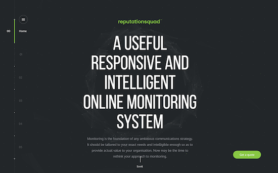
Reputation Squad is an online business monitoring solution for medium and large-scale companies.
They use several mouse sensitive animations that are decorative, offering visitors a sense of control, which is exactly what you'd expect from a monitoring service. Their landing page consists of different sections you can scroll through within a "page."
It's a unique and interactive take on moving from one resourceful piece of content to the next, rolling from what they do down to case studies. A clear “Get a Quote” CTA follows the user throughout.
2. Asana
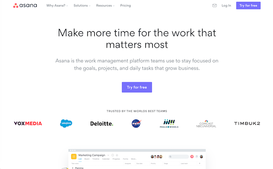
Asana's site is excellent because it directs visitors exactly where they want them to go. It's clean, simple to navigate, and offers no distractions.
Prominently displayed on their homepage is a giant call-to-action waiting to convert visitors into consumers of their products.
3. Ultimaker
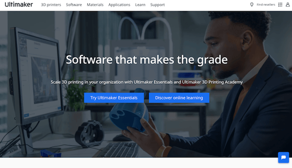 Ultimaker, the 3D printing company, presents a clean and simplified website that leaves plenty of whitespace to help their short demonstration videos and high-resolution pictures to be the focal point of the website design.
They also keep their copy uncluttered an to the point so visitors know exactly what they do and how in just a few words. In the past, Ultimaker has even won the CSS Design Awards Special Kudos.
4. Quid
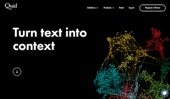
In design, less is often more. No clutter or chaos puts your message front and center. Quid is a data site that puts the world's information at your fingertips. It connects big ideas through making interesting data connections.
By using a minimalist design, it improves the user experience, cutting load times and improving readability. With less content on the page, it draws more attention to their message, making small statements deliver greater impact!
5. Magnetica
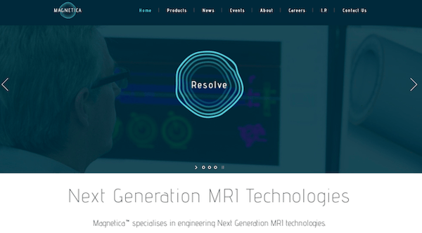 Not only does Magnetica have a website that captures visual interest instantly with their interesting homepage, they also explain highly-scientific MRI technology in an easy to understand way. There is a CTA that follows users on every page they view and they have an "Email us" CTA at the bottom of every product page.
Magnetica provides an easy to use and functional website design with careful simplicity.
6. Dropbox Business User Guide
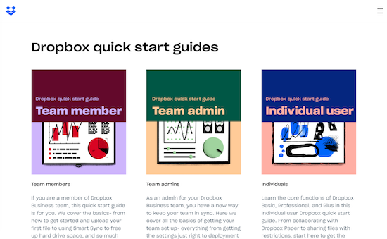
Dropbox is a well established brand. Their business user guide is set up as a separate B2B website. The website is a great example of a material design approach.
It reads like an interactive book with screen turning animations and sections that are easily accessible from the table of contents. It's incredibly interactive and user friendly. This is an excellent FAQ solution for a business service!
7. Grammarly
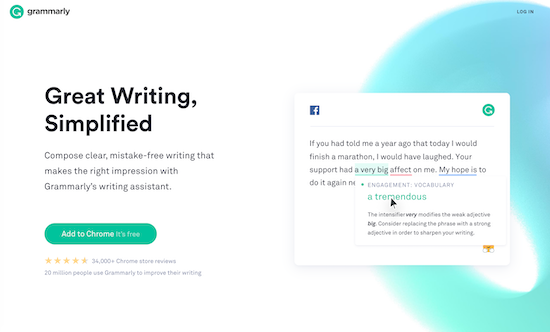
Grammarly is a great example of B2B web design. It features long scrolling, functional minimalism, and animation. But the biggest feature is its flat design that fills up the entire screen.
This helps with load times and responsiveness on mobile devices. The flat design gets information across in an easy-to-read intuitive manner. And look! Right from the start you get a bit of social proof with a star rating and user count.
8. Hirelevel
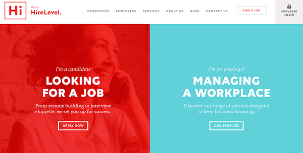
The stark color contrast is the first thing hat captures visitors when they land on Hirelevel's brilliant website. The differentiation between the two personas that Hirelevel targets are immediately apparent. This helps save the visitor time because they will immediately know where to go to get what they need.
This website does a great job at taking a personal approach to B2B website design.
9. Zendesk
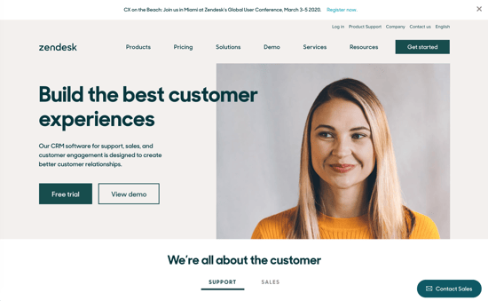
Zendesk makes an effort to let you know exactly what you can expect from them from the start. Focused on customer support, their messaging is centered on how they can help you "create better customer relationships." There's really no confusion about what this company does.
And to double down on their mission of prioritizing the customer, check out the banner at the top of their page. At the time this is written, Zendesk is offering a User Conference to continue supporting their loyal base. Talk about practicing what you preach!
10. Dstillery
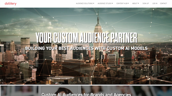
Animated graphic design is a hot B2B web design trend that can help increase the user experience on both desktop and mobile devices. It a great way to tell your company's story.
Dstillery takes this concept and combines it with the website's urban style to keep visitors visually engaged. If you scroll further down, they showcase an impressive roster of clients also. It builds a bit of trust between the company and potential customers.
11. Kekselias
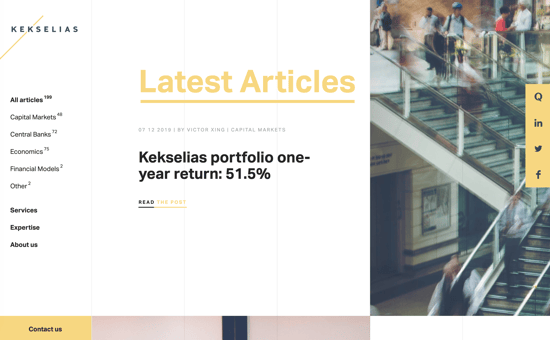
Kekselias is a portfolio management, investment analytics service for institutional asset managers offering macro research and market analysis. This site features a minimalist landing page that highlights elements on mouseover.
The page features a scrolling display of recent articles and a simple CTA to “read the post.” The menu is located in the upper right area of the page. When you click the menu, it opens to reveal three subpages where their services are clearly explained.
It's a blog-like approach that offers value (the articles) and a great user experience to elegantly explain a complicated business.
12. ACME
A packaging provider for shippers and logistical operators, ACME's website is beautifully designed. It features a striking yellow and white text floating over a dark black and white photograph of an empty warehouse. This is an excellent example of a strong B2B website design.
Their business services target three markets: shippers, retailers, and corporate logistics managers across multiple industries. As you enter the main website, they clearly break down their offerings by service and industry, making it very easy to find what you need.
13. Blake Envelopes
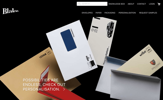
While envelopes aren't the most exciting product out there, they're something every business needs. Blake's website makes finding exactly what you need fast and easy, right from their homepage!
The first thing you see is a search function. You can specify color, size, type, and dimensions. Then search their extensive product catalog to find exactly what you need in seconds!
14. Batterii
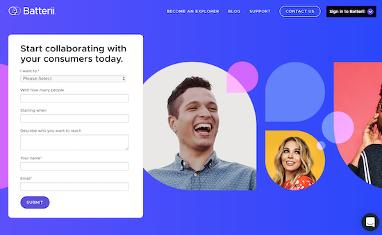
Batterii's website is an excellent example of design minimalism that still provides the information you need. Your audience should be able to instantly identify your company's purpose and how it can deliver a solution.
Batterii's homepage is one simple form to get you started "collaborating with consumers." It's a clever way to generate leads right from the start.
15. Packlane
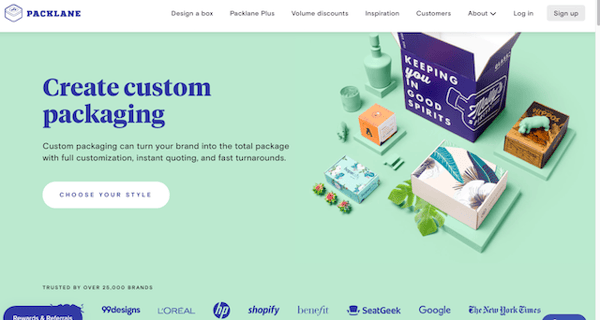
Packlane has several graphics to present information about their products to visitors in the best way possible. They have a variety of customizable folding boxes for business' product packaging and examples to help inspire creativity.
They even have a cool step-by-step video graphic that demonstrates how to design a box. This website is modern and user-friendly with CTAs that are customized to their B2B target audience.
16. D.FY
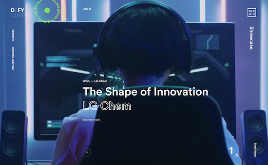
D.FY uses compelling videos to illustrate their content with the story of who they are. Video is a trend that is becoming more popular on website homepages.
It's a great alternative to excessive “about us” content that can lose your visitor. Video is a great way to tell your story, and D.FY's homepage is a great example.
17. Pulse 220
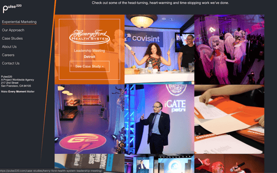
Pulse 220 uses several great design tools on their website. The popularity of mobile browsing has made "card layouts" an effective tool for organizing content to create a user friendly mobile experience.
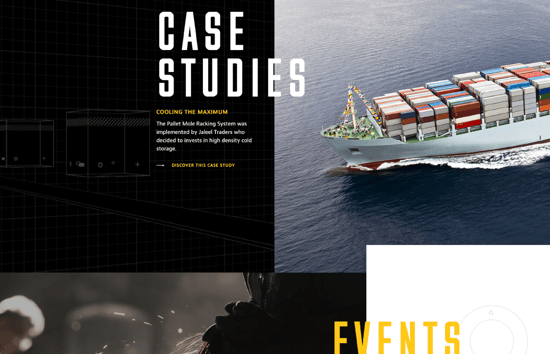
Pulse 220 uses this design technique well to showcase their case studies.. Each “card” presents an image bolstering message. Highlighting the customer's business, what the event was, and where it took place, you get a quick snapshot of the case before diving in even deeper.
18. Yapstone
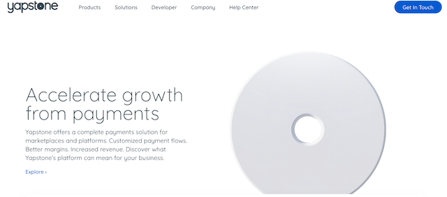
Yapstone offers online and mobile payment solutions. Their website features a gorgeous testament to minimalism as you scroll down from their cool hero image graphic.
From the use of clever design tricks in their section headers to a consistent, cooling color scheme, this website shows off just how aesthetically pleasing minimalism can be. And even without a ton of copy, there's still a clear message of who Yapstone is and what they have to bring to offer.
19. Jaco
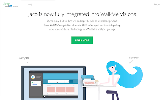
Jaco has a fun site that uses animation as a brand identifier. When you go to their website, that first element you see is a video about the company. Scroll down a little farther and Jaco shows you how they record and play user interactions with your website so you can experience your site as your users do.
They also have examples of the collected user data and some of the functionality they offer – a great design that highlights the functionality of their service.
20. Pics.io
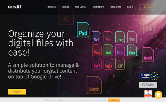
Pics.io is a cloud based digital media management platform. Their website is well organized and uses multiple visuals to demonstrate how to use their product. They show how easy it is to share and store your digital assets online using Pics.io.
You can access all of your digital assets, videos, audio, and images in a single place and find your media based on keywords, descriptions, and custom metadata. They even offer a function that can generate keywords automatically using artificial intelligence.
21. Powerwest
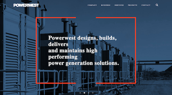
Powerwest, an Australia-based company, has an excellent website that thoroughly explains what they do right when you enter their website. The language they use is easy to interpret, and they have a high-quality photo of a job site in the background that contributes to the overall design and look of the page.
As you scroll down, they have several pictures of projects they worked on with short explanations next to them. They provide links to more information if the user wants more details about each project.
The last section on the homepage includes a full form for users to fill out in case they are interested in Powerwest's services.
22. Weblounge
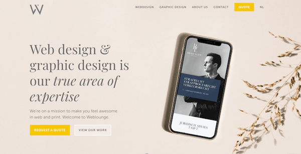
Besides Weblounge's amazing website, their business name is also pretty amazing. They incorporate a relaxed design with a consistent color palette that is appealing. Their most important CTAs standout in a bright yellow color to entice visitors to click to generate a quote.
They brilliantly use a simple graphic example of a mobile webpage to show what they do and give a taste of what their web design style is. They even offer an easy way to view more samples of their work before the user decides to dive right in for a custom quote.
23. Blueleaf
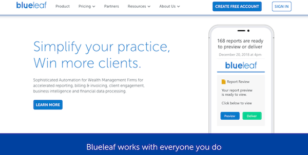
Blueleaf automatically appeals to its target audience with a clear headline that describes what they can do for visitors in no more than six words. This website features a clean design with a tailored approach that focuses on empathy and impactful messaging.
If I worked in wealth management, this website would definitely make me want to click the CTA "Learn More."
24. Plink
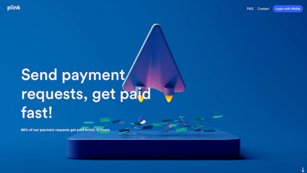
Plink has a great animation on their website that draws visitors in right away. It is clear what they do, and they tell visitors exactly how their services can help them: Get paid fast. This is impactful because who wants to wait for money?
This to-the-point website design is a B2B dream site with vivid colors and a clear CTA in the top right corner.
25. Dialpad
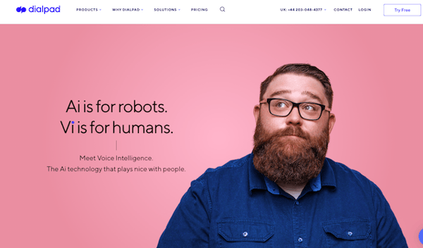
Most likely, the products you sell are for humans – whether you are a B2B or not. Dialpad does an excellent job of using photography and micro-copy to leverage the value of human interaction to humanize their product.
The site is instantly appealing and makes visitors want to know more about the voice intelligence that is for humans as their copy says.
Want to have an incredible website design that is modern and attractive? Then continue reading so you can learn the tricks and tools of the trade with our best practices for website design.
B2B Website Design Best Practices
Of course, there's always a little extra you can do to boost the value of your website. By exercising some of these best practices, you can get a leg up on your competition and really meet your customers on their level.
Do Your Research.
via GIPHYThe better you know your audience, the more likely your site is going to capture their interest and appeal to them.
Through understanding their goals, demographics, and pain points, you can start to identify patterns in their purchasing decisions and develop strategies that will make moving them down your sales funnel a cinch.
Map out their buyer's journey and develop a thorough playbook of buyer personas for your team. The more focus you can put on meeting their needs, the better your website will be. The goal is to design a site with your customer in mind.
Write Valuable Content.
This is crucial. Words have meaning, so make sure that you're leveraging the right ones to get your messaging across.
B2B buyers are looking for you to tell them what they need to know about your company, your product or service, and how they're going to benefit from it.
In fact, some may need to tell you what their pain points are in the first place. It's not uncommon for a customer to recognize that they have a problem, but not know what it is.
Take some of the headache out of it by writing clear, value-focused content on your website across your pages. If it makes sense for your marketing strategy, maybe even consider writing a blog! Your customers may appreciate you being a free resource.
And don't forget your keywords!
Optimize for Mobile Devices.
How often do you wait until you get all the way home to start searching the web on your desktop these days? In fact, there's a pretty high chance that you're reading this on your phone right now.
It'd be wise to assume that your consumers have similar habits.
via GIPHYIf a B2B website isn't mobile-friendly, then its losing a great deal of customers who have adopted the lifestyle of getting information at just the tap of a finger. Websites need to be designed to fit multiple screen sizes, all while still being responsive and organized.
Stay Consistent in Your Branding.
You would be surprised by just how much your customers pick up on when it comes to branding. If your website's design is all over the place, it makes it seem disorganized and, to be honest, kind of like you don't know what you're doing.
By creating a brand style guide and implementing it consistently across your site, you're communicating your brand and all that it stands for: your company values, mission, goals, etc.
Practicing this can even help your teams keep their eye on the ball. The better they understand and invest in your company's brand, the more aligned their individual goals will be with the big one. This will be reflected in their interactions with customers who are looking to build a rapport and trust in your brand.
These examples and best practices can offer you some great ideas for design and content presentation that you can incorporate into your own B2B website. B2B websites are different than marketing to consumers.
By understanding the differences, you can focus your website design on targeting businesses by providing your customers with the information they need in an aesthetically pleasing design that builds trust and help you close the sale!


.png)
Comments