
The purpose of a landing page is to get your website visitors to convert to the next stage in the buyer’s journey.
There is no doubt a bunch of awesome landing pages out there that follow all of the important best practices when it comes to creating the perfect landing page. In no particular order, here are 12 of my favorite landing page examples that cover a variety of stages in the buyer’s journey.
1. Wistia
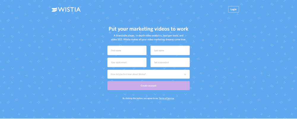
Wistia’s sign-up page for their free account is short, sweet, and to the point. The headline is clear and concise and the text explains exactly why you need a video hosting platform and the benefits of using Wistia:
A brandable player, in-depth video analytics, lead gen tools, and video SEO. Wistia makes all your video marketing dreams come true.
The form is the perfect length and is located with great placement above-the-fold. If you scroll down, they’ve also included some FAQs to hopefully answer any questions most customers have before signing up.
By making these two sections contrasting colors, they don’t take away from getting a visitor to convert.
For a video hosting platform, this landing page could benefit by having a short, informational video on it.
How to Make It Better
Adding a sign-up button below the FAQ could be useful to bring website visitors back up to the form, as well as adding some testimonials or social proof to actually show how other customers have successfully put their marketing videos to work using Wistia.
2. Muzzle
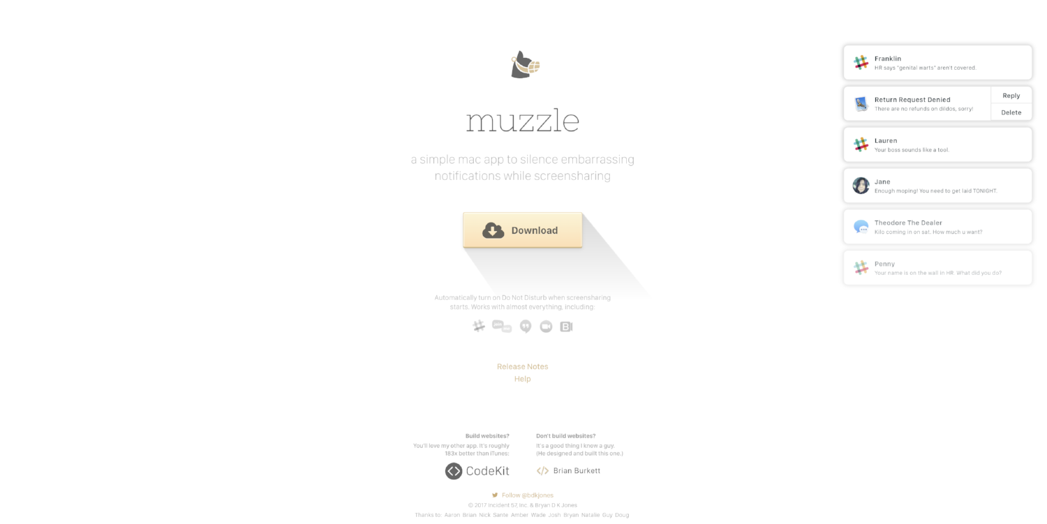
The goal of a landing page is to help website visitors decide whether or not your product or service is what they’re looking for and worth their time. Muzzle is a Mac app designed to silence on-screen notifications while screen sharing.
As soon as you land on their page, you can immediately determine whether or not you need to download this app to stop the slew of embarrassing notifications from appearing on the upper right-hand side of your screen.
What better way is there to show website visitors the very problem that your product solves?
How to Make It Better
This page doesn’t actually require any information about the visitors that download the app. Requiring an email address at the minimum could be useful in order to build a subscriber base to notify when new apps/integrations are added. Using contrasting colors for the “Download” button could also call more attention to it.
3. H.Bloom
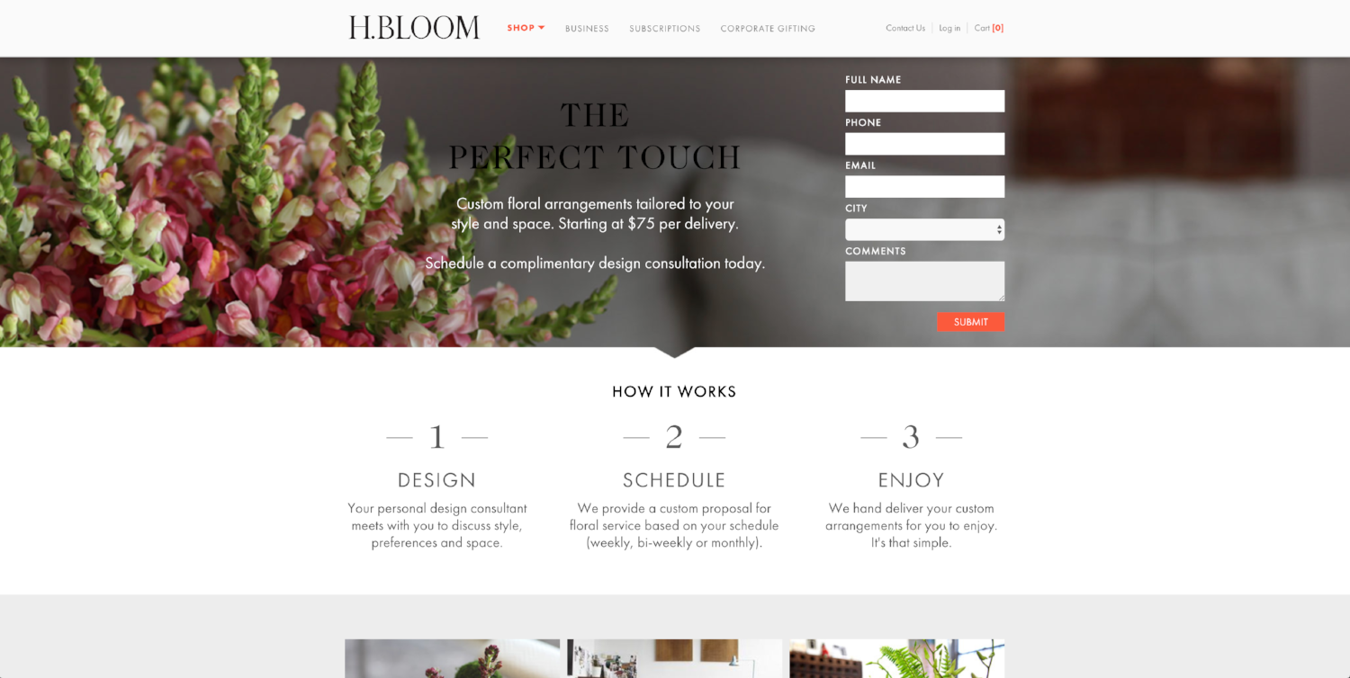
This landing page does a great job of utilizing images and white space very tastefully. It’s definitely one of the best looking landing pages I’ve seen.
In addition to being such a pretty page, it also has some great conversion elements, such as a clear and concise description, a form above-the-fold, and a contrasting orange “Submit” button that stands out without looking out of place.
How to Make It Better
If I were to make any edits to this page, I would change the “Submit” button to say something more enticing and specific to the offer.
4. Airbnb
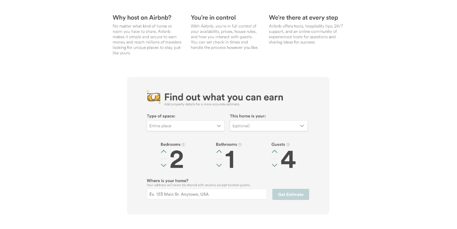
To encourage website visitors to become Airbnb hosts by simply entering location, number of guests, or private/shared rooms, Airbnb estimates a monthly earning potential of your house, apartment, or room. Talk about personalization!
Further down the page, you’ll see a brief overview of the process, safety information, and FAQs. A great addition to this page is the fact that your estimated monthly earning potential stays at the top of the page as you scroll—a great reminder for potential hosts!
Once you get to the bottom of the page, there’s a clear description and brightly colored CTA to get started.
How to Make It Better
Testimonials and social proof could prove invaluable for this landing page. Many potential hosts may be skeptical of what it’s like renting out their accommodations to complete strangers or even sharing part of their home with them.
5. Codecademy
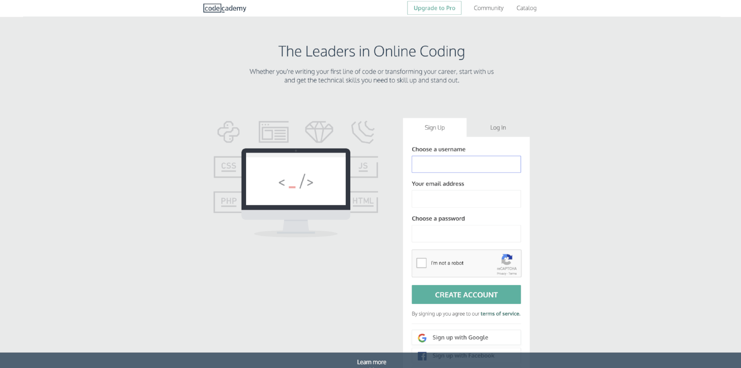
Codecademy is an online learning platform for learning how to code CSS, HTML, and more. The headline on this page is clear and concise, and the text explains exactly how Codecademy can help those new to coding or those looking to advance their careers.
This page has some great conversion elements including an above-the-fold form, CTA with contrasting colors, a relevant image, an informational video, and testimonials.
How to Make It Better
To increase the chance of conversions of this page, I would include an actual quote in the testimonials section instead of pushing users to click-through to a new page and possibly miss out on a potential conversion.
6. Uber
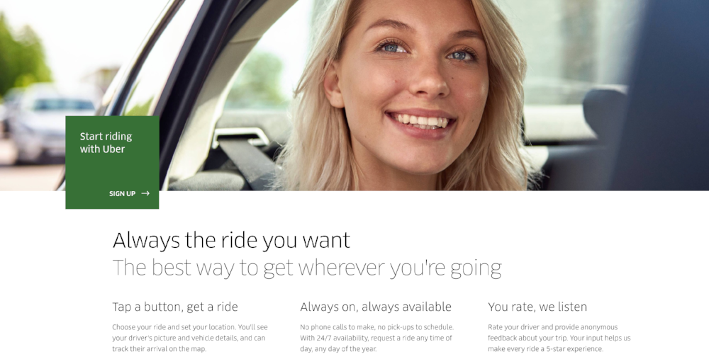
Uber’s ride page has its first conversion element (a large, square CTA) above-the-fold, overlapping a large hero image of a happy rider. This CTA is seen an additional 3 times throughout the page, as it leads website visitors through the process of riding with Uber.
This landing page does a great job with personalization, as it lets website visitors select which vehicle best suits their travel needs, a pricing estimate based on their pickup and destination locations, and follow-up tips for how to use their app.
How to Make It Better
There are a lot of different links and CTAs leading to different pages, which can deter the visitor from signing up for an account. The page also focuses on actually riding with Uber, as well as Uber Eats, which is Uber’s food delivery service.
Ultimately, Uber is still receiving a new signup and making a profit, whether the new user is taking a ride or getting food delivered.
7. Slack
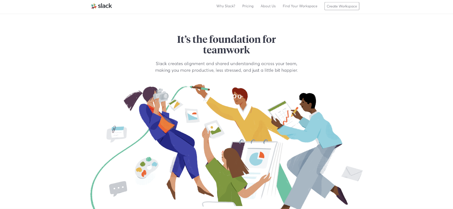
Slack’s “Why Slack?” page, or features page, has a clear and simple headline. Rather than a CTA above-the-fold, they have a large image with four business people all performing different tasks in an organized and happy manner. How often can you put four different departments together and keep everyone smiling the whole time?
This page shows the benefits of using Slack and has a related testimonial within each section. Although the page has more links than I’d typically like, most of those links lead to a page where there is a CTA in above-the-fold to sign up or get started using Slack.
How to Make It Better
Slack has a lot of cool features and many integrations, which can seem daunting at first, so it might be beneficial to add a video on the page to show how easy Slack is to use.
8. Landbot
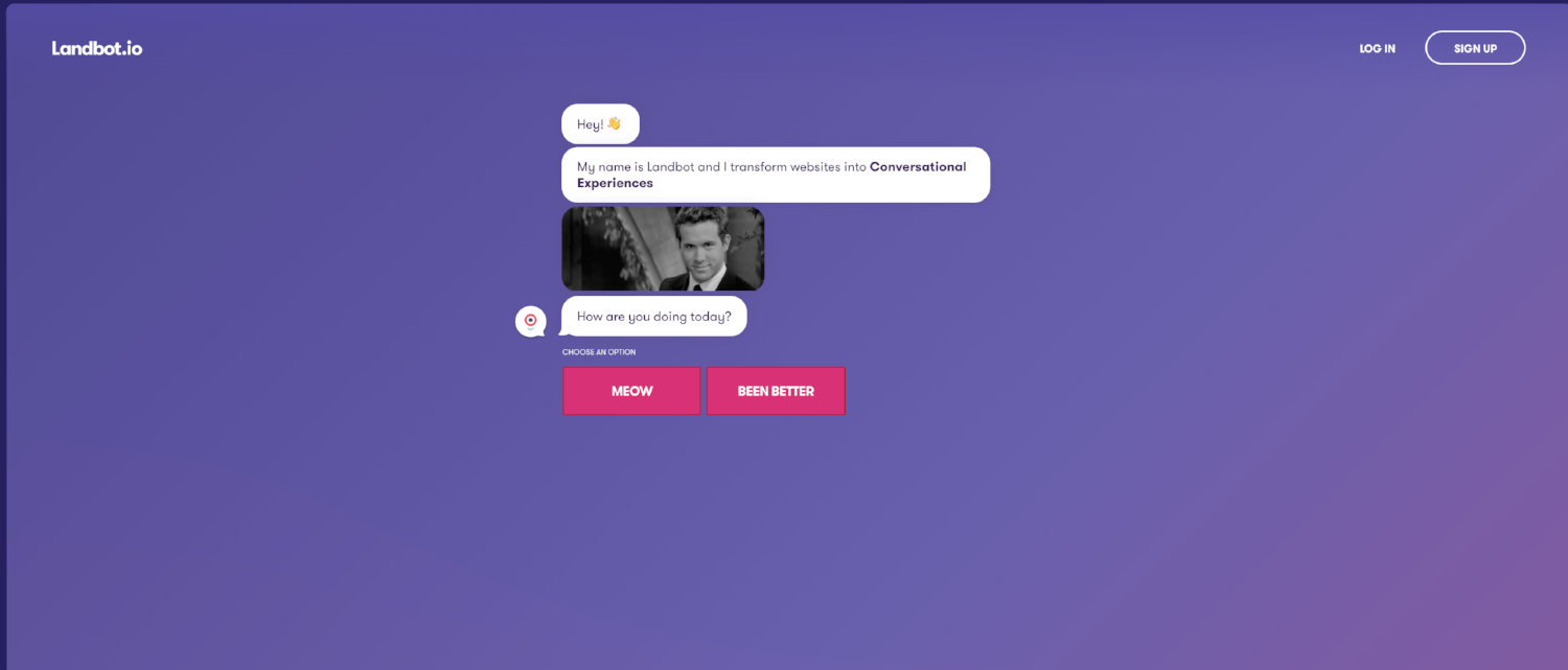
Landbot is a service that creates chatbot-based landing pages. Like Muzzle (the Mac app we talked about before), Landbot puts their own product front and center on this landing page.
Instead of a traditional form with action-oriented content on a landing page, on this page, website visitors partake in a conversation with Landbot’s chat-bot (full of emojis and GIFs).
By interacting with this chat-bot, users can choose to sign up right away, learn more about the product, or learn the story of how Landbot came to be.
How to Make It Better
This landing page provides the ultimate user experience for website visitors, all while following a very specific conversion path based on visitor responses during the “conversation.”
9. Lyft
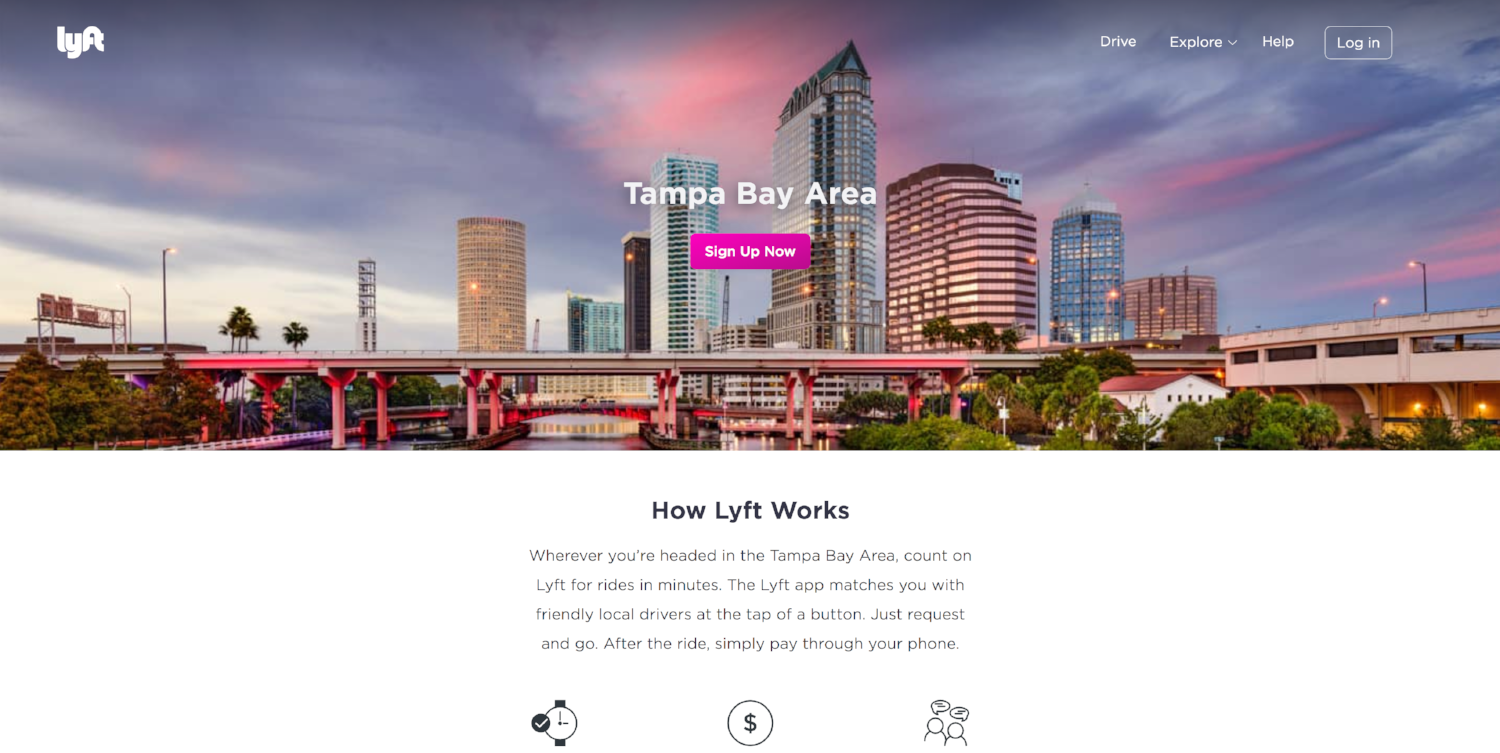
What I love about Lyft is that they have landing pages for each city they’re available in. Each of these pages has a bright pink CTA located above-the-fold and simply explains how Lyft works directly below the hero section.
Like Uber’s landing page, this page also does a great job with personalization by allowing website visitors to estimate the cost of their trip and choose a vehicle that best suits their needs, and also includes an itemized list of the costs associated with each vehicle.
The bottom of the page focuses on driving opportunities with Lyft and focuses on how drivers can easily earn money, whether it’s by full-time driving, weekend driving, late-night driving, and more. By offering these two different conversion paths, they’re able to address two different personas.
How to Make It Better
I would love to see the analytics to understand if adding a form directly above the "sign up" now button would increase their conversion rates.
10. Spotify
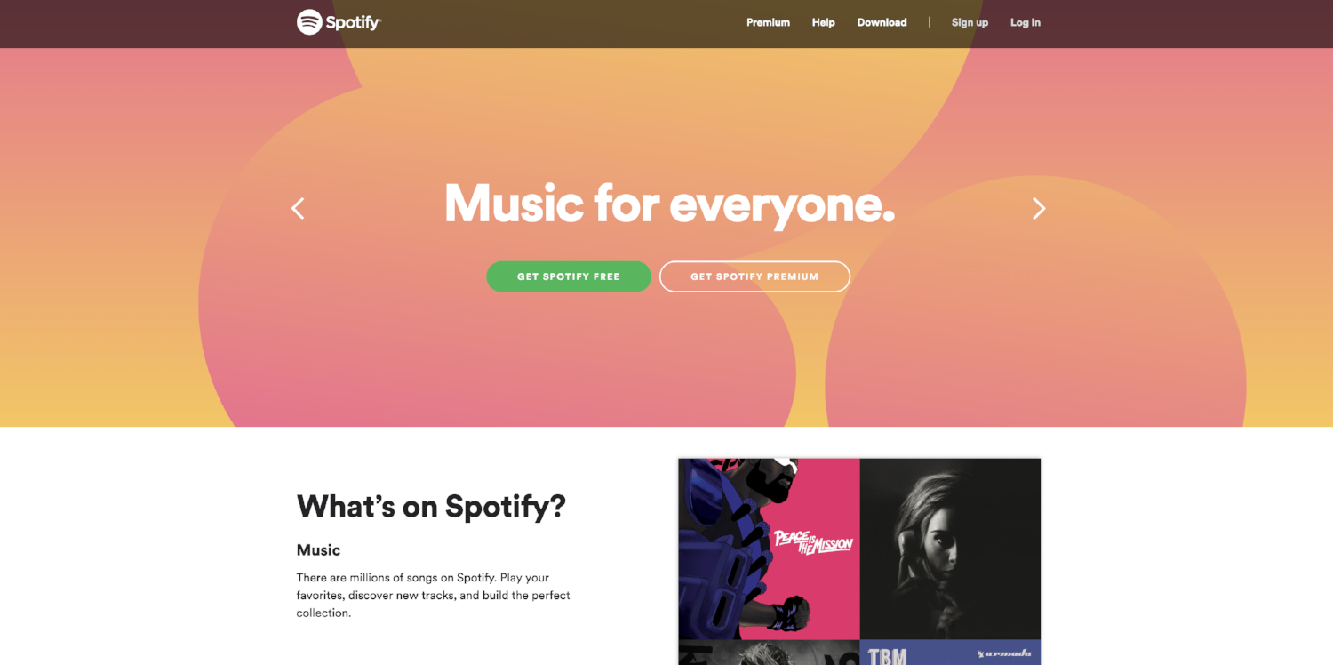
The music streaming service, Spotify, has become increasingly popular over the last few years. Chances are, if you’re visiting their website, you already know who they are and what they have to offer.
Having both a free and paid version of their service bodes well for Spotify. If you’re like me, you started with a free account and upgraded to the paid account.
The main headline on the homepage is clear and concise, and the green CTA stands out well due to the contrasting background color.
How to Make It Better
The main thing that takes away from this page is the fact that they’re using sliders in the hero section. Although, thankfully, the sliders don’t change unless you click the arrow buttons.
11. GEICO
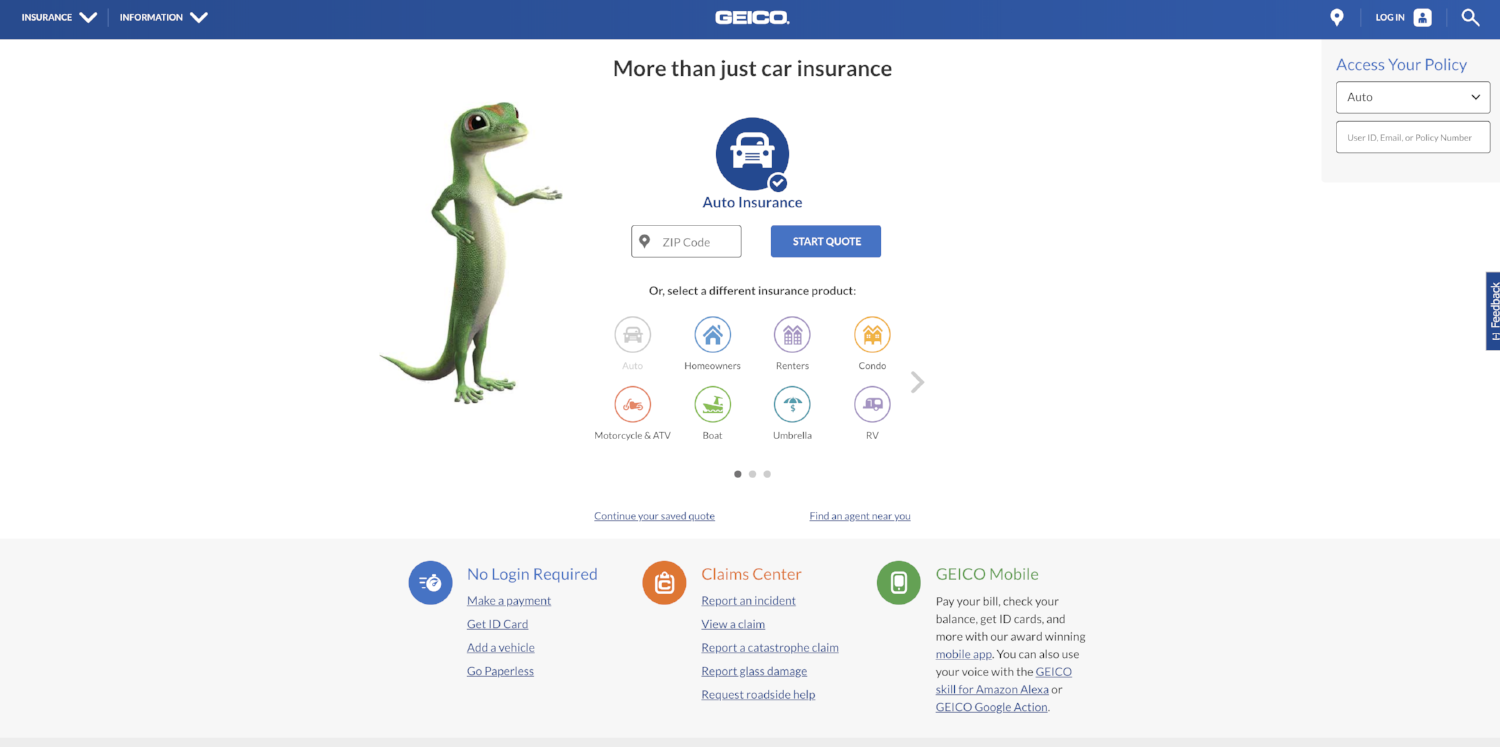
GEICO makes the process of getting an insurance quote as painless as possible with a user-friendly setup that offers both a great user experience and a clear conversion path. Once you select the type of insurance quote you need, GEICO provides helpful FAQ content for topics including multi-policy discounts, address changes, and more.
This page was built around user engagement and conversions with it’s simple, easy-to-use layout and use of conversion elements, such as a CTA above-the-fold, a relevant image (AKA their signature GEICO Gecko), and action-oriented content.
How to Make It Better
We all know the car insurance industry is extremely competitive. I would imagine most of Geico's visitors have many of the same pains, and thats price.
Adding a section that illustrates information on expected savings or what their rates are (even if its a ballpark) compared to my current company. Adding that little piece of information, could go a long way.
Another note, once you enter your zip code to search for rates, you're taken to another page with a lot of additional steps. Understanding the time involved up front would probably delight their visitors.
12. Plated
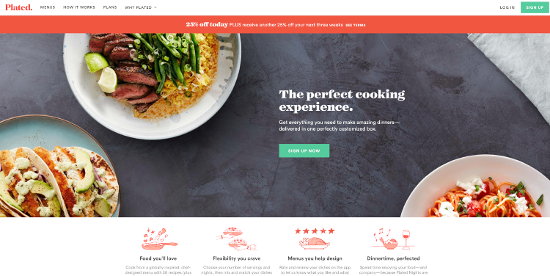
Plated is a subscription-based meal delivery service. The hero image with three delicious meals is a quick win to get almost anyone on board to sign up.
The four icons and brief descriptions below the hero offer lots of information with minimal text. There’s a clear conversion path with a bright green CTA above-the-fold, as well as a bright orange bar at the top of the screen for a discount—and who doesn’t love a good discount?
The page has lots of relevant imagery with a good balance of white space and testimonials throughout. All of the CTAs on the page are bright green and use relevant action words depending upon the section they’re located, but all point toward the sign-up page.
How to Make It Better
I would allow the visitor to convert right on the page, thus shortening the conversion path. Adding a simple single line form field asking for an email address would do the trick.
Welp, there you have it. 12 awesome landing page examples that should inspire you to create the best lead conversion machine for your company, while keeping your audience's needs top of mind.


.png)
Comments