As more businesses begin incorporating video and other media in their marketing strategy, responsiveness across devices can become an issue. If you wish to include your flashy, new video on your HubSpot blog, you also have to consider its playability and responsiveness on different window sizes and devices.
Fortunately, there are two very simple ways to make YouTube videos and other types of embedded media responsive on your website's blog. These are:
- Using a custom CSS
- Using the jQuery plugin, fitvids.js
In this video walkthrough, I detail how to use both of these methods on your website blog and make embedded videos responsive.

Thanks for reporting a problem. We'll attach technical data about this session to help us figure out the issue. Which of these best describes the problem?
Any other details or context?
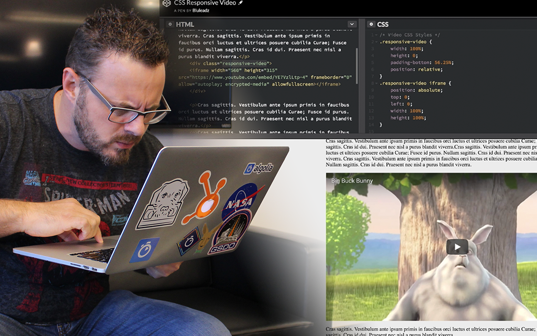
CSS-only Way to Make Videos Responsive
Here's the example in CSS:
See the Pen CSS Responsive Video by Bluleadz (@bluleadz) on CodePen.
The process to turn YouTube videos and other media responsive, particularly for mobile, is pretty straightforward:
- Take the YouTube or Vimeo embed code, or other relevant embed code, and insert appropriately into your blog/page HTML code
- Wrap the embed iframe in a new <div>
- Add a class of responsive-video to the wrapping div
- Place the class .responsive-video in your CSS file
- Set the class width: 100%; and height: 0;
- Add padding-bottom: 56.25%;
- Add a position: relative; to the responsive-video class
- Target the iframe with .responsive-video iframe set position: absolute
- Set top: 0; left: 0;
- Set width:100%; height: 100%;
- Ta-da! Your embedded video is now fully responsive
Using fitvids.js to Make Videos Responsive
Here's the example in CodePen:
Fitvids.js Responsive Video by Bluleadz (@bluleadz) on CodePen.
The fitvids.js jQuery script makes optimizing videos and other content for mobile devices even easier. Here's what to do:
- Visit the fitvids.js website and download the plugin
- copy and paste the embed code in your HTML code as you normally would no extra wrappers needed.
- Link jQuery and fitvids.js file before the closing </body> tag of your website.
- Copy $("<YOUR_CLASS_OR_ID_HERE>").fitVids(); from the example above and and place it in your javscript file.
- Copy the class or ID from the wrapping container of your blog post i.e.(.blog-post) and paste it into the fitvids.js code $(".blog-post").fitVids();
- That's it! Your embedded videos will no be responsive on your blog
For a visual representation of the steps involved in both of these methods, make sure to check out the video in this article!


.png)
Comments