Let’s face it, we’ve all been stuck on color at some point or another. Whether you’re a designer working in Photoshop or an anti-tech savvy individual trying to make a simple brochure, I’m here to explain to you why color matters and show you some awesome kick-ass color palettes as well as some additional resources you could use for picking out the best colors for your next project.
Why Color Matters
The honest truth is that colors matter for a variety of reasons. They can cause a person to feel a particular way, they can bring out the importance of your design, and they can even balance the other colors used in the design.
Our brain has learned to correlate certain colors to a specific feeling—danger, warning, awareness, love, security, death, joy, and even excitement.
The balancing act of colors is also extremely important in design. You’ll want to be sure that the colors you’re using compliment one another in some way. This doesn’t mean you can’t use a yellow and a brown together, but you will have to experiment with the shade and tone of a color to ensure they work well together.
What You Want to Convey
Something you must always think about is your audience. What do you want them to get out of your design? Do you want them to feel safe and secure? Do you want them to be alert and aware? Or do you want them to feel informed?
All these questions should cross your mind at one point or another, and believe it or not, your answers can relay a different color solution. Depending on your content and the information provided in your designs, you’ll be able to answer the questions with ease and look for colors that relay this message.
Maybe you have a brochure about the warnings and dangers of hurricanes and storms. In this case you may want to incorporate reds, yellows, and possibly a brown color to relay the message of danger, awareness, and destruction. It all comes down to how you want your design to be interpreted.
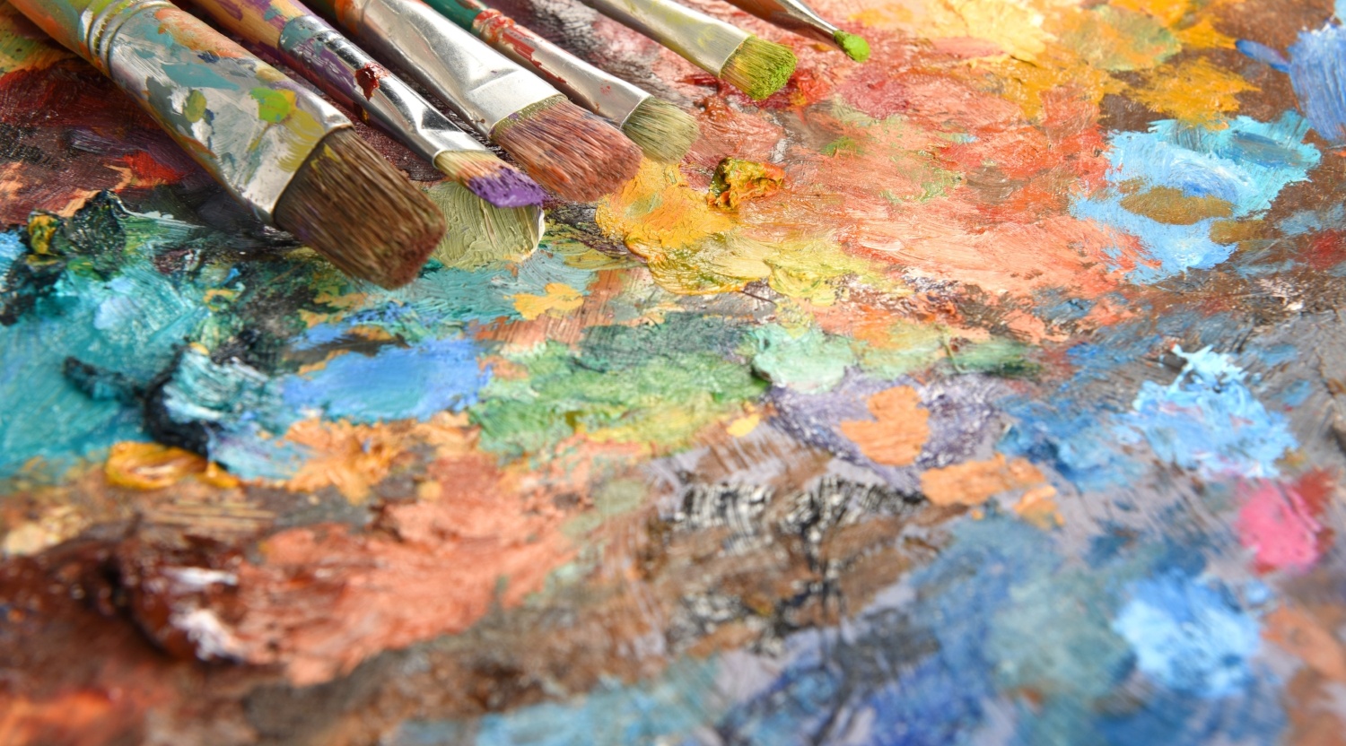
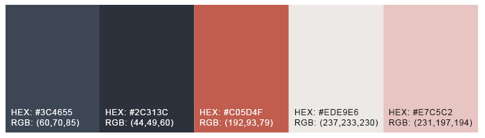
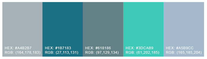
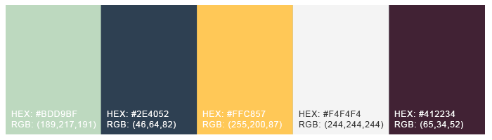
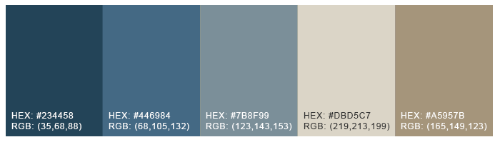
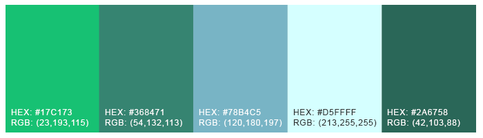
Color Palette Examples
The following color palettes are provided so you can use for your next design project. Take them, modify them, make them your own. Whatever you want to do - go for it.
Want to Check Out More? Check Out These Sites
Need a little bit of extra help? The following list includes some awesome color picker sites that are completely free and can be very useful when working on your next design project.
I hope you found this post to be helpful when working on your next project. Remember to experiment with colors, make them your own, and ALWAYS have your audience in mind when choosing which colors are right for your project.
- http://www.color-hex.com/color-palettes/
- http://www.paletton.com/
- https://www.canva.com/color-palette/
- https://coolors.co/
- http://colormind.io/
- https://mycolor.space/


.png)
Comments