
Let’s face it: Websites haven’t really been beautiful for all that long.
For most of the history of the Web, most sites were butt ugly.
There is an unmistakable 1994 aesthetic you can identify in a flash when you look at, for example, the Oocities Archive Project of old Geocities homepages. Clashing colors and flashing text were only the beginning.
And yet, some of the worst ugly websites are also the most successful.
To this day, many ugly websites are still around – and doing business.
Let’s visit some of them and figure out their secrets
1. Berkshire Hathaway
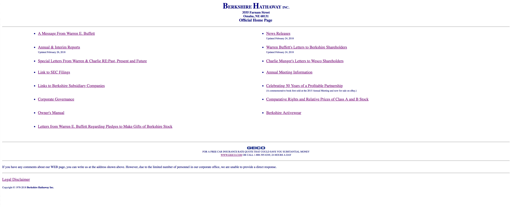
Berkshire Hathaway stubbornly refuses to join the post-dialup era: Its design hasn’t changed since at least 2010. The site is all text except for the logo of subsidiary GEICO and doesn’t even have a color scheme – just two wads of “Already Been Clicked” links.
Berkshire Hathaway has a logo, but it’s nowhere to be seen.
And yet, despite a few bumps along the way in recent years, Berkshire Hathaway is still known as one of the most profitable companies in the U.S. (and its 9th-biggest employer.) Having an U=ugly website hasn't made a bit of an impact on it.
What We Can Learn
If you’re really the world authority on something – and it has little or nothing to do with the Web – a beautiful website might not matter. That said, almost everyone has something to gain by giving their site some TLC (and almost no one is Warren Buffett.)
2. Craigslist
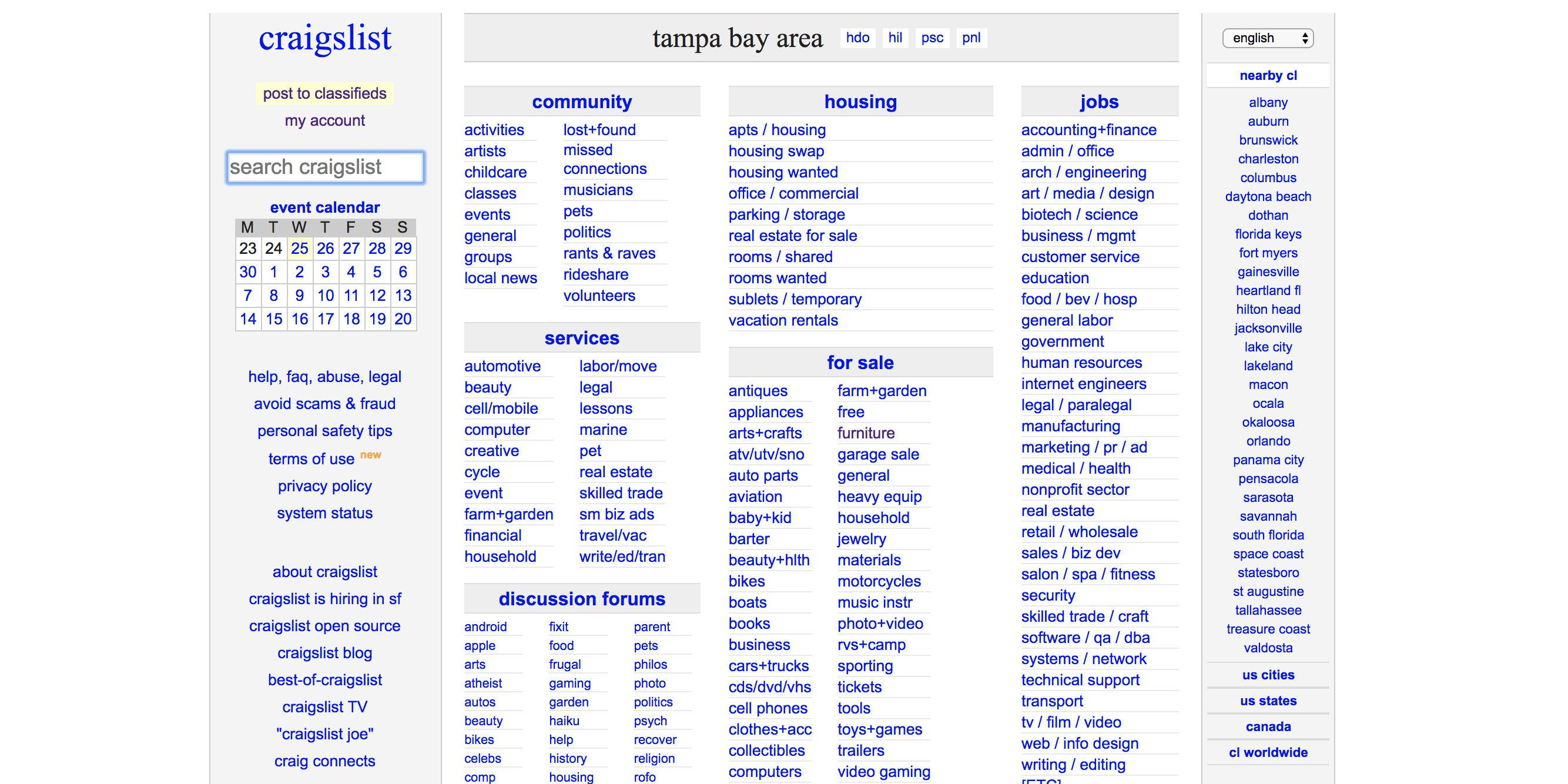
Craiglist opened in 1995, and from that day, its design has barely changed.
Craigslist is far from the bargain basement project it appears to be: According to Quantcast, it’s one of the top 20 most visited sites on the Web, yielding over 50 million unique monthly users.
It even has some personalization, seamlessly passing on users’ sessions to the Craigslist site in their area. But every local has the same text-heavy appearance – calling to mind the newspaper classified ads Craigslist itself has long buried in its wake.
But with each page just a few kilobytes, we can be sure its bandwidth bill won’t break the bank.
What We Can Learn
“Function over form” can be a blessing if you’re providing a service everybody understands. Craigslist is much more scalable than it would be if every page had even basic graphical elements, ensuring it can provide reliable service to millions of monthly guests.
3. OfficialPayments.com
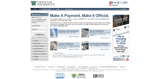
This turkey looks like it waddled right out of 1990, complete with an ugly, boxy layout, generic clipart, tiny, awful buttons and a color scheme that makes your head hurt. But despite all this, it is still one of the most important websites in America: Because you can use it to pay the IRS.
Groan!
Official Payments is tied with other websites that look like they were designed with a WYSIWYG editor back on America Online, like USA.gov (which is just as ugly) and Annual Credit Report, the site where you can get copies of your credit reports for free each year.
And yet, according to Alexa, Official Payments is within the top 3,500 sites in the U.S., with a global rank around 22,700, and a potent list of both organic search terms and high-value referrers. It’s not just limited to April, either: There’s always someone checking in.
What We Can Learn
If you’re the only one who does what you do, your website doesn’t have to be a work of art. Still, it’s important to make sure users can access the functions they want quickly and easily. Notice that as drab as it might be, the site is very clear about where to go to pay up!
4. Nielsen Norman Group
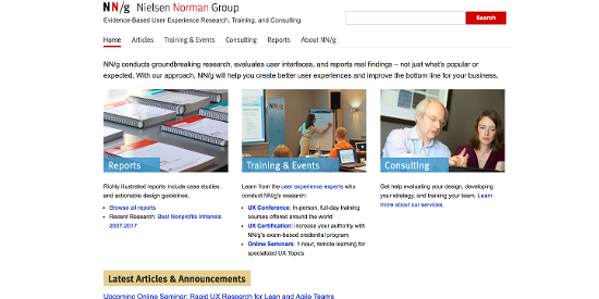
Nielsen Norman Group is one of the leading enterprises in the world when it comes to cutting-edge research on a variety of user experience topics ... which makes its site all the stranger. Because, when you visit, you might conclude this is a really ugly website.
At least at first.
Since beginning of the Web, Nielsen Norman Group has been delivering some of the most insightful content for anyone who wants to structure information online. To get an idea just how formative their work is, they were probably the first to discover people don’t read online.
And that was back in 1997!
It’s a little jarring, then, that the site is so plain. Even the typography uses 10.5 Arial font with little breathing room. So, what happened? Did Nielsen Norman Group fall prey to its own long history and get left behind on design, a case of “do as we say and not as we do”?
Not quite.
Although the typography does leave something to be desired, on closer examination:
- The design shows excellent insight into the user personas that visit the website.
- It’s almost impossible to get lost, with key topics linked intuitively throughout.
- Each article is a deep, well-researched piece of illustrated thought leadership.
- Its traffic statistics show healthy traffic from the U.S., UK, China, and India.
What We Can Learn
When you’re catering to the needs of a highly specific audience you know well, you’re allowed to break the rules. The simplicity of NNGroup.com makes its thought leadership more accessible to its international viewers and its long-term readers by eschewing “fads” in favor of concrete data.
5. Reddit
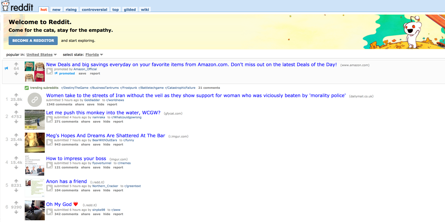
Reddit is known for its “bad” design. Ugly website and all, Reddit still has its die-hard fans: Quantcast places Reddit as the #10 site online with 79 million “monthly people.”
What We Can Learn
Sometimes, it’s the community that makes a site and not the layout, interface, or code.
What “ugly websites” inspire you in 2018? Let us know in the comments below!


.png)
Comments