Color psychology is one of those things that is difficult to grasp at first, but it plays a role in the behavior of consumers visiting a website. There is a lot of contradictory advice out there. Women and men both like green, don’t use green, green is for nature — it is difficult to know what is fact and what is fiction. The following are some good reasons to consider using green in your website design.
1. Green Is Appealing
Green is the second most popular color, right behind blue. This means your design is more likely to appeal to the most people possible — both men and women — simply by utilizing this popular color.
Keep in mind, however, that those who are color blind may have trouble discerning between different shades of blue and green, depending on the type of colorblindness. Keep this in mind when designing, and you should be able to work around it. For example, it is best not to place blue on top of green for this reason unless they are very different shades that provide enough contrast to be readable in gray tones.

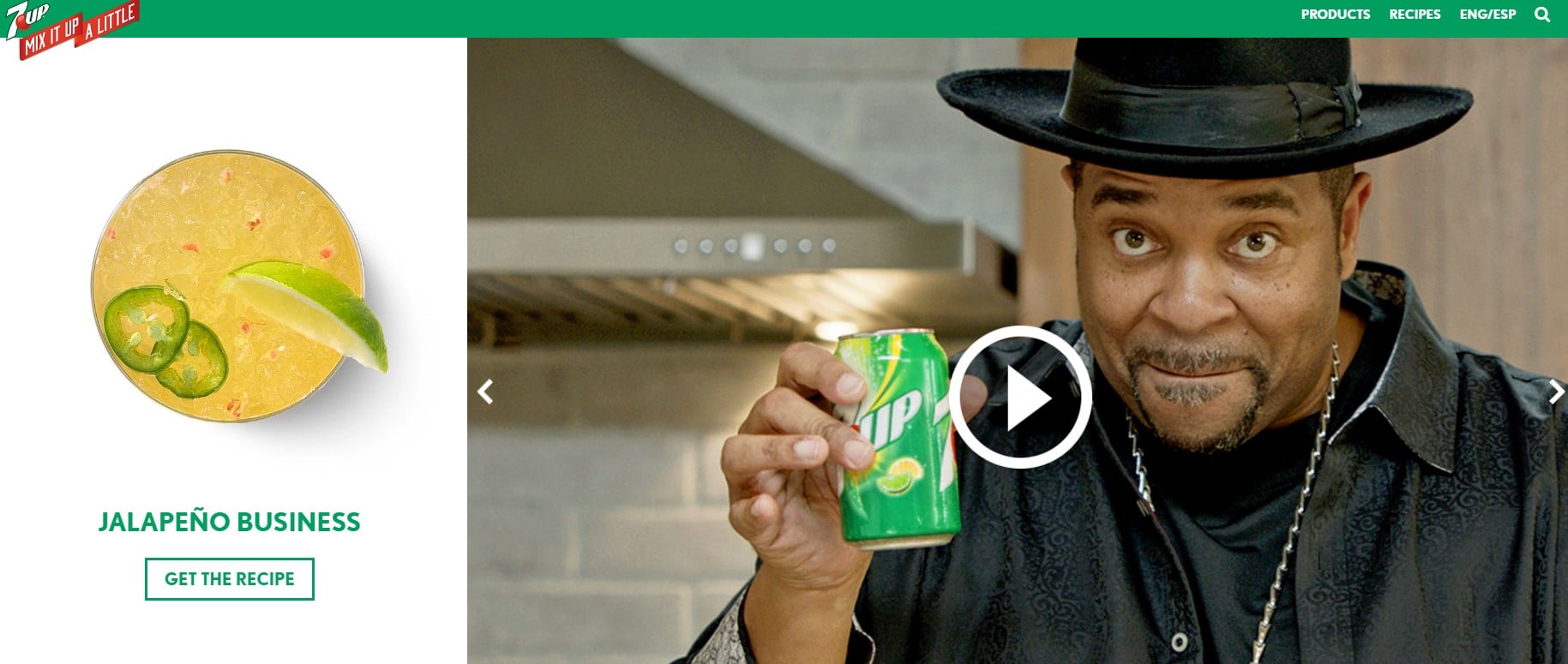
7Up’s website utilizes dark shades of green with pops of white and green lettering on a white background. This type of design would work well even for those with a visual impairment. It also is a refreshing color, and, while darker than the color of an actual lime, it does indicate the use of the fruit.
2. Green Evokes Positivity
Although a lot depends on the shade, green is a cool, soothing color in most cases. It reminds the user of being outside in nature, perhaps Christmastime at home or a sunny day with fresh green grass under bare feet. Because of that, green evokes a warm emotion in people.
It can represent growth and vitality as well. Green is similar to blue in its calming properties, but in design, green can also balance the overall look of a page. If you want to show youth and energy, use a brighter shade of green with more yellow. If you want to evoke nature, use olive greens. Dark greens can indicate elegance and stability.
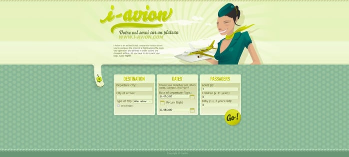
Take a look at the i-Avion site, which uses brighter greens to give a youthful feel to the website. The combination of a mint green and a medium shade of green appeals to those looking to have fun and travel.
3. Green Pops as an Accent Color
Green works well as an accent color as long as you stick with neutral or complementary colors on the page. For example, you can have a stark white page with green accents to add just that little pop of color. This type of design works particularly well for product pages, because it allows the designer to draw attention to the products but still use the psychology of green to show nature.
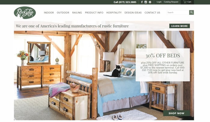
A good example of a site that uses a pop of green as an accent color is Rocky Top Furniture. Note how they use green in their logo. Green is used in some of the navigation and halfway down the page as a full-width background to draw attention to the newsletter signup form. By using just pops of green, it draws the eye to specific areas on the page.
4. There Are Lots of Shades to Choose From
Choosing the right shade of green for your audience can be a challenge. There are any number of color combinations and hues available. As mentioned before, a brighter green with more yellow can have a youthful feel, while a deeper green can create a feeling of stability.
Green is said to take up more space in the human eye's spectrum than other colors. Think about other brands that make the same statement you want to make and study the shades of green they use in their marketing materials.

You’ve likely seen the new pistachio commercials with an elephant named Ernie. Well, Ernie has his own website, and it is the perfect example of choosing a color that matches your branding. The Ernie commercials are fun and fresh. The Ernie website is dark with pops of a bright green and a lot of yellow elements.
5. Green Works With Other Colors
About 95% of designers will use only one or two colors in their design, so using three could help your site stand out from the crowd a bit and draw reader interest. Just don't overdo it.
When using green alongside other colors, make sure they complement one another so the colors do not clash. This can be very jarring to the site visitor. It is a good idea to use a color palette tool to make sure the colors look good together. You can auto-generate a palette around the shade of green you wish to use, or you can plug in the colors you want to use to ensure they look okay together.
6. Green Makes Your Brand Recognizable
Studies show that people associate a color with a brand. In fact, 85% of consumers indicate that color is one of the primary factors that influence their decision to choose a product, and it has been shown that using the same color across branding increases brand recognition by as much as 80%.
If you feel your brand would benefit from using the color green, make sure you use that color across branding. Use it in your logo, on your website on social media, on print advertising and so on. The more the consumer relates your brand to a particular color or combination of colors, the more recognizable your brand will be.
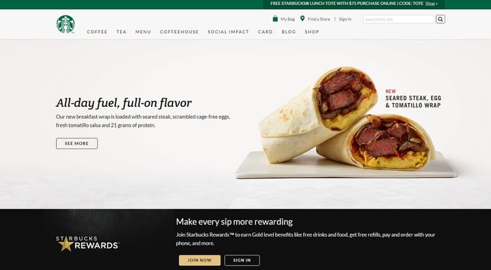
Starbucks is a good example of this type of branding. Their green logo of a nautical woman uses green as the background with the negative space creating the image. You see this logo on their website, and it reminds the user of the logo on their cups and the signage used in their stores. This makes the brand recognizable and relatable.
If you’ve shied away from green in your designs because you just weren’t sure how receptive people would be to it, keep in mind that the majority love this color. Green is a good way to get across a down-to-earth feel or show consumers your company is fresh and natural.


.png)
Comments