Long attention spans are in short supply these days, and why wouldn't they be? Thanks to mobile devices and modern technology, most of the power is in the consumer's hands. They choose when, where and for how long they engage with almost any type of media. So, no matter what, your design must somehow appeal to their senses if you want to capture their attention.That's tough to do for many reasons. 53% of mobile visitors will abandon a site that takes longer than three seconds to load. But that only relates to performance, what about content? According to a 2008 study, on average people read about 28% of the text on a page.
The takeaway here is that if you want your visitors to see the bulk of your content, it needs to be more visually appealing. In particular, you need to space out paragraphs and break up long blocks of text. People tend to scan a page in an F-shaped pattern: two horizontal stripes, one on top of the other, and a vertical stripe running down the left side. You can use images to grab their attention as they scan, hopefully enticing them to stop and delve deeper into the text.
How do you do it though? Surely, there must be a science to it? You can't just throw random images and photos throughout your page, or can you?
1. Do Consider Your Audience
The first thing you should before making any changes is identify your audience and their preferences. The demographic and topic matters. If you're putting together a comprehensive online research paper, for instance, then you'll want to minimize the images you add to the page. If your audience is younger and mobile-based, you'll want to break it up as much as possible.
Furthermore, consider the material itself. If your content lends itself well to imagery, then use it. If you can explain your message better with larger blocks of text, then you know what to do. Yes, walls and walls of text are overwhelming and off-putting, unless they're in a printed book. But sometimes, you need uninterrupted text, so get to know your audience before making any changes.

New Atlas - previously Gizmag - is one of our favorite tech and news blogs for this reason. They speak to their audience, not just with the content and tone but also the visual elements and overall style. The top of each post has a featured image with a link to the gallery below. Then you have an introductory paragraph, followed by some relevant thumbnails. As you make your way further down the page, you regularly come across a neat, appealing visual element, image or widget.
2. Do Choose an Appealing Font
If you choose appropriately, the font and typography in and of itself can be a visual treat. In fact, sometimes it's better to let the text take the spotlight, especially when it's aesthetically pleasing.
This also plays into the overall design and theme of your site. Do the colors and distractions make the text harder to focus on? Do you need to space out the text to make room for dividers and smaller visual elements? Would it be beneficial to the content itself to separate text by chapters, pages, or sections?

Type Terms is our go-to example here. It's a typography cheat sheet, but that doesn't mean you can't steal some ideas from it! Pay attention to how the fonts and content offer all the visuals you need. It's like eating a hearty meal with your eyes.
3. Do Keep It Simple (and Chunky)
You already know that people don't take the time to read entire websites. In fact, they don't even read half of it. If you fill your page or site with large blocks of text, people are going to ignore most of it. Yes, if a visitor is interested in the topic or content they'll read, but it's the first impression that makes the difference with new visitors.
You can make the page and content easier to scan by breaking it into segments or chunks. Use images and media to separate different points and or paragraphs, and keep things relatively simple. This is especially true for retail and e-commerce sites. When showing off a product, customers only want to know the key points and features. They don't need the backstory of what went into making the product or how you tailored your creative processes.

The Verge and sister-site Polygon are masters of this technique. Pay particular attention to how they use visual themes and elements to break up their text-heavy content. And yet, it all adheres to a minimal and modern web design theme. It's impressive, to say the least.
4. Don’t Ignore the “Other” Visual Elements
It's easy to toss a photo between paragraphs, right align a product image, or break up text with traditional media. But don't forget that you don't always have to use images or photos. There are a variety of visual elements, styling tools and web features you can use to break up the monotony. Blogging tools like WordPress and Drupal, for instance, often include a horizontal line to indicate a page or section break. These elements can add to the visual appeal of a webpage.
If you're so inclined, you can style these elements yourself and include them on the page. Just know that you don't always have to use a traditional photo or video to add a visual element.

Forklift and Palate use a variety of visual icons, cues and unique formatting to break up their pages. It serves as an excellent reminder that images and photos aren't the only elements at your disposal.
5. Don’t Hate, Animate
Sometimes, the best way to accent or complement your design is to sprinkle in a little animation. You don't necessarily want something flashy that will detract from the main content, but that doesn't mean you can't be creative.
Parallax scrolling, for example, is a great technique that can give your page, content and visual elements some depth.

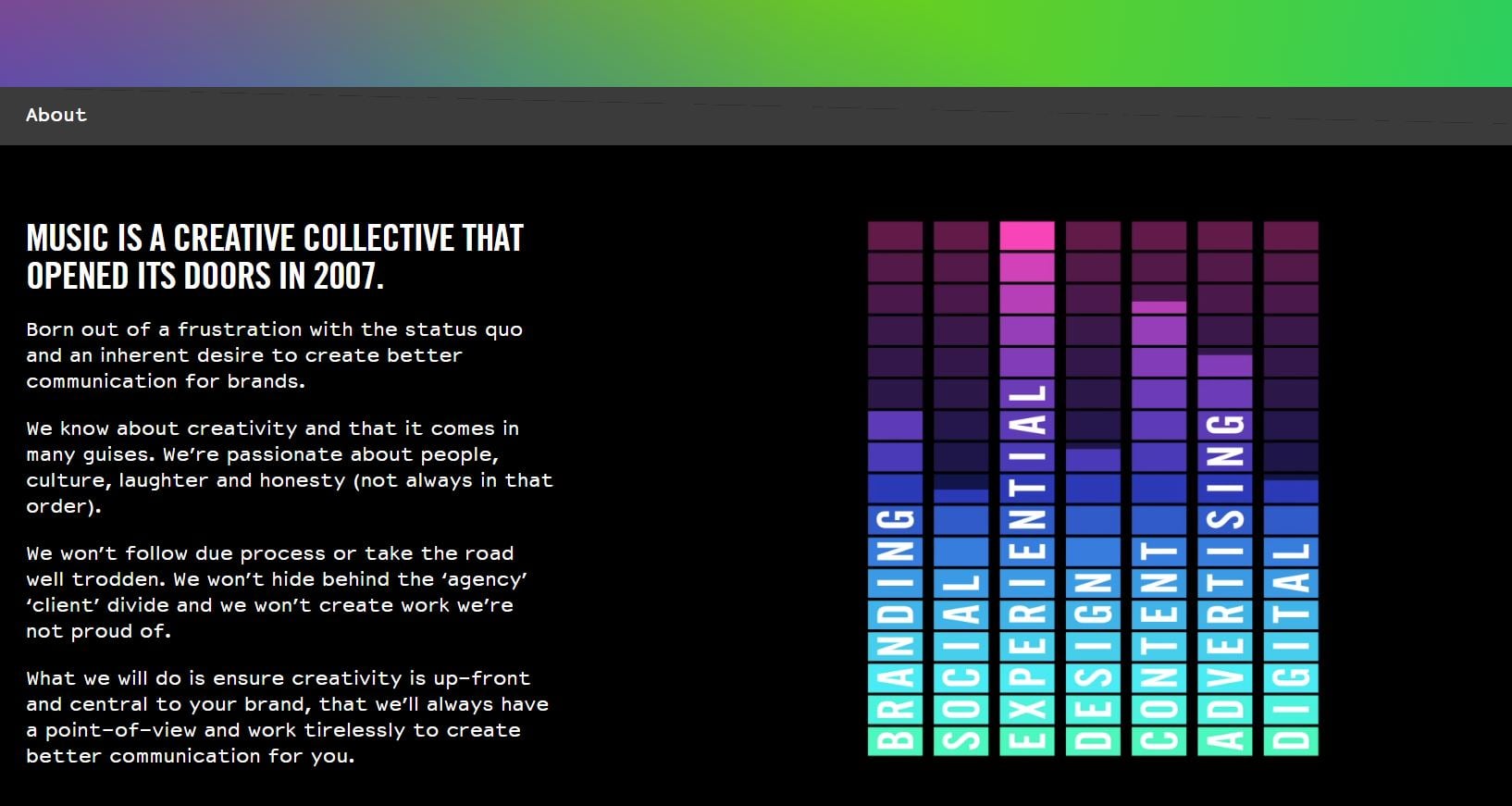
Pay attention to how Music utilizes animation and parallax scrolling to break up the content on their site. It's tasteful and appealing.
Don’t Get Swept Away by the Currents
These do's and don'ts are all very important, yes, but it's all just as crucial that you don't let yourself get carried away. Breaking up your page, especially text content, is a must, but you don't want to litter your design with too many distractions. Stick to subtle, yet appealing elements and photos, and be sure to always emphasize the main body of your content. Don't subtract from the experience. Complement it, and add to it.


.png)
Comments