
What? Another Image Gallery Tutorial?
Hubspot has a built in image gallery.
For those who have used it before, you will understand why this tutorial is 100% necessary. Shade thrown.
Step 1: Create a New Custom Module in the HubSpot Design Manager
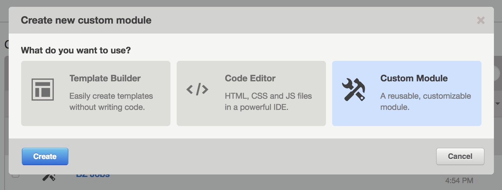
You will need this to make the gallery modular. I named ours Super Cool Gallery, which is totally appropriate.
Save that module for later. We will come back to it.
Step 2: Create a New HubDB Table and Give it a Name
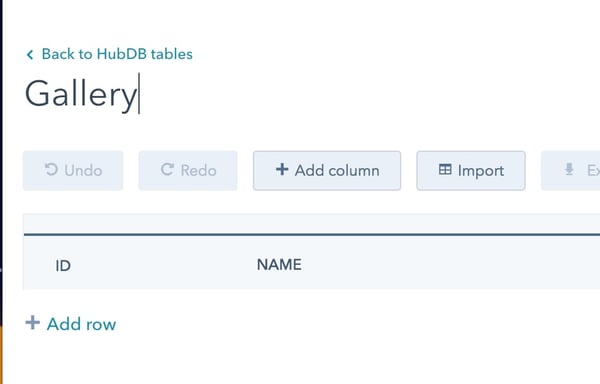
At this point, you can delete the default NAME column and add two more columns.
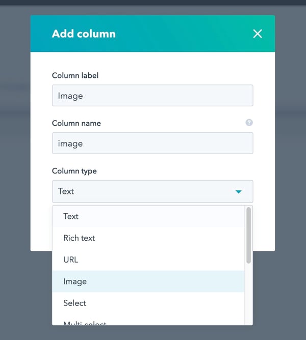
The first should be an image column; just call it Image:
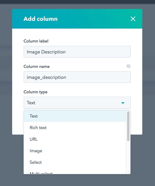
Second: an image descriptor column. I called it Image Description and it should be a text field.
Keep record of the column name from each of these fields, as they will be needed shortly.
Go ahead and add all of your images and descriptions to the HubDB and publish it when done. We're halfway there!
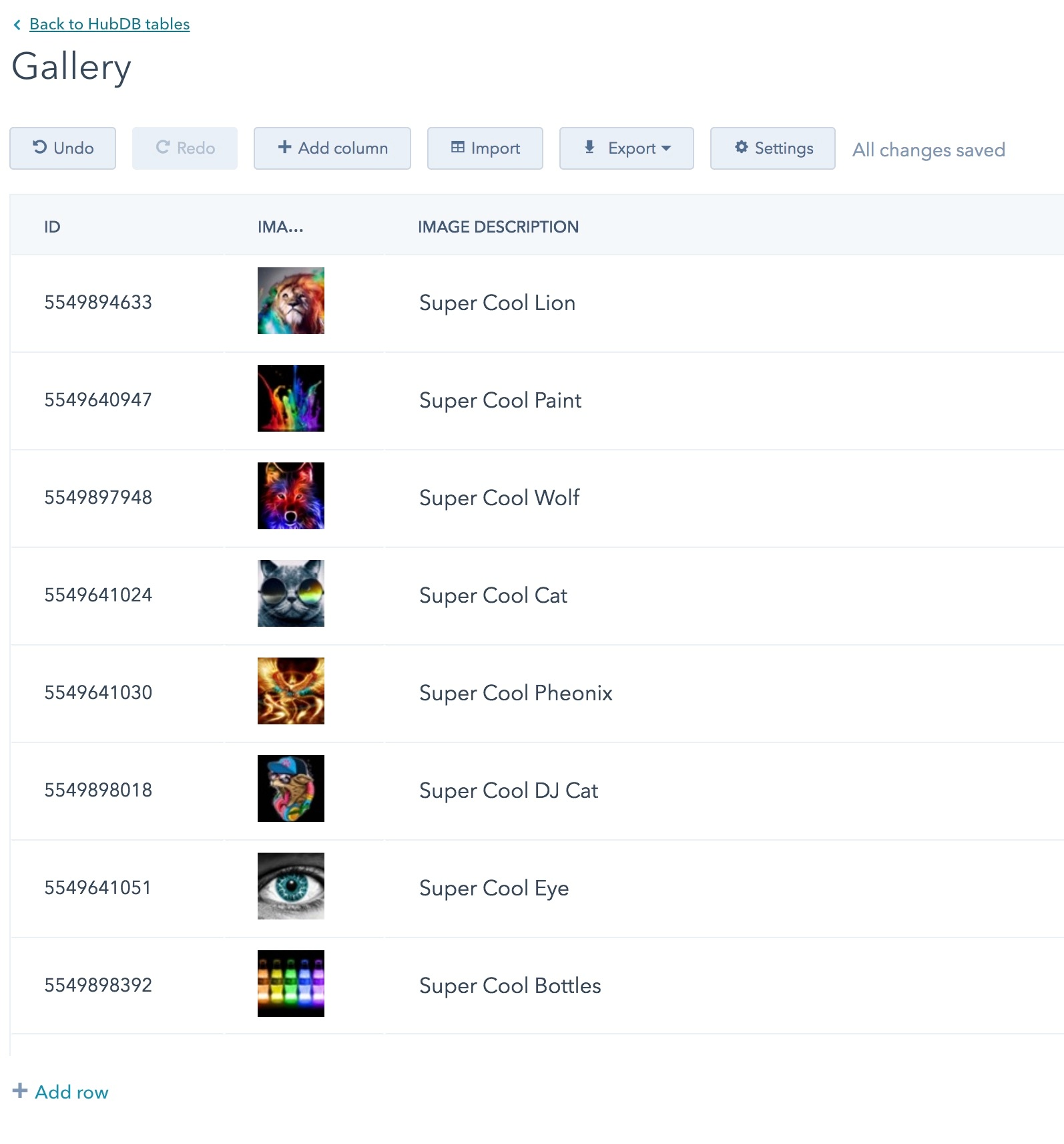
One thing though: make sure and make note of the TABLE ID that is found the URL and in the list of all of the tables you have in HubDB. You will need this to access the information found in the database you have just created.
The URL looks like this:
https://app.hubspot.com/hubdb/<PORTAL-ID>/table/<TABLE-ID>Step 3: Lets Code Some Stuff!
Remember that custom module that we created? Now that you have your HubDB gallery table created and published, you can go back to that.
Once there, we are going to add three sections to it: CSS, HTML and HubL, and Javascript.

Section 1: CSS
CSS is intended to make this look pretty and ensure that our images are centered and that's it.
<!-- use require_css ensures the css goes to the head of the html -->
<style>
    /* Make Gallery Three Wide and add padding arround it. */
    .gallery {
        padding: 2em;
        columns: 3;
        width: 100%;
    }
    .gallery__image {
        display: block;
        max-width: 100%;
        margin-bottom: 1em;
    }
    /* Make sure the gallery overlay takes up the entire screen and sites on top of evenrything. */
    .gallery__overlay {
        position: fixed;
        top: 0;
        width: 100%;
        height: 100%;
        background: rgba(0,0,0,.8);
        z-index: 100000;
    }
    /* Close Button */
    .gallery__overlay .close {
        position: absolute;
        top: 2rem;
        right: 2rem;
        background: transparent;
        color: #fff;
        font-size: 2rem;
    }
    /* Center the image and text in one fell swoop. We use translate to ensure the image is always centered. */
    .gallery__image--wrapper {
        position: absolute;
        top: 50%;
        left: 50%;

        transform: translate(-50%, -50%);
        width: 100%;
        max-width: 1000px;

        color: #fff;
    }
</style>
Section 2: HTML and HubL Code
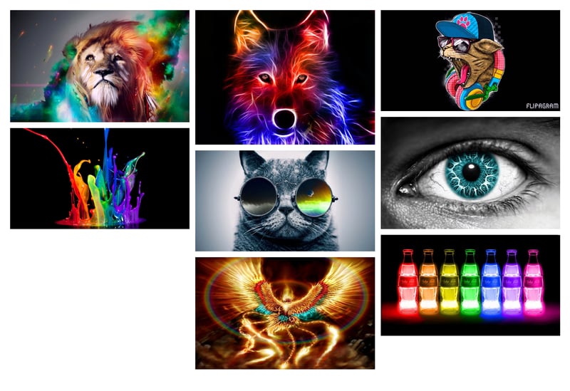
This is the meat and potatoes of this article. We use HubL to extract the content from the HubDB table that you created a few moments ago. The HTML will provide a markup for the initial gallery listing.
Using HubL, we loop over each row in you database and output them into three columns using HTML markup and CSS.
<!-- Gallery Markup -->
<div class="gallery">
    <!-- Pull the gallery hubdb from hubspot and set it as a variable called  gallery. -->
    {% set gallery = hubdb_table_rows('677222') %}
    <!-- loop over the info and create a linked image with the image url and -->
    {% for scimg in gallery %}
        <a class="gallery__image" href="{{ scimg.image.url }}" title="{{ scimg.image_description }}">
            <img src="{{ scimg.image.url }}" width="550" alt="{{ scimg.image_description }}">
        </a>
    {% endfor %}
</div>
Each image that we output is small, but we wrap each image in an anchor link that has a URL leading to the larger version of the image.
At this point, you should have something that looks similar to the gallery we are trying to create. Now, lets make it function, as well, using Javascript.
Section 3: Javascript to Make it All Work
The Javascript below accomplishes three things.
- When you click an image in the gallery, it grabs the URL and title text from the link that wraps the gallery image.
- Then, it creates and appends a modal overlay with the full size image and a nice description along with it, displaying it over all of the content.
- It also ads a function to close the overlay, hide it and then remove the overlay from the HTML, getting ready for the next image modal.
<!-- use require_js is to ensure the javascript gets added to the footer -->
<script>
    $(function(){
        // If you click the gallery image
        $('.gallery__image').on('click', function(e){
            // dont let the link go anywhere
            e.preventDefault();
            // grab the url of the link clicked as well as the title
            var url = $(this).attr('href'),
                title = $(this).attr('title');
            // create and append a image popup with the url and title that we grabed.
            $('body').append('<div class="gallery__overlay"><button class="close">close</button><siv class="gallery__image--wrapper"><img src="' + url + '" alt=""><p>' + title + '</p></div></div>');
        });
        // When you click the close button
        $('body').on('click', 'button.close', function(e){
            // dont let the close button link anywhere
            e.preventDefault();
            // Hide the overlay and then remove it from the DOM.
            $('.gallery__overlay').hide('400', function(){
               $(this).remove();
            });
        });
    });
</script>
Example
Thats It!
Add your new module to a flex column or a template and you are good to go.
This is a super simple and extensible image gallery that, at 4kB, shouldn't bog down your website. The gallery will provide a great user experience because it is mobile friendly and uses HubSpot's ability to create responsive images, as well.
If you enjoyed this tutorial, that is awesome. Want to learn something else and can't find a tutorial about it? Let me know and we will do our best to work on it!
Chad Pierce
Chad is the lead designer and developer for Bluleadz Inbound Marketing Agency, father of 3 and husband of one.