
No matter what type of website you run, you likely have some form of a call to action (CTA) on one or more pages.
However, not all CTAs garner the results you'd like. What is that magic elixir that makes one CTA outperform others?
Around 47 percent of websites have a CTA button that's easy to spot in three seconds or less. Place your CTAs where they are easy to see and focus on the action you'd like the user to take.
Tips to Make Your CTAs More Click Worthy
Calls to action are only created for one job: to get clicked. There's a pretty wide variety of CTAs and their individual roles vary, but the desired action is always the same.
via GIPHY
Here are seven improvements you can make to your CTAs today to increase your clickthrough rate.
1. Indicate the Button Is Actionable.
Readers often skim over webpage content. Make sure your CTA buttons are actionable, so users understand they are supposed to click on the button and complete the action indicated.
An actionable-looking button might sound obvious, but you'd be surprised how often buttons blend in or don't look as though they link to anything else.
There are any number of ways of indicating your button is actionable. Add beveled edges or shadows to it so it stands out. Use text that shows the user will get a particular result if it's clicked on. Make it a different shape than other elements on the page.
Whistle uses a button in the shape of an oval, which contrasts with the square and rectangular elements on the page. Even though there is another button, it fills in the CTA with a solid background and gives it a bright lime green color to grab the user's attention.
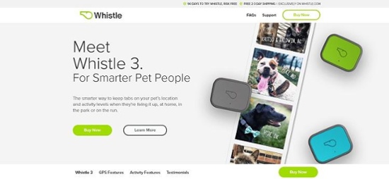
It's clear what will happen when you click on the button — you'll be taken to a page to purchase the GPS pet locator.
2. Choose a Bold Color.
Speaking of standing out, your CTA button should be in a bold, bright color that contrasts with the rest of the page.
There are different opinions on what colors convert best, and the truth is that it varies widely based on the audience and your particular page design.
Your best bet is finding a shade on the color wheel that is opposite from your palette and stands out. For example, if your background is dark, go for a light button. Then, conduct some split testing and see which color performs best with your specific audience.
3. Use High Action Words.
Although you'll see the words "submit" and "click here," choosing something not used as frequently but that's still an action verb may be more effective in capturing user attention.
via GIPHY
An authoritative statement performs better than a question. Users are psychologically influenced to click on your button.
4. Create Extra White Space.
As a designer, it's tempting to add additional elements to show the client how much value they're getting for their money.
However, in design, white space is equally important.
Adding a bit of additional negative space around your call to action button draws attention to it and shows visitors the element is important enough to warrant a spot of its own.
5. Add an Arrow.
In a couple of different case studies, designers noted that adding an arrow to a CTA button increased clicks. Helzberg Diamonds saw a 26 percent increase in CTR by merely adding a pointer to the button.
Something as simple as an arrow draws user attention and improves your button's performance.
6. Personalize the Language.
via GIPHY
A personalized CTA button performs better than a generic one, but how can you create this experience when you don't know each person visiting your page?
Fortunately, you can quickly develop buyer personas and then create landing pages geared to each segment of your audience.
The CTA button on that page reaches its audience with words meant to engage. Put yourself in the shoes of the user and figure out if they'd prefer first-, second- or third-person language.
Personalize the button to match the subject matter on the page and the main reason why the user landed there.
7. Keep Design Simple.
Less is sometimes more when it comes to engagement. If you design a CTA that shakes every two seconds, flashes neon colors, and has a ton of other frills on it, you can risk deterring a click.
Research has found that simpler designs see better results than more elaborate ones.
Utilizing bold colors against white space is often enough to draw a user's eye. Simplicity doesn't mean boring; it just means more focused and intentional.
By adding a lot of other CSS effects, users can become annoyed, which isn't any way to generate business.
8. Limit User Options.
When presenting a call to action, you're presenting choices. Typically, those choice options are "Yes, I'll do the action" or "No, I'll pass."
That trend's been established for a reason. Even though you're looking to delight the customer and meet them at their level, you can actually confuse them by giving too many options.
CTAs aren't meant for quick engagement. If you give a user multiple answers to your call, they may not be up for taking the time to consider every opportunity.
By limiting the options to one or two buttons, with well written copy, they'll get the gist of what you're offering and be able to pick quickly.
9. Build In Urgency.
Even though we look to high action words to compel visitors into clicking on a CTA, sometimes it's not enough to really convert them.
If you create a sense of urgency, though, you'll convince them that they need to act quickly or they'll miss out on something great.
via GIPHY
Including phrases like "limited time only" or "almost sold out" will keep them from being non-committal or disengaged.
10. Study What Your Competitors Are Doing.
One of the best things you can do to learn about good CTA is by studying what your competitors do, as well as other successful brands outside your industry.
Take notes on everything from placement of the button on the webpage to color to wording. Are there other elements and copy that point to the CTA, and if so, how do they drive their buyers through the sales funnel?
Once you have a list of the best buttons you've discovered, try some of the techniques on your website, testing each change to see how effective it is at increasing clicks.
With a little time and effort, your CTA buttons will create higher conversion rates than ever before.


.png)
Comments