
Images are almost always the #1 reason for a slow website. Even if all of your images are optimized and sized correctly, they can still cause performance issues, especially on longer pages that have lots of images—a pillar page or even a blog page, for example. This is where the "Lazy Loading" technique comes in to save the day.

What is Lazy Loading?
The default browser behavior will automatically load all the images on a page when the page initially loads. If the page has 100 images, it's going to try and load all 100 images and not stop until they're all loaded (slow website alert!). Lazy Loading is a technique that forces the browser to only load the images that are currently in-view and will load the rest as you scroll to them.

Lazy Loading Sounds Awesome! So, What's the Catch?
The primary problem with lazy loading is the fact that there are no images until you scroll down the page. This causes page reflow as you scroll, which will hinder a good user experience—you're essentially taking one step forward and two steps back.

☝️page reflow caused by images loading. Say no to the reflow, kids.
The Page Reflow Solution
The trick to getting around this issue is using a small (in terms of file size) placeholder image that is the same height/width as the full size image. HubSpot has a nice little feature that allows for automatic image resizing. This means we can generate the placeholder images automatically and use CSS to force the image to its full size to minimize page reflow. 🔥🔥🔥
☝️an example of lazy loading images on a slow internet connection
Pretty sweet, right?! Here's how to make it happen...
How to Lazy Load Images on a HubSpot Blog
Step 1: Add the Lazy Loading JavaScript Plugin to Your Template
Fire up your design manager, edit the "Listing Template," and add this script to the template:
<script src="https://cdnjs.cloudflare.com/ajax/libs/vanilla-lazyload/8.6.0/lazyload.min.js"></script>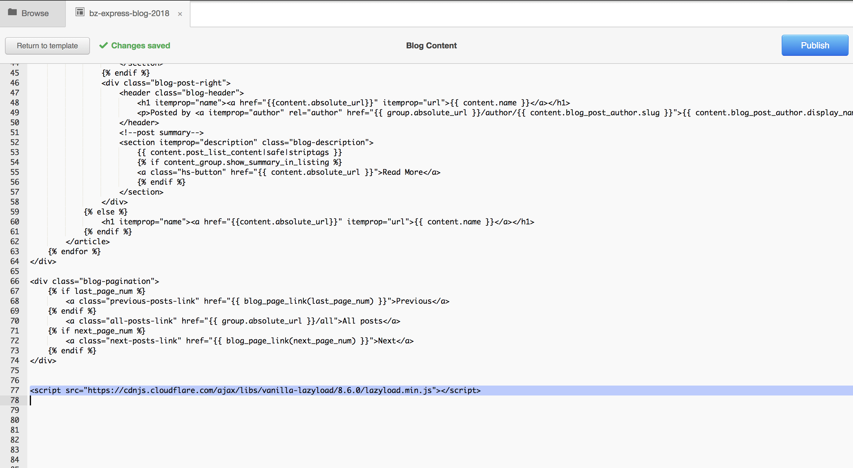
There are a few different plugins out there, but I tend to prefer this one.
Step 2: Update Your Featured Image Markup
Find your blog post's featured image—it will look something like this:
<img src="{{ content.post_list_summary_featured_image }}" alt="{{ content.featured_image_alt_text }}" class="hs-featured-image">Now update it to this:
<img src="{{ content.post_list_summary_featured_image }}" alt="{{ content.featured_image_alt_text }}" class="hs-featured-image" width="12" style="width: 100%;" data-src="{{ content.post_list_summary_featured_image|replace('/hubfs/' + hub_id, '/hub/' + hub_id + '/hubfs') }}?width=600" data-srcset="{{ content.post_list_summary_featured_image|replace('/hubfs/' + hub_id, '/hub/' + hub_id + '/hubfs') }}?width=600 600w">Step 3: There is No Step 3... That's it!
Automatic Image Resizing not working?
If the code above isn't resizing the image, it's most likely due to the fact that your default file manager hosting domain was changed from HubSpot's CDN to your own domain. If that's the case, update the replace filter to the following to fix it:
|replace('/hubfs/', '/hs-fs/hubfs/')
How It Works—An Explainer
Let's review each new attribute added and explain what each one is doing.
width="12"this is what tells HubSpot's automatic image resizer how large (or small, in this case), in pixels, the image should be sized to. This is what generates the placeholder in thesrcandsrcset.style="width: 100%;"this is the CSS to override the default image width (12px), so that it fills it's container. This is how we fix the reflow issue.data-src="..." data-srcset="..."this is where the full size images live that will be lazy loaded in with the JavaScript plugin, overriding the placeholder.
The Results
We recently added lazy loaded images to our blog and saw an improvement of close to 50% in initial page load times. Here are the before-and-after stats from webpagetest.org:
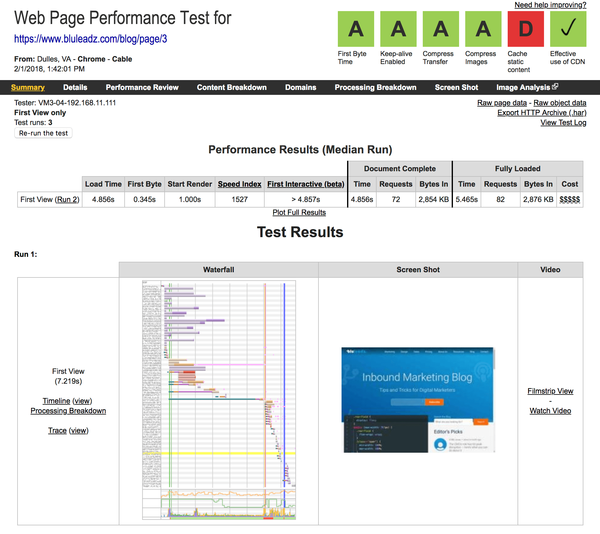
☝️ Before Lazy Loading
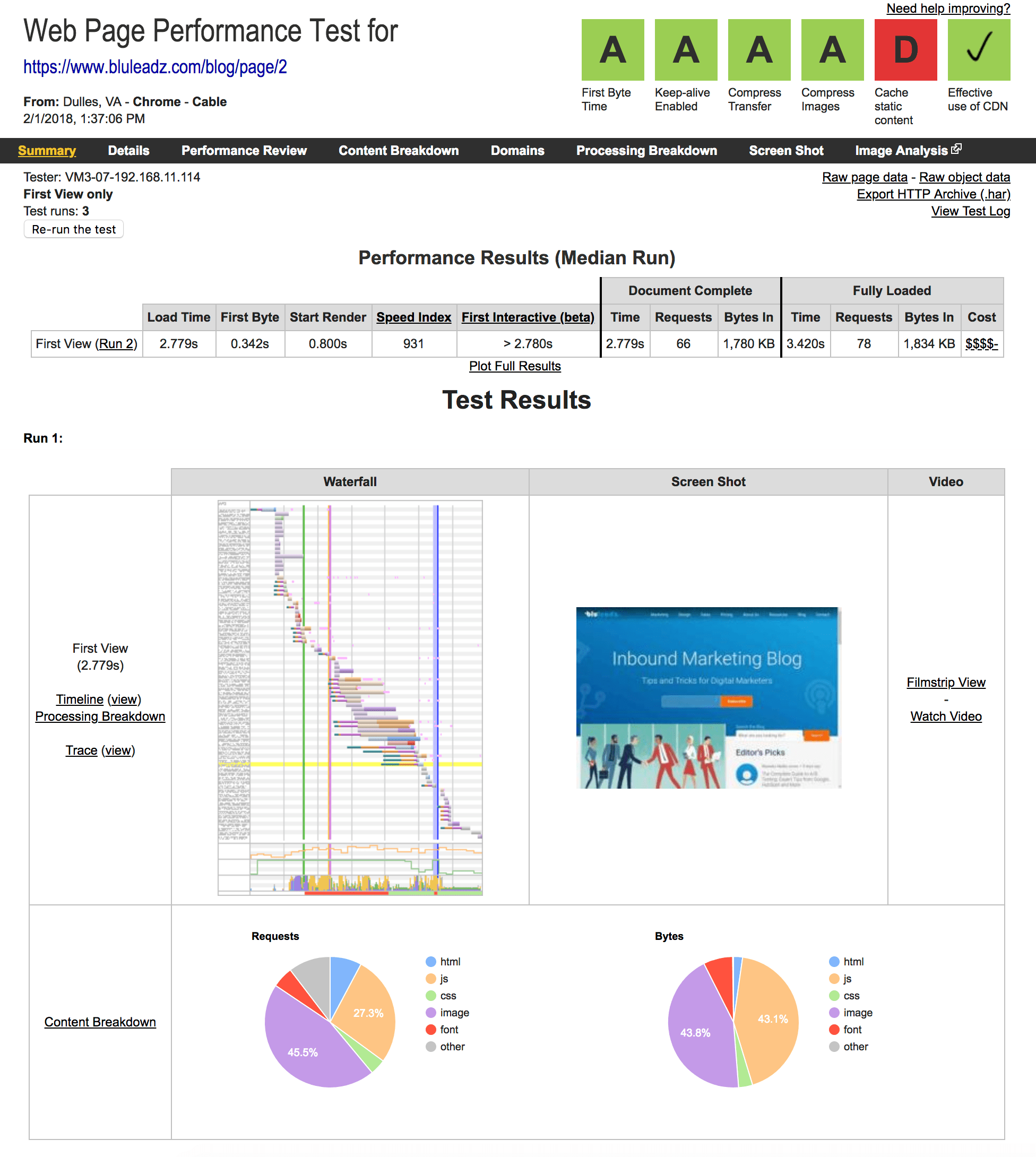
☝️ After Lazy Loading
Holy Macaroni, Batman—That's Fast!
As you can see, lazy loading images will give your site quite the performance improvement. Google's recent anouncement about using page speed as a mobile search ranking factor means there has never been a better time to improve your site speed. Let us know if you try this technique and what kind of difference it made on your site in the comments below.

Stefen Phelps
Stefen Phelps is a husband, father of three, full-time web developer & UX designer, as well as a hobbyist musician/videographer residing in Brooksville, Florida.