For all the pros building your site on HubSpot offers, there's a big con for developers. That is HubSpot's reliance on a modified version of an almost 5-year-old grid framework. A lot has changed since then. While they may update this in the future, as of now, this is what we're stuck with.
If you're building your coded templates, you can easily choose to use whatever grid system you prefer (or even none at all). However, if you choose to use the Drag-and-Drop editor so that non-developers can make minor edits, you're forced to use HubSpot's grid system.
Why Override HubSpot's Grid?
Like I was saying earlier, the current system is OLD and a lot has changed since it was created that makes once difficult design tasks trivial. This post will go over how to replace the existing grid with a new flexbox-based grid. If you're a front-end developer who hasn't heard of flexbox, then what rock have you been living under? It is a new layout property introduced to CSS that answers many of the issues that other layout methods had.
You may be wondering what superpowers this new system has. How do dead-simple, automatic, and equal-height columns with no JavaScript sound? What about the ability to selectively reorder content (at a breakpoint, perhaps)? Maybe your design calls for columns that can't be made on a 12-column grid. Or, say you're working with a HubSpot Flexible Column and you want the grid to auto-magically adapt to the number of items. All of this is possible—easily—with a flexbox-based grid.
Implementing the Grid
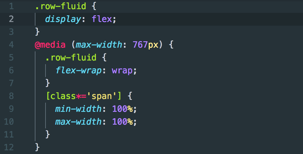
Using the grid is remarkably easy, requiring only a few lines of CSS:
See, told you it was simple. The beauty of this is that it's a progressive enhancement to the standard grid. Due to this, we don't need to bother redefining all various column sizes.
At this point, it, more or less, looks and behaves like the standard HubSpot grid. If we add some content to these columns, however, you will see its first trick.
Without a line of JavaScript or setting-explicit heights, all of the columns are now responsively equal height. Much better than how it would look normally.
It has some other special powers too:
These aren't intended to be copied into your CSS verbatim, but instead used as a basis for writing your own styles. The gist of this all is to add a class to a parent element to limit those changes in the row you're trying to edit. CSS-Tricks has an excellent flexbox guide if you want some more details on flexbox properties.
Another neat trick is to make auto-grids for flex columns. In the following demo, we have a Flexible Column with 4 modules in it. The grid will automatically adjust based on how many items are in it.
This is done by applying the same principles to the Flexible Column itself (so that its children become flexy).
There's Got to Be a Catch
If this is so much better than what HubSpot uses now, why haven't they switched to it? There are some special considerations they need to make, such as what the editor experience for this would be, as well as maintaining backwards compatabilty for sites that aren't ready for the change.
Additionally, there's browser support to consider. You should also consider this before implementing a flexbox grid. As of this writing, flexbox is currently supported in 97.66% of browsers globally. Notable browsers that don't support it are Internet Explorer 9 & older; Internet Explorer 10 and 11 have some bugs with their implementations.
These represent ~3% of browsers in use globally. However, these browsers may represent a larger amount of the visitors you actually get; consult your analytics.
Wrap Up
As a developer, flexbox has been life-changing. It's time to bring this to HubSpot. With over 97% support, for most, it's relatively safe to use in production. Not to mention, since this is a progressive enhancement to the standard grid, it if fails, you just get the standard grid as-is.

.png)
Comments