The world of business is incredibly vast. There's B2B, or business to business, and B2C, or business to consumer. Then, both categories can be broken down further into big businesses and small businesses. There are so many classifications to concern yourself with — as well as the differences and benefits between them.
When designing a website, how do you know which classifications matter? More importantly, what do your customers want from your site and design? Do businesses want to see something different than your average consumer? That would make sense if it’s true — or would it?
We’ll make this a little easier on you and everyone else. The simple answer is that none of it matters in the slightest. A customer is a customer regardless of where they come from or what industry they work in. You’re going to factor in your audience when you design the initial layout anyway. What matters is whether or not your site works well and makes conversions.
Here are the top six features you should concern yourself with. We’re going to assume you already have a design and theme chosen and you just need help improving specific elements.
1. Clear and Valid Contact Information
Whether you share the contact information for your business and customer service team on every page in the footer or set up a designated space for it, make sure it's there. Furthermore, make sure any and all information is valid, convenient and clear.
With email addresses, for example, you can embed a link on the page so that when a customer or client interacts with it, their preferred web client or app opens right up. The same can be done for phone numbers, chat services and more.
Also, find a way to separate the customer service side of the equation from leads and inquiries. You don’t want someone who’s having trouble ordering a product or service waiting weeks to hear back from the wrong support team. It stands to reason your customers don’t want that to happen either.

Quicksprout has an awesome contact form that's short and sweet where it counts when you have to enter your details. Leading up to it is a detailed infographic that breaks down why you might want to reach out. More importantly, the contact page is always highlighted and visible thanks to a button that stands out from the regular theme. Check it out in the header navigation menu!
2. Encryption and Security
When you’re trusted with handling incredibly sensitive information like Social Security numbers, credit card info, addresses and more, you want everything to remain as secure and private as possible. Breaches are a huge deal these days and they happen all the time. You can prevent unauthorized users from accessing sensitive data by making sure it’s encrypted, which is an added layer of security.
Secure Socket Layer (SSL) encryption allows you to protect any data coming from and going to your website. Sites with active security and encryption will start with "https" instead of "http," making it a change your customers will notice and appreciate — especially while performing transactions over the internet.

Visit Amazon.com and right away you’ll notice the URL starts with “https” and the browser will tell you the connection is “secured,” which means encryption is active. All transactions and transmitted data are more heavily protected when using the retailer’s site.
3. Personalization Options
Even if you target the same basic audience or demographic all the time, everyone is slightly different. They'll all have their own likes and dislikes, including products and services in your inventory. Make sure your website accommodates everyone by adding support for personalization.
The best way to do this is to create an account-based system where your visitors can log in and update personal details or account settings. Deploy the system that works best for you and your customers — just make sure they have the option to personalize their experience and take advantage of it.
You could deliver customized special offers and discounts, for example, to loyal customers who are looking to upgrade to a new product or software version.

Clopay has an account system like the one we described. But things get really interesting after you’ve logged in and used their unique design service. You can see what it looks like to have different garage doors installed on your home and then you can save the designs to your account for reference later.
4. Validation, Customer Testimonials and Reviews
You can shout from the heavens that you’re the best brand in existence, but guess what? No one is going to believe a word you say unless you provide proof. That’s where added validation come into the picture. If you had to apply and earn a license or certification, display it proudly on your website. If you earned an award or label — especially from a prestigious organization — show it off!
You also want to share and allow third-party feedback like customer reviews, recommendations and testimonials. Setup a process that allows all customers and clients you come into contact with to share their experiences. Then encourage them to do so for others to see.
You can always add this information yourself or have your web developers do it, but that takes away a lot of the credibility. It’s better to deploy a system that crowdsources the content.

Codecademy turned their customer testimonials and reviews into a fully-fledged content page. You can hear the “stories” of various customers and users along with how the brand and their products helped enrich their life.
5. Seamless and Responsive Navigation
Have you ever seen a website that works wonderful on desktop but falls to pieces when you visit from a mobile device? What about a site or design that has sluggish navigation elements and animation? What about a site missing clear navigation to begin with?
Chances are good that if you encountered these things, they frustrated you to no end. How do we know? Because we encounter them all the time and it still bothers us to this day. Nothing kills a site faster than terrible navigation controls and unresponsive elements.
Make sure the experience is seamless and efficient no matter what platform your users choose to browse on. If you have a large menu or multiple sub-menus, it might be a good idea to have it collapse on mobile until it's needed. This gets handled a lot of the time by an icon that opens into a menu when users need it but remains closed when they don't.
Take a look at any one of the website examples on this list. Every single one is responsive and will adapt according to the resolution and screen size of the device you’re browsing from.
6. Accessible Calls to Action
You're probably a designer or graphic artist. Or maybe you're a manager and you simply handle the regular sales and business opportunities. Whatever the case might be, you're probably not a marketing expert. Still, you probably understand the importance of a call to action.
It’s the very point where you engage your customers and ask them to do what you want. This includes using buttons like “Buy Now,” or “Sign Up Here” and instructions to “Click here for more information.” Don’t completely litter your site or design with them, but make sure they’re placed in the open and that they remain accessible to everyone who visits. Call attention to what it is you want your customers to do — whether that’s buying a product, reaching out for more information or simply signing up for a newsletter.

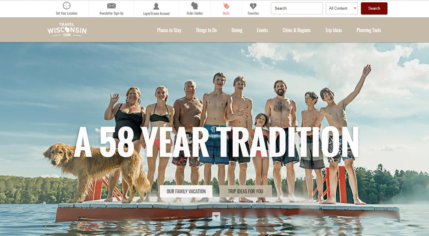
Ever been to Wisconsin? Know what there is to do there? Neither do I. In fact, you’d be hard-pressed to convince us there’s even a tourism market in the state. This site proves we’re wrong, and they do it efficiently with their call to action, right there at the top the page. You can see what there is to do or get personalized trip ideas. Scroll down the page some more and there are additional C2A elements, all used appropriately.
Appealing to your audience and your customers — no matter who they are or what they do — isn’t difficult, but it does take effort. Get started today by trying out some new techniques and before long, you’ll have a strong indication of what your customers respond to the best.


.png)
Comments