
When you’re looking at your site analytics, do a lot of your visitors land on your contact page but fail to follow through? If so, then you may need to tweak your Contact Us page on your site.
The goal is to gain a lead by answering questions or getting interested consumers to get in touch. A simple form on the contact page just isn’t enough in such a competitive marketplace.
Contact forms convert a measly three to five percent of the time. However, if you add additional items to the page, then you up your conversion rates considerably. While there are many different ways to enhance your contact page, we’ve chosen the top five added features you should consider when designing your site.
1. Surveys
Even though surveys are a longer type of form, they have the best conversion rates out of the different types of forms. Surveys are the second highest in conversion rates and also allow you to gather more data about your leads than other forms.
You can implement smart features that show certain questions based on the way the site visitor answers the previous questions. This allows for a shorter survey but funnels the information to the details you need.
At the same time, don’t overdo it. If you make your form too long, people may grow frustrated and simply bounce away. One idea is to have a shorter signup and then encourage those who’ve signed up to complete additional surveys and gain points, discounts or prizes for doing so.
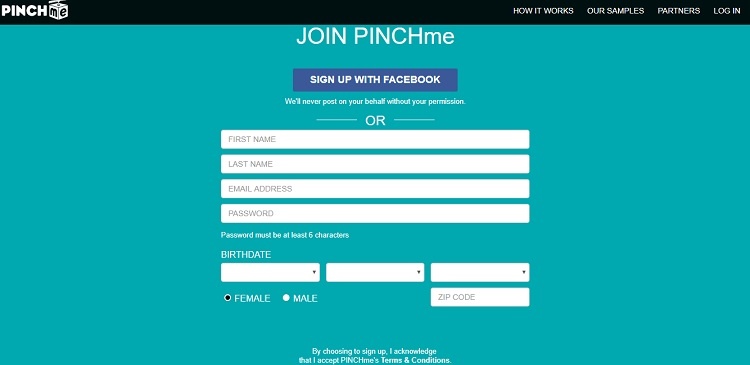
PINCHme is a site that offers free samples. Although the initial sign-up form is just a bit longer —gathering basic info and birth date — once you’ve joined, the system narrows down your choices to figure out your interests and what companies might want to target you with a sample or special offer.
2. Links to Social Media
More and more people are using social media as a way to stay connected with the companies they like. Social media is even used to ask questions or lodge customer service complaints. The key is to figure out which social media sites are most likely to attract the type of audience you want.
Once you establish a presence on those sites, add buttons on your contact page so that visitors can easily connect with you on social media, too. You can simply add a small icon near your contact form. People who use those platforms will recognize the symbol.
3. Individual Location Information
One thing missing from many company websites is thorough contact information. About 51 percent of consumers feel that this info is often missing. A lack of thorough information can make you look less trustworthy. Consumers want to know they have multiple ways to get in touch should something go wrong with a product.
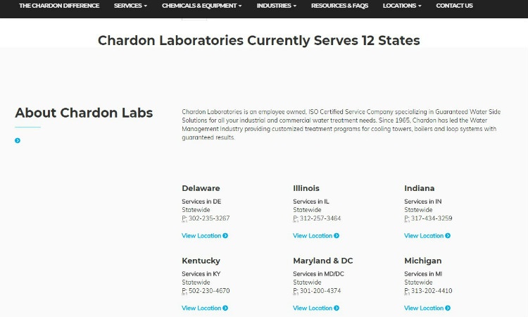
Chardon Labs does a good job of providing thorough information about each of their locations. They start with a contact form at the top of the page. Directly under the form, they list the location, what areas that particular location services and a telephone number. You can also click on the “view location” button and get more information on a particular location as well as the ability to speak directly with a representative well-versed in that area.
4. Beauty
This might sound a bit silly at first. Why does a contact page need to be beautiful? On average, 38 percent of site visitors who feel a website is unattractive will leave the site.
You work hard to get traffic to your site. The last thing you want to do is lose visitors because your site isn't aesthetically pleasing. Take the time to add visual elements and beautify the overall look of your contact page.
5. CTA Button
A CTA button is a vital part of your Contact page. However, there are a lot of factors to consider when creating a CTA, so that you will gain maximum conversions. Even the words you use on the CTA have an impact. For example, many people do not like the word “submit” but prefer “go” or “start.”
The button that works best for your audience may vary. Be sure to complete A/B testing to see what color, placement and words work best on your site. Even the size of your button might impact your conversion rates. The stats seem to vary widely between industries and even different websites, so the key is to use best practices and then test them.
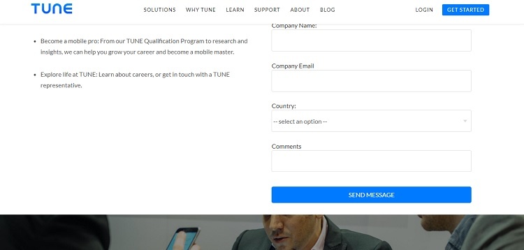
Tune does a nice job with their CTAs on their Contact page. First, they use a shade of blue that matches the color of their logo. Blue is also a popular color among both men and women.
There is a small CTA button in the upper right navigation menu that simply says “get started.” Then, directly under the form, the button is larger and says “send message” rather than “submit.” This works well to encourage the site visitor to send the message and ask any question he or she might have.
More Than a Form
These are just five things you can focus on to amp up the power of your Contact page. However, there are many other elements you can add that will lend credibility to your site, making contacting you easier and encourage site visitors to become customers.
Take the time to study the contact pages of your fiercest competitors and see what they might be doing that you need to adopt for your own page.


.png)
Comments