Let's face it: email design is like the Wild West—antiquated and untamed. Coding an email feels like taking a time machine back to the days before the Web Standards Project helped normalize web development. Not only do all the email clients use their own (often buggy) unique rendering engine... *cough* Outlook *cough*... but they also have failed to implement many of the modern CSS features that developers have come to know and love (all hail flexbox and grid). One of the many casualties has been support for high-density (Retina) displays.
Due to quirks with various clients, the standard practice of taking a 2x image and constraining it with a max-width simply doesn't work. Instead, you get an email twice as wide as you intended with some horizontal overflow or weird zoom for added frustration. Because of this, developers often resort to using images that are the exact pixel size for their placement. That's fine for a normal 72ppi screen; however, modern monitors—and phones especially—have pixel densities of at least double, if not quadruple, standard amounts, which leads to blurry and bad looking images.
It Doesn't Have to Be That Way
The folks at Litmus have come up with a clever solution. Through some CSS shenanigans and knowledge of what clients support what, Litmus has introduced a way to achieve Retina-ready images in email. The crux is that Outlook, and others email providers, will always try to display an image at its natural size and skip over any max-width: 100% values you apply.
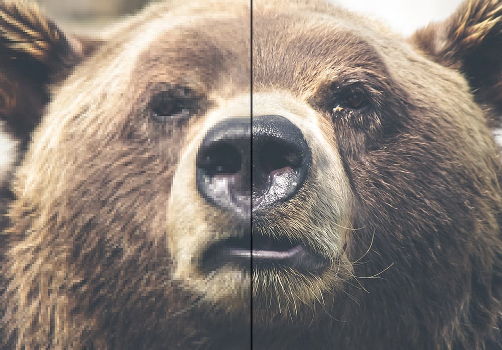
<img alt="Majestic Bear" src="bear-2x.jpg" width="600" style="width: 100%; max-width: 600px; display: block; border: 0px;" border="0">Here's how we work around this: first, we set an explicit width on the image, then we style it to be 100% wide. On most email clients, this 100% width set by CSS will take over and keep the image at the right size. The magic to get the troublemakers in line is setting a max-width equal to the explicit width you want the image to display at. This limits the image to the width you want without affecting the clients that behave correctly.
It's worth noting that this trick is for content images. If you want to live on the edge and include background images, then make sure you've got a sensible fallback color; after all, background images don't work everywhere.
The good news is, where they are supported, the modern features you've come to expect in background images just work, making Retina images trivial.
Email Can't Be That Easy
If that's what you're thinking, you're right—in general, email is hard. That said, in this case, creating Retina images really is very simple. That's not to say there are no caveats though—With images that are 2x, the pixels come with an increase in file size.
Remember that email is most often opened on phones, these days. With that in mind, optimization is key. Be sure to save your images in as optimized a format as you can, and use a lossless compressor (like ImageOptim) to ensure those images are as small as possible.
Don't ship blurry emails.


.png)
Comments