
Seven seconds.
That’s a very small window to have to wow recruiters and hiring managers. According to Ladders, Inc., the average initial screening time for a resume is just 7.4 seconds.
Basically, the appearance of your resume can be the defining line on your chances of scoring an interview.
What Top Performing Resumes Have In Common
That same Ladders study found that the performance of resumes is tied on the whole to layout, flow, and content. It’s acknowledged across the board that information cramming isn’t a best practice, but that’s not the only flaw recruiters have pointed out.
via GIPHY
The worst performing resumes had:
- Cluttered layouts – Busy, crowded resumes can appear overwhelming.
- Long sentences – Brevity is always better when you're trying to impress a hiring manager quickly.
- Minimal white space – White space is important because you want your resume to look well balanced.
- Lack of sections and job headers – Resumes need to be organized to effectively communicate a lot of information.
- Keyword stuffing – Overuse of certain words and phrases creates a poor reader experience and hurts your credibility.
On the other hand, the best performing resumes included:
- Simple layouts
- Bulleted lists
- Detailed overview
- Clearly marked sections
- Clear font
Apparently, the smallest details matter, even resume font choice. It’s an element that you may have never even considered, but it counts.
Why Font Matters
The best way to frame your resume in your mind is to think of it as a means to tell your story. This document showcases your professional self and value while highlighting some of your personality as well.
via GIPHY
It’s your first impression, and you know what they say about first impressions. When you look at it that way, every detail counts.
Your font selection should be:
- Clear: Stylizing your resume contributes toward its success, so boldening headers and jobs should be explored. Some fonts go a little crazy when you attempt to add effects to them though. Pick a font that won’t lose its integrity just because you decided to italicize it.
- Not distracting: The point of a resume is to highlight you and your achievements, but those details can get lost within a distracting font. Bubble letters and excessive cursive curling can be just as glaring as a typo.
- Easy to read: Don’t make the reader strain to read your skills. If your font choice is too confusing or difficult to read, your resume won’t make it past those seven seconds. Recruiters don’t want to have to work that hard to find out if you’re qualified or not.
Resume Fonts You Should Consider
There’s no denying that having such a wide array of fonts to choose from is both exciting and intimidating. Some are pretty fun, but may not exactly be professional. Others are pretty straight forward, but don’t convey the level of personality you’d like it to.
Here are some pretty great fonts for you to consider:
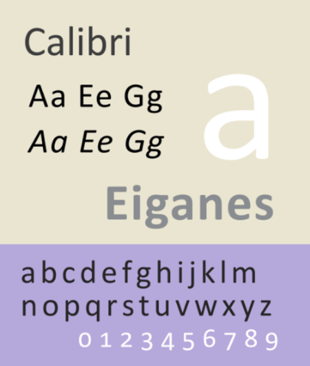
Cailbri
Source: Wikimedia/Blythwood
Calibri is a pretty default font that’s easy-to-read and professional. That being said, it also means that other job seekers are probably using it, which docks a few points for originality.
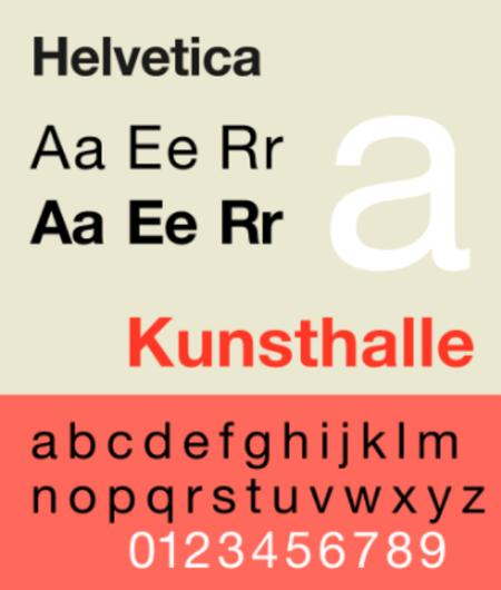
Helvetica
Source: Wikimedia/GearedBull
Helvetica is seen as one of the more elegant sans-serif fonts and is a recruiter favorite. Unfortunately, it doesn’t come pre-downloaded on Microsoft Word like it does on Macs.
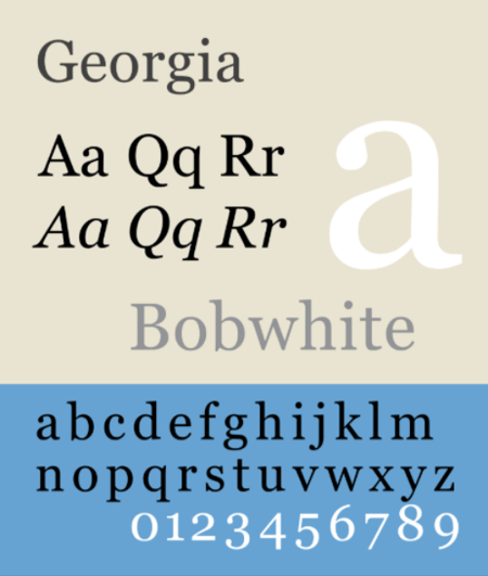
Georgia
Source: Wikimedia/GearedBull
Georgia is available regardless of the program you use. It’s often seen as a suitable alternative to Times New Roman, so it’s pretty popular, which may be a con.
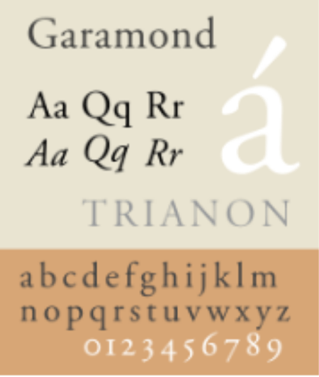
Garamond
Source: Wikimedia/GearedBull
Garamond is a great choice to go with since it’s easy to read, pretty, and not excessively used. It’s an older font, but really, that’s not much of a complaint.
Avenir Next
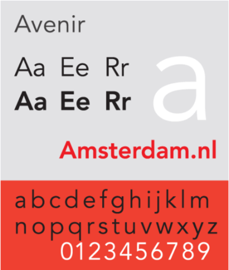
Source: Wikimedia/GearedBull
A very clean font that has a variety of weights for stylizing your resume, it’s a great choice for documents that will be viewed online since its latest update. Be wary of certain weights though, as they can be a bit too thick and condensed.
Verdana
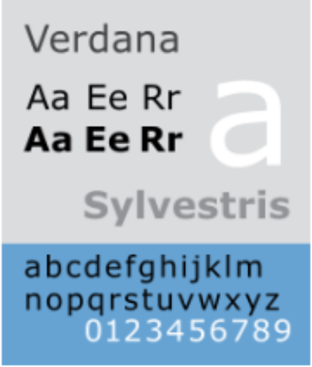
Source: Wikimedia/GearedBull
One of the smaller choices, it’s a great space saver on the page. Unfortunately, though, it doesn’t bring that much character to the plate, appearing pretty close to Arial and other basic fonts.
Gil Sans
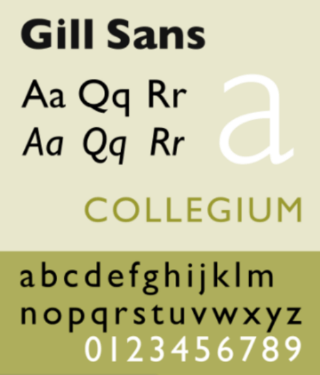
Source: Wikimedia/GearedBull
A classic font, Gil Sans is a pretty well recognized option for those who want something with a bit more style. It’s readable and unique, but quickly approaching the realm of being overused.
Lato
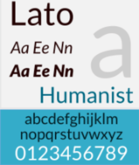
Source: Wikimedia/Gtk3
Totally free, Lato appears pretty neutral on paper. In order to bring out some of its more unique characteristics, you’d have to increase the size a bit. Regardless, it’s an incredibly professional option that would be a great choice for a resume.
Book Antiqua
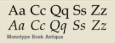
Source: Wikimedia/GearedBull
With a more novelistic appearance, it’s an industry favorite out of the Serif category. Available across operating systems, the only real downside to choosing this font is that it may not look as modern as certain tastes prefer.
Didot
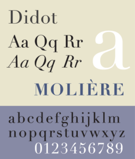
Source: Wikimedia/Kopiersperre
Didot is popular in the fashion industry, titling many famous name brands. It’s a safer option for a more fancy feel to a resume. It isn’t a free font, though, and can be a little overbearing if you have a lot of text on your page.
Cambria
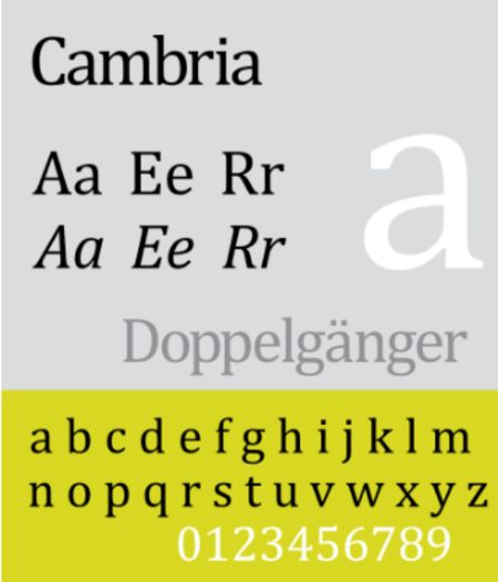
Source: Wikimedia/Sun Ladder
An easy to read font, regardless of text size, Cambria’s a pretty safe option. It’s seen as very traditional and old-fashioned, which can both work in your favor and against you depending on the organization you submitted your resume to.
Times New Roman
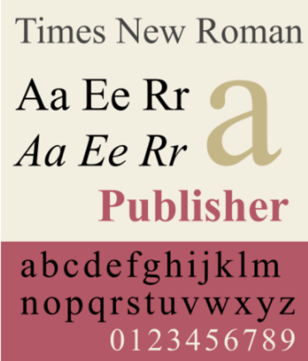
Source: Wikimedia/Rbpolsen
Professionally, this is the preferred font for most documents, from proposals to ebooks, because of how easy it is to read it is. But it is used world-wide, which can make your resume feel like another page in the pile.
Other Considerations
Picking a font that will impress recruiters while still reflecting your personality can be a fun break from listing out your soft skills. But the work isn’t done just because you clicked on an option from the drop down menu.
Here are a few more details to be aware of:
Best Resume Font Size
Make sure that you stick to a 12 point font size. It’s the easiest to read without taking up a ton of necessary white space. Feel free to use larger sizes for headings, section titles, and the like, but do so sparingly and appropriately.
If you're struggling to get all your information on one page, consider using a smaller size, like 10 points. But anything smaller would be difficult to read, so find a good balance. You might need to cut down on your word count or remove sections that aren't relevant to the position you applied for.
Pairing Fonts
A visual trick that is sometimes overlooked is pairing two fonts that agree with each other on your resume. Choosing two contrasting typefaces, like a cursive font with a standard one, can bring a more stylized feel to your document.
via GIPHY
When done correctly, the two won’t fight for the reader’s attention and will balance one another out. Dedicate one to headers and titles while the other is designated to the body of the text.
Bolding and Italicizing
These two effects are great for highlighting specific words, but make sure not to clutter your page with them. You still want your resume to appear clean and digestible.
Bold text can be used to draw the eye to titles or subtitles without having to increase the font size.
Italics are better for supporting text, like the location of your university for a degree listing. Use it as you would smaller text sizes.
The First Step to Your Amazing Career
A strong resume is a great starting point for building a successful career, so it’s critical that you attack it from every angle. Even the finer details, like the font you choose, weighs in on a recruiter or hiring manager’s opinion. Choose wisely.
But most importantly, be yourself! Stay true to who you are in how you pursue exciting professional opportunities. Make sure that your resume still has elements of you in it.


.png)
Comments