
The calls to action (CTAs) on your site can send your conversion rates soaring. People are used to seeing CTAs in advertisements, emails, and on websites and social media platforms. If you want to really grab user attention, you must find the best ways to engage your particular audience.
What is the magic formula that makes people want to click on one CTA over another? The perfect formula takes a number of factors, mixes them together, and tests the results to see what people respond best to.
How Do I Make My CTA More Clickable?
Average conversion rates run between 2.6 percent and 6.1 percent, depending upon the industry you're in. Anything you can do to improve on the typical clickthrough rate takes your business to the next level. Improving your CTAs is a first step to gaining more clients.
What are some of the things you can do to make your CTA more clickable and encourage conversions? Here are our favorites, along with some examples to show you what works well for other business owners.
1. Define the Shape.
If you want people to click on your CTA button, you must show it is an actionable element on your page. It should be a definitive shape, preferably a rectangle or oval. If you want a rectangle with a rounded look, curve the edges a bit.
If you’re trying to improve clickthrough rates, choose a shape people are used to seeing on other sites and know that it functions as a CTA.
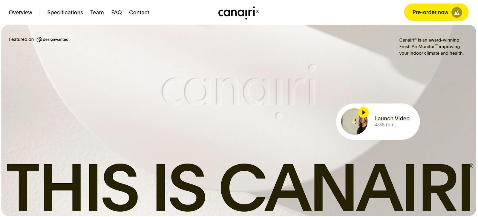
Source: https://www.canairi.io
Canairi uses oval CTAs. Note how the color pops against the white portion of the background. You only see the vivid yellow repeated on the play button to launch a video.
By setting the button apart with a bright color and expected shape, the user is much more likely to click on the CTA and move forward in the buyer’s journey.
2. Know Your Audience.
When it comes to content, design and marketing, you’ve likely heard the advice repeatedly to “know your audience.” The reason you hear this step so frequently is because it is a vital part of success promotions.
One study found when CTAs were targeted to specific buyer personas, people viewed them 42 percent more often than generic CTAs aimed at no one. Create personas for each segment of your audience and consider how they might respond to colors, shapes, placement and language.
3. Add a Pop of Color.
Your CTA should stand out against the other colors on the page. You can even stray outside your brand’s color palette in the interest of grabbing user attention. Another option is to go with a hue brighter or darker than the others in your design.

Source: https://bravuratechnologies.com
Bravura uses a beautiful gradient button. By utilizing a pop of pink blended into vivid purple, they grab user attention. The hue also contrasts with the blue background and draws the eye. Note how the background is made up of curves, so the CTA has sharp, defined edges to add even more variation.
4. Utilize Icons.
If you have space, add a small icon to encourage the user to click. An arrow shows some action should be taken, for example. A play button indicates the person will view a video if they click on the CTA.
You can use any type of icon you choose, but try to be straightforward and utilize them only when needed to indicate some type of movement on the user’s part.
5. Choose the Right Placement.
Where should you place your CTA button? Many people prefer to have it above the fold, while others feel the best place is after you fully answer consumer questions. You may want to play around with your button’s placement and see what converts best for your particular audience base.
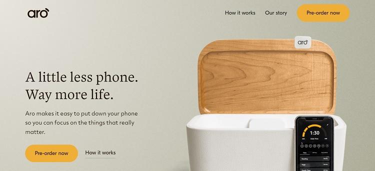
Source: https://www.goaro.com
Aro does a good job of placing their CTAs in a prominent location. However, they don’t ignore that some people may want to know more about it before they place an order.
Note how they offer a less prominent CTA to the right that reads “How it Works.” Users can choose whether to learn more or move forward in the sales funnel.
6. Use First or Second Person.
Your CTA language should be personal. Try to avoid third person, which can distance the action from the user. Instead, stick with first or second person. For example, “Get Your Free Guide.”
You may want to try various versions, such as “Get Free Guide,” “Grab My Free Guide” and so on. Conduct split testing to see which language works best for your customer base.
7. Create a Sense of Urgency.
Once they bounce away from your site, users are less likely to return and take action. Try to take advantage of them being there to at least gather their contact information for follow-up. What would cause people to click on your CTA now?
Create a sense of urgency with the language you use. Offer a limited time discount, encourage them to reach out 24/7 or use some other language that makes them think now is when they should contact you.
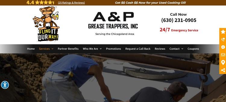
Source: https://www.apgreasetrappers.com/septic-systems
A&P Grease Trappers Inc. uses some language that encourages immediate action. For example, they use the words “Call Now” to indicate people can call at any time and to reach out. Just under that information, they use red letters and write, “24/7 Emergency Service.” If the user is in doubt about business hours, they’ll understand they can call at any time.
Keep Refining Your CTAs
Don’t just assume the CTA you’ve always had is good enough. Try different variations, colors, placement, and shapes. Over time, you may find users are less likely to take action. When you mix things up, you engage them again and encourage interaction.


.png)
Comments