
Seventeen percent of Americans check their email before their feet hit the floor in the morning. Fifty five percent check email within an hour of waking (no judgement if your feet still haven’t hit the floor in that hour). Why is that important?
Well, if you’re like most business owners, you’re actively working on building a strong mailing list to deliver information, updates, and marketing materials to your customers and prospects. In fact, done the right way, a mailing list has one of the best returns on investment (ROI).
Email marketing has, on average, a return of 42 dollars for every dollar spent, depending on your industry. With that kind of return, it’s no surprise that most businesses are actively working on developing lists of their targeted audience members, and if they’re not, they should be.
Because collecting email addresses from potential customers doesn’t have to be complicated, and shouldn’t be, it’s one of the most sound and important investments you can make in your marketing plan.
What Is an Email List?
In simple terms, an email list is a list of emails compiled from a variety of collection sources but, most often, your website. When visitors come to your website, you’ve likely got some kind of form they can complete to add them to your mailing list (hint: if you don’t yet have this, you should!).
For marketing teams, this is the first step toward nurturing leads. Building a quality email list means you're building a large source of contacts, who show they're interested in your products or brand, to reach out to and connect with.
Should I Buy Email Lists?
No.
One more time for those in the back: no.
“But what if…”
Still no.
It may seem like a fast and easy way to build your email list, but good email lists are about more than numbers. Not only that, but there are other significant drawbacks to buying email lists can be detrimental to your business as well, including:
- Email providers may penalize you for it.
- Response rates are negatively impacted.
- You may be flagged as a spammer.
- Your reputation is tarnished.
- The email addresses in the list may no longer be active.
- Names or other data may be incomplete.
- You'll be in violation of the CAN-SPAM Act of 2003 (sending unsolicited emails).
How to Build the Best Email List Organically
So, if you can’t just buy the list, how do you build one? As noted above, fast and easy isn’t the route, which means it can, and will, take you time to build a list of potential and repeat customers who are loyal to your brand interested in your offers and information.
Thankfully, there are some strategies you can employ to encourage folks to sign up and start to grow a high-quality email marketing list.
1. Develop Trust.
Because spam is still a real problem, and because everyone is asking for our email address these days, many people have to weed through many messages, daily, to get to the mail they want to see. Further, for many of us, there’s often a handful of emails in our inbox we don’t recall signing up for. As a business, that means you have to be transparent with new visitors about how you use their information, like their email address.
Further, when signing up for a new email list, many folks worry about the frequency of emails. Visitors want to be reassured that they won’t hear from you multiple times a day and that their inbox won’t be flooded by emails from you.
So, how do you develop trust from the start? Be upfront about your policies. Be sure to include a statement on your signup form stating, "We never sell or share your information."
Also, be clear about how often they can expect to hear from you. If you send out a weekly sales notice, be explicit about that.
Then, in your emails, make it easy to both update preferences (email frequencies or list segmentations) or to unsubscribe. Providing subscribers with some control over the communications they receive means they will be more likely to trust your intentions.
2. Promise Inside Information.
Most people love to be able to share something new, to be the first to know, or even to be ahead of the trend. In fact, hipsters are staking their reputations on it. So, use your email to tap into that.
With countless sites on the internet featuring, likely, similar services or products, a person visiting your site is likely interested in what you’re offering. If you’ve got their attention, keep it by promising to deliver up-to-date information and new products or services right to their inbox.
3. Show You’re Valued.
As much as folks love to be the first to know, they equally dislike being the last to know. You can tap into that too! Let visitors know how many other people are already receiving and enjoying your emails. Not only does this entice them through what’s known as the “bandwagon effect,” but your numbers may also help establish trust.
For example, a ticker at the bottom of your signup form might say “Join 10,000 other subscribers.” Not only does this say that all of these folks trust you with access to their inbox, but it also says your mailing list is something others value.
That said, if we’re building trust, don’t fabricate or inflate these numbers. If you’re just starting to build your list, this strategy is best held off until your numbers demonstrate enthusiasm and value.
4. Sharing Is Caring.
Word of mouth is the advertising everyone seeks. In fact, 92 percent of consumers trust recommendations from friends and family. Whether it’s social media, email forwarding, or a conversation that leads to sharing, your fans and those on your mailing list can be your best means of promotion.
You can, therefore, actively encourage your subscribers to participate in these activities and spread the word. You can even incentivize them to do so by offering a discount or offer for email list referrals (when someone signs up) or codes for new folks to share with the person who referred them!
5. Offer Incentives for Engagement.
One of the best ways to get folks to sign up for things is to incentivize it. Incentivizing means you are sharing something of value with them, for something of value to you.
While discounts are a great option, you can also offer free guides, seminars, ebooks, or other assets that relate to your product or service.
6. Branch Out with Ebook Offers.
Whether the asset exists or not, it’s likely you’ve got either the knowledge or collateral to write an ebook about your industry, products, or services. Set aside some time to write a book and upload it via a platform, such as Draft2Digital, Kitaboo, or Joomag, listing the price as free. On the first or last (better yet, both) page of your book, invite readers to sign up for your mailing list for more tips, information, or products related to your topic.
Once you create a free book, you can participate in giveaways on sites such as BookFunnel, Smashwords, or Amazon’s Kindle (they require that you offer it exclusively via them for 90 days on KDP Select).
There are a lot of services out there available to you if you’re looking to distribute a book for free, and social media is a great way to advertise. Using hashtags for your industry as well as #freebook or others can help you tap into a new market.
7. Keep the Signup Process Simple.
This should be obvious. If you need and want more information or more data, collect it later. Let people opt in for that. It is vital to keep the sign up for your newsletter or emails as simple as possible.
Define simple? Two or more fields. No more. Name and email address. That’s all you really need to start. No one wants to fill out lengthy forms, nor do they want to do it on a mobile device, which is how many of them will be accessing your site.
6 Essentials for Compelling Email Signup Forms
Now that we’ve looked at the strategy overview, let’s drill down a bit and talk about specific strategies, techniques, and language you can use to increase conversions and get those email addresses.
1. Lead With the Value.
If you’re incentivizing the sign up, lead with that. While transparency and honesty help you build trust, in this case, leading with “Get our email” or “Sign up for our newsletter” is akin to leading with “Get more emails.” As noted above, our inboxes are overflowing already and so this while upfront and honest, it won’t really convert anyone except the already highly motivated.
Instead, lead with “Want a great deal? Sign up today!” or an offer that either makes your list seem exclusive or adds value to the sign up, such as a discount, free offer, or other incentive. Starting with this language demonstrates the value and encourages the visitor to sign up in a way that plain language just doesn’t.
2. Create a Clear Call-to-Action Button.
A button is a button, right? Wrong. Again, this is a case where often the clearest, simplest language may not be the best. Much like establishing the value in the lead, making your call-to-action (CTA), which is typically a button on the email form, enticing is important.
For that reason, consider the language you use on the button. Skip the boring “submit” or “sign-up here.” While active verbs are great (and necessary), you’ll want to do more than that. Highlight on the button the value of the offer. You can pair it with active language, but show your visitor the value.
For example:
- Earn more money with our tips.
- Build your email list now.
- Improve your email marketing today.
Notice that each of the examples leads with an active verb then follows with the value of the newsletter or email, clarifying exactly what you will get when you subscribe.
3. Consider Your Form's Design.
As important as the language is, the design and form set up is equally important. Again, 61 percent of website visits are coming from a mobile device and so making signup forms simple for those users (and others) is crucial.
A few things to keep in mind when designing your signup forms to keep them simple:
- Remember user experience. The field sizes should be highly visible and big enough for those using touch screens.
- Use a single column and no more than two to three fields.
- Allow the email address to be the user name for the site rather than requiring a separate user name.
- If you require a password, use a show password button rather than a password confirmation field.
- Avoid captcha or complicated verification steps.
- Consider color and contrast. Any instructions should be easy to read. Your CTA button should stand out.
4. Include a Visual.
Our brains are designed to process visual information. In fact, our brains process visual information significantly faster than text. As valuable as your text and text strategies are, you can complement those with an image that demonstrates the value of your offer as well.
5. Test, Analyze, and Test Again.
As with anything in the marketing world, testing is your friend. Much like you would with email campaigns, once you’ve got a form and CTA you think will work, run it and gauge the response. Tweak it and try again. You’ll soon discover what works and what doesn’t and be able to build a form that gets you the email list you want and need.
Much like building the list itself, this may take time. Be patient. Don’t cut a test too short simply because you don’t get a response right away as it may be another element that’s impacting the signups.
Remember that email signups aren’t the only number you should be looking at. You’ll want to run those numbers against site visitors and other relevant metrics so you see the whole picture.
6. Deliver the Right Form at the Right Time.
Much of inbound marketing is about providing the right message to the right customer at the right time. Your email signup form is no different. Planning how and where you offer these can be crucial, and you’ve got a few options, each with their own merits.
Entry Pop-Ups
As it sounds, these pop up when a visitor first visits your site. Because these pop-ups typically block the page, you want to make sure you do a few things with them.
- Don’t have them open right away. Give the viewer a few seconds to look around.
- Research suggests about five to 10 seconds into viewing the site is the “sweet spot.”
- Make it easy to close the window. While you may lose conversions, you’ll keep others who don’t mind and are interested enough to keep looking. The user experience here is the value. Don’t impede it.
- Don’t be afraid to use this pop-up on more than your homepage. A visitor poking around may have been reluctant at first, but may reconsider.
Exit Pop-Ups
Similarly, these pop up when a visitor is about to leave your page, as determined by mouse movement toward the “close” or “back” buttons. Exit intent pop-ups catch users prior to their leaving and can include additional offers, reminders, or a suggestion of the impact of the user leaving prior to taking advantage of your offer such as:
- “Are you willing to miss out on thousands of potential email signups?”
- “Leaving already? Without our free ebook?”
End of Blog
If your reader has already made it to the end of the blog, you know they’re interested. This is the perfect opportunity to add in some extra value and make a real connection.
In-Line Forms
These appear in the middle of text and can be integrated into a blog as a way to offer more value to what a reader is already enjoying. Text might include: “Like what you’re reading? Get more great info in our newsletter!”
Sidebar Forms
Sidebar forms sit next to site content and can be static (anchored) or move with the text. They can act as a reminder that more content or more value is just a click away. However, you want to be careful that it’s not so busy that it distracts a reader from your blog post or webpage copy.
Each of these forms can be designed to appeal to different people at different times. The key, as noted above, is to deliver the right content or value add for the right customer at the right time.
Email List Form Examples
One of the best strategies you can use, other than testing for yourself, is examining what’s working for others and applying some of those techniques to your own site. Here are some great signup CTAs that exhibit some of the best practices discussed above.
1. TOMS

TOMS keeps their signup form extremely simple. With just one field on their form and a “Join Us” action button, this is a quick sign up. Understanding that most folks will opt out of a lengthy form, TOMS gets simple (and it fits the brand). It’s an extremely mobile device friendly form, which suggests they understand their audience as well (who they are and how they’re connecting).
They also offer an incentive here. Combining more than one element of effective mailing list invites, they’re likely to attract a good number of subscribers.
2. J. Crew Factory
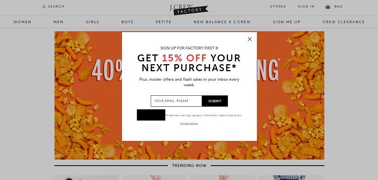
When you land on J. Crew Factory’s website, they utilize an entry popup that incentivizes your sign up with 15 percent off your next purchase. The value add for the newsletter is also information about flash sales, so two incentives here.
Inclusion of a link to their privacy policy may convince those who are leery about signing up for emails from a large company to establish trust.. There’s some quality design work here as well. Super simple contrasting colors, use of varied fonts, and sizes mean it’s easy to read.
3. Title Nine
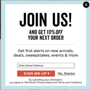
Title Nine has a pretty standard entry pop-up that appears about 10 seconds into the site visit. The language speaks to the brand and signup offers several incentives, both immediate (discount) and to the email itself. The opt-out is pretty easy to find as is information about privacy and terms.
4. The Daily Egg
The Daily Egg offers the chance to subscribe to their newsletter as concisely and unobtrusively as possible. This thin banner sits at the top of the page, providing a simple and remarkably straightforward call to action. It’s the ideal example of a simple signup that speaks to the brand.
5. CXL

CXL's newsletter signup flexes their popularity numbers with a shout out of over 95,000 subscribers. In an industry that changes and evolves fairly rapidly, this appeals to their audience’s desire to stay on top of trends.
Inclusion of email frequency is great to assure subscribers that their inbox won't be flooded and, as an extra step, they confirm your voluntary signup as well. CXL covers most of the bases here.
6. Shinesty
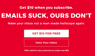
Given the nature of their product (underwear), Shinesty can be a bit cheeky. They use an entry pop-up as well as a static signup at the bottom of their homepage.

They use funny language, present the painful option of not subscribing, incentivize the signup, and speak directly to a viewer’s concerns about a flooded inbox with irrelevant emails.
7. RemoteOK

Since remote work is on everyone’s minds these days, it shouldn’t be hard for RemoteOK to get folks to sign up. Still, they keep their email signup visible, but unobtrusive (at the bottom of the homepage), let you opt in for frequency immediately (set clear expectations), keep it simple (one box to fill out), and tell you just how many other folks are enjoying the content. Great stuff and super simple.
8. Kate Spade
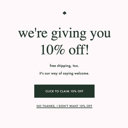
Fashion company Kate Spade is also following some great best practices with their pop-up email signup form. First, it shows up about 10 seconds into your site visit, giving viewers enough time to check out the homepage and poke around a bit before the offer comes up. Then, it offers an incentive, disincentivizes the alternative (“No thanks, I don’t want your deal”), and includes a really simple form at the bottom of their homepage as well.
9. Tyr
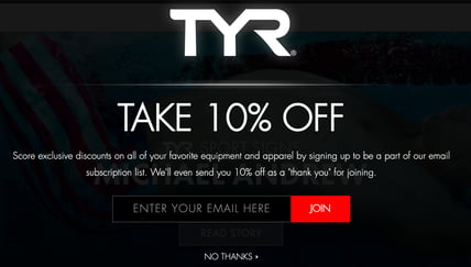
Tyr’s email signup is pretty simple, but there’s a few things we’d like to note here. First, the entry pop-up shows up about 10 seconds into the site visit, offers an incentive, and it matches the brand in that it’s straightforward and simple from the language to the design.
Of note too is the experience of opting out in that it’s right in the center, easy to find and easy to read. In other words, the user isn’t searching for an x to close out the window.
10. Ripped Body
It’s a unique strategy that the homepage is the email signup, but Ripped Body has got quite a bit going for it in terms of email signup success.
First, the page offers social proof regarding how many others are subscribed and enjoying the content. Next, it offers a value-add in the form of a free book. The form is super simple, including a visual of what “ripped” looks like, and it also provides a pretty clear description of the expectations (no supplement sales, etc). Further, the language used to get attention is well done in that the question makes a visitor think about their performance and health.
Each example here employs some of the best practices discussed. Ideally, you’ll want to explore what works best for your brand and your audience. However, it’s worth noting where others have been successful and tweaking those strategies to meet your needs as well.
Grow Your Email Lists
We’ve covered a lot of ground here for something that seems (and should be) simple. Often the most simple designs have a lot going on behind the scenes and getting visitors to sign up for your email list is no different. Growing your subscribers takes time, consistent effort, and patience.
It’s important to remember it’s about quality, not just volume. You want real leads who are interested in your products or services.
Consider which strategies work best for you and your brand and implement them. Test them out and then revisit. Remember, it’s about the right message, to the right people, at the right time, so figuring out who, what, and when is the first step to building your email list.


.png)
Comments