Think about how many hours you've spent building and perfecting your website and marketing message. Your goal is to drive traffic to your site so you can collect leads and gain new customers.
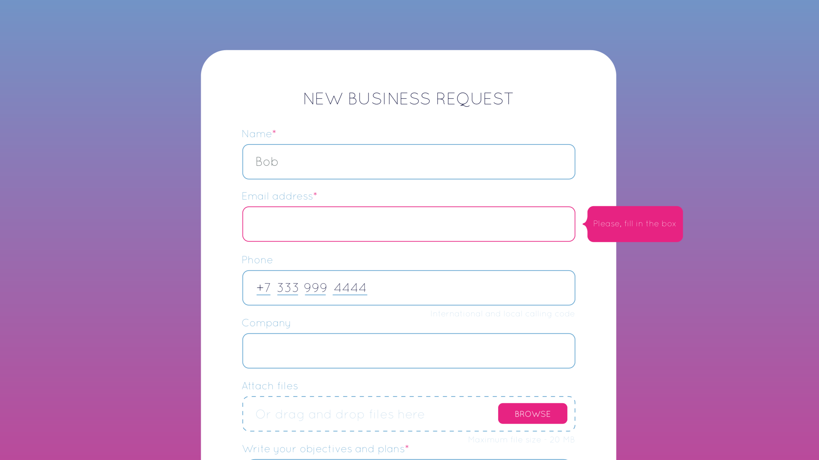
Making a few minor improvements to your contact form increases your conversion rates. A median conversion rate is around 2.35 percent, but some site owners get as much as 11.45 percent.
Improve your contact form without spending a lot of time or money and improve your conversion rates.
1. Reduce the Number of Form Fields
In one case study, Expedia found a single form field cost them about $12 million a year in conversions. They removed that field and saw an increase in conversions in one night.
People are busy, and they are leery of sharing personal information. Reduce the number of fields in your forms and watch your conversion rates soar.
For example, if you currently ask for a name, email, address, and phone number, try just asking for a name and email. You can gather additional information later.
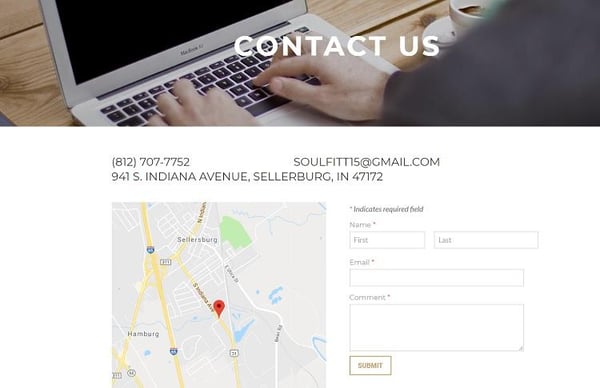
Soul Fitt is a privately-owned gym. Note how simple their contact form makes it for users to get in touch with them.
They don't require a long health history. They ask for name, email and offer a comment field. They also list their company email in case someone wants to send an email rather than fill out a form.
2. Install a Form Abandonment Add-On
via GIPHY
If you use a content management system such as WordPress, you can install a plugin that allows you to capture partially filled-in, but abandoned, contact forms.
If the user puts their email in, then bounces away, you have their email and can follow up and ask if they had a question. Some might see this type of follow-up as intrusive, so use the abandoned form follow-up sparingly, and only reach out once.
3. Direct Users to the Right Department
If your company has several departments, directing users to the correct one improves their experience by allowing them to receive a quick and efficient answer to their questions.
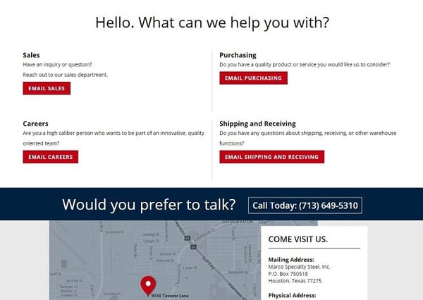
Marco Specialty Steel offers an option to contact specific departments, such as sales, purchasing, careers and shipping and receiving. However, they also provide a contact form further down the page where you can make a general inquiry if that is a better fit.
4. Enable AutoComplete
In a government time use survey, researchers found 24 percent of full-time employees with advanced degrees did at least some work at home.
Add in household work, children's activities and get-togethers with family and friends, and you begin to see why anything that makes your audience's lives easier and more convenient is a welcome addition.
If your form has an option for autocomplete, enable it and save your visitors another step in the process. Autocomplete fills in form fields from answers users have previously given and keeps them from typing the same information again.
This time-saver could mean the difference between a person completing your form or getting distracted.
5. Change Your Wording
Slight changes in your phrasing make a difference in customer feelings toward your brand. If you want customers to contact you, you need to make them feel like you want to hear from them.
Consider how you can sound conversational and inviting within your copy. What is your overall personality as a brand, and how does that come through in the wording of your contact form?
Using words such as "Let's chat," "How can we help?" or similar phrasing is inviting. Let's compare two examples to see which is most inviting to users. These are both burger restaurants in the Midwest.
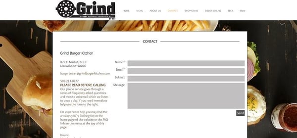
While Grind Burger Kitchen's food might be delicious, their contact form could be more inviting. Note the wording on the left. They say, "Please read before calling," and go into how they don't respond well over the phone, so you should email them instead.
It would be more inviting for them to say, "We'd love to hear from you!"
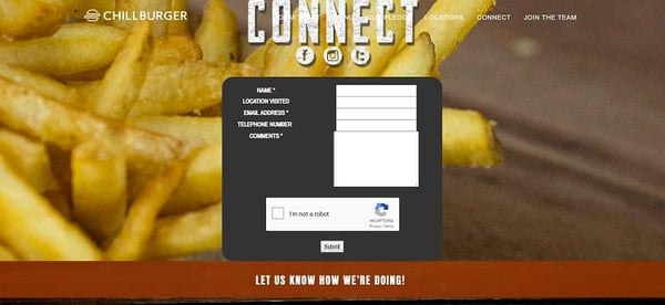
Their competitor, Chillburger, gets the wording right on their contact form. The form itself is simple, and then in big letters underneath, they invite customers to let them know how they're doing.
Instead of "Contact," they use the word "Connect," which feels much more personal and inviting. There are subtle differences between the contact forms on the two sites, but one invites people to connect, and the other keeps them at arm's length.
Take time to survey the wording on your contact form and make any needed adjustments to create text that invites.
6. Remove Captchas
Have you ever visited a site and tried to fill in a form, only to run headfirst into endless captcha images of signs or cars? Or, perhaps the form asked you to input text you could barely read, and you understandably got the letters and numbers incorrect.
Captchas add a level of frustration for site visitors, so removing them makes filling in the form easier. Yes, you'll have to deal with a bit of spam that sneaks through, but the results will be more real leads.
One study found turning captchas on resulted in a 3.2 percent loss in conversions. Honeypots are a better way to filter out spam because the extra code detects the behavior of spam bots and makes the form simpler for visitors to use.
Small Changes
If you want to improve your contact form in a day, make small changes such as the ones listed above. Little shifts in wording, the number of form fields or even spam controls make a significant impact on conversion rates.


.png)
Comments