
If someone was searching your site and wanted to get ahold of you, what would they see on your contact us page? A phone number? An address and map? Nothing?
Marketers often spend so much time focusing on the design and content of the homepage and service page that they neglect the contact page.
However, your contact page should be one of your most important pages.
Think about it. If someone clicks on your Contact Us page, then they are obviously interested in speaking with you! Therefore, your Contact Us page should be more than just a number and a generic email address.
Contact Form vs. Email Address: Which Is Better?
via GIPHYYou might already have a contact page live on your site. But does it have a contact form or just a company email address?
There’s a lot of debate when it comes to this: What should your contact page include? Visitors are already navigating to it for a reason, but what should be available to them when they get there?
Some companies think plastering a generic email address on the page will do the trick. However, you never know who will be contacting you and for what reason. If your company receives a lot of emails, it can be very difficult to sort through them all and reach back out to them in a fashion appropriate to the nature of their outreach.
This is why contact forms are a must on your "Contact Us" page.

Contact Forms Look Professional and Are Easier to Use.
Overall, we feel that having an easy-to-use contact form looks more professional and put together on a Contact Us page than just an email address, phone number, and/or mailing address (although these can be important to include as well).
Think about it: When you really need to contact support, you're looking for immediate help. With a contact form, you can fill it out within seconds and click send.
Yet, with an email, you have to copy it, open up your email provider, paste it in the recipient field, and then type up your message. And, you might not have provided enough information to the company, which would require more emails between you and the company until they're finally able to fully help. That's a pretty stressful situation.
Contact Forms Allow You to Easily Direct Communications to the Right Team Members.
People contact a company for all sorts of reasons: a product/service issue, an interest in working with your business, or even an interest in working at your company.
When you receive a bunch of generalized contact emails, it can be hard to filter through and properly direct each email to the right representative—especially if they have odd or missing subject lines.
With a well-designed contact form, redirecting messages to the right department can be done in the blink of an eye. It can even be automated when combined with tools like HubSpot workflows. For example, if you ask visitors their reason for contacting your company, the information from the response field can be used as a trigger to enroll the new contact into a workflow. This workflow could then assign the contact to a certain team or team member appropriate to the contact's needs or interests.
Ideally, your contact page should include both a simple contact form and other contact informatio (email address, phone number, address, etc.). You never want to limit a visitor’s opportunities to reach out to your business. So, when in doubt, put them both on your page!
What Fields Should You Include on Your Contact Form?
First and Last Name
Obviously, getting the contact’s name is the most important field to include on a contact form. Need I say more?
Email Address
Yet another obvious, essential element to collect in a contact form. How else are you going to reach back out to them if you don’t know what email address to send to?
Your best bet is to request a business email address—especially if your company is focused on B2B work. If they include a Gmail, AOL, or other free email account address, they might not really be interested or prepared for B2B services.
Of course, for a B2C-focused company, free email addresses are commonly-supplied as people use their personal email addresses for finding consumer goods and services.
Company Name
This is a great way to get to know which companies are reaching out to you for help. With the name of the company in your back pocket, you can do a little digging to better understand what the company sells and how you might be able to help them with their problems.
Of course, this may not be as necessary for a B2C-focused company looking to sell products directly to consumers.
Reason for Reaching Out
Whether this is a simple dropdown field or an open-text, paragraph field, this is essential.
It’s important to understand the intent of someone’s inquiries. Why is this person reaching out? What specifically are they searching for answers about?

10 Contact Us Page Best Practices
People are coming to your Contact Us page to contact your business. Follow these best practices to ensure that visitors will keep coming to you to ask questions, seek help, and learn more about your business!
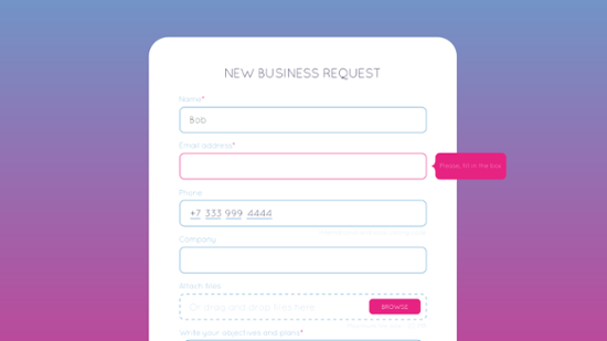
Only Ask Necessary Questions.
Your Contact Us page shouldn't be similar to a game of 20 questions. Ask for the information you need, and then try to obtain details later.
For example, Slack has a simple form that asks one question and then allows the user to select one reason they are making contact.
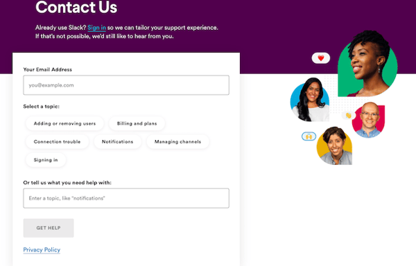
It's important to think about user experience and how it impacts form fills on your page. The more fields visitors have to fill out, the less likely it is that they’ll actually complete the form.
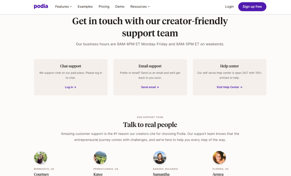
Show Real People From Your Customer Service Team.
People may be hesitant to submit a form on your Contact Us page out of the fear that no one will respond to them. They may also believe that if they try to contact you, they will get an automated service.
This is why it's important to include pictures of people from your customer service or sales team to let your users know that someone real is going to respond. For example, Podia has a great Contact Us page with images of support team members—these quick headshots and employee blurbs help visitors emotionally connect with Podia's support team before they even reach out.
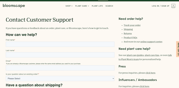
Include Links to FAQs.
Your user may have a simple question that can easily be answered in your frequently asked questions section. This way, your customer service or sales team won't be bogged down answering simple questions from prospects or customers.
For example, Bloomscape the new plant delivery startup, has a link to their FAQs on the right side of their contact us page, giving visitors quick access to answers they need.
Explain Why the User Should Reach Out to You.
What specifically are you able to help them with? Provide some detail. Consider adding a subheading on your page that says something like "to learn more, contact us here" or "for questions or general inquiries, submit the contact form below."
This gives visitors a clear understanding of what they can expect from contacting you.
Take Advantage of Smart Forms.
People contact your business for all sorts of reasons, so they may come back more than once and fill out a contact form. Use smart forms to switch up the fields and collect the right information each time.
Smart forms can also help you guide prospects through the sales funnel as you track their actions on your site and change the forms to represent the sales stage they are in. For example, the first phase of a Contact Us form might have just the most basic questions on it—name, email, phone number, and reason for contact. On future form fills you might change the fields to include things like company name, number of employees, or any other information that would be useful for your organization.
Include Your Social Media Links.
Sometimes people want to contact you on social media for fast responses. Offer them the choice to contact you through one of your social media channels. By doing so, you also give them a chance to learn more about your business.
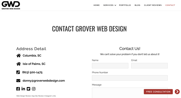
For instance, Grover Web Design includes all of their social media links at the bottom of their Contact Us page's Address Detail list:
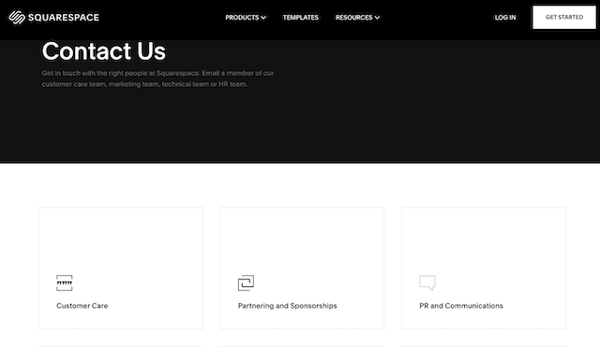
Centralize Your Contact Options.
If you offer more than one option for users to get in contact with you, then add a menu in the center of the Contact Us landing page. This makes it easy for users to select the exact way they want to get in touch with you, instead of searching for it.
Take a look at SquareSpace's contact us page. They have options for departments to contact in neat boxes below the hero space.
Keep Your Design Consistent With the Rest of Your Website.
While a contact page might not always be the most informative or engaging, it doesn't mean you should sacrifice good design. Be sure to design your contact page to fit your branding.
This means your Contact Us page should have similar colors, fonts, and images as the other pages on your site. You don't want your users wondering if they clicked a link that took them to a whole new site!
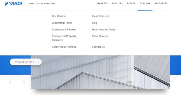
Help Users Find Your Contact Page.
Contact Us pages are often placed in obscure parts of websites. When users have to search for the link to the page, it takes them more time than they need to and likely increases their frustration.
If your Contact Us page is difficult to find, your users may think that you don't want people to contact you, and they will move on to one of your competitors to find answers.
Make your Contact Us page easy to find by including it on one of your main menus. As you can see, Yardi has their Contact Us link on their main drop-down menu.
Keep It Simple.
Lastly, make sure your Contact Us page is not cluttered or convoluted with too much information. It should be straightforward with a clean look so users can take desired actions easily.
Bad layouts and overuse of images and content can cause friction for people who just want to talk to someone. When you embrace simplicity in your design and content, you're going to achieve your goal of converting more visitors into leads.
20 Perfect Contact Page Examples That Should Inspire You
Below are 20 of the best Contact Us pages we could find. Take a look at each and jot down a few things you like – they just might help inspire a redesign!
*Note: Not all of these pages include all of the elements and best practices from above... but they're too cool not to talk about.*
1. YETI
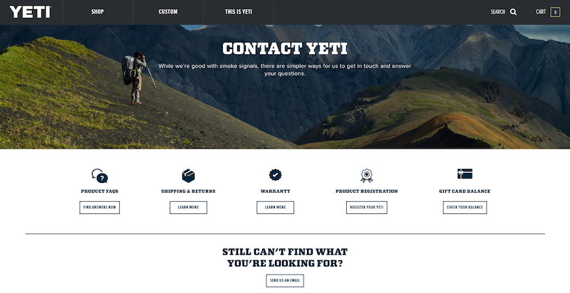
At Bluleadz, we love our YETI cups. You can find one on every employee’s desk (no joke). But what’s even better than YETI’s awesome drinkware is their kickass Contact Us page.
The top image is attention-grabbing when you get to the page, and it shows the company’s personality and humor with the line, “While we’re good with smoke signals, there are simpler ways for us to get in touch and answer your questions.”
They offer a variety of options to help you find the right information you're looking for, including FAQs, shipping and return policy, warranty, product registration, and checking a gift card balance. These pathways make it a lot easier to find answers.
And, if you still can't find the right answer to your question, simply click "Send us an email" and a contact form will pop up in a new tab. Here, you can fill out your name, address, and select a dropdown of what you are reaching out about. Then, use the open text field to add more detail and explanation.
2. PayJoy
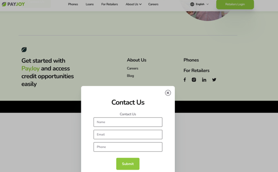
Here's an atypical Contact Us page... because it isn't a page at all! Instead of taking visitors to a separate page to fill out a contact request, PayJoy employs a pop-up form that can appear on their site to prompt visitors to contact them.
This form triggers when someone clicks on PayJoy's "Contact Us" button on their page—which helps ensure that it is seen by someone who's actually interested in reaching out as well. The neat thing about this is that it avoids making someone navigate to a separate page to fill out the form—reducing friction so that conversions increase.
It’s not your typical Contact Us page experience, which is what makes it stand out.
3. Grammarly
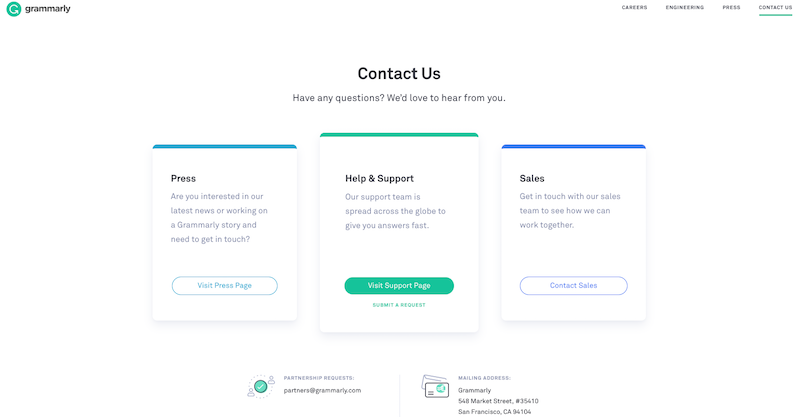
Keeping your contact page simple and clean is always a good idea. After all, users are on the page because they want to contact you, so don’t confuse them with too much unnecessary info.
Grammarly does a great job demonstrating a clean page design for their users. They have three CTAs – one to visit their press page, one for help and support, and one to contact sales.
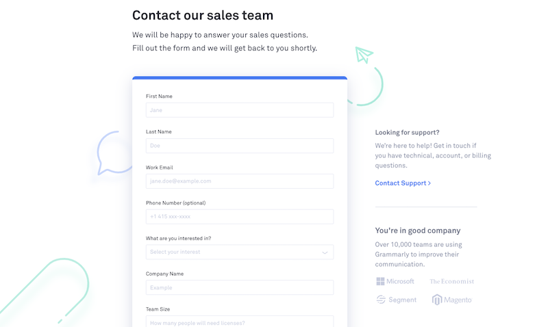
Similar to YETI's design, offering various branches right at the start allows visitors to find what they're looking for more easily. And, when you click on the "Contact Sales" CTA, you're immediately redirected to a detailed contact form to send to their sales team.
This clean, easy-to-use contact page reflects the rest of the Grammarly brand and website well. Accent colors bring a little life to the page, but the overall design is professional and useful.
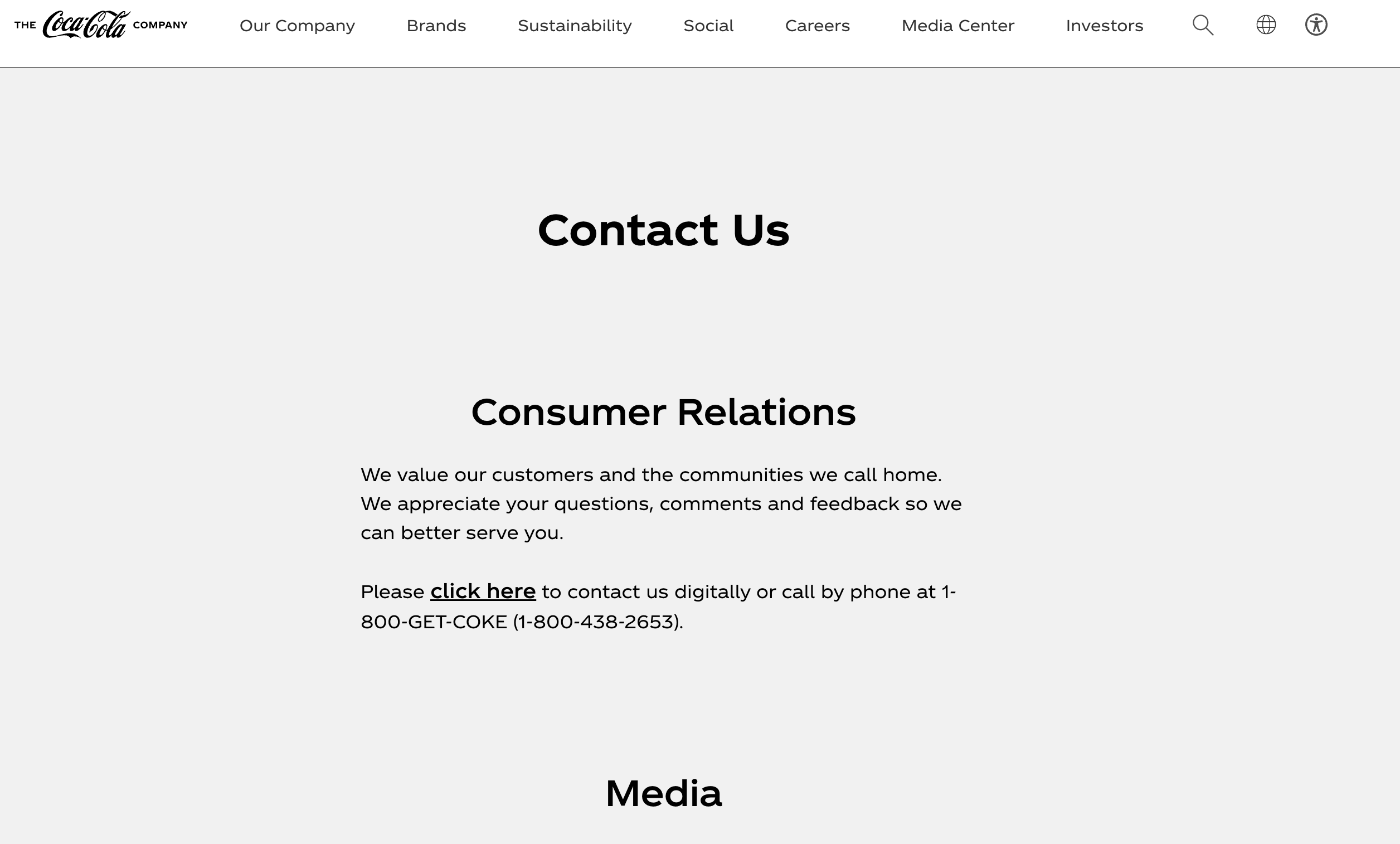
4. Coca-Cola
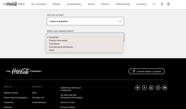
It’s no surprise that a company like Coca-Cola would have a great Contact us page.
As the concept of conversational marketing (live chat and chatbots) continues to grow in popularity, Coca-Cola was sure to include it on their website in a creative way.
The top of the page also has specific contact information and links for different audiences—such as consumers and the media. This helps the page sort the types of contact requests right off the bat.
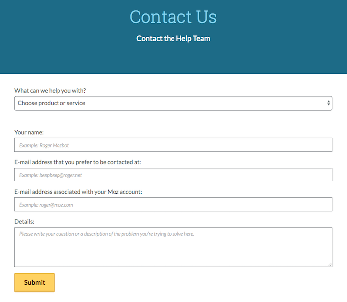
5. Moz
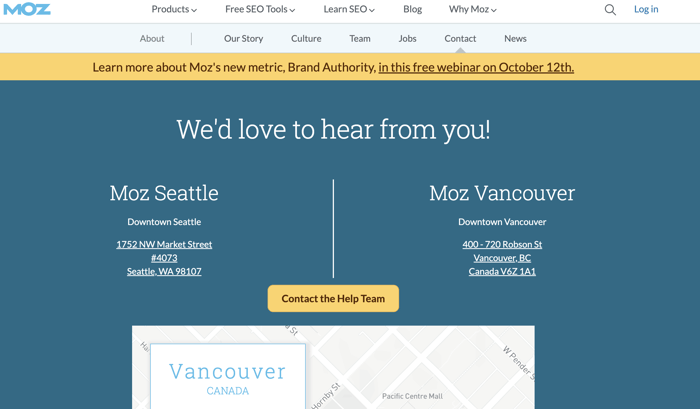
You don’t need a flashy design to have a good about page! Moz keeps it simple and to the point with this simplistic page.
They have their address and a bold yellow CTA that opens up a simple form to contact the Moz help team. Beneath that is a cartoon-like map of their location. Nothing more.
It’s a great contact page example proving that you don’t need to overwhelm your users; rather, a simple CTA allows them to move to the next step when they're ready to reach out.
6. Dialpad (Formerly UberConference)
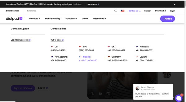
Dialpad is a great virtual conference system that a lot of businesses use to communicate with teams and clients. And when you need to contact them for support, they made it easy to reach them directly and get it!
When you click on their contact option from their main nav, the dropdown immediately gives you a list of phone numbers to call for service and support in different regions. Additionally, a chatbot activates that asks you questions to help better direct your query so you get in touch with the right agent and that they have what they need to know to better help you.
This helps make the overall contact experience more positive and impactful.
7. Burger King
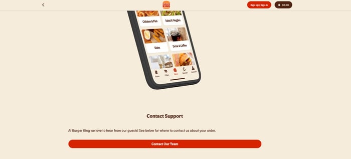
Burger King's' contact us page has a simple layout that focuses strongly on their brand colors and sorts customers by sending them to a chatbot solution once they've clicked on the "Contact Our Team" button:
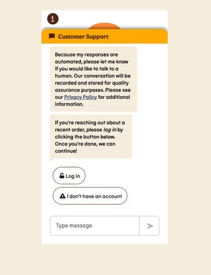
From here, the visitor is guided through a series of questions about their order to help narrow down the specific reason for the visit and to help resolve any issues. In addition to the chatbot option, the BK contact page also has a CTA asking for visitor feedback—which is incentivized with an offer for a free Whopper sandwich if you fill out the survey. This helps the company capture both contact emails and testimonials (as well as criticisms that can be used to improve their stores or services).
8. Achieve3000
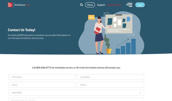
There are probably a variety of individuals visiting your website. Are they looking for sales? Do they need customer support?
Achieve3000 makes it easy for people visiting their site to find what they need with targeted contact options right in their top menu navigation. By segmenting it like this, you can make it easy for everyone to contact the department that is right for them.
The form itself is kept as simple as possible, asking for the bare minimum information needed to facilitate the conversation.
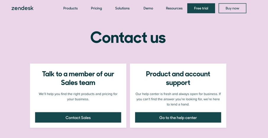
9. Zendesk

Talk about simple.
Zendesk realizes that the people coming to their contact page are looking for a quick way to reach out – enter the three-field contact form.
All they ask for is a work email, a subject (a dropdown option between pricing/sales, billing, marketing/PR, partnerships, or employment), and a quick message referencing your outreach. Click submit, and someone will contact you soon!
If you're looking for product support, there's a quick way to find it – just click the "visit our help center" CTA beneath the contact form to be redirected to Zendesk's help center.
10. Batterii
Another simple design, Batterii really streamlines the contact process.
But here's the best thing:
They also include their contact form right on their homepage!

This is a genius tactic: Offer visitors a way to get connected with a sales rep as soon as they come to their website.
11. Brandaffair
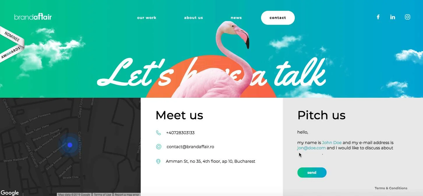
The entire Brandaffair website is amazing... and their contact page doesn't disappoint.
While a simple design makes contacting a business easier and less distracting, some companies opt for a more visual approach that is eye-catching and bold. I think Brandaffair wins!
If you're looking for a phone number, email address, or address, you can find that under the "Meet Us" section. And, if you're looking to pitch a project or reach out to the team, you can submit a fill-in-the-blank form under the "Pitch Us" section. Pretty cool, right?
12. Domo
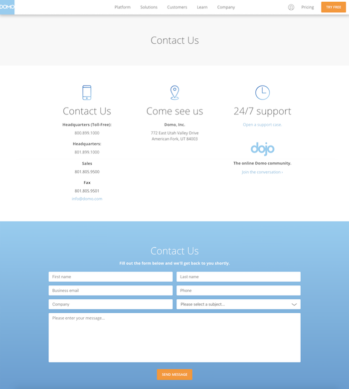
Domo's contact website page is another example that proves that clean design works.
Thin, gradient icons symbolize the various ways to reach out to the team, from phone call to address to 24/7 support. Then as you continue to scroll down, there is an option to fill out a generic form to contact Domo directly with any questions, comments, or concerns.
The design of this page is nothing crazy, but it seems that Domo doesn't want to appear crazy, after all. Their overall website design is just as clean, so the simplistic approach to this page complements their brand well.
13. Yummygum
Sometimes, you have a choice of sticking to the status quo or branching out and being unique to attract visitors. And for Yummygum, a design studio in Amsterdam, they chose the second route.
Their whole website sports an incredibly unique feel that makes it stand out from the rest. The site's special click and transition help create a memorable experience to stick out in the minds of visitors. Once you're on the contact page, you're given a very simple, easy-to-fill-out form that only asks for the minimum required information. It also gives you a direct contact email for a member of their team so you can get a more personal touch right away.
14. Urban Influence
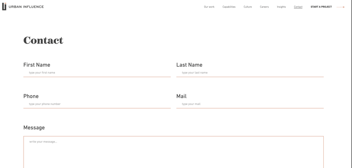
Urban Influence's contact page fits perfectly into the rest of their website design. Module-like color blocks break up the various sections on the page (though the top with the form remains a stark and simple white), making your eyes jump to each to see what's up once you start scrolling.
The form is placed as close to the top of the page as possible. There is no hero on the page to push the contact form down. Instead, specific contact details for different offices (Chicago, Seattle, and Mexico City) are placed below the form. On this page, the form comes first so there's as little distraction from it as possible—helping to get visitors to convert by filling it out.
15. Vidyard
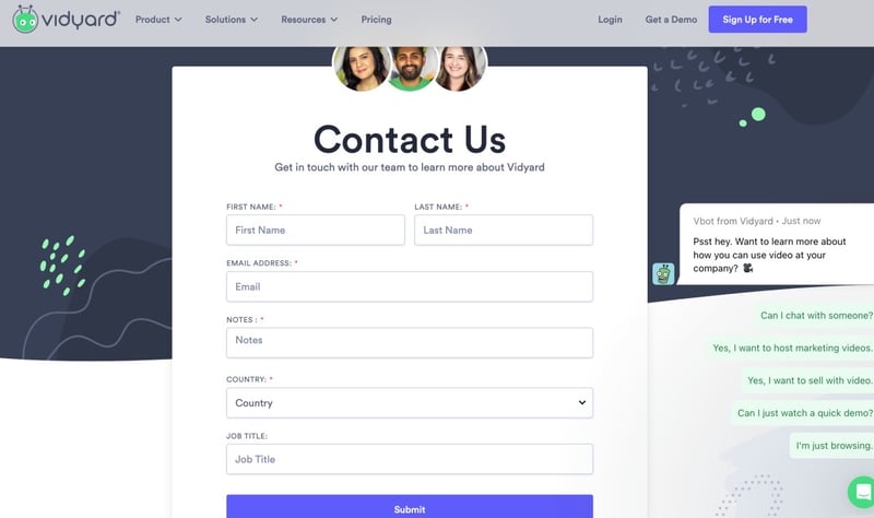
Here's another example that embraces simplicity, but combines it with chatbot features to help guide the conversation before the contact ever meets with a representative. The Vidyard form puts in a quick, upfront request for basic contact information. Then, a chatbot swings in from the right with a bevy of quick responses suitable for different situations.
This page really proves the value of staying up-to-date while keeping things nice and simple.
16. The Middle Finger Project
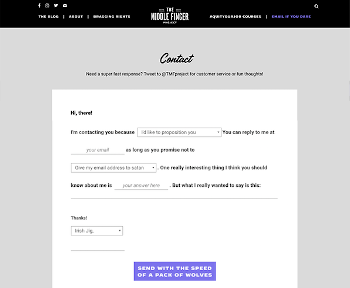
Humor can really go a long way in attracting new visitors and encouraging them to reach out. And that's exactly what The Middle Finger Project does!
Already an intriguing brand name, The Middle Finger Project's contact form is nothing short of entertaining. In a mad-lib-like format, the dropdown options are pretty funny – yet contacting founder Ash Ambirge is still super easy.
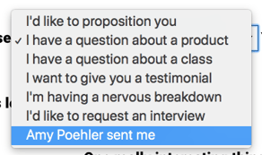
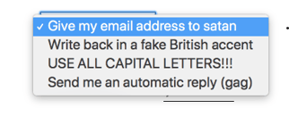
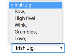
With a few short clicks and a little laugh, you can easily reach out to The Middle Finger Project about products, ideas, testimonials, and more. Once you're done, send with the speed of a pack of wolves.
And, according to the top of their contact page, if you "need a super fast response? Tweet to @TMFproject for customer service or fun thoughts!"
17. Deux Huit Huit

Initially, the contact page on Deux Huit Huit's website is very black and white – a rather simplistic design. The inclusion of a "Let's be friends" section helps visitors sign up to follow the company on all of their social media channels as well — which is a nice touch and helps foster that social channel interaction with their brand. But, as you continue to dive further into the page design, it gets even neater.
When you hover over each button (contact form, phone number, email, Google Maps, etc.) the black-and-white text turns into colored text, and there's even a really cool typewriter effect.
Then, toward the bottom of the page, there's a "Say Hello" section. Click this, and then the real fun starts. (I know it's just a website page, but it's just so cool!)
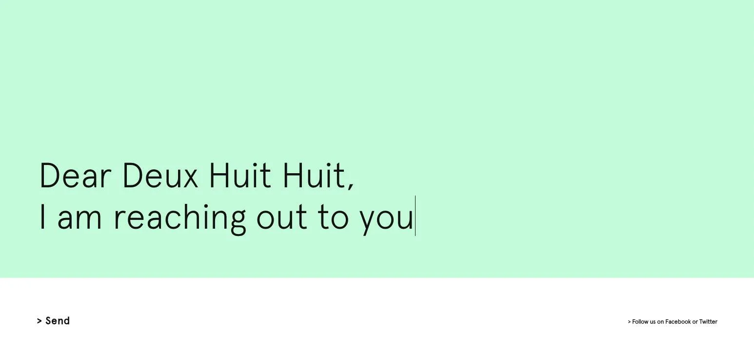
"Say Hello" is their version of a contact form. There's no required fields, no character limit – just a simple message you can send to the team. And, as you type, the background color changes! (It'll make you want to write more just so you can watch in awe.)
Ideally, they still want you to include your name and company (if applicable) so that they have the proper context to your message and can better understand where you're coming from.
Plus, if you don't include an email, you'll receive this quick message, "Hmm ... You did not specify how we could reach you. Do you wish to send the message anyway?" So, be sure to leave one so they can reach back out!
18. HubSpot
It's no surprise that we're big advocates of HubSpot – as as Elite Solutions Partner, we are all aboard the HubSpot train.
But aside from that, we actually adore their entire website design! If you haven't checked it out yet, they use really clean and fun animated graphics as their visuals... loading up a page makes it feel as though I'm stepping into a cartoon.
Yet, their contact page takes a slightly different approach – they show real images of real offices and real people. When you're contacting them, they want you to know who you're contacting.
Initially, under their "Get in touch" header, you have two options: Talk to sales, or contact support. When you click contact support, you are redirected to their support page, where you can search any of your questions and let their technology dig through their knowledgebase to (hopefully) find a valuable answer for you.
Still can't find what you're looking for? Scroll down further for various options to reach out to the HubSpot support team. Whether you submit a ticket, ask the community, tweet at HubSpot, or call, someone is there to help.
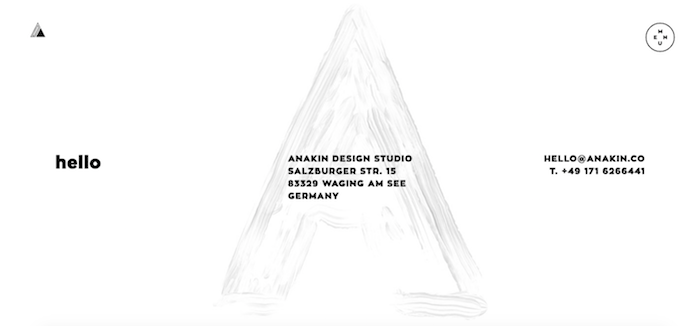
19. Anakin
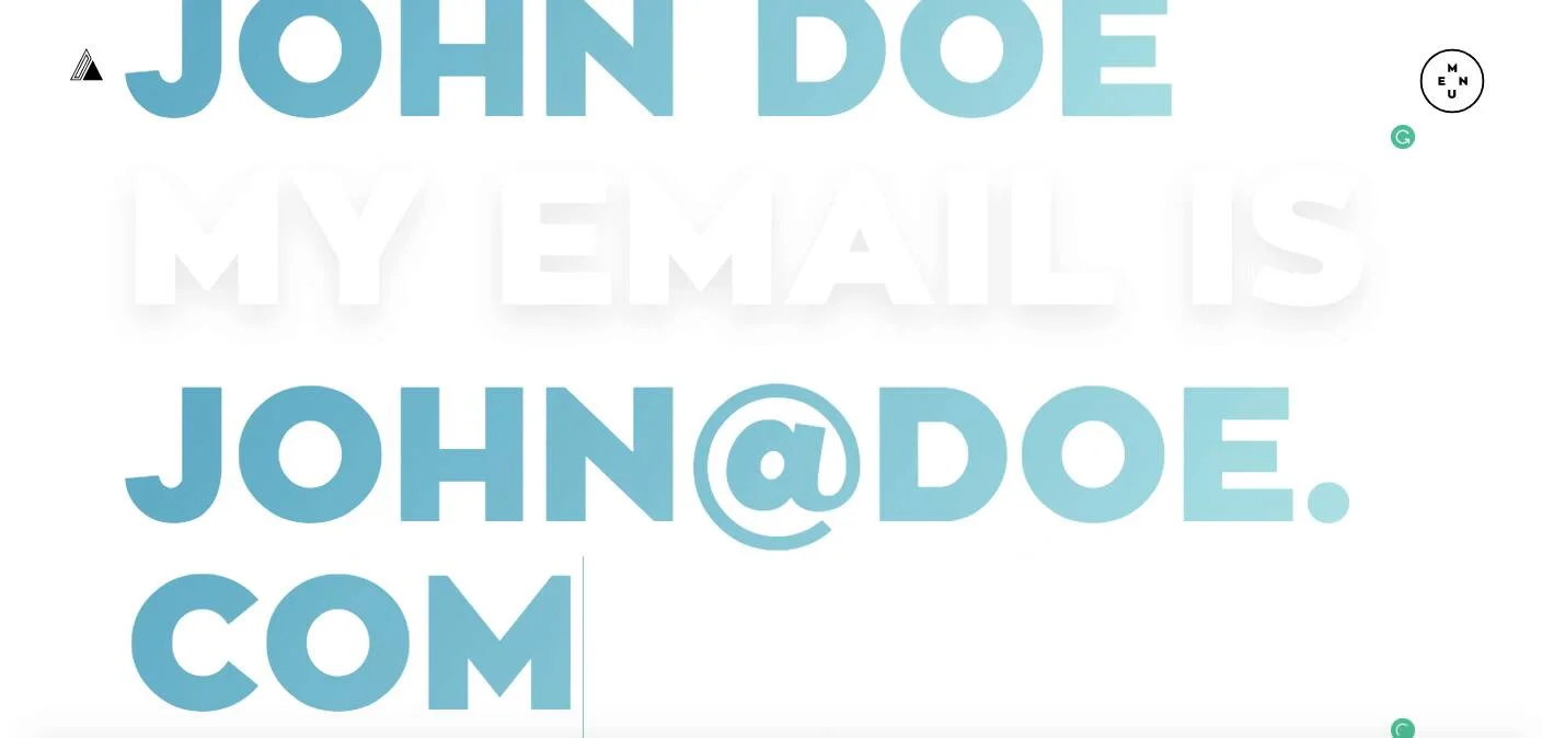
Though a very out-of-the-box design, the result is pretty freakin' cool.
Now, I wouldn't suggest taking this approach on every contact page, it seems to work for Anakin, a design studio in Germany, because their overall design is very loud and bold.
A very straightforward form reads, "I am [name] My email is [email] I send you [words] now." Once you're done filling it out, just click the yellow "now" and your message has sent.
Since their form is so in-your-face, the rest of their contact page is very clean and utilizes a lot of white space. Just a simple hello, address, email, and phone number does the trick.
20. Bluleadz
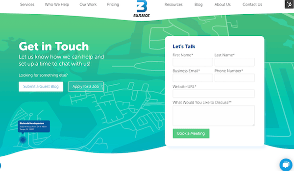
Not that we want to toot our own horn, but we do love our own contact page!
We rebranded our website a few years ago, and the contact page was just one element of that. With our broadened color scheme and new gradient, drop shadow, and wave elements, we went all in on the page to make it look inviting and easy to use.
In the background, we have a map to our office location along with the address, phone number, and email. We also used this opportunity to include CTAs for inquiring about sponsored guest blogs, joining the team, and submitting requests for project work. The plan is to make it easy to learn about these common inquiries that we receive.
When you have an awesome contact us page, get ready to generate more qualified leads. Even better: You can prepare your sales team to have in depth conversations with people who might be ready to become your next happy customer.


.png)
Comments