When people are researching a new place to eat, it’s important for a restaurant’s website to be informative, up to date, and authentic. This is especially true when the industry is disrupted during a global pandemic, where people need to feel comfortable and trust that the business takes public health seriously.
The restaurant industry is all about increasing brand awareness while also providing a sneak peek of what the entire dining experience is like. With an engaging, user friendly website, businesses can make a great first impression and attract the right audience to their brick and mortar location.
This comprehensive guide shows you best practices for website design. It also includes some examples of awesome restaurant website designs to emulate, along with tips for hiring a design agency if you’re unsure where to start.
Restaurant Website Design Ideas and Tips for 2021
Here are some tips to refine your website and keep it contemporary:
Include a Health and Safety Page.
No matter the circumstances, you want to show that you’re aware of what’s going on in the world. For example, during the COVID-19 pandemic in 2020 and 2021, customers want to know that your business is acknowledging the reality of the situation.
They want to see what precautions you’re taking and protocols you’re following to ensure their safety, and the safety of your staff. Informing them of your “new normal” standard procedures means you value their peace of mind.
Highlight Your Takeout Menu and Specials.
Your takeout menu, hours, and any special information should be clearly accessible on your website. The “new normal” in the post-pandemic era involves eating more takeaway food than perhaps ever before.
One way to entice customers into trying your restaurant is to offer a takeaway special — maybe free delivery once a week or half price appetizers when ordered to-go.
Feature a Clearly Defined Reservations Option.
This ties back into the health and safety specs of your restaurant; customers will want to make a reservation without any reservations. As in-person dining opens up in different locations, it’s important to communicate the status of an establishment’s availability.
Plus, the option for making reservations gives customers comfort in knowing that they have a scheduled time to enjoy the dining experience. They don't have to worry about traveling to your location only to be turned away or get stuck waiting for an hour to get a table.
How to Design an Awesome Restaurant Website
These main website design ideas should keep your restaurant’s brand consistent and perfectly serve your customers:
Align Your Web Presence With Your Physical Presence.
If your restaurant has a colorful and vintage appeal, then your website shouldn’t be minimalist black-and-white. Customers might be researching your restaurant to get a feel for what to expect when they arrive, so your digital style should accurately represent your physical presence.
Understand and Appeal to Your Target Audience.
As with any business, it’s important to understand who your target audience is and who your customers might be.
If you’re located near a college campus, you might want to have student discount specials or have grab-and-go meals prepped for easy access for busy students. On the other hand, your dining experience would be different if you were in a business plaza because you would expect professionals and executives to frequent your restaurant.
The main takeaway is to keep your branding consistent and relevant to your audience.
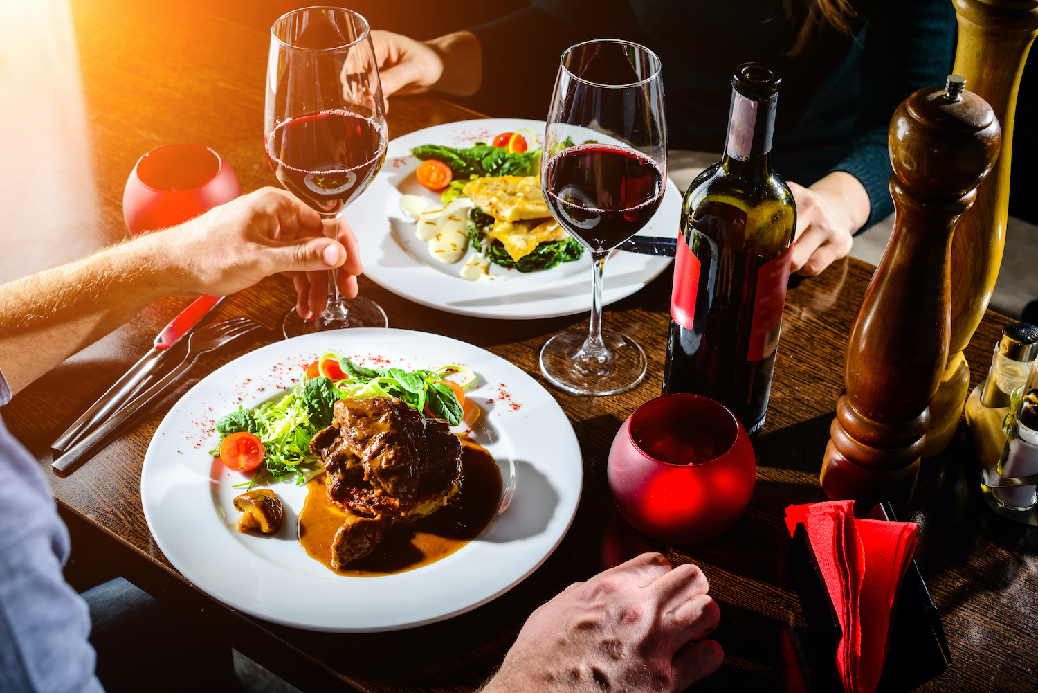
Say "Cheese" With Pictures and Nutritional Information.
Your customers should be hungry when they see pictures of your food! My mouth was watering when researching for this post because pictures communicate a million things in an instant.
In addition to presenting your delicious menu, you might consider adding nutritional information when appropriate. For example, if you offer organic, fresh-pressed juices, it would be helpful to the consumer to know what ingredients and nutrition go into the product.
You probably wouldn’t want to include this information if you have menu items like “Death by Chocolate” or “Endless Ice Cream Sundae Buffet,” however, so use your best judgment if customers would be interested in knowing the finer details.
Share Your Story With a Compelling "About Us" Page.
Perhaps you founded your restaurant after completing your quest to make the best omelette ever, and want to share your findings with the world. Maybe your restaurant is based on family recipes from your South Asian heritage.
Whatever your story may be, customers would appreciate getting to know a little more about you. This adds a human element, which can help you develop trust with your patrons.
Present Easy-to-Find Contact Information.
How much would it cost for catering? What time is happy hour? What road do I take to get to your restaurant?
These are questions customers might have when they just want to speak to a person or get a quote for pricing out a big order. Help them get the info they need fast by providing all the appropriate details.
In the context of local SEO, your phone number, address, and other pertinent contact information should be readily available on your site. Not only does it help your customers get in touch with you, but it also shows search engines where you're located and signals that to searchers who look for great restaurants in their area.
Get Professional Help With Your Restaurant Website Design.
Not everyone is an expert designer or web developer. Fortunately, you don't need to go it alone. Instead of doing hours of research on how to code and settling for something subpar, you can outsource your site design to teams who know how to build you a site that attracts customers to your door.
There are a plethora of reasons to invest in a fantastic website: To establish credibility with potential customers; to provide helpful content that’s readily available; to develop a positive reputation, and many more.
Maybe you’re not sure where to start when designing or redesigning your website, and want to explore working with a design agency. Here are some things to consider when shopping around:
- Have they proven the results our team needs with their other clients? Does their design strategy include mobile optimization, too? Be sure to look for their portfolio, case studies, or reviews.
- Do they describe how they conduct their operations internally and define what resources you get as a client? Try searching for information about their team structure and project management.
- Do they provide transparency in their pricing? You shouldn’t get hit with random, vague fees; instead, you should have a clear outlook and understanding of the cost and its breakdown.
- Do their culture and values align with what you’re looking for?
- How do they execute website optimization best practices? Do they provide website design resources that are educational for you as a business owner? You can learn more about the agency by reading their blog, checking out their content offers, and seeing if they rank high on Google.
- Finally, what’s their client onboarding process?
These initial points of review will help inform your decision about who to hire when designing your website.
10 Examples of Great Restaurant Website Designs for 2021
Let’s look at 10 examples of restaurant websites that are chock full of information and gorgeous pictures to convey the experience a customer will have.
1. Ichicoro Ramen
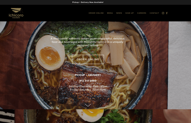
This website features full-screen pictures of its food with simple text information layered over it. The color scheme tracks with the physical appearance of the restaurant, and a pop-up window lets the site visitor know they are operating only with pick-up or delivery options.
Update: Ichicoro Ramen closed permanently in 2023
2. Easy Bistro
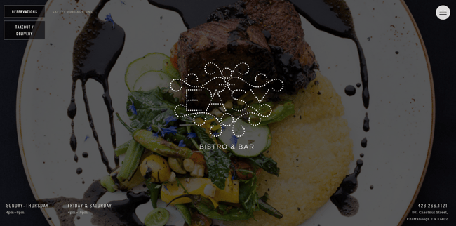
Easy Bistro’s site features a casual scrolling picture on the homepage, plus contact information and restaurant hours at the bottom of the page so the visitor doesn't have to dig for it.
For 2021, they have a pared-down page menu, limited to just reservations, takeout/delivery, and safety precautions, which lets the visitor know what their options are.
3. Quay
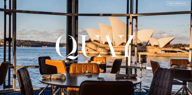
Quay’s website features close-up shots of the food before scrolling down to a menu button and an about me spotlight on the owner and chef Peter Gilmore. The navigation pane offers a wide selection of pages, including Health and Safety, Reservations, Events Planning, and more.
This easy-to-read layout provides all the information one could need!
4. CAU Steakhouse
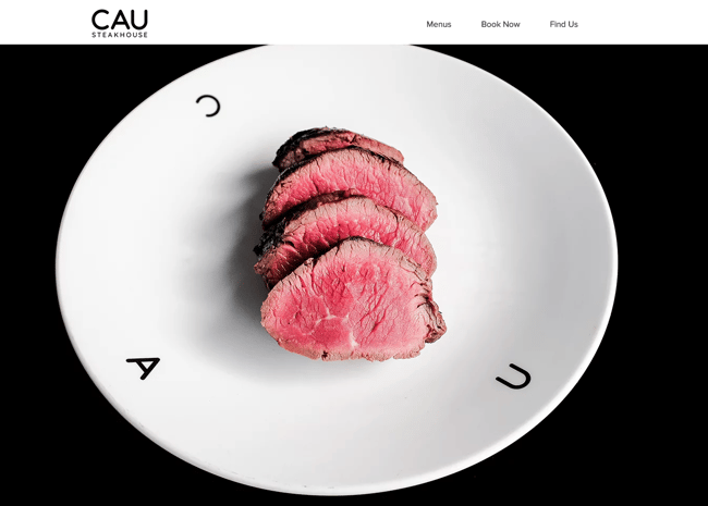
CAU Steakhouse sets the tone on their website of being sleek, high-class, and delicious. Their elegant home page centers on a picture of steak on a logo-inscribed dish.
Visitors can then scroll down to learn a little more about their Argentinian dishes, menu, and contact information.
5. Girl & the Goat
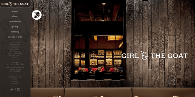
Girl & the Goat switches up the typical restaurant site design by having their sidebar operate as the navigation feature rather than a heading that lists pages.
They use a picture of the restaurant’s interior and even include a gallery page to showcase more images of their interior. Each page demonstrates their commitment to a great guest experience.
6. Back Yard Burgers
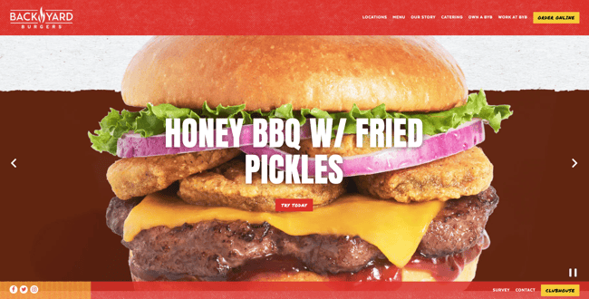
The color red indicates urgency and is frequently used for fast-food eateries.
Back Yard Burgers is one such eatery that offers tasty convenience, and their website gives visitors a thorough overview of how they started by offering great burgers before expanding into several states across the southeast. Plus, they provide info on franchising and a menu of mouthwatering options.
7. Squeeze Juice Works
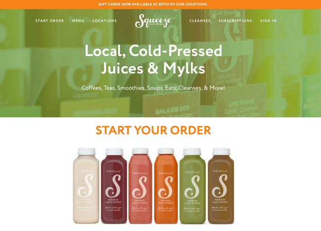
Squeeze is a staple of downtown St. Petersburg, FL dwellers, offering fresh-pressed juices, coffee, and organic food options.
Their website features vibrant colors and readable menu options, and a pop-up tells visitors about a 10 percent discount on new subscription options. Their wide selection includes ingredients information and all the ways your beverage can be customized.
8. Hamburger Mary's
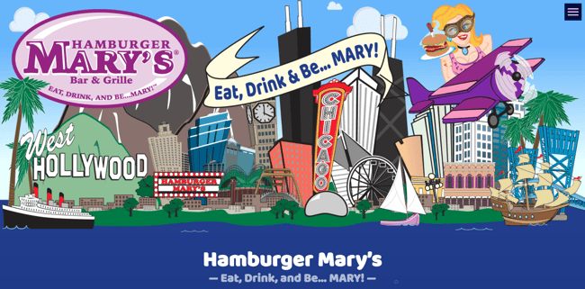
Hamburger Mary’s is a restaurant that provides an entertaining atmosphere in addition to great food — and their website reflects that.
With a tagline like “Eat, Drink, and Be... Mary!” and events such as drag shows and karaoke nights, the website is fun and colorful rather than streamlined and stiff. Since they offer a unique experience, Hamburger Mary’s sells merchandise through their website, too.
9. Bern's Steak House
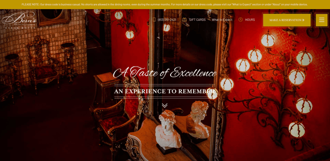
Bern’s Steak House is the epitome of class and elegance in a dining experience, and their website aligns with this experience.
From elaborating on the art of cooking steaks to including a frequently-asked-questions page called What to Expect, their website provides the visitor with all the information they need to enjoy a luxurious experience.
10. McDonald's
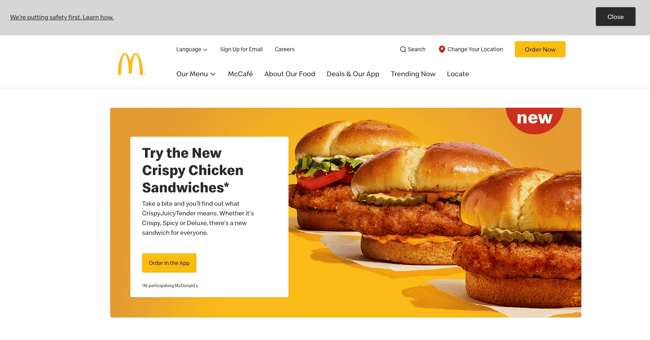
Ok, this is kind of a wildcard here because McDonald’s is so deeply lodged in the American consciousness that you might ask, "Why do they even have a website?"
I found it to be quite an illuminating hub of information on the brand, as it gathers nutritional information, in-app exclusive deals, product transparency information, and more all in one spot. This site is a great example of how to organize and present a variety of news and information without bogging down the interface or overwhelming the visitor.
2 Great Restaurant Website Designs + Tips to Improve Them
Now, let’s take a look at a few restaurant sites that could improve their user experience with a couple of small adjustments:
Giraffe
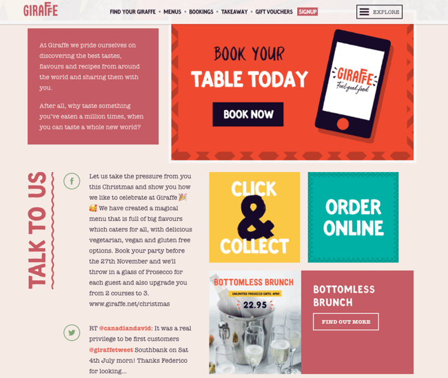
Giraffe’s site is colorful and fun, as I would imagine their dining experience is, too. However, the homepage tries to do too much — some graphics move and blink, while other graphics are crowded a little too close together.
The effect is that it feels cluttered or disorganized. The homepage could be improved by breaking up the content in a more logical way.
Bar Cöde
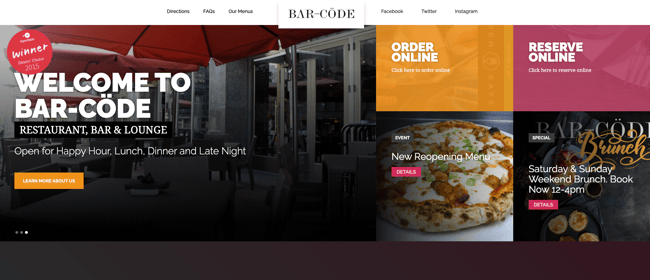
This Washington DC-based restaurant and bar has an interesting website. While the images are beautiful, the user experience can feel disrupted. They present a lot of squares with differing sizes, text in images that rotate and which also have separate text over them, and a general lack of visual coherency.
Try to not overwhelm visitors when they land on your homepage. If you provide too many CTAs and various features like visual sliders, people can feel overwhelmed while trying to find the information they need.
Use This Recipe for Website Design Success
As with any design project, there are a thousand different factors that contribute to a successful and appetizing website for your restaurant. With a few key ingredients and the right amount of spice, your website will be just as delightful as your menu.


.png)
Comments