Your landing page has to accomplish a lot of different tasks. Not only does it need to grab the user's attention, but it must convert into sales if you want your site to be a success. The average B2B company, for example, only has a two percent conversion rate.
It's difficult to know everything you should include or what to cut. Fortunately, there are some truly stellar landing pages out there. Studying the ones that work well allows you to put your own spin on those tactics and create a site that draws users in.
Here are nine great examples:
1. Keep Your Page on Point
It isn't easy to make your case to the consumer about your product or service. Over time, you may even start to add more and more justification for why the user should buy your product.
However, when it comes to creating a landing page that converts, keeping the focus on what you want the site visitor to do is a smart move.

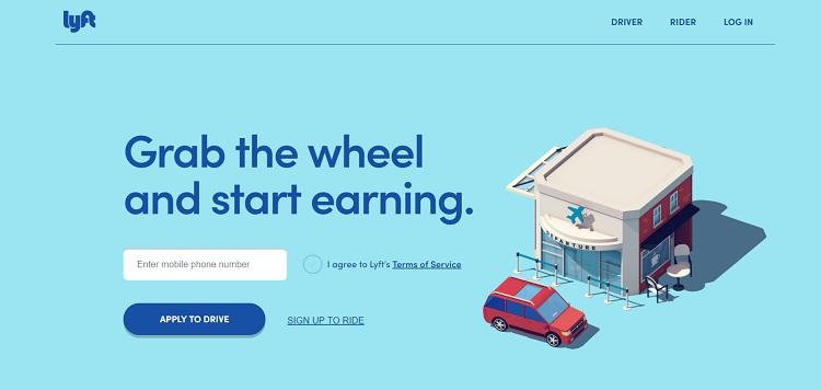
Lyft has a model that requires a high number of drivers to deliver their service. Their landing page reflects the need for qualified drivers. Everything about the landing page focuses on getting people to sign up and drive.
Note the call to action (CTA) of "apply to drive." They show how simple it is to earn money by adding the tagline of "Grab the wheel and start earning."
2. Solve a Problem
Your offer should solve a problem for the reader. Your goal is to make the consumer's life a bit easier. The more concisely you present the solution to their potential problem, the more effective your landing page will be. Everything on your page should have the same focus — solving their problem.
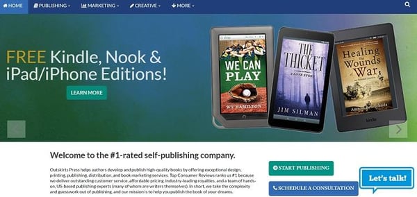
Outskirts Press solves a problem for those wanting to self-publish a book. Note the call to action buttons. One encourages the user to "start publishing," and the other invites you to "schedule a telephone consultation." The site also offers a live chat feature.
3. Add Videos
Adding videos to your landing pages increases conversions by as much as 86 percent. Videos on landing pages can take on a couple of forms. You can add a box to the side that features the product and shows it from all angles or that shows the product in use. You could even add a video as the background for your landing page.
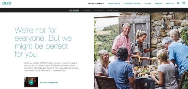
The videos that play in the background on the PURE landing page are highly relevant to the topic presented. Their goal is that their insurance is a smart solution for families with more to protect.
The video playing in the background features a dad holding a baby, a mom and her children, a dad hugging his graduating daughter, a luxury boat and a home with a beautiful setting.
4. Reach Multiple Audiences
What if you have to reach multiple audiences on your landing page? Creative solutions allow you to target more than one persona type with a single landing page, or you can also create multiple landing pages with a focus on each for a particular audience.
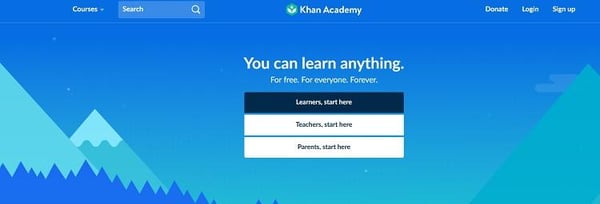
Khan Academy has three very specific potential audience types they must cater to on their home page. Teachers, parents and students all make up their audience.
The way they handle this varied audience is to simply create three CTA buttons that are stacked together. Each button is targeted to a specific audience.
5. Add Reviews or Testimonials
Once you get site visitors on your landing page, the last thing you want is for them to bounce away to another site. Sixty-one percent of people read online reviews before deciding on a purchase. If you want consumers to make a decision and not bounce away from your site, then make it easy by providing some form of review or links to them right on your main page.
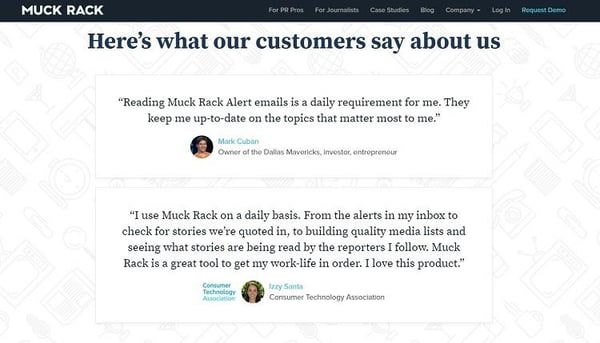
Muck Rack does a good job of incorporating customer reviews without distracting from the main message on their landing page.
The service is geared toward businesses that want to stay up on mentions of them, so the quotes are from well-known business owners, such as Mark Cuban, owner of the Dallas Mavericks and television personality on Shark Tank.
The reviews are there for anyone who wants to read them, but they don't distract from the CTA and information on the page.
6. Take Advantage of Social Proof
Do you have a lot of mentions or followers on social media? Social proof is one way to entice more people to sign up say for a free newsletter. Once users are signed up for your newsletter, you can continue to market to them week after week.
Social proof can be shown in any number of ways. You can add a "follow us" link and state how many people already do, you can add boxes that feature Twitter mentions of your brand or pull out only specific reviews that highlight what you want. Social engagement is still growing, so adding in some social proof entices users who are on social media a lot.
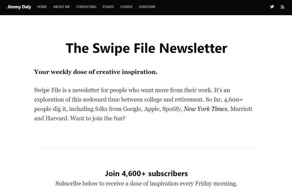
Take a look at how the Jimmy Daly newsletter entices people to subscribe. It encourages you to join 4,600 other subscribers. Note how simple the page layout is.
There is a headline, a simple description of what the newsletter offers and then the info about the other subscribers and a call to action. There is no confusion about what action the user is supposed to take. No other elements are competing for attention on the page.
7. Offer Something Free
A tried-and-true method to get site visitors to convert into leads is offering something free. However, that item must be something with value and that the user really wants. Everyone offers free guides. What is different about yours?
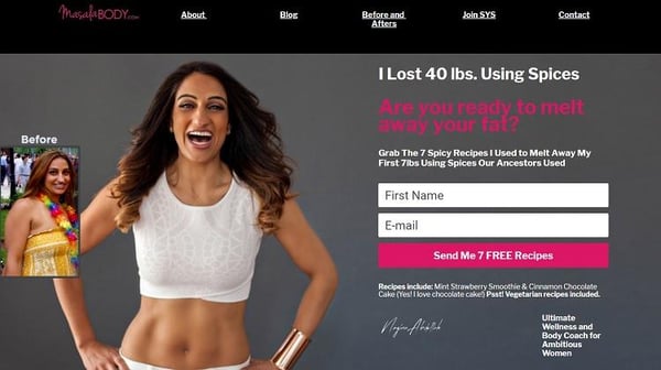
Masala Body does a good job of offering something free. The landing page presents a question about whether you're ready to melt away your fat and then offers to send you seven free recipes that the wellness and body coach used to melt away seven pounds.
The recipes are for spicy food, so the topic is a little different than some of the other sites out there. It grabs the reader's attention in a number of ways.
8. Use Color Strategically
Some colors grab attention more than others, particularly if they present contrast on the page. Add a pop of blue or red for your CTA and conduct A/B testing to see what colors and placement work best.
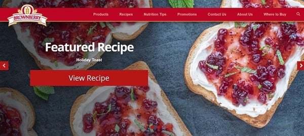
Brownberry is a premium bread, and their landing page has pops of red that draw the eye. Their goal is to get you to check out their recipes, and their landing page points to that from the recipes listed to the invitation to sign up for an email list that also gives you recipes.
9. Refine the Information
Make sure the consumer has the information they need to make an informed decision. If you have anything on the page that isn't needed, go ahead and delete it. 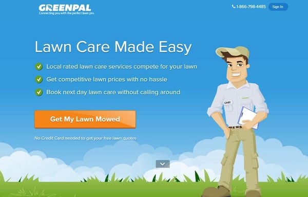
GreenPal serves customers who need their lawns cared for. To make the process as simple as possible, the landing page focuses on getting your lawn mowed and receiving competitive prices from lawn pros in your area.
Speaking to Your Audience
The key to speaking to your audience is knowing what their needs are and how you can most easily fulfill those needs. Once you figure out who your target audience is, it's simply a matter of refining your message to best reach that audience.


.png)
Comments