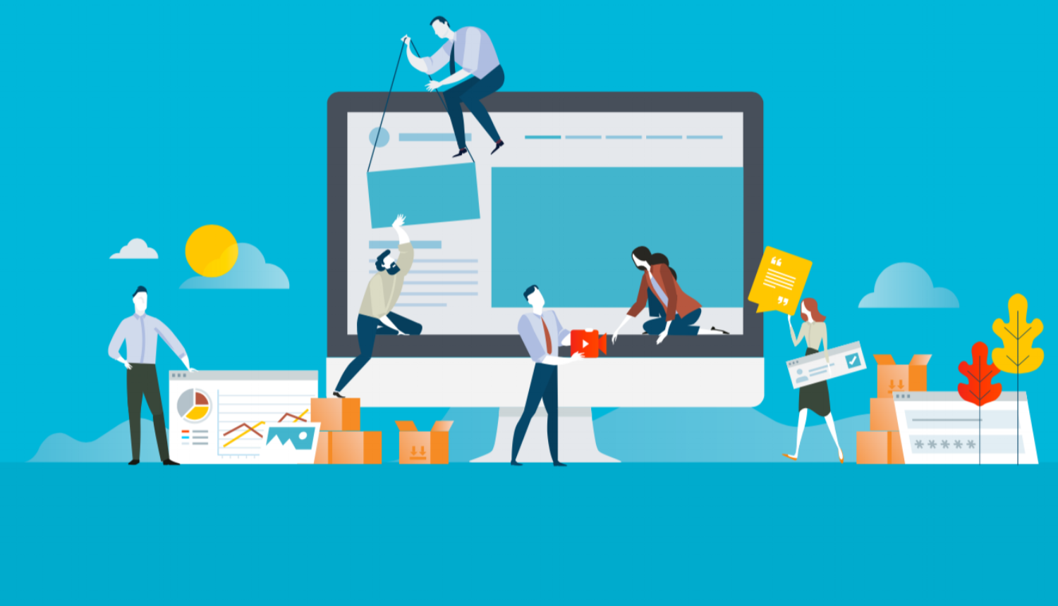
A business blog is a great way to introduce prospects to your company and skill set. In fact, a 2016 study in the UK found that bloggers rank as the third most trustworthy source of information, following friends and family!
Your blog is a perfect vehicle for letting readers know who you are, what you do, and why they should choose to do business with your company.
Creating a blog that has readers falling in love with your products and services is not only about creating informative content; it's also about how that content is presented.
Your blog design not only attracts users and guides them into your site with targeted, relevant, and engaging content, but it needs to have visual appeal and provide users with a unique, easy-to-navigate experience.
Elements to Consider in Blog Design
Not every blog is designed the exact same way. There are various things to consider when designing both your blog homepage and your actual blog article layout.
Imagery
Do you plan on including a featured image for each blog you post? If you are, you'll want to be sure to highlight your images on your homepage and probably include them as a hero image on the article page.
Grid Layout
How many articles do you want to put on each row of your homepage? Even more, do you want to keep it simple with a grid view or go out of the box and do something completely different?
Preview Text
Do you wish to feature a snippet or description of each article or just include the title of each article? While preview text can help add context to an article, it can also fill more space and make design a little trickier.
Centering
Will you center your content on a blog page, or will you offset your body text to make room for sidebar content? Speaking of sidebars...
Sidebar Elements
What do you want to put on your sidebar? Latest posts, popular posts, author bio, CTAs, offers? The options are endless, but you'll want to establish this before you start designing so you know what to expect to place there.
Social Share Buttons
Will you include social share buttons on your homepage or on each blog page? Will your social share buttons be static as you scroll, or would you rather place them at the very end of the article?
Subscribe Button
Do you want to offer visitors a quick and easy way to subscribe to your blog? Consider putting this at least on your blog homepage for easy access. If you just place it at your footer, not many visitors will see it.
The 15 Best Blog Designs and Layouts
When it comes to blog design, a great way to learn what works is to check out other successful business blogs online. Here are 15 gorgeous blog examples to get you started.
1. Adobe
Adobe's Blog Homepage
What we love about it: Adobe obviously has some of the best creativity and design around. The white background of their blog allows for the colors in their blog photos to stand out beautifully – speaking of colors, the palette they use is stunning. They utilized moving visuals throughout the blog homepage which really attracts the eye, and everything is organized in a clean way.
Benefits: Utilizing this layout would create a super clean design for your blogs; There is a simple text hierarchy that is easy to identify but not distracting; Easy share and bookmark capabilities can entice a reader to do just that.
Limitations: This layout might not be your best bet if you use photos or images that aren't super engaging or visually appealing. Plus, your preview text field in this layout is super short.
Adobe's Blog Post Layout
Adobe utilizes white space beautifully on their blog pages. The featured images fills the screen, then one column keeps all the content and imagery within the body of the text clean and simple.
The tab at the bottom of your screen allows you to see your progress as you read through the article, and it even gives you an easy way to read the previous or next article they published.
2. Help Scout
Help Scout's Blog Homepage
What we love about this design: Help Scout's blog features a minimalist design with negative space, making it easy to focus on the content. They include images for every post, and the front page features a banner highlighting a recent or popular entry.
This design screams “clean” and “readable.” What do we mean by readability? Basically, think legibility and digestibility.
Benefits: This blog design creates a cohesive page and clean layout; The featured post is more noticeable and can attract more attention; The overall design highlights the post categories in a simple way.
Limitations: It might not look as clean if photos aren't cohesive or follow the same color palette; If titles are ambiguous, not having a text preview field might make it hard for the reader to know what the post about.
Help Scout's Blog Post Layout
Another fan of white space, Help Scout doesn't clutter their sidebars with busy text or imagery. Rather, the focus is all on the content. (They do have static social share buttons, however, which allows visitors easy access to share their content on their channels.)
A simple black and white color scheme is easy to read, yet their articles could use some more imagery or visuals to break up large chunks of text. It does look a bit wordy, which might turn some people away.
3. Wistia
Wistia's Blog Homepage
What we love about this design: Wistia's blog uses clean fonts and headings, which puts the focus on the content. A well-designed "latest" column structures their recent posts in a cool calendar-like timeline, displaying the publish date vertically to the left of the title and author.
Their design streamlines the user experience, targets the right content, and makes navigation easy to understand.
Benefits: Plenty of white space makes for a clean design and easy organization; This design doesn't show too much content on one page, utilizing "See all in..." buttons for each category; If designed to match the blog aesthetic, including content offers throughout the blog homepage doesn't seem intrusive.
Limitations: If you don't post often, it will show in the "latest" column; Only the first article in each category includes a text preview; There is no search bar feature to help readers find what they're looking for quicker.
Wistia's Blog Post Layout
Can you tell we love these simple one-column layouts? Like Adobe and Help Scout, Wistia centers their articles nicely. Additionally, the images placed throughout the article do a great job of separating their text and encouraging an easier read.
Additionally, we are also a big fan of how they add colorful boxes to their notes and tips. With a simple pop of color, it entices you to read what they have to say. Smart move, Wistia!
4. Beyond
Beyond's Blog Homepage
What we love about this design: The blog for Beyond is super clean and organized, showcasing a four column grid. The four tabs on the top right allow readers to sort articles by theme, which is essential for readers to find exactly what they're looking for without scrolling forever.
Bonus cool points: When you select a specific theme, the tiles shuffle in a fun, dynamic way that delivers a beautiful user experience.
Benefits: The preview text includes five short lines so readers can read a quick snippet about each blog post; The columns appear orderly and organized, and when you hover over a blog image thumbnail, the image gets a little bigger and the preview text box highlights in orange to show readers what selection they can click on.
Limitations: Lacking a search bar might force viewers to scroll excessively through each theme filter; The boxes are narrow, so even shorter titles appear to take up too many rows of text and feel crowded.
Beyond's Blog Post Layout
Colored, capitalized headers stand out among the article, which easily grabs your attention and encourages you to keep reading.
The design of this blog is simple and clean, but could probably be improved with a larger featured image to grab more attention. The title of the article sits far above it, which looks a little fragmented and out of focus.
5. Microsoft Stories
Microsoft Stories' Blog Homepage
What we love about this design: This “microsite” is an example of a great way to revitalize an old-school brand using beautiful, interactive content. The square layout mimics their logo, providing a subliminal brand identifier.
By simply hovering over an article, there is movement, whether it is a zoom in on the photo or a simple background color change. Microsoft Stories is a perfect example of how your business blog can humanize your brand. Blog design can not only disseminate information; it can also aesthetically communicate your brand message.
Benefits: This design is less text heavy, allowing you to get to the point quicker; The overall layout features a lot of breathing room for a cleaner design and viewer experience.
Limitations: Due to its equally proportioned layout, featured photos must be horizontally oriented. The featured photo is also very thin, so it can be hard to find a photo that fits the action within the respective dimensions.
Microsoft Stories' Blog Post Layout
Microsoft doesn't play it safe. In fact, they go way out of the box with their blog design!
Take a look at the blog above, for example. Notice anything different from the past articles we've talked about? A black background is definitely a bold choice. But, don't worry, not every blog features a black background. Each blog features its own unique design and imagery, yet all together they still are cohesive in design and aesthetic.
We really like their use of images and video throughout. Smaller circle images add a little something different to the design, while their larger images and videos fill the screen, making you stop and admire the amazing photography.
6. Urban Influence
Urban Influence's Blog Homepage
What we love about this design: Urban Influence's blog is another great example of simplicity. Similar to Beyond's blog, this one breaks the layout into columns. In this case, the three columns and grid paneling create a beautiful symmetry throughout the blog homepage. Also, the reader can filter through themes by selecting them on the top left.
Bonus cool points: When you hover over a blog post, the photo develops a sepia filter, showcasing a really awesome visual effect to the reader.
Benefits: For the OCD type, this clean, orderly grid layout is a dream; the boxes appear to provide plenty of room for longer preview text.
Limitations: A common theme in these newly popular, simplistic layouts - no search bar; Depending on your preference, the symmetrical grid might feel too ordered and dull; When you hover over an article, the image and title text faintly change to a light brown, which can be easily missed.
Urban Influence's Blog Post Layout
A full-screen featured image fills your screen the minute you load an article. With the title overlaid, you're immediately drawn in.
But, what we really like about Urban Influence's blog layout is how they use images with text to kick off a new section. For example, one of the images shows the difference between a controlled environment and no-man's land, which then segues into a section comparing the two.
7. Adventure.com
Adventure.com's Blog Homepage
What we love about this design: A bold title and full-width photo immediately grabs your attention upon loading Adventure.com. They use colorful photos to serve as its own creative color palette, leaving the rest simple and neutral. Posts on the homepage have a shadow effect, adding a 3D feeling to the page. When scrolling down, the two-column grid is interjected by another full-width photo and title, drawing you into its superb photography.
Benefits: Choosing this design keeps colors to a minimum, allowing your photography to do the attention-grabbing; A simplified layout makes posts easy to read, and, if applicable, choosing a limited number of categories could mean that more content can be discovered by interested readers.
Limitations: Without text preview for each article, a reader would have to click on the article to learn what is about (could be good and bad, if its not what they were hoping to find); Because content doesn't keep appearing as you scroll further down the site, readers would have to select a category topic at the top to view more related articles.
Adventure.com's Blog Post Layout
We love Adventure.com's blog homepage so much, and we have to say we aren't disappointed in their article layout either.
What's interesting about this layout is that it breaks that traditional column look. The body text area is rather narrow, while the images exceed past that to fill the screen more and really capture your eye.
Their pull quote design is also simple but bold – a simple red line and bolded text fits within the body text dimensions but still manages to stand out and break up the text.
8. Design Milk
Design Milk's Blog Homepage
What we love about this design: Design Milk uses a simple layout to highlight posts. The categories panel remains visible even when you scroll or a post is opened. It's well organized thanks to the black bars with subheaders for different types of articles, like "latest," "featured columns," and "popular articles."
Benefits: You'd have the ability to display multiple featured articles in a moving carousel; Easy-to-find category tabs stay on the page with every scroll you make; A neutral color palette creates a simple design aesthetic; The top right section is a great place for an email subscription CTA.
Limitations: Dull photography would drag down neutral colors; The slider on the top left can make your readers feel impatient as they wait for the next option to appear; The panels mixed with the black bar subheader sections can feel busy and overstimulating for some readers.
Design Milk's Blog Post Layout
Design Milk really does have a magazine vibe to it, doesn't it?
Initially, you see the featured image to the left and the featured image below it, while the right sidebar features all their popular posts.
It might be a big cluttered in the beginning, but luckily the right sidebar does eventually end. A lot of Design Milk's articles are photo-heavy, so they are smart to utilize their featured image as a clickable photo gallery where you can check out all the images in the post. Something like this would be great for companies who use a lot of product photos in their content!
9. Fubiz
Fubiz's Blog Homepage
What we love about this design: This art and design blog is really sleek and features some cool personalization features. At the top, you can slide-scroll through highlighted posts. Below that is a "Creativity Finder" search box where visitors can choose a persona like “art lover” or "student" along with where they are from and the type of content they're seeking. The site then presents content based on their choices. A pretty cool way to increase conversions and meet readers' needs!
Benefits: It's an eye-catching blog design that keeps readers scrolling; Including something similar to the Creativity Finder would be a unique way to share personalized content choices for readers.
Limitations: Though eye-catching, this design lacks preview text space; A design-heavy layout is not best suited for all industries; The minimal white space can make your content feel crowded and clustered.
Fubiz's Blog Post Layout
Fubiz's article layout is slightly similar to Design Milk's, as they both incorporate popular articles in the sidebar. But, what stands out more in Fubiz's design is their article title and featured image.
When you click on an article, the first thing you can see is a large, bold title with the feature image behind it. This reassures you that you clicked on the right article!
Fubiz's content is also photo-heavy, so having a lot of white space on either side of their articles allows you to focus solely on the imagery.
10. InVision
InVision's Blog Homepage
What we love about this design: InVision's blog uses several different design elements that all work really well together. Descriptive titles work well with the post slider. Below the slider are three columns with short one-line descriptions. An excellent use of white space allows posts to “float,” helping the user focus on finding the information they care about.
Benefits: A grid design maintains a consistent layout with gutters that guide your eyes down the screen; A subtle blog subscription CTA on the bottom doesn't disrupt the reader's experience.
Limitations: While there are plenty of categories available, the design is missing a category list to view all the options; Having a full-screen featured article requires high-quality photography, which could be hard for businesses with lack of resources to attain; the overall design requires a lot of scrolling to dig deeper to find older posts.
InVision's Blog Post Layout
While there is no color in their design (besides the images), InVision's blog post layout is still pretty great.
One of our favorite parts is the pull quotes that you can actually click on to tweet out! It's simple yet makes a statement – which can help boost brand awareness in the long run!
If you don't want to tweet the pull quotes, you can always click on one of the social share buttons on the left. Add a description and share straight from the article page.
11. DigitalMarketer
DigitalMarketer's Blog Homepage
What we love about this design: Another site similar in design to InVision is DigitalMarketer. Right from the start, DigitalMarketer's blog page features a stunning, cohesive blue color palette. DigitalMarketer highlights featured posts in the first section and then lists each post in a single, scrolling column below, keeping the reader's eye on one blog at a time and drawing them deeper into the page.
Benefits: This would be a great layout to display featured content and popular posts first; Incorporating Facebook, LinkedIn, and Twitter share buttons next to each articles removes unnecessary steps when sharing content online; Feature images that follow a similar aesthetic adds cohesiveness to your blog.
Limitations: Wasted space is apparent on the right column underneath "popular posts" when you continue to scroll further down the page; This design is more text-heavy, so your images won't stand out and engage readers as much as they could.
DigitalMarketer's Blog Post Layout
Unlike other blog layouts we've looked at, DigitalMarketer offsets their article to the left, allowing for more white space on the right side (which is initially filled with popular posts at the top).
Their design is simple, with larger headline breaking up the sections of their article and images scattered throughout. Their small pull quotes are designed within their body text, signaled with a thin green vertical line. It stands out yet still allows for a clean body.
12. WebDesigner Depot
WebDesigner Depot's Blog Homepage
What we love about this design: With a name like WebDesigner Depot, you'd expect a killer blog! This visually appealing site incorporates a multiple module layout highlighted by their three main colors: white, black, and golden yellow.
Some elements move when hovered over, such as articles getting larger and popular posts and freebies shifting left and right. The colors, fonts, and background are used consistently to make the site professional-looking and easy to read.
Benefits: Multiple-module layouts feel unique; There are plenty of areas to promote popular posts, including the right sidebar.
Limitations: Without ads or sidebar CTAs, you could potentially waste a lot of space on the right side of this layout; The list of tags and themes at the footer underneath the email subscribe CTA can feel overcrowded and busy.
WebDesigner Depot's Blog Post Layout
The design of their title and featured image is strong and fits right into their design aesthetic on their blog homepage. It makes a statement right away.
As you scroll through, you can easily spot hyperlinks, as they are signified by a thick blue line. When you hover over them, the line turns yellow – a simple effect that makes a big impact!
I will say their articles could use a bit more imagery, as the article above has zero images in it. As you read the article, you anticipate some sort of image but are never greeted with one.
13. Brit & Co.
Brit & Co.'s Blog Homepage
What we love about this design: Brit & Co's page is clean, warm, and welcoming. Free of clutter, the content is digestible and the layout is organized and readable. Each category is designed into its own column featuring the four most recent articles. Every other category has a patterned background, and featured photos are cropped into a square. When hovered, titles become highlighted, attracting a reader to click and read further.
Benefits: Your subscribe button will be spotted quicker if placed it at the top of the page; similarly, the search bar is also easy to find on the top right so readers can search keywords and find what content they want in a speedy manner.
Limitations: Photos in this layout could only be square; Because there is no text preview, each blog title must be very specific and tell the gist of the article in only a few words; Most recent articles are located at the very bottom, so they may not receive as many impressions.
Brit & Co.'s Blog Post Layout
Brit & Co. does an excellent job of using large product images in a lot of their articles. The white backgrounds of the images let the products themselves stand out and keep the overall design really clean.
Their hyperlink design looks like they ran a highlighter over the type, which has a really unique effect to it. You don't see that too often!
14. The Londoner
The Londoner's Blog Homepage
What we love about this design: This blog uses stunning images displayed in a grid layout, similar to that of a Tumblr page. Hover over an image and you're given the title and link to the corresponding blog post. It allows for a minimalist, interactive page, while still providing the information you're looking for.
Benefits: A design that is mage-centric creates more visual appeal; Unlike other layouts, this design accepts a featured photo with any photo orientation and dimension; A simple CTA helps break up the photo grid; The categories tab follows with each scroll.
Limitations: Only images are seen off the bat, so photos must be strong and entice readers to want to learn more; As seen with these other blog design limitations, this design lacks preview text, which could force readers away from your page with little information learned.
The Londoner's Blog Page Layout
This type of layout is common for a lot of bloggers – and it seems to work for The Londoner.
In this particular article, I applaud their creative image with numbered products. It really gives off a typical magazine feel (you'd be lying if you said you haven't seen a spread like that in a magazine).
Also, while I'm not always a fan of a sidebar because it can create clutter, I really like the sidebar on the Londoner's article pages. It's a great way to show off her Instagram pictures and engage more with her audience. And it could work for the right business too!
15. Evernote
Evernote's Blog Homepage
What we love about this design: Color, color, color! Evernote's blog homepage knows how to utilize their color scheme perfectly. Custom imagery looks spectacular, eye-catching, and neat on their blog page.
Benefits: An alternating view of two and three articles breaks the traditional grid look, which can help you highlight more popular articles. Custom feature images gives you full creative freedom to design engaging work to draw the reader in.
Limitations: Custom imagery takes a lot of time and would require a lot of attention from your design team; The titles are slightly overshadowed by the featured images, which could confuse readers about what each article is actually about; No subscribe button in sight, so might not get many subscribers.
Evernote's Blog Post Layout
Evernote knows how to be consistent. Their color scheme flows perfectly into their individual article layout, with a featured image filling the top of the screen. Because many of Evernote's articles are short and sweet, they can most likely get away with not including images within their body.
If you're looking for a quick share option, Evernote provides it for you on the left side (and at the end of the article just in case you forgot!).
These blog examples offer a good selection of design elements that can make your blog more readable, attractive, and easier to navigate. Offering a clean visual look along with killer content and a flexible design is the best way to increase your readership.
Quick Tips For a Better Blog Homepage Design
Stick to Your Color Scheme.
Your brand colors should resonate throughout your entire website – and that includes your blog!
Opt for a few (not all) of your brand colors to use as an element of your blog homepage. They can be subtle or more prominent, that's up to you – just make sure your overall design remains cohesive with the rest of your website.
Consider How Many Times You Post Per Week.
This is a big consideration if your business posts a lot of content on your blog each week. Your post frequency should affect how many articles you choose to include on each row of your blog homepage.
Why does this matter?
If you choose a super clean, one-post-per-row design and post three times a day, your visitors would have to scroll forever to check out your content. But, if you created a four-blog row, it would be a lot easier to skim through your content and find what interests them.
Treat White Space Kindly.
We've said it before and we'll continue to say it – white space is your friend.
No matter how you choose to design your blog, you should have some sort of white space present to allow your visitors' eyes to breathe a little. Nice, clean grids with white space in between each blog listing is a common way to incorporate white space into your design.
Use a Light Background and Dark Text.
Now, I know we showed you Microsoft's bold blog design with a black background and white text, but it doesn't always work out.
Your best best is to keep your design simple with a light white background and a darker text. Your text doesn't have to be pure black, though. Many businesses opt for a more gray black so the contrast isn't too much on the eye.
Where to Look For Blog Design Inspiration
Everyone needs a little inspiration now and again. And, if you're looking to get a better idea for your blog design, there's a few ways to do so.
Check Out Websites You Like.
Obviously, we listed 15 of our favorite website blogs, but there are tons and tons of other great blog designs that might spark a new idea for your own.
Also, don't just limit yourself to blogs. Analyze any website page you find interesting – just because it's not a blog, doesn't mean you can't find a really cool design aspect to include on your blog!
Look at WordPress and Squarespace Templates.
Even if you aren't on WordPress or Squarespace, these platforms offer tons of free and premium blog templates that you can skim through to find inspiration for your blog.
As you look at various templates online, take screenshots and jot down notes of things you like – this will help you narrow down what you like and don't like.
Skim Through Awwwards.
This website is full of award-winning websites and designs from all over the world – so it's bound to spark some creative ideas for your company!
Scroll through their page of the best website examples of magazine and blog design. This page is always updating with fresh, new websites that feature out-of-the-box design work.
Get Designing (Then Blogging!)
With all the inspiration available to you, your business blog can look just as kickass as the rest of them.
Just remember not to be a copycat. Grab bits and pieces of things you like from various websites and find a way to incorporate them into your own design in a different way.
That way, no one will have a blog like yours! With the design ready to rock and roll, you'll be able to focus on writing awesome blog content to start filling your blog listing pages.


.png)
Comments