The Best 404 Page Examples
- 1. Amazon
- 2. Marvel
- 3. Pixar
- 4. Freeform
- 5. Bitly
- 6. Huda Beauty
- 7. The Australian
- 8. Codecademy
- 9. Eastern Market
- 10. The Useless Web Index
- 11. Penguin Random House
- 12. IMDb
- 13. Falvey Memorial Library
- 14. Emirates
- 15. Lonely Planet
- 16. Bluleadz
- 17. 20th Century Studios
- 18. Disney
- 19. Fox
- 20. HelpScout
You've spent hours creating your website, developing content, and building your brand, only to overlook your 404 page. It's easy to rely on the generic code your host provider offers, but the real question is, should you?
Creating a custom 404 page is easy, and a great way to continue your brand development. A creative, fun, or informative 404 page can make even a broken link, or missing page, fun for visitors.
It can make light of an unfortunate situation, redirect visitors to similar valuable content, or even add an amusing brand message to what would normally be a disappointment for your visitors.
What Is a 404 Page?
A 404 page, otherwise known as a "Page Not Found Page" or "error page," is a a domain page a user reaches when the web address or URL doesn't provide the right information to route the user to the proper page.
To help you better understand a 404 page, let's break down the components of a URL or Uniform Resource Locator. A URL is made up of:
- A protocol
- A domain name
- A path
For instance, take into consideration our blog URL: https://www.bluleadz.com/blog. The protocol is https://, the domain is bluleadz.com, and /blog is the path.
The 404 page appears when users accidentally type in something like https://www.bluleadz.com/bling. The domain is correct, but the path /bling leads nowhere.
The HTML code response for this is 404, which also helps you to uncover any broken links on your site. For example, let's say you have products listed on your site, and each has its own unique path.
So your URL would be https://www.pretendbiz.com/products/shirt-1, with a link to this product on the main page. If you decide to remove this product but you forget to remove the link, the user will be rerouted to a 404 page that lets them know the page cannot be found.
6 Essential Components of Cool 404 Pages
Let's look at a summary of some of the most essential components of 404 pages to help you develop your own error page.
Humor
When a user clicks on a broken link or makes a mistake when typing in the URL, it can be pretty frustrating. However, making a funny or appealing 404 page can help to lighten the mood.
This ensures that you provide your customers with a good experience on your website, even when something appears to "go wrong."
A Clear Brand Theme
Even though the 404 page isn't an essential page on your website, it is still a part of your website. This means it needs to align with your brand, and it even gives you a chance to showcase your brand a bit more.
This helps you make an opportunity out of a problem. In addition to having your logo in the corner of the page, you should also include brand colors and brand imaging to add a little pizzazz.
Use of Graphics
Blank pages are boring and lackluster. Give your users something exciting and fun to look at. An appealing graphic can remind them why they still want to click a link to continue searching for what they need.
A good practice to adopt is to make your graphic relate to your copy in some meaningful way.
Links to Other Popular Pages
To avoid losing traffic, add internal links on your 404 page, which helps your users find what they need. Do some guesswork and select links to popular pages that you think will help your user.
Text That Guides Users to The Right Place
Essentially you need a warning message, and you need to provide them with an action to take that helps reroute them.
Don't be afraid to put your own spin on the text instead of using the standard line, "You've reached the wrong page" or "Page not found."
Header and Footer Links
Providing users with the same navigation menus that they can find on other pages gives them an excellent user experience. They are more likely to know which link to click in the navigation menu because they are probably already familiar with it.
This means they will be less likely to bounce from your website.
The 20 Best 404 Page Examples
Need some more inspiration to make a wonderful 404 page? Take a look at these examples from real-life companies.
1. Amazon
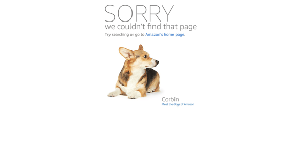
Amazon has a lot of balls in the air at any one time. Their error page is one area that they never need to worry about. It's outstanding! It's part recruiting tool, part brand identifier, and a lot of fun!
When you land on their 404 page you're treated to images and copy on the many dogs who hang out at the company's offices. From there you can click into bios of the pooches, and reach further down to real stories of their employee owners talking about what a great company Amazon is to work for.
2. Marvel
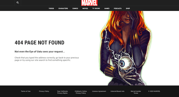
Marvel literally features an eye-catching image on their 404 page. They make use of one of their characters and the Eye of Uatu to add humor to their page by stating that even it couldn't "see your request."
The other great thing about this 404 page is that they have a top and bottom menu so users can easily navigate to other pages to find what they are looking for.
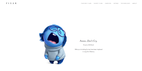
3. Pixar
Pixar's 404 page features Sadness from 2015's Inside Out along with the message “Awww...Don't Cry, It's just a 404 error.”
Pretty simple and straight forward and it does the job. It also is a visual brand identifier for Pixar that's really cute!
4. Freeform
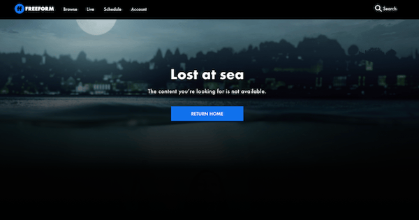
Freeform's 404 page is representative of one of Freeform's popular shows, Siren. Their graphic of the bay at night is eye-catching, and their copy is simple and clever.
They also have a clear CTA that takes visitors right back to the homepage.
5. Bitly
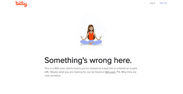
Bitly's error page offers a zen picture of a woman in some sort of yoga pose. Landing on a 404 page can be frustrating, and Bitly understands that.
They offer some advice about case-sensitive links, and they help reroute users back to the homepage.
6. Huda Beauty
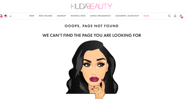
Illustrations are great to have on a 404 page, but custom illustrations of your founder are even better to have. Huda Beauty adds a touch of style to every page on their website, and their 404 page is no different.
Their 404 page also gives users access to search and their shopping bag in the upper right-hand corner. Huda visitors can easily be redirected to the page they are looking for.
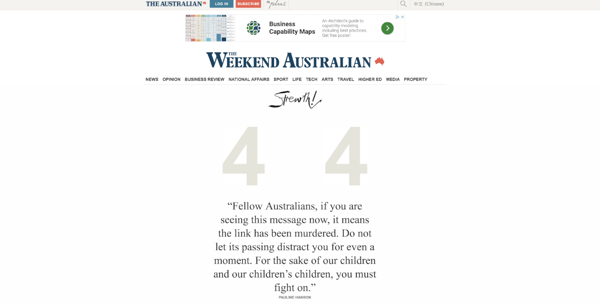
7. The Australian
Australia's national newspaper owned by News Corp, The Australian has a unique error page that fits perfectly with their extensive coverage of government and politics. It pokes fun at political language and politicians' public screw-ups.
When you land here you select a politician from a drop down menu to explain the error like only a politician can. Perfectly on point, and a lot of fun!
8. Codecademy
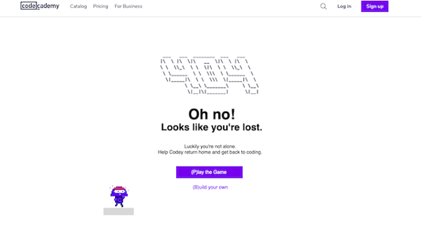
Codecademy is a great website that teaches people how to code. They have an amazing 404 page with a game you can play that involves a runner and a few blocks that the running character has to jump on when you press the space bar. They also let you click a CTA that takes you to a course that teaches you how to code games.
They do a great job of creating a brand-specific, fun 404 page that truly helps reduce user frustration to create a great user experience.
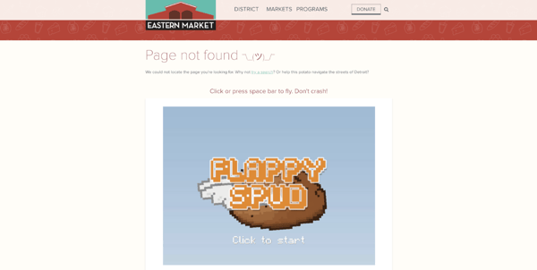
9. Eastern Market
People love games, especially flappy games where you tap a key to fly an object through the sky avoiding obstacles.
Eastern Market in Detroit has an error page that features a game called “Flappy Spud” where you fly a potato through walls. When you hit an obstacle, it explodes into a pile of french fries. Nice touch.
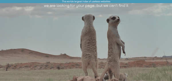
10. The Useless Web Index
The Useless Web Index is the largest index of completely useless websites online. Even they have off days.
When they can't find what you're looking for, they're ready with the perfect error page; a video of meerkats being meerkats and other amusing stuff.
11. Penguin Random House
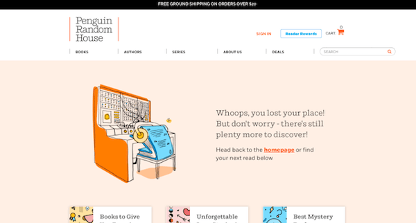
Penguin Random House has a great 404 page with a funny illustration of a book sleeping on the job. Their copy is clever because it stays on brand and redirects users to the homepage.
They also have a full navigation menu and search bar to help users navigate the publishing site easily.
12. IMDb
IMDb's error page is a great example showing that an error page doesn't have to use static copy.
Pages can scroll through a library of copy, images, or artwork to give you a unique page for every visitor. IMDb's page features altered movie quotes. Refresh it a few times and check it out.
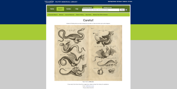
13. Falvey Memorial Library
Falvey Memorial Library is located on Villanova's Campus in Pennsylvania. While it's not a world class library, its 404 page is pretty fun.
It features the headline “Careful – Instead of finding what you were looking for, you seem to have stumbled upon some dragons.” Then you're given options to navigate away from these beautiful illustrated beasties.
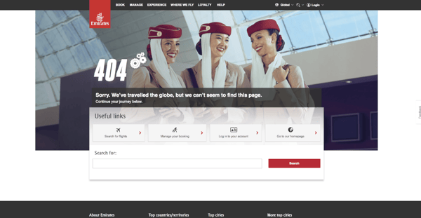
14. Emirates
Emirates is the UAE's ultra-chic international airline that's known for its luxury, style, and high quality. Their error page ties in perfectly with the rest of their website.
It's a perfect reflection of their brand image and provides you with plenty of options to easily find exactly what you're looking for on the site.
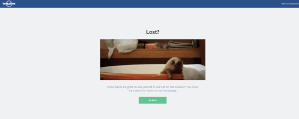
15. Lonely Planet
You don't always need to have some grand scheme, brand connection, or metaphor on your error page. Sometimes, all you need is a sloth in a bathtub to get your point across!
16. Bluleadz
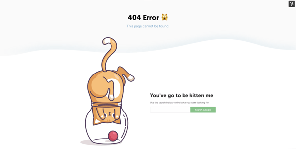
So call us biased, but we love our 404 page! With the coined phrase, "You've got to be kitten me," it probably expresses how most people feel when they reach a page that no longer exists.
The cat on the page probably shares that same sense of frustration trying to get the ball that's just out of reach. With a nifty search bar, you should be able to find content similar to what you were originally looking for.
17. 20th Century Studios
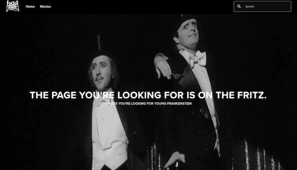
20th Century Studios has an awesome on-brand 404 page with a large black and white still shot from one of their famous old movies. They play up the image with funny text under the header.
They even have a search bar and a simple menu so users can find what they are looking for or go back to the homepage.
18. Disney
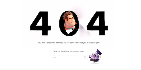
Disney delivers nothing but excellence, and their 404 page is no exception. They have an animated Wreck it Ralph popping his head through the 0 in 404 to mirror the confusion of the user. Below the large 404 is distinct and witty copy that references one of their movies.
To add to that, they have another one of their characters at the bottom to help users search for exactly what they need.
19. Fox
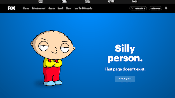
This 404 page is one of our favorites. Fox features a humorous call to action that pokes fun at the user for arriving at a page that doesn't exist. It says, "Get it Together" under "Silly Person. That page doesn't exist."
And of course, it has a sarcastic Stewie from Family Guy with his arms crossed. Beyond the cool image and CTA, Fox has a full menu at the top to help people navigate the site from there.
20. HelpScout
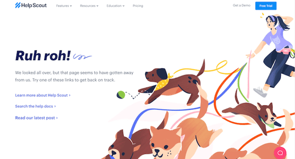
HelpScout has a great 404 page that aligns with their branding. It displays an adorable illustration that relates to their copy. They don't use the standard, "This page does not exist." Instead, they have a headline that says, "Ruh Roh!"
Then they provide three links to help users get to the right page, along with header links.
Custom 404 error pages don't have to be boring. With a little creativity, they can serve as another element in your brand development and digital marketing strategy.
These examples use everything from humorous text to informative search capabilities, animation, video, and more to turn an unfortunate occurrence (a broken link) into another touchpoint for their brand.
Clicking on a broken link doesn't have to result in a potential lost sale or future client. With a witty, well designed error page, you can turn a negative into a fun, informative experience for your users, and after all, isn't that what it's really all about?


Erika Giles
Erika is a Marketing Copywriter at Bluleadz. She is a huge fan of houseplants and podcasts about conspiracy theories. She spends most of her free time reading, writing, and enjoying the outdoors.