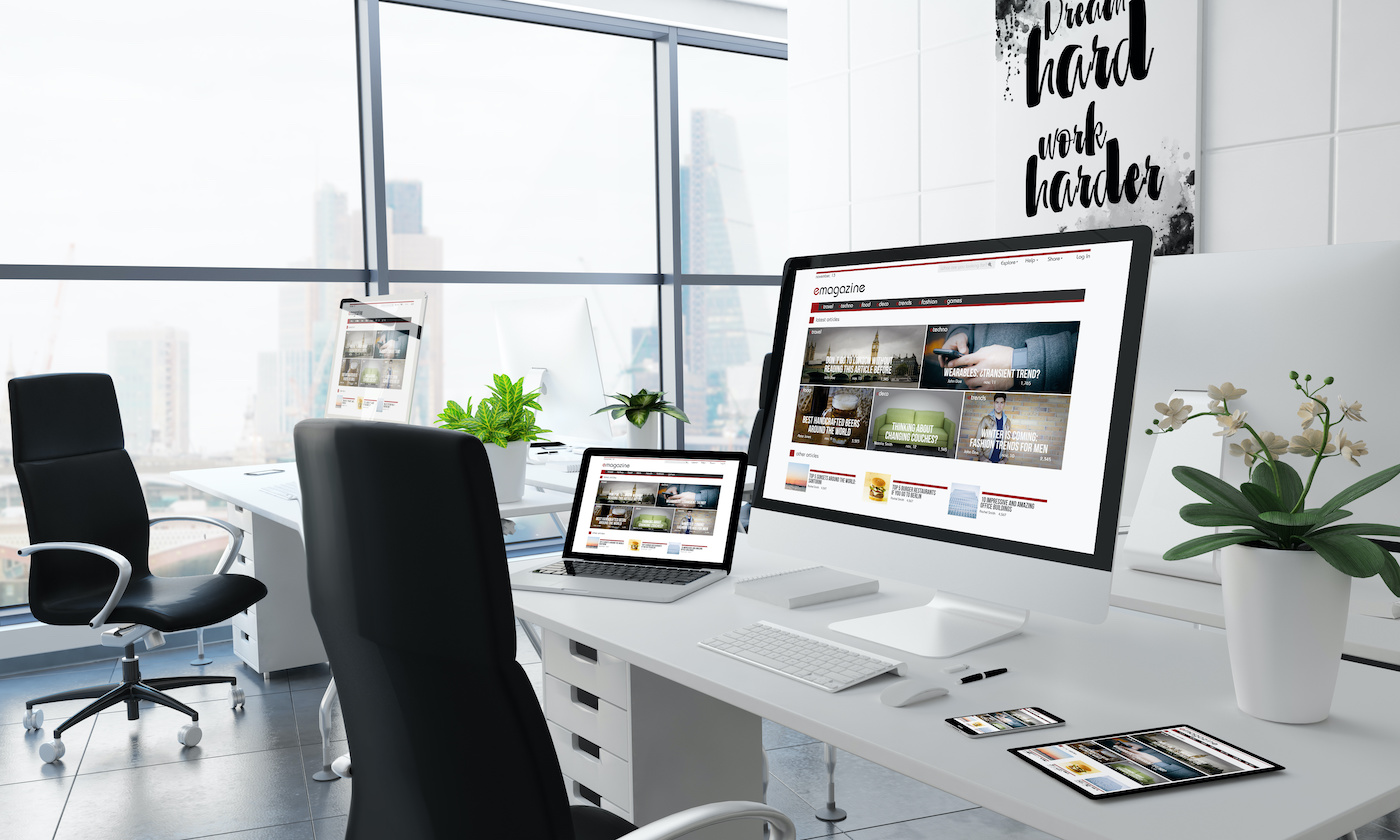
With all the talk about landing pages in the digital marketing world, it’s vital not to overlook the role of a website’s homepage.
Your homepage is your virtual curb appeal, and it is essential to manage your curb appeal to keep visitors coming to your site for the best user experience possible every time.
There are a bunch of great homepage designs out there, and reviewing some of the best designs can help inspire you to create your own awesome homepage.
What Is a Homepage?
A homepage is a company's main webpage that people typically land on when they first enter a site from a search engine. The homepage often serves as the introduction a person may have to a company. Essentially it is a "virtual storefront."
Even if the homepage is not where people start, it is where they go when they need to navigate quickly or when they return to your site later.
Some companies try to get visitors to sign up for an account or email list to encourage them to learn more about their products and services so they eventually become customers.
Even if a visitor doesn't sign up, you should create your homepage in a unique and memorable way so that you leave a lasting impression on them.
Benefits of a Well-Designed Homepage
via GIPHYA great homepage is meant for more than just looking aesthetically pleasing, even though that is a part of it. There are lots of other benefits that follow the looks.
Here are just a few:
It Increases Brand Awareness.
If you make your website memorable, then it will be that much easier to generate returning visitors and brand buzz.
Your brand image and values should be obvious through the messaging of every page on your site, especially the homepage.
The homepage is the door to the rest of your site and everything that will inform your visitors on your value, offers, products, and background.
Without it, no one will be able to identify who you are or why you own your position in the market.
It Improves the User Experience.
A well-built homepage usually translates into an easy interface that visitors have no sweat navigating. By providing access to the information that they're looking for in an organized fashion, you're providing them with value right out the gate.
Visitors definitely take notice of their user experience and it carries a lot of influence over their purchasing decisions. Play off of that psychology by building a homepage with that in mind.
It Boosts Conversions.
As frustrating as it may be, you need to make a great impression in order to convert visitors. They're looking to see value and trust, which, as marketers, translates to presenting them with incentive and opportunity.
If you make it easier for them to get what they need on or through your homepage, then you'll have a much easier time boosting your conversion numbers.
A sloppy or unattractive homepage usually only results in a high bounce rate.
Important Elements on a Homepage
Of course, as creative as we'd encourage you to be in your homepage design, there are certain elements you'll want to incorporate so that it really packs a punch.
It's like a puzzle. Every picture looks different in the end, but you still need the pieces to put it together.
An Effective and Evolving Design
A great homepage is going to be effective in meeting all the key points we've discussed so far: communicate value, build trust, assist visitors, and attract buzz.
To achieve all of that, you'll want to use a combination of different strategies. Incorporate CTAs, whitespace, a great style guide, and excellent copy to create a fantastic layout.
It's also important to be adaptable and evolving as time goes on. Static homepages usually become outdated pretty quickly. Change the page as the needs of your visitors and trends of the market change.
Omni-Channel
An easy to navigate desktop homepage isn't the final goal. It's important to be mobile-friendly as well.
via GIPHYToo many graphics or complicated designs and features have a tendency to get convoluted and messy when they're opened on different platforms. Make sure to optimize your page for mobile use, which is incredibly popular in today's world.
Caters to Audience Appeal
Your homepage is not meant to be a widely casted net. Keep your buyer personas and target audience in mind when building the page.
It needs to be focused on the type of customer that you can best serve and who have the highest chance of converting. Eliminate any fluff and use language that will attract and appeal to your preferred audience.
Value-Focused Content
By being value forward on your homepage, you have a higher chance of keeping visitors on your site than trying to capture their attention on a deeper landing page or blog post.
That's not to say you can't bring in traffic or convert on those pages, but, typically, your homepage is the first point of contact for traffic. Show them right off the bat that you've got what they're looking for and they'll stick around long enough for you to prove it instead of going to a competitor.
One way to do this is to try to keep the most important information and CTAs above the fold so they're directly visible when someone visits your website.
33 of the Very Best Homepage Design Examples
There's plenty of inspiration on the web to draw ideas from. Some homepages are breathtaking and visually unique. Others are tremendously functional and deliver on their promises immediately.
It all depends on their (and your) business style and brand appeal.
Let’s look at some amazing examples right now:
1. Airbnb
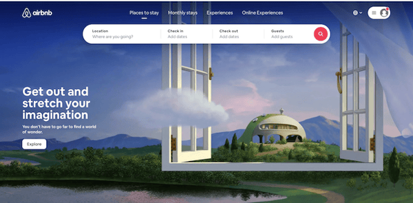
Airbnb’s brand has seen better days, but its homepage design has never been better. Minimalism is often a sign of a modern homepage that communicates quickly and provides great mobile experience.
In just one sentence, Airbnb draws you in and gets you ready to start searching its site. Breathtaking visuals evoke a spirit of exploration users with wanderlust are sure to love.
2. Dropbox
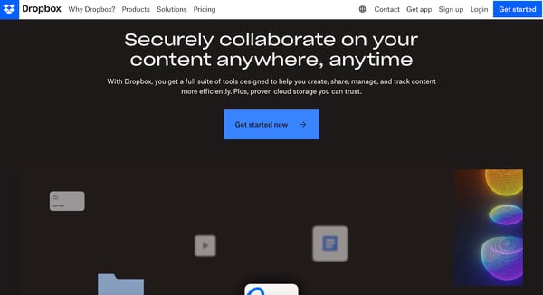
Dropbox has been described as the company everyone is trying to kill. Its homepage design is no doubt one of the things that’s made it resilient: In less than 40 words, it tells you everything you need to know about one of their key benefits: collaboration.
Those looking for a peek inside of their solutions can scroll on to watch videos of their tool and take a glance at some impressive statistics.
3. TED
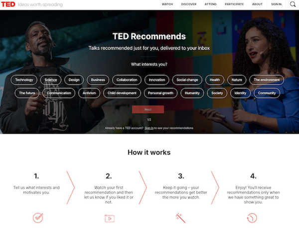
TED encompasses many different subjects and has a giant library of informational videos and articles. Their homepage puts everything on the line right away so that users can select what they are interested in without delay.
They have a clean design with a nice hero image of two of their speakers on the left and right of the image. TED also lists simple steps describing how to use and benefit from their platform.
4. Medium
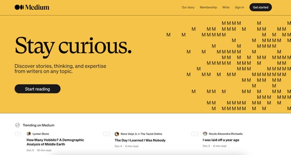
Medium is a publishing platform that has attracted thousands of would-be thought leaders, as well as many established voices.
Although it bucks convention by leaving its value proposition halfway down the page, by the time you get there you’ve almost certainly been hooked by eye-catching hero space above the fold and the dozens of trending articles.
5. KIND
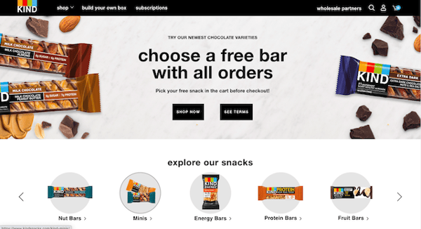
From total obscurity and dismal performance, KIND Snacks have burst onto the scene with some of the strongest branding around.
KIND invites you to jump in and start shopping for healthy snacks in the banner. The traditional top navigation is all but replaced by image-driven product categories. Bright colors and promotional copy says "free", and who can resist free snacks!
6. REI
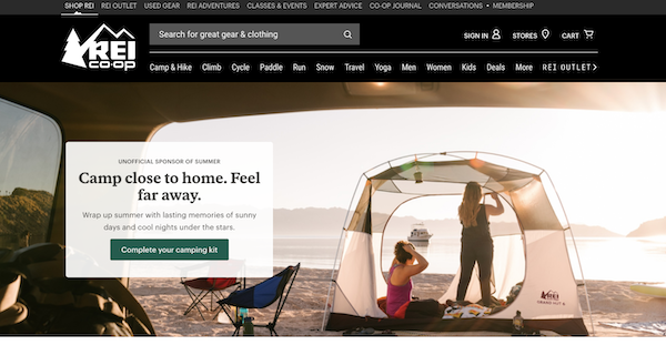
REI has made its name in two ways: As a top supplier of outdoor gear and a leader in related content.
REI’s key goal is to drive membership in its co-op, and this is reflected everywhere in the customized CTAs and image panels. Customers who have no interest in all that also instantly see the online store’s thirteen major product areas.
7. Zenni Optical
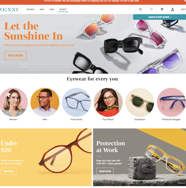
Zenni Optical thrives on personalization and offers a chic, yet cost-effective alternative to stores like Lenscrafters.
As you’d expect, its homepage design thrives on the visual: stylish glasses everywhere and icons for each category of glasses. Their copy is cute and clever with the headline, "Let the Sunshine In".
8. Udemy
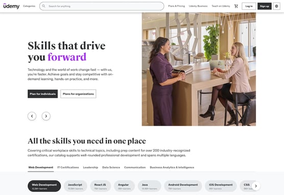
Udemy specializes in online video courses developed by independent experts. The homepage underscores its selling point – convenience – while orienting customers to the huge library of material.
With a customized list of general topic areas at the top and an ever-evolving list of personalized course recommendations below the sliding banner, this page is magnetic.
9. Amazon
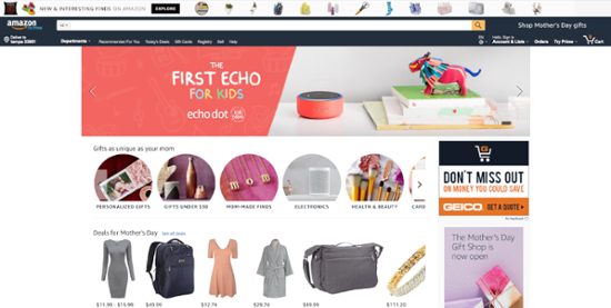
Amazon’s homepage design is a result of years spent crunching terabytes of data. The goal: To create a compelling ecommerce experience that gets people browsing even when they don’t plan to buy.
With offers and even entire design elements customized to user behavior, it’s almost impossible to visit without seeing something you’re interested in.
10. Netflix
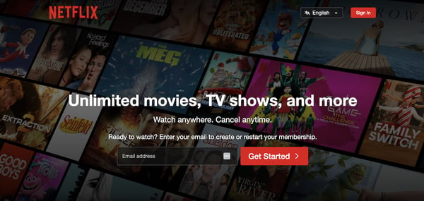
The Netflix homepage design positions the brand as the #1 alternative to traditional movie-going in just a few words!
Its simple, eye-catching “Get Started” button is a world-class CTA example. New users interested in learning more – and those with common objections – can find out everything they might want to know in a handful of minimalist, yet highly visual page segments.
11. Etsy
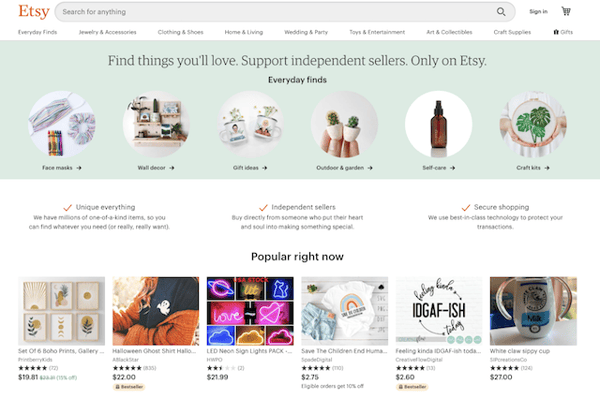
Etsy is a site where independent merchants, many of them crafters, can display and sell unique wares.
The header image orients users to the hottest site-wide offer. Just beneath, new users learn the basics of the site in three quick headers. It’s hard not to get pulled into the ever-rotating “Popular Right Now” items – and that’s certainly intentional.
12. Nike
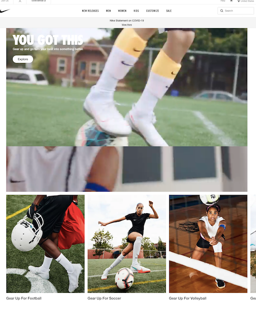
Nike is one of the most recognized brands in the world, so its homepage design won’t waste time on a bunch of details you already know.
You can reach any category of Nike shoe in just one click, so most people won’t spend much time on the homepage. Those who do will find exciting, ultra-visual hooks for products dedicated to any sport.
13. Chipotle
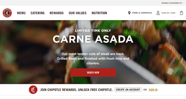
Chipotle uses their homepage to drive attention to a limited time offer. To execute this, they've embedded a looping video of a Chipotle order that's sure to get your mouth watering.
An important feature to highlight on this homepage is the accessibility button in the top right corner. This ensures that the website is easy to navigate for all kinds of users. The button is right where you need it, yet doesn't disturb the overall page design.
14. Oscar
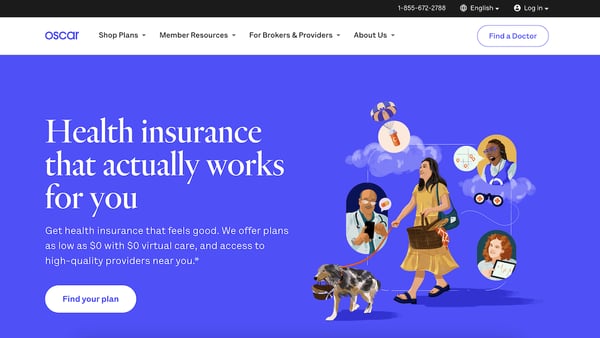
Health insurance is by no means a fun topic, but the homepage for Oscar makes it more humane and personable – starting with the URL itself (“Hi Oscar.”)
Everything from the art style to the clever use of whitespace is intended to make a daunting topic simpler. The copy underscores this with concepts about affordable and accessible health insurance options.
15. A24
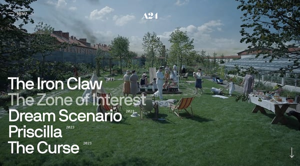
A24 has been kicking butt over the last few years with their films, and they take the opportunity to showcase it on their homepage.
Composed of trailers for their new projects, behind the scenes notes of popular movies, and a fun shop, the production house does a great job of meeting visitor expectations.
16. Slack
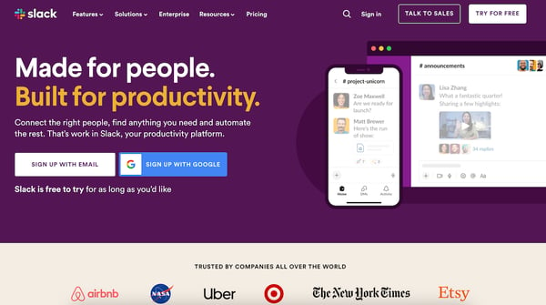
The Slack homepage sticks to its unique style guide with a clever mix of colors and illustrations. The messaging on the page is pretty straightforward, "Made for people. Built for productivity"
It's clear what visitors should do next — sign up or sign in. There's a pretty comprehensive nav bar as well, helping visitors explore as they dive a bit deeper.
17. Nescafe
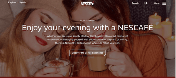
When you think of coffee, you probably think of cozy coffee shops and disposable cups. But Nescafe is made right in your home with the people you love.
Their large hero image on their homepage features candles, two girls in fall clothes, and glass mugs with coffee foam and cinnamon gives visitors a warm feeling from the moment the enter the site.
Their copy states that they have coffee for all of your moods, and they have a great CTA that invites users to "Discover the coffee experience." Their word choice pins them as a premier leader in coffee.
18. Nest
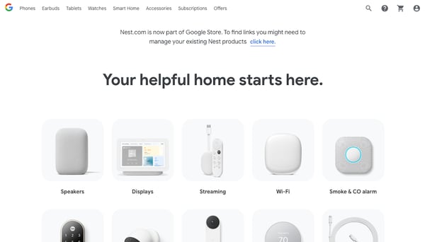
Nest's homepage is a bit different from the others. As you can see, Nest has moved its site to the Google Store. And while that may seem like a bit of a misdirection, it's actually genius.
Instead of confusing current customers by taking down the homepage entirely, they take the time to inform visitors of the change and redirect them to the official store. On top of that, check out the tiny navigation in the upper right corner.
Customers can still sign in or find support on this page if necessary. Talk about a great user experience.
19. 4 Rivers Smokehouse
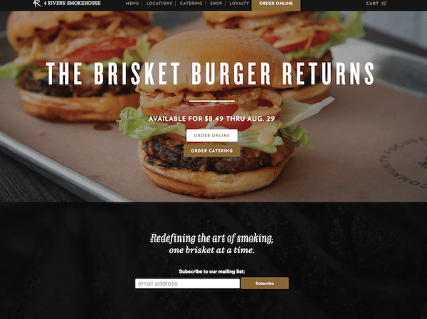
Want to learn how to showcase your products? Take a page out of 4 Rivers' book.
They highlight their new menu items front and center, making visitors' mouths drool the moment the page loads. The CTAs are pretty clear and engaging as well. Go ahead and order your meal online or look into catering.
20. Evernote
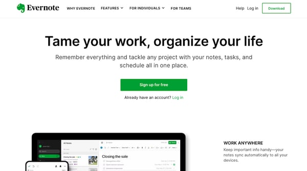
Evernote is another great example of a homepage that has brand awareness at the center. Known for its simple note-taking features, the homepage expands the scope of that reputation showing how the app has become an entire organizational suite.
It has a pretty, clean nav bar and a color scheme that pops, but it isn't too harsh – an excellent effort by a well recognized brand.
21. Swab The World
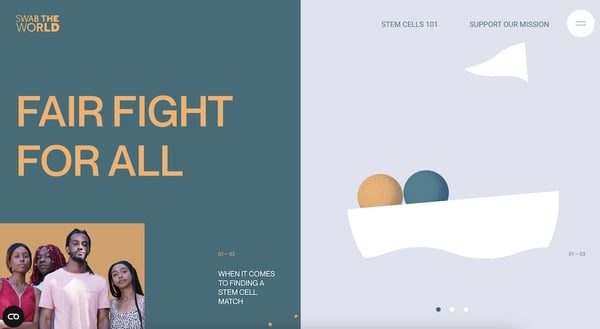
Swab the World is a website that is trying to bring awareness to stem cell donation diversity. They showcase a unique and modern homepage that explodes with contrasting orange and teal.
They have powerful but simple copy that is relevant to their cause, and it helps pique the interest of their visitors. They even won The Site of the Day Award on Awwwards in 2020.
22. Green Mountain Energy
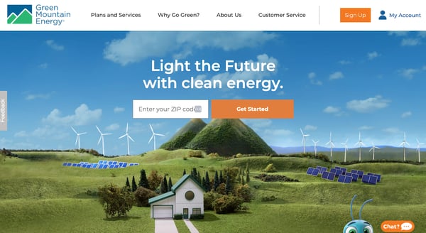
Green Mountain Energy has a beautifully designed homepage with a custom image that perfectly displays what the company does. The homepage is not cluttered and has simple copy that compels visitors to learn more about clean energy.
They even have a link to a video that describes what their impact is on the planet.
23. Century 21
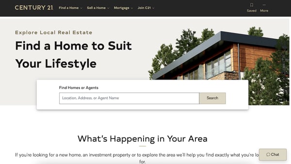
Century 21 has a homepage that would make anyone want to search for a new home using a real estate agent. It's sleek and modern design is visually appealing, and it has everything visitors need to navigate the site and find what they're searching for.
The search bar automatically tracks the visitor's location to search for homes in their area.
24. United Healthcare
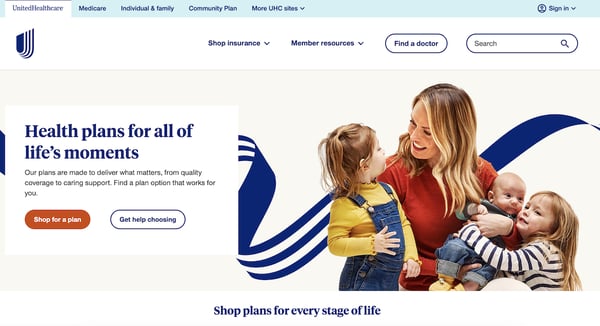
United Healthcare has a clean and informative website design with several CTAs for people to click on to learn more or find what they need. The hero image shows a happy mom and her children with copy to the left that mentions that they have health plans for all stages of life.
Through this homepage, visitors can find a doctor, search for plans, and explore a variety of healthcare categories. Visitors don't have to navigate through the whole site to find what they need. This contributes meaningfully to user experience.
25. Shademaster
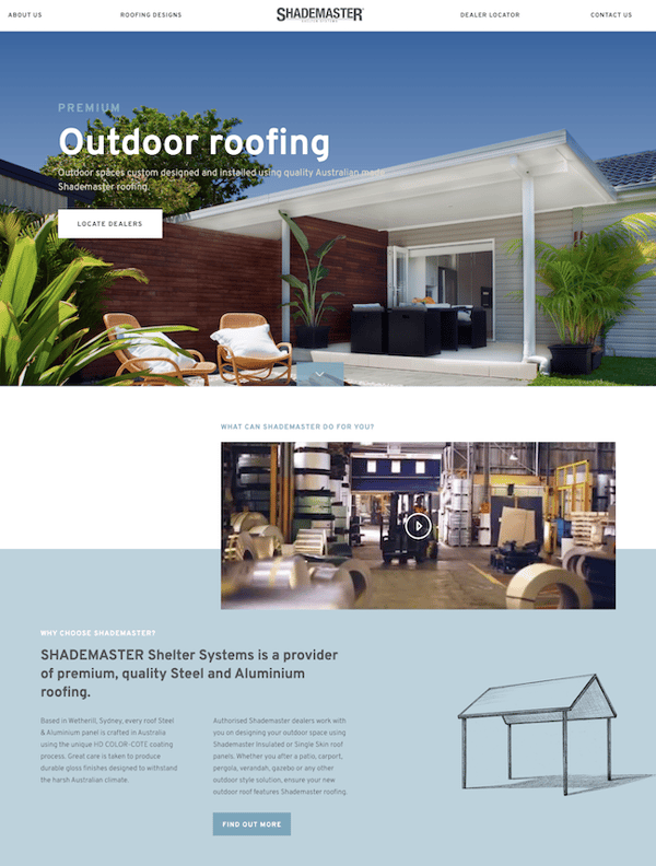
Shademaster is an Australian company with a fantastic homepage that won the best UX design through the CSS Design Awards. Their website features a fresh and modern template with beautiful images and a short video that explains how a Shademaster can benefit their customers.
They also have a navigation menu that follows users as they scroll so at any point while they are looking at the website, they can select something from the menu bar instead of having to scroll all the way back up.
26. CocoKind
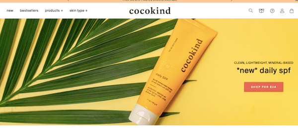
Cocokind makes a bold statement with their bright hero image on their fantastic homepage. They have a simple design with clear CTAs and a well-designed navigation bar. The navigation bar includes dropdown menus with several categories that you can see right away.
Cocokind's navigation also has product pictures of popular items featured on the navigation menu that users can click on to go straight to that specific product. This way, they don't have to spend time browsing.
27. Spinx Digital
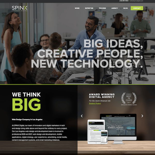
Spinx has an awesome homepage that segments different topics well to keep the page de-cluttered and easy to scan. They have a nice hero image of a workplace and people talking that gives their homepage a friendly vibe.
The best thing about their homepage is that they show icons of companies they've worked with, and they provide a whole section that describes their areas of expertise. This way, prospects learn everything they need to know about your company from one page.
28. Fig and Yarrow
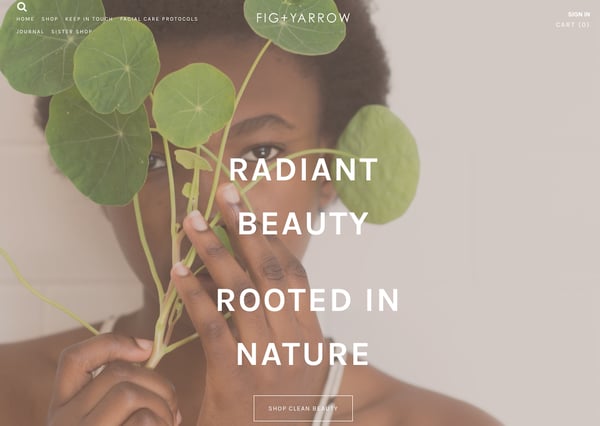
Fig and Yarrow has a beautifully designed homepage that sets the tone for its natural skincare products right away. Their main background image is subtle and offers a nice color palette for the page. They have simple copy that explains what they do with a clear CTA right underneath.
This site uses excellent whitespace and makes it easy for users to find just what they need.
29. Gymshark
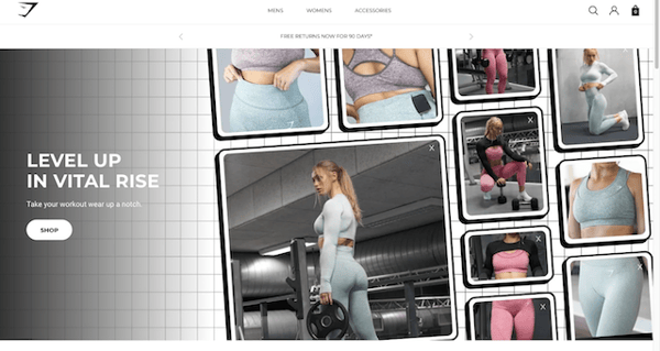
Gymshark has risen in popularity in the past few years and is now a top sports and workout wear contender. Their homepage features several beautiful pictures of their workout gear to the right.
Essentially, Gymshark has a simple homepage that is attractive just like their workout gear itself.
30. Stack Overflow
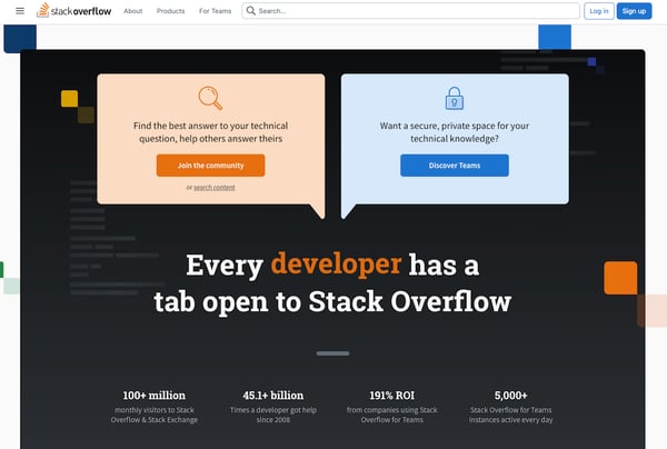
Stack Overflow has an eye-catching homepage that directly addresses website visitors and asks what they're looking for. Below those call-outs is a rotating line of text that takes it one step further by identifying specific job roles that can benefit from their product.
This homepage lets users know exactly what Stack Overflow does and how they can help their visitors within a few lines of copy.
31. Delta Airlines
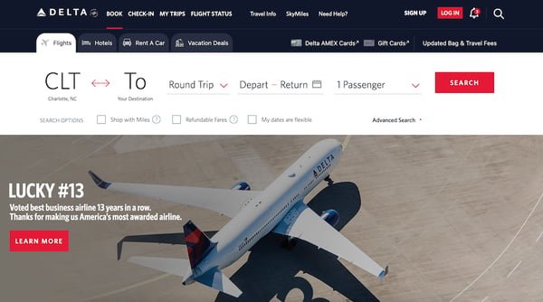
While this is perhaps one of the busier homepages on this list, it's design is still thoughtful. The Delta Airlines homepage immediately shows visitors what they need to see: an option to search for flights.
The tabs across the top open up more options for travel related searches. Plus, the image above the fold points viewers to important news regarding the business.
32. Lyft
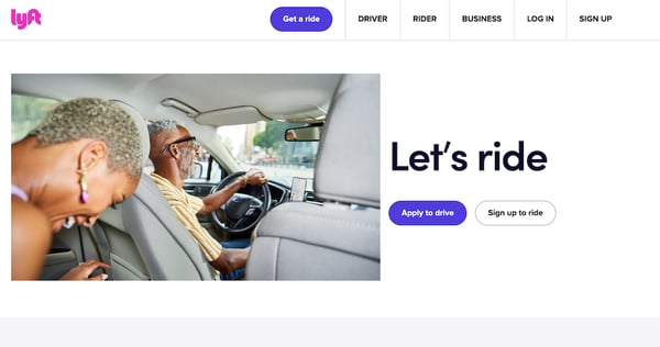 Without saying a whole lot, Lyft's homepage shows visitors exactly what they need to see. The CTA buttons are simple and applicable to their two main personas.
Scrolling down to the next section introduces a list of benefits when driving with Lyft. In half a scroll, viewers can immediately gain answers to some basic questions.
33. Cava
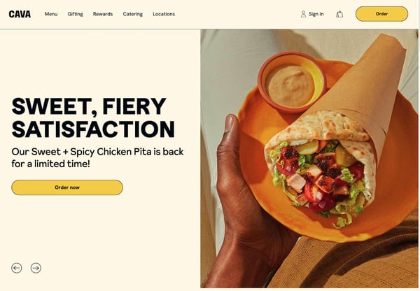
Cava recently revamped their branding to be more minimalist, which perfectly juxtaposes the flavor of their food. This homepage takes quite a simple homepage and makes it interesting by using high quality images of their food and complimenting them with a simple color scheme.
Your homepage can do a lot for you when it comes to boosting your brand awareness and converting new customers. You'll want to give it all the love and attention you can.
And, thankfully, you have some pretty great examples to follow after.


.png)
Comments