
Pillar pages are often a topic of discussion among marketers. The strict definition of a pillar page can be hard to pinpoint if you've never worked with them before.
Pillar pages offer you opportunities to gain search authority while delivering educational information to your target audience. They allow you to thoroughly answer questions about a specific topic on one page.
These pages are essential to your website. Let's explore what they are and provide you with some benefits and good examples of pillar pages to help inspire your pillar page creation.
What Is a Pillar Page?
A pillar page is a page that covers all of the important aspects of a specific topic on one page. Pillar pages expound on a topic, covering it broadly while targeting a specific keyword that is related to the in-depth topic.
These pages have room for additional reporting and cluster content that links out to other pages.
For example, your keyword may be about a broad topic like multi-channel marketing. And you may post a piece of cluster content about social media marketing, which is a more specific keyword related to the topic.
Pillar pages are longer than blog posts, but they're not as in depth since they cover all aspects of the keyword you're trying to rank for.
Some of the common pillar page titles include:
- "Guide to ___"
- "What Is___"
- "Why ___ Matters"
- "How to ___"
- "Best of ___"
It's important to note that not all pillar pages are guides. In fact, there are a few different approaches you can take to your pillar page strategy.
Types of Pillar Pages
There are three main types of pillar pages that brands create.
Resource Pillar Page
Resource pillar pages are optimized bookmarkable reference pages that contain valuable links to similar themed content.
These pages can be external focused or internal focused. External focused resource pages are made up of external or non-brand links. Internal focused pillar pages link to on-brand content.
Like normal pillar pages, the segments and subcategories of the broad topic are broken down into sections. There is minimal content in each section to introduce the resource links because the value of the page comes from the links it provides to the relevant resources.
Product or Service Pillar Page
Product or service pillar pages are used by businesses who offer multiple products and services. The pillar page should answer key questions about a service or product so prospects can better understand what they'll be getting if they choose to purchase one of your offerings.
It should be descriptive, but it shouldn't provide too much information that will overwhelm page visitors. An overview about pricing, services, benefits, steps, and setup processes should be included.
10x Content Pillar Page
10x content is long-form content similar to an ebook or a guide. The content you produce for this pillar page is ungated but owned and controlled by you.
The content on a 10x pillar page is supposed to be 10 times better than the highest ranking results for a specific keyword or keyword set. This means that 10x pillar page content is highly comprehensive with a mix of trustworthy, useful, interesting, and high quality content.
Essentially, this pillar page should cover every aspect of your core topic.
The 5 Benefits of Pillar Pages
Here are five of the main benefits that pillar pages can provide your business:
1. They Help Sales Reps Qualify Leads.
Pillar pages are created to draw visitors in and to convert prospects into leads. Sales reps can use pillar pages to educate leads, answer their questions, and to qualify these leads as good fit prospects for your business.
2. They Build Trust and Credibility with Visitors.
With a pillar page, you can provide your visitors with comprehensive content that positions you as an expert on that industry topic.
Visitors will begin to see you as the go-to-authority on matters related to your pillar page topic.
3. They Create a Better User Experience.
Pillar pages and topic clusters allow your site visitors to find all of the information they need on a topic within your website. This means they won't have to navigate multiple sites to get the information they need.
They enjoy a great user experience on your site, and you get to reduce your bounce rate.
4. They Improve Your Ranking Potential on SERPs.
If one topic cluster performs well, this can elevate the pages that link from that within your topic cluster. The high word count, backlinks, and shares contribute to the boost in page visibility on search engine results pages (SERPs).
5. They Generate Backlinks and Social Shares.
Pillar pages are known to get shared often throughout a variety of platforms. This can help you gain backlinks as individuals share your pillar content and link back to your webpages.
Pillar page content often gets shared by industry influencers so they can educate their audience on a particular topic using content you created.
7 Essential Elements of a Successful Pillar Page
Here are the seven aspects you need to include in your pillar page to increase its chance of success:
Page Title
Pillar page titles are typically targeted keywords that are short, descriptive, and broad. The keywords and title should be featured prominently at the top of your page.
Ungated, Long Form Content
Pillar page strategies are based on thorough and lengthy content that is laid out in a thoughtful manner for site visitors.
Special consideration needs to be given to the layout with proper structure, image use, typography, and more so the content can be broken up into easily digestible pieces.
A pillar page can succeed with a template, but using a designer or developer can take your pillar page to the next level and help you increase reader engagement.
The content should remain ungated, which means anyone who visits the page can read through the information in its entirety without needing to submit information into a form.
Organized Content Sections
Content on a pillar page should be broken into well organized sections. This helps to increase the readability of your content so it is not overwhelming for site visitors.
It also helps readers to locate the information they are most interested in quickly.
Internal Navigation
Another essential element of pillar pages is internal navigation. Internal navigation or jump links allow the reader to jump from one content section to another.
Visitors can find specific content sections without the need to scroll and search the text for it themselves, which may encourage them to stay on your page longer and decrease bounce rates.
Some of the popular approaches to internal navigation include floating sidebars, dropdowns, pop-outs, horizontal navigation bars, and content index sections.
Internal and External Resource Linking
Link out your pillar page content to helpful external resources that relate well to the content it links from. The more related content you link out to, the more likely you are to rank high on SERPs for your pillar page.
You should also link to other parts of your website to your own relevant resources. In fact, internal linking is a major component of your topic cluster strategy.
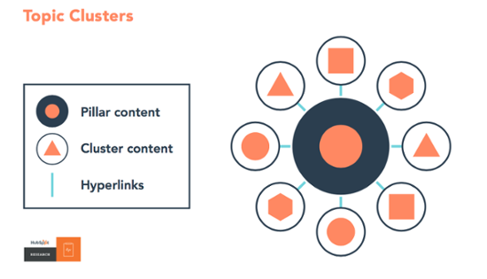
As you can see, the pillar page is the center of your cluster. You then build internal links by creating cluster content on subtopics related to the pillar page's main topic, then you add hyperlinks between the cluster content and the pillar page.
Calls to Action
Strategically placed CTAs are needed on a pillar page to encourage conversions. Just like your blog posts, pillar pages attract top of the funnel visitors who are early in their decision making process.
Your CTAs can help them to learn more about your organization through the content you offer. More importantly, the content offer you're gating should be helpful and attractive to your readers so they actually want to click your CTA.
Once they click on a CTA, they are sent to a landing page where they fill out a form and convert into a known lead.
Consider using a banner CTA at the end of your pillar page or use text CTAs throughout the page. Text CTAs are less disruptive and can hit on relevant points throughout the pillar page content.
Main Website Navigation
Pillar pages are focused on SEO and attaining traffic. This means your pillar page should have a navigation menu that easily takes visitors to other parts of your website so they can continue their journey.
Presenting a main navigation menu makes it more likely that your visitors will continue to explore your site and learn more.
The Best Pillar Page Examples for 2021
1. Best Overall: The Ultimate Guide to the Best Productivity Apps From HubSpot
HubSpot is one of the leaders when it comes to top content marketing trends. It’s always a good idea to refer to their blog first for any topic related to marketing, sales, and customer service.
They also nail their pillar page strategy. Their productivity apps pillar page does not disappoint, acting as a great introduction to how pillar pages should work.
Clocking in at 12 pages and a whopping 4,700 words, you’d expect it to cater to the needs of a wide range of audiences. Sure enough, it’s able to cover a number of key subtopics, listing a ton of different kinds of apps including time management, workplace, note taking, and much more.
That means it serves as a single, comprehensive resource ideal for users and Google alike.
Notice that, although there’s only one CTA within the main text, HubSpot’s guide called "How to Be More Productive" is promoted both within the main header and in a widget window crawling down the right side of the page.
You don’t have to read any text to know what the offer is, so it can effectively grab your attention and entice you to download it.
How It Could Be Even Better
The HubSpot team can dare to sprinkle a few more CTAs throughout the main page text here.
A pillar page needs to put users and content first to be trusted, but it’s also ok to have elements like shareable social quotes and exit intent lightboxes to increase engagement.
2. Best Data Visualization: Population Healthier From The Atlantic
Population Healthier is an initiative of The Atlantic magazine that helps to stretch the boundaries of how pillar pages can be designed. It goes to show that the page can be both data centered and creative in its presentation, ideas that are easy to lose sight of in text-heavy content.
Population Healthier is an interesting example of how a pillar page can become a large strategic project. Experts from Aetna Health were called in to provide guidance and assistance with the data and on how to display it. Both companies get SEO benefits, and readers get insightful content.
How It Could Be Even Better
Although there is a nav menu at the top, it could do better signaling the content in each section.
Many users prefer a long page that hints at the total amount of content to an “infinite scrolling” page – and infinite scrolling can also have negative SEO consequences if used incorrectly.
3. Best Technical Elements: The List Building Strategies That Grew 251,000 Subscribers From Help Scout
Most pillar pages will have tons of text, but we all know that content doesn’t succeed on its text alone. There has to be a level of visual interest to hold attention – and it also needs to fit into the overall SEO strategy on a technical level.
"The List Building Strategies That Grew 251,000 Subscribers" does a stellar job in these areas.
This pillar page demonstrates that the authors have a deep understanding of their target audience and their pain points. While the content is interesting (and useful!), it’s the little details that show they set out to create a definitive resource, not just another piece of linkbait.
There are four things you’ll notice at a glance if you skim this page:
- Although the content is text heavy, images relevant to the text are used to keep your attention.
- The typography is easy to read and navigate, with clear headers, blockquotes, emphasis boxes, and more.
- They link to many external sites that expound upon their ideas using external research studies and other helpful on-brand content.
- The layout is responsive and adapts easily to any display, including mobile displays.
How It Could Be Even Better
Some of the external resources have the potential to distract or even confuse a casual reader. Wikipedia links are the big culprit here. Unless you’re linking directly to a pillar page partner, it’s usually best to leave enticing external links out or reproduce similar resources on your own site.
4. Best Navigation and Text: The Complete Guide to Outsourcing Your Electronics Manufacturing From JJS
Of course, all content has to be useful to a specific reader at a specific time. The tone, depth, and helpfulness of content are all major factors in whether your pillar page achieves its goals. JJS Manufacturing provides an outstanding example with its page on outsourcing.
The outsourcing your electronics pillar page is clearly an ebook that was translated into a web format. Still, it works because it conveys the authority of the brand and walks the reader through an entire sophisticated process – evaluating, planning, and implementing outsourcing.
The depth and breadth of coverage shores up the brand’s credentials as a thought leader and makes it easier for B2B decision makers in the space to imagine getting great value. The process is mapped out from the start, the content is well organized, and the CTAs are striking.
How It Could Be Even Better
Let’s face it: Even in today’s visual culture, useful content is driven by text. The JJS text shines, but there are a lot of places where an illustration is just what the content doctor ordered. That’s especially true when discussing complex projects or using data to shore up the USP.
5. Best Storytelling: Battle of the Bots From HubSpot
As mentioned above, HubSpot is one of the best leaders in all things digital marketing. Their guide on chatbots is another excellent pillar page they recently released.
The flow of the scrolling experience is seamless and fun for the reader. Plus, the text-to-visuals ratio within the content is great. Images, embedded videos, and gifs break up the blocks of text really well, making it a breeze to read.
But most notably, it takes a fun storytelling approach to educate readers on the value chatbots deliver in marketing. The theme is reminiscent of a comic book or graphic novel that takes place in the future.
How It Could Be Even Better
Just like the productivity apps guide included on this list, this pillar page could use some CTAs to encourage readers to download relevant offers. This way, they can download additional resources to read at their leisure.
6. Best Use of Simplicity: The Content Marketer's Ultimate Guide to Search Engine Optimization From Bluleadz
Yes, we are patting ourselves on the back for this one. Our most recent pillar page, "The Content Marketer's Ultimate Guide to Search Engine Optimization," wins us over for the simplicity of the overall user experience.
The design flows well together without overloading the reader with too much rich media. Visitors can focus on the most important part of this pillar page – the content itself.
It acts as a great resource for marketers of all levels, novices and experts alike, walking them through SEO strategy, planning, tools, and more.
How It Could Be Even Better
We should consider adding relevant CTAs within the body of the pillar page. There are plenty of content offers that could be beneficial for readers of this pillar page, like an editorial calendar template or goal setting worksheets.
These relevant content offers would add even more value for our readers and give us an opportunity to generate more leads.
7. Best Pop Culture Theme: The Star Wars Guide to Net Promoter Score From Typeform
Nerds who love Star Wars and customer satisfaction can rejoice! Typeform created this fun, engaging guide to NPS, using Star Wars references and illustrations throughout.
The illustrations are incredibly detailed, and some visual elements, like the images of the Darth Vader toy, are interactive, allowing the reader to drag and drop them.
Pop culture fun aside, the content is in-depth and dense with important information about the importance of customer satisfaction and how to implement NPS into your business. Plus, the pillar page ends with a relevant CTA, encouraging readers to create their own NPS survey using Typeform's software.
How It Could Be Even Better
The theme is undeniably fun, but for some readers, it may become overly distracting. For example, in The 5 Whys section, there are a few paragraphs exploring Anakin Skywalker’s transformation into Darth Vader. This section isn't as informative as some readers might expect it to be because it doesn't stay focused on the point of the pillar page.
8. Best Service Pillar Page: Pay-Per-Click Management Services by Vital
Vital created this pillar page to explain their multiple pay-per-click management services. This pillar page handles all of their most frequently asked questions regarding their services.
The page outlines details about:
- The types of services they have
- Monthly management benefits
- Account setup process
- Their step-by-step approach
- A brief overview of pricing
Vital's page is descriptive, clearly written, and optimized well for search. This pillar page is suited for the decision stage of a buyer's journey, which is well indicated by the CTAs they chose about talking to an expert and getting a proposal.
How It Could Be Even Better
Vital doesn't have an extra long pillar page that makes having jump links a necessity. But adding a jump link menu or table of contents on the lefthand side would make it easier for their users to find what they need fast.
9. Best Guide: The Definitive Guide to Branding by Olive & Company
Olive & Company delivers a great pillar page that has a lead generation objective. They include several helpful tips, images, stats, and content clusters that thoroughly educate page visitors.
This pillar page is an excellent piece of content that contributes to Olive & Company's thought leadership by highlighting their modern branding and content marketing strategies.
They also include a table of contents jump link bar on the righthand side of the page to make it easy for users to jump to the content they are interested in reading.
How It Could Be Even Better
This pillar page is pretty top notch. The only thing it could do better would be to add in some prominent CTAs. They include relevant CTAs, but the color could stand out more to make them more enticing for users to click.
10. Best Content Sections: How to Build a Successful Digital Marketing Strategy for Healthcare Software by The Spot on Agency
Spot On offers a simple pillar page titled "How to Build a Successful Digital Marketing Strategy for Healthcare Software." It's jam packed with helpful and relevant content related to their keywords.
Their content is sectioned out well with chapters that discuss each aspect of their topic thoroughly. They include a table of contents button at the top of the page before chapter one that opens up into a full jump links menu, making it easy for users to locate what they need.
They also have content clusters within their chapters that are represented with a different color and image so they stand out as important.
Spot On makes good use of external and internal linking by linking to blog articles that explain specific topics further.
How It Could Be Even Better
This pillar page has one CTA and form at the very bottom of the page. They could add more in-text or sidebar CTAs on the page to capture the attention of visitors that exit the page before reaching the very bottom.
If you already have a lot of content with clear relationships between different questions and customer pain points, it won’t take you long to fashion your own pillar page.
Pillar pages don’t have to transform the entire structure of your site: They simply serve as the “missing piece” that brings everything together and takes the results higher.


.png)
Comments