No matter how much traffic you have, it all amounts to nothing without conversions.
When all is said and done, conversions are the end goal of digital marketing and sales.
A conversion, simply stated, is any action prospects or leads take that moves them closer to becoming a paying customer.
That includes a wide range of possibilities, such as:
- Joining your email subscription list counts as a conversion.
- Clicking a link in one of your promo emails is a conversion.
- Requesting some content or a product demo is a conversion.
- And, of course, making the purchase is the big conversion.
Your existing customers convert too. Every time you re-engage your customers and they take action, they are converting. Ideally, you’ll be able to use cross-selling and upselling to add more value to each one of your major accounts over time.
Conversions Are King, But What’s the Key to Conversions?
via GIPHY
If you want to boost your conversion rate fast, you need to have analytics.
Without the data provided by a reputable analytics suite, conversion rate optimization becomes impossible. That’s because conversion rates can actually be affected by relatively small tweaks in your site’s structure and presentation, but you need data to know they’re working.
Otherwise, even an experienced marketer will simply continue guessing.
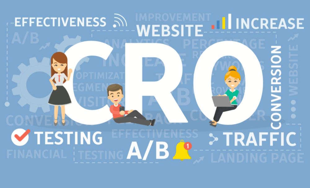
If you want to make your conversion rate optimization to be truly scientific, split testing is the way to go. Split testing, also known as A/B testing, uses experiments where two different versions of a page are served randomly to web visitors to determine which variant converts better.
The crucial points include the following:
- There should be only one major tweak differentiating the two versions of a page.
- There should only be one A/B test running on any given page at any given time.
- The results of previous tests should be implemented before new tests are executed.
When you take things in a slow, analytical fashion, you can track outcomes more easily. Plus, you’ll be able to ensure that your workflow accounts for consistently, methodically rolling out the lessons learned from each test. Over the months, conversion gains will grow and so will your bottom line.
It’s in that spirit that we present seven of the best ways to raise website conversion rates.
Before you get down to improving you conversion rates, it's a good idea to conduct a site audit. Increasing your website's traffic will allow you to convert more of that traffic, and here is a good list of SEO tutorials to help you get started.
Our years of experience tell us that when you use these tactics, you can supercharge your conversion rates quickly. To be sure you’re on the right track, though, it’s always wise to get a solution like Google Analytics up and running so you can verify your “before and after.”
Let’s rev the conversion engine and get down to it!
1. Improve Your Headlines
If you want conversions, your headlines are the place to start.
On any given page, the top headline is the text most likely to be read. It’s all but impossible not to read, in fact. People are primed to know that the big words at the top of a page are the most important for understanding the content.
Many sites will split test a dozen different headlines for their blog posts, video posts, and landing pages before settling on a high-converting choice.
2. Add a Guarantee
via GIPHY
Whenever anyone makes a purchase decision, they want to reduce the risk as much as possible. For the average consumer, an ironclad money-back guarantee removes a lot of doubt.
It may be more difficult to make a guarantee compelling in the B2B world, but SaaS platforms have a major advantage: They can offer a free trial period that keeps the commitment light.
3. Add Testimonials
Testimonials are essential for a high-converting website. A testimonial helps your prospects see that someone they can relate to has had success with your product in the past. That’s powerful social proof that can overcome plenty of anxiety.
You might start out with just a trickle of testimonials, but you should always collect them. Ideally, you’ll end up with a large roster of them for each of your offerings. Out of those, you can select the right ones for individual buyer personas so your conversion-focused content is truly customized.
4. Repeat Your Call to Action (CTA)
When they’re developing their first landing page, many marketers make the mistake of waiting until all the way at the bottom to show off their smoking hot CTA for the first time.
Although users tend to be more engaged with a focused and optimized landing page than they are with other kinds of pages, the fact is this: They’re still going to jump around.
They could make the decision to buy after any individual section of your lander. So include your CTA and CTA button before all new divisions or major headlines.
This is especially critical for your mobile website, where scrolling all the way down the page to take action might prove exhausting to impatient users.
5. Add a Product Video
Tons of digital marketing research has shown a product video makes a big difference in overall conversion rates – even when the user never actually clicks on the video.
That’s right: Simply by existing, a video will increase conversion rates.
Your video should be explicitly focused on your page’s offer – not just a general testimonial video. Assume that about half your viewers won’t ever look at the video, however, and plan the script accordingly. The page text and accompanying video should reinforce one another.
6. Test Your CTA Button
via GIPHY
Every digital marketer has heard the old story about testing the CTA button.
There’s an urban legend that, once upon a time in the Information Superhighway days of yore, one of the earliest digital marketers changed a CTA button from red to green and doubled or even tripled conversions. (In some versions of the story, that man’s name was Albert Einstein.)
Suffice it to say that while adjusting the button that leads to the conversion won’t transform your business, it is one of the most important single elements on any page. Plus, the results can be so significant that they will really give you a firm handle on how good A/B testing should work.
With that in mind, your earliest split tests should focus on things like:
- The color of your button.
- The actual call to action.
- The shape, shadow, and size.
- Any accompanying text.
For some excellent insights on CTAs, check out this blog post over at Moz: 3 B2B Case Studies That Prove the Power of CTAs.
7. Add a P.S.
There’s a sound reason why a postscript is such a traditional part of the landing page experience.
Just like the headline, the P.S. occupies a very special place on the page ... that is, the bottom.
Generally, web users on desktop will skim down to the bottom of the page shortly after reading the headline. They may be looking for the terms of your guarantee or, simply, for the “Add to Cart” button. Whatever the case, though, they’re likely to happen across the postscript.
Remember, these are just the fast ways to boost conversions.
Ultimately, you’ll need a strong sales funnel, compelling offers, and content that aligns with your leads at each stage in the buyer journey. Once you have these, conversion optimization tasks are the icing on the cake.
For all your hard work, you could see massive conversion gains literally overnight.


.png)
Comments