Your logo.
It's what people first notice about your brand. It represents – and is – your brand.
But how does your company logo affect the way your brand is perceived?
A company logo is a symbol of your company's identity. It creates a first impression of your company and expresses your company's value all in one. People have learned to associate a brand's logo with its values and character.
What are these associations, and why are they important to keep in mind for your logo?
A company logo says a lot about your brand: Who you are, what you do, and why you do what you do. Considering logo type, color, and shape, here is what your company logo says about you.
What Your Company Logo Type Says About Your Brand
The style of your logo should not go overlooked – it will represent who you are as a brand.
Your logo should be present everywhere you are: in your stores, on your website, on your apparel and miscellaneous swag, etc. Therefore, you want a logo that you will be proud to see everywhere you go. And you also want your logo to fit in with relevant trends.
When it comes to logo style, there are five common types:
Wordmark
 Wordmark logos, also know as logotypes, are freestanding company names or acronyms that are designed into a stylized logo. eBay, CNN, and Google are all examples of wordmark logos.
Image via WikiCommons
Wordmarks allow your brand to be easily recognized. However, you should always be sure that you stylize a wordmark logo to make it unique, or it may lack interest.
Letterform

Letterform logos are made up of a single letter that represent a brand. For example, a yellow M is the McDonald's logo, and Honda uses just an H.
Using a letterform logo can simplify a brand name. They can sometimes be symbolic of the brand (e.g., the golden arches of McDonald's), but you should make sure your letterform is always legible.
Image via WikiCommons
Pictorial

Pictorial logos are logos that use recognizable symbols to represent a brand. Starbucks uses a green mermaid, and Twitter uses a light blue bird to represent its brand.
A pictorial logo expresses the idea that "a picture is worth a thousand words." A pictorial logo may be literal, like Apple's apple logo, or can symbolize a brand's attitude or industry.
Image via WikiCommons
Emblem
An emblem logo is a logo in which the company's name is directly associated with a pictorial element. Harley-Davidson uses an emblem logo.
Emblem logos look great as an embroidered patch on logos, but they may not appear as clearly when smaller, since your company's name will be hard to read at a smaller scale.
Image via WikiCommons
Abstract

Abstract logos are highly conceptual symbols that wouldn't immediately be recognizable, just like an abstract art piece. Pepsi and Chase both use abstract logos.
Image via WikiCommons
Abstract logos can be memorable if well designed, but can also be confusing and unrelated if not thought of carefully. Nike's swoosh logo is one of the most recognizable abstract logos around.
Which Is the Best Logo For Your Company?
This all depends on the name of your company and what you offer or sell. Each company has something different to put on the table, so your logo should directly reflect who your brand is.
Short company names can typically succeed with a wordmark logo to keep the simplicity of the brand. Be sure, however, to carefully consider the fonts of your logo, as a font can just as easily carry emotion like color. Pick a font that represents your brand's personality, not one that contradicts it.
Abstract and pictorial logos should always be carefully thought through so your consumers don't get confused. They should be straightforward and represent your brand's attitude or services in some sort of way.
What Your Company Logo Color Says About Your Brand
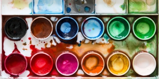
Colors are what make your brand logo pop. In fact, 85 percent of shoppers say color is a primary reason for why they buy a particular product.
Because your company colors will also be used in your web design, products, and more, it's important to actually sit down and think about the colors you want to represent your brand.
On the topic of color, let's discuss three important things you should always consider when crafting the perfect company logo.
1. Color Theory Should Always Be Your First Thought.
Color theory plays a major role in how consumers perceive a brand. We’ve covered this topic in depth before, but let’s look at an overview of the most popular logo colors and the connotations each color has.
- Red: Powerful, Passionate, Strong
- Orange: Fun, Rejuvenating, Bold
- Yellow: Happiness, Positivity, Friendliness
- Green: Growth, Balance, Wealth, Nature
- Blue: Trust, Honesty, Dependability, Calm
- Purple: Creativity, Royalty, Quality
- Black: Sophisticated, Security, Elegance
- White: Purity, Innocence, Cleanliness
2. Tints and Shades Are More Important Than You Think.
It's important to note that each color isn't really just one color; the basic colors you see above are simply hues – the most pure form of a color. Add a little white to a hue, and you get a tint. Add a little black, and you get a shade.
Why do tints and shades matter in logo colors? Modifying the color of your logo can modify the story you tell.
For example, a sophisticated company may want to use red in their logo design, but they don't want to come off too forceful and strong with a bright red. To tone it down, they may decide to select a tint of red that is softer and more suiting for their company.
Consider what tint or shade you want your logo colors to be; as you play around with different variations of a color, you will notice how the look of your logo alters.
Take this example we created based off the Tide logo. Tide, a laundry detergent and fabric care company, prides itself on its bold color scheme and strong logo – a bright orange and blue bullseye with a slanted blue font outlined in white.
Now, take a look at our modified version, where we added more white to each color to create a logo with tints of their original.
ORIGINAL MODIFIED
Blue: #0068ac Yellow: #fff215 Orange: #f47e40 Blue: #2a65c8 Yellow: #ffff8f Orange: #fa7234
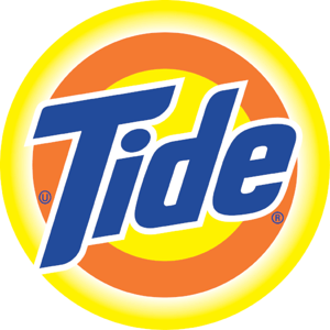
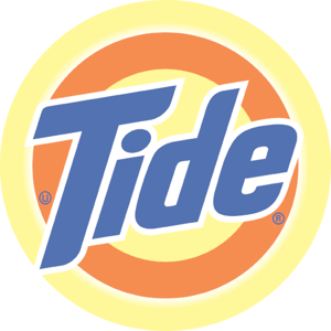
Image via Logopedia
Isn't this a huge difference? If you were walking down a shopping aisle at Target, which logo would grab your attention first? Obviously, Tide's original logo colors – which is probably why they carefully selected their colors.
Without the bold colors, the Tide logo doesn't stick out enough and gets washed out in the background. In the laundry detergent industry, there are a lot of brands competing for their consumers' attention, so Tide does a fantastic job of using bright, bold colors to steal their eyes away from the competition.
Takeaway: Depending on the emotion you want to evoke with your logo, you will have to properly adjust your colors to create the perfect tints and shades to represent your brand.
3. Your Color Schemes Really Do Matter.
Now that you understand color theory and how tints and shades affect the emotion of your logo, you have to consider the entire color scheme you want for your logo – and your brand as a whole – to have.
This is where color scheme comes into play. Every brand should have a color scheme, and your logo should directly represent that by including the most important colors.
Your logo can be made up of either one color, or it can be a mix of multiple colors within your color scheme. Let's take a quick look at the five most common color schemes for businesses:
Monochromatic
 A monochromatic color scheme is one comprised of only one color yet includes different shades and tints of that color.
Bluleadz's logo is an excellent example of a monochromatic color scheme. Our primary color scheme uses different shades of blue, and our logo is actually an ombré of these colors.

Analogous
 An analogous color scheme is made up of colors that are directly next to each other on the color wheel (ex. red, orange, and yellow).
This type of color scheme is generally pleasing to the eye because it is made up of similar colors. BP's logo is a great example of analogous colors.
Triadic

A triadic color scheme is just how it sounds: a triangle. It is made up of every fourth color on the color wheel.
This color scheme is sometimes referred to as primary and secondary color schemes because both are triadic (ex. red, yellow, and blue; purple, orange, and green). Burger King's logo uses this color scheme.
Complementary
 Complementary colors are colors that sit opposite one another on the color wheel. This includes purple and yellow, blue and orange, and red and green.
It can even include colors like the ones seen to the left – reddish purple and yellow-green. The Los Angeles Lakers use this color scheme.
Split Complementary
 A split complementary color scheme is comprised of one color, and the other two colors are on either side of its direct complementary color.
This color scheme is very popular as it easily grabs your attention. Taco Bell's logo is an example of a split complementary color scheme.
Depending on how you want to brand your business, you'll need to consider exactly how many colors to include in your logo.
Research shows that 95% of the most popular businesses use only one, at most two colors. Starbucks and Coca-Cola, both very large, successful brands, only use one color to represent their brand. And, it works for them.
So, remember that it's important to consider the colors, the tints and shades, and the color scheme that will represent your brand.
Who is your brand, what are you selling, and how do you want your audience to feel about it? Ask yourself these questions when choosing your logo colors. You should aim to match the mood of your brand and audience.
What Your Company Logo Shape Says About Your Brand
Similar to color psychology, the shape of your logo can tell a lot about your brand just by looking at it.
This may seem odd at first, but people have grown accustomed to associating logo shapes with particular feelings. Whenever people see a new logo, they make instant associations with it and the brand behind it.
It's important to understand how the shape of your logo will affect how your brand is perceived. Like color theory, we have discussed how different logo shapes affect perception. Here are the most popular logo shapes and the associations most commonly attached to them:
- Circles, Ovals, and Ellipses: Community, Friendship, Wholeness
- Olympic Rings
- Squares and Rectangles: Stability, Balance, Reliability
- Microsoft
- Triangles: Intellect, Power, Energy
- Google Drive
- Curves: Happiness, Rhythm, Feminine
- Amazon
- Symmetry: Organization, Tradition, Hierarchy
- Shell
- Organic: Pleasure, Comfort, Nature
- Whole Foods
- Vertical Lines: Masculinity, Strength, Power
- Cisco Systems
- Horizontal Lines: Tranquility, Calm
- IBM
When creating your logo, ask yourself, "What identity do I want my brand to have?" Just like color and style, you'll want to consider what shape you want your logo to take.
Each logo shape evokes emotion. What emotion do you want your logo to have?
Why These Elements Are Important in Logo Design
When working together to create a "perfect" logo for your brand, you have to consider all the parts that make up a logo.
- How will your colors share certain emotion about your brand?
- What shape do you want your logo to take, and how will that affect how consumers view your brand?
- What type of logo do you want to use, and why does that work best over others? Will it be easily recognizable?
Some of the best logo designs are the simplest. Don't stress over the little things, but focus on the bigger picture.
Your logo represents your company and all the values and passion that comes with it. In the end, create something memorable to you.

Baylor Cherry
Baylor is an inbound specialist for Bluleadz. As a native Floridian, she enjoys soaking up the Florida sun, buying clothes she can’t afford, and dreaming about one day owning a dachshund.