

The ecommerce sector continues to soar.
Since 2007, ecommerce has been on an upward trajectory rivaled by few other industries in modern history. From a start around $30 billion in 2007, ecommerce is now projected to hit $5 trillion worldwide by 2021.
That’s a lot of opportunity for driving revenue. But you need a great ecommerce website in place for your visitors to get excited to buy from you.
10 Key Features of a Good Ecommerce Site
- User Friendly Design
- Social Proof
- User-Generated Content
- High Security
- Multiple "Contact Us" Touchpoints
- Frequently Asked Questions (FAQs)
- Awesome Visuals
- Wish Lists
- Related Items
- Special Offers
When you’re building your ecommerce site, you can’t cut any corners. Online shopping is all about convenience for visitors, so if your site is clunky, outdated, and poorly built, you won’t be generating sales.
And your competitors with kickass sites will be running laps around you. So make sure you focus on building a site with these 10 key elements in mind.
1. User Friendly Design
Simplicity is key when you’re designing a site, and it’s especially important for ecommerce. Three of four consumers say ease of use is the most important aspect of a site, so prioritize usability over appearance.
via GIPHYSure, your site might have flashy visuals and impressive parallax scrolling, but ultimately, what matters most is providing a clear path for visitors to find information they need to purchase from you.
To develop a strong user experience, you want to include enticing navigation, simplified search functionality, and mobile responsiveness. The truth is you don’t have much time to guide visitors toward making a sale.
What do you do if a site is slow to load? What if you can’t read product page content on your phone? What about when your search doesn’t yield relevant results?
You likely leave, and visitors on your site will do the same. Make the user experience top priority for your ecommerce site.
2. Social Proof
Emotions drive us in our decision making, so they play a big role in your marketing and sales efforts. Through social proof, you can show interested visitors that you’ve already connected with and delighted other customers.
Social proof is how you demonstrate that others bought your products or services. This feeling of being connected to a group of other happy customers can be appealing and can guide prospective buyers through their decision making stage of the buyer’s journey to actually click the ‘Buy Now’ button.
By seeing your customers post their positive reviews on social media or writing reviews on your site, prospective customers will trust you and see how legitimate your business is to others.
3. User-Generated Content
Speaking of social proof, user-generated content (UGC) is a great channel for this. You need to encourage your customers to create content to share their love for your products or services.
Provide incentives to get your customers to create this content, like Instagram posts with information about their experience, and share it on your ecommerce site.
One of the best examples of this comes from Article. When exploring their furniture, you find customer posts that use the hashtag #ourArticle to show how customers designed their room with their furniture.

Source: Article
By including this on your site, you can give shoppers inspiration for how to make the most of your goods or services.
4. High Security
This is a no brainer in today’s age of cybercrime. Criminals target high value sites like ecommerce sites to try to capture financial information.
Your customers deserve protection, and when you don’t have that little lock on your web browser, you can lose a lot of potential sales. People want to trust you with their credit card and contact information, so give them peace of mind.
Invest in an SSL certificate and two factor authentication to beef up your site security, and educate your visitors about why you have this in place and how you value their protection.
5. Multiple “Contact Us” Touchpoints
If your site visitors have to search high and low just get in touch with you, you’re sending a bad message. This might seem like you don’t want them to contact you, which can breed distrust.
They might have questions about what they’re purchasing or just need some support in solving a problem. Give them a clear communication channel so they can reach out to you.
You should include multiple options for how they can talk to you, like via phone, forms, emails, and even chatbots and live chat. The easier it is for them to contact you, the faster you can help them, which can entice them to buy from you.
6. Frequently Asked Questions (FAQs)
Sometimes visitors don’t want to rely on contacting you. This is where FAQ sections come in handy.
By creating content centered on common issues, you’re giving visitors a resource to help themselves. In the context of ecommerce, obstacles customers can face fall under topics like product or service support, account management, return policies, and much more.
Make FAQs easy to find so visitors can get answers fast. This is a great way to instill confidence in buyers and establish credibility with them.
7. Awesome Visuals
Expectations have gotten high now for ecommerce site product pages. You can't just throw grainy photo of your products or services up. You need high resolution visuals that showcase all elements of the thing visitors want to buy.
In the case of products, you should include multiple angles and give users the ability to zoom in on it. You should also include videos to show products or services in action.
8. Wish Lists
The king of the ecommerce world, Amazon, does this best. Giving users the chance to build lists for future purchases is the best way to encourage them to come back to you.
You should also give users the opportunity to share their wish lists publicly with their networks. This way, you're getting free exposure (and potential traffic) from others. And it acts as another social proof feature on your website.
You can even use wish lists and bookmarked items in remarketing campaigns. This is an easy win in getting your interested prospects back to your website.
9. Related Items
People want to feel seen and understood. And when you're able to present them with additional products or services that are relevant to what they want to purchase (or to what they've already purchased), you're making them feel valued and understood as a human being who has unique interests.
You can present related items to encourage them to buy other items or to compare similar options so they buy what best suits them. This shows customers that you want them to make the best decision, and it also opens doors for upsell and cross-sell opportunities.
10. Special Offers
This is a standard marketing practice – promoting deals and discounts on select items. You can entice visitors to make purchases by displaying offers they can't say no to.
For example, give them a deadline for ordering by midnight to get free shipping, or offer a steep 10 percent discount if they spend over $150 at once. You can showcase offers on an ongoing basis too. This makes customers come back for more when they see a deal they already took advantage of in the past.
The 10 Best Looking, Most Successful Ecommerce Websites
The key to creating your own beautiful ecommerce website is to take a look at some examples that work. Here are 10 examples to spark inspiration for your site:
1. Amazon
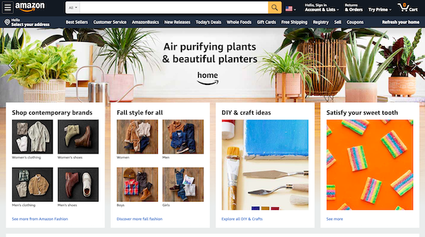
Amazon is the king of successful ecommerce sites, but it didn’t get there overnight. It first launched all the way back in 1994 – and like most websites of the era, it had a grating, text-heavy layout that would be impossible to put up with today. Plus, it only sold books.
How things have changed!
Although there are many reasons Amazon has rocketed to the top of the hill among successful ecommerce sites, we can distill it all down to a single factor more powerful than any other: Data.
Amazon leverages data in dozens of unique product category recommendation widgets across the site, drawing casual visitors in so they have more opportunities to buy. This is visible throughout Amazon’s broad and growing portfolio of services, like Amazon Prime Video, Amazon Photos, and Fresh.
Because the site can gather an enormous amount of customer behavior data – including granular info on how long users spend on each page and what attracts their attention the most – it has the ability to refine its ecommerce presentation like no other brand in the business.
Rich, comprehensive data from millions of users is what it takes to be the undisputed leader in ecommerce sites. But, even enterprises with less data to trade are on making waves on the web.
2. Walmart
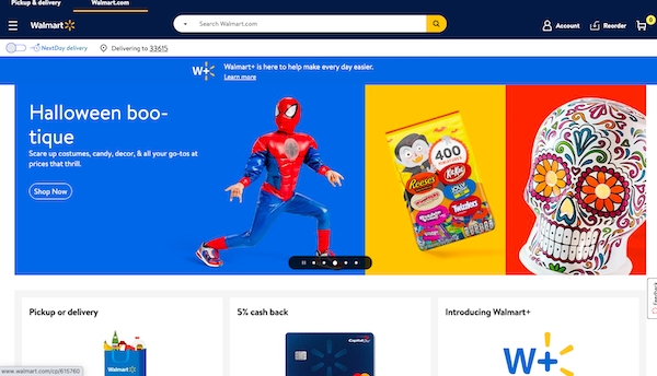
Walmart’s recent refresh of its long-time ecommerce website implements best practices such as a king-sized image slider with compelling hero shots, location-specific deals linked to your IP address, and data-driven product categories that adjust based on your needs.
It’s no secret to those watching successful ecommerce sites these days that Walmart is in a fistfight to keep its revenue healthy against Amazon. Looking throughout the site, you can find all kinds of ways the brand has adapted to this challenge.
For example, Walmart’s site prominently advertises its free next-day delivery, reeling in customers who love the convenience of Amazon Prime and uniting its supply chain with its ecommerce. You can also find ancillary, local-friendly services like grocery pickup and credit cards here.
3. Apple
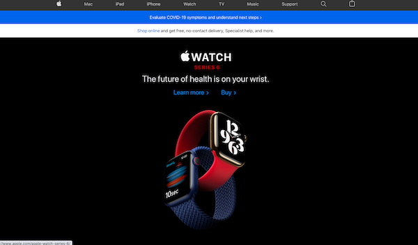
Apple is one of the slickest brands in the world – in fact, the total value of the brand alone is estimated at over $200 billion as of 2019. Naturally, the brand itself is the company’s most valuable tool in forging a world class ecommerce experience.
Apple binds virtually all of its various services to the online Apple Store, and you might think this is actually a drawback. Anyone who has gone through the laborious process of resetting their Apple ID credentials knows it can add lots of unwanted stress to your day.
Still, the ability to tie things together – going one step beyond even Amazon – serves Apple.com well in its tireless efforts to cross-sell and upsell to its customers. Almost everywhere you go on the site, you’re sure to find product promos of all kinds, including snazzy video content.
Apple’s expertise in user interfaces and experience design shines through on its site, too. Even though there’s a huge amount of content to sift through, the menus are clear and concise. The clean, “product silo” approach eases navigation and enhances product hype.
4. Staples
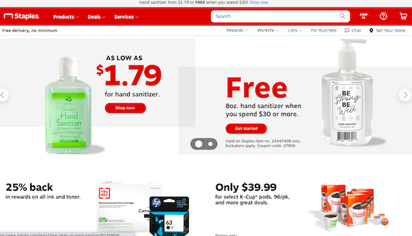
For a company to rely on its website for more than half of its total sales, you know it must be doing something right. The layout for Staples.com isn’t nearly as minimalist as some of the other entries on our list: It wants you to see everything and really soak it in.
Staples is one of the most successful e-commerce sites partly because it crafts a truly seamless connection between your online experience and your offline one. You can instantly access deals from your local store, leverage fast local shipping, and browse the latest print ads.
One of the most clever little innovations Staples has to offer is the way it positions the search bar above its main navigation – keeping search front and center so you can go right to looking for the product you need. Naturally, the sites translates smoothly to mobile, too.
5. Macy’s
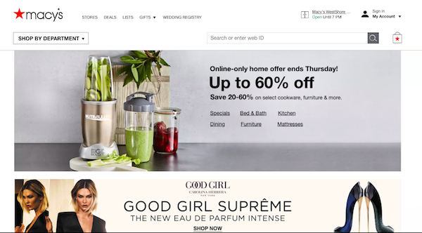
Macy’s and other legacy retailers have been caught up in what some call an “epidemic of boring” over the last several years. While righting the ship on traditional – or boring – in-store retail has taken some time, Macy’s has already figured out how to create a sharp e-commerce presence.
Looking back to early 2010, Macy’s website had attracted a whirlwind of complaints. Now, it has been completely revised. Its simple navigation and image-rich look provides a compelling compilation of curated deals, yet the site still looks and runs crisply on any mobile device.
6. The Home Depot
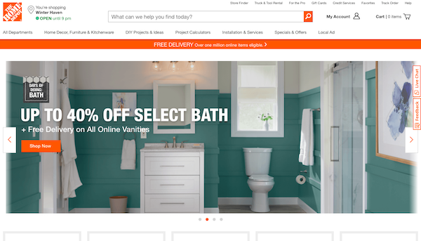
Let’s face it: Home Depot probably isn’t #1 on your list of most successful ecommerce sites.
When most people think about a hardware store, they think about going there in person to check out all the neat tools, hardware, and materials they could use in their latest DIY project. The unique strength of Home Depot’s website is its ability to bring this experience online.
Home Depot has crystallized its deep insights about its customers in some amazing ways on its site.
Instead of being limited to browsing by product category as on many other ecommerce sites, you can check by room of the home or by project – just like you would at the store.
Like many other ecommerce titans, Home Depot trades heavily on fast, free shipping to blunt the Amazon advantage. It also rolls out huge, email-backed promos on holidays corresponding with its peak buying seasons, like the 4th of July, Christmas, and Father’s Day.
7. Harry's
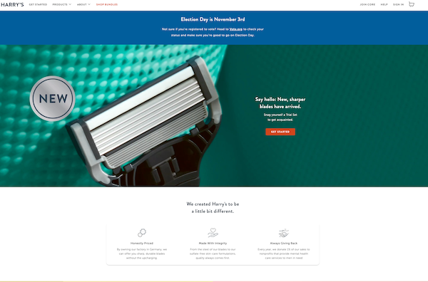
Harry's website starts off with a bold hero image that features one of their new products close up with copy that accompanies it on the right side. They do a great job of letting their visitors know what's new on the site right away, encouraging them to learn more or get started with their CTA button.
The site is simple, clean, and has an excellent layout. They also include icons below their hero image that feature aspects about their brand that are enticing and useful to their target audience.
Harry's makes simplicity classy with its easy-to-navigate, optimized site.
8. Forever 21
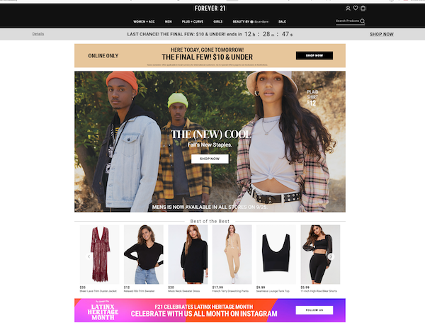
Forever 21 is a popular clothing store among teens and young adults, and they manage a trendy site that continues to attract their target audience.
They have clear sections that help to segment their prospects and customers so they can find exactly what they want without needing to search their whole site for it.
Their current sales are displayed below their main navigation bar with a countdown to provide the user with a sense of urgency so they will be more likely to buy the first time they visit.
Another element that Forever 21 gets right on their webpages is styling it for the new season by displaying images of popular clothing items for the season. They also include a footer bar with a link to one of their social media pages.
9. Simply Gum
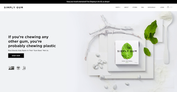
Simply Gum has a clean and simple design that matches well with their entire brand, hence the "simply" in their company name. They want their prospects and customers to know that their gum has no additives and is healthier than other gum brands.
Their site demonstrates this by making everything (except the text and the mint on the packaging) white. This automatically draws visitors eyes to the fresh mint.
They have a clear CTA as a part of their hero image and use clever copy for their headlines. For instance, before they let their site visitors know they provide free shipping, they say "keep your mouth entertained."
10. Bliss
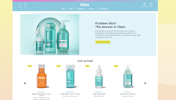
Bliss has a bright and colorful website to display their fun and energetic in-spa products. The site encourages site visitors to explore, engage, and buy by using fun graphics and a beautiful color scheme.
The site is interactive and responsive with expandable menus and even a cool skincare quiz that helps users to find the best skincare products for them.
Bliss also allows users to easily find locations where their products are sold just in case a site visitor wants to purchase products in person.
Best Practices for Running a Successful Ecommerce Website
Now that you're inspired by these amazing ecommerce websites, you're ready to run a successful one on your own.
Ensure your site includes all the key features we discussed, then keep these best practices in mind to hit your sales goals.
Create Informative Product Descriptions.
High-res photos and videos are awesome, but your visitors also want copy to read about your offerings. Keep descriptions concise, with smaller chunks of text, but provide a comprehensive overview of each product and service.
Break up content with bulleted lists as well. This makes it easy for customers to skim read through the items they want to purchase.
Constantly Run Tests and Evolve.
Your site may not be getting the most sales as you think, even if you're crushing your revenue goals. The only way to be absolutely positive that you're maximizing your conversions is by conducting A/B tests regularly.
Play with where you place CTA buttons. Update copy on landing pages. Try different colors and visuals. Record the results for each change, then make the improvements you need to one landing pages to drive even more sales.
Invest In SEO.
This is obvious, but it's worth emphasizing here. You need to be creating optimized content so your site shows up in relevant searches. Sites on the top of SERPs win the lion's share of organic traffic.
You can develop a comprehensive SEO strategy that consists of creating high value blogs that address your ideal buyer's challenges and pain points. Insightful, consistent blog posts prove your authority to your audience, so it can help you build a strong following.
Reduce Checkout Steps.
A long checkout process kills your sales, plain and simple. In fact, 23 percent of consumers say they abandon their carts due to confusing, lengthy checkout processes.
So strip down checkouts as much as you can. Determine what is essential that you need from the buyer, and just ask for that information. Billing. Shipping. That's usually all you need.
Highlight Benefits of Creating a Profile.
So many ecommerce sites make the mistake of making a customer profile mandatory. This can be a huge issue for prospective customers, especially if they want to make a purchase as fast as possible.
A whopping 31 percent of consumers say they abandon their cart when sites want them to create an account. In other words, don't make it a hard and fast rule for shoppers, but do encourage them to sign up for a profile.
You can highlight the benefits of creating a customer profile. For example, they can have a faster checkout process the next time they come to your site.
Accept As Many Payment Options As Possible.
In the world of Apple Pay, PayPal, and alternative payment options outside of Visa, you need to be open to all the most commonly used options. Remember, the shopping experience is all about catering to the shopper's preferences.
If they want to pay using American Express, even if you're paying higher merchant fees, you should give them that option. They want to give you money, so accept the method they want to use. Otherwise, you're losing out on more revenue.
Join the Best of the Best
So, what really makes the most successful ecommerce sites tick?
Lots of factors come together, but some things definitely stand out:
- These sites use data to continuously refine how they serve their customers.
- They focus on a great user experience, including a top flight mobile UX.
- They apply ecommerce website design best practices to earn credibility.
- They adapt to their buyer personas and provide truly tailored messaging.
- They leverage cross-selling and upselling in ways germane to the brand.
- They emphasize convenience to curb the advantages of big box rivals.
Whether you’re in B2C or B2B, you can take actionable lessons from these six industry titans. If you don't have the internal resources, consider working with selected agencies to take your ecommerce site to the next level.
Never stop looking for ways to provide an even more customer-focused site and your web visitors will reward you handsomely.

Jeff Previte
I am a Content Manager at Bluleadz. I enjoy spending time outdoors -- camping, hiking, hammocking, and everything in between. I also love reading, writing, and learning how to play guitar.