The Best Education Website Design Examples
- 1. Wellington College
- 2. Bright Horizons
- 3. Typing Agent
- 4. Coding Dojo
- 5. Skillshare
- 6. I Memorized That
- 7. The Bronx Charter School for Children
- 8. Hope Academy
- 9. Lessonly
- 10. Hyper Island
Website design is a very involved process that requires a lot of research and thoughtful action. Some of the most challenging websites to design are for educational institutions.
This is mainly due to the fact that so many different audience segments exist for education companies. They have teachers, students, administrators, graduates, and alumni to provide content for.
This means they must provide a lot of information in an organized way. Fortunately, there are some best practices you can follow, as well as beautifully designed education website examples to learn from.
6 Elements of a Good Education Website
There are a few things that every education website should have to serve their audience well. Here are six elements of an awesome education website.
1. They Have Search Functions.
Education websites can be quite complex because of the amount of information they need to provide. Some areas an education website may cover include clubs, classes, curriculum, applications, events, honors societies, contact information, and more.
The solution to make navigating your site easier? A search bar.
Many people know what they are looking for when they enter your site. Give them an easy way to find it like Wellington College did. For example, I typed in "curriculum" and several results related to this term popped up within seconds.
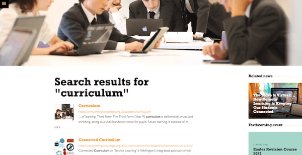
That's a great user experience. Instead of scouring through several drop down menus, visitors should have direct access to content they need.
2. They Use Videos and Other Imagery to Tell Their Story.
Education websites still need to keep up with some of the modern elements of web design. An important design trend you should follow is the use of videos and imagery that help you to leverage your brand story.
This helps a visitor place themselves at your institution and may help them decide to take your courses or to attend your school.
You can create many different kinds of video content, including:
- A video explaining the school or program.
- A welcome message from the dean or president.
- A simple video showing the school campus with students walking around.
- A video about how to sign up for online courses.
3. They Are Mobile Friendly.
Students and prospective students, like everyone else, prefer to browse on mobile if they need to find information fast. Make sure your website design is responsive across a wide range of electronic devices.
Not only does this deliver an exceptional experience that is seamless for your audience, but it also improves your search engine optimization (SEO) efforts. That directly leads to more organic traffic over time.
4. They Include Sections for News and Events.
Most educational institutions have a lot going on that their students and faculty need to be updated on. The best way to let people know what's going on in the school is to post it on your website.
If one of your facilities shuts down or classes are cancelled due to inclement weather, the first place people will go to check class cancellation or facility shutdown is on your website.
Take a look at this example from USF that shows information about an upcoming university closure and a virtual fair, along with other important news at the bottom of their homepage.
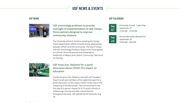
Informal educational websites may also include news on their sites to update individuals about new course offerings or class specials for the month.
5. They Include Links to Their Social Media.
Social media is a must have, even in education. It helps to showcase your school culture and gets your students more involved with your digital presence.
People may not think to look for your social media on their own, but they may check it out if you include links to it on your website's homepage or contact us page.
You could also provide links to your social media profiles in your footer. For example, the University of Tampa prominently displays them in their footer.

To take it a step further, you may even add a real-time reel of your social media posts on your website so people can get a glimpse of your fun images, graphics, and videos.
6. They Are Simple.
Simplicity is key to a beautiful web design that entices people to engage and explore. Make sure your education website has enough white space so your pages aren't cluttered and difficult to navigate.
This helps to make sure your users have the best experience possible on your website!
5 Education Website Design Best Practices
A good education website doesn't just fall out of the sky. You have to craft it according to your audience. Here are some best practices to follow when you design or re-design your website.
Include Brand Colors.
Make your site stand out by using colors that are unique to your brand throughout your website.
You wouldn't want someone to land on your homepage and wonder if they were in the right spot. That's why you have to make sure they know it's your brand by adding your flare to the site.
Style guides are essential for delivering a consistent digital experience across all your platforms. When you're consistent with your branding, you're able to build awareness and recognition with your target audience.
Make Sure It Is Easy to Navigate.
It's not enough to have a beautiful education website design. It must also be functional. Keep a simple navigation bar with drop down menus so your users can find what they are looking for easily.
A navigation design that is difficult to navigate will frustrate and confuse your visitors.
For instance, you want your users to be able to reach all of your pages and information from the homepage. If they can only reach your contact us page from another random page that isn't your homepage, then you likely won't be getting many calls or emails.
Organize Your Content Based on Your Audience.
Most educational institutions service various ages, backgrounds, and audiences. Make sure you provide content sections for each segment of your audience.
For instance, if you are a university with undergraduate, graduate, and online education courses, you'll want to make sure you provide the most accurate information to each audience.
Keep Informational Text Clear and Concise.
Education websites should sound professional, but you should be careful not to over-explain concepts throughout your site. Keep your tone simple so you don't confuse your site visitors.
For any content that may need to be explained in more detail, try adding an FAQ section or address pain points in your blog posts.
Add Interactive Elements.
Another way to make your website standout from the competitors is to make your site responsive. For instance, if you make your menu bar responsive by allowing users to scroll over the menu to expand the categories, it may help keep your users more engaged.
You can do this throughout your site to allow users to place their cursor over topics they want to read about.
Making your site interactive helps to keep users on your site for a longer period of time.
10 of the Best Education Website Design Examples
Take a look at some of these education websites to help inspire you to create your own beautiful site.
1. Wellington College
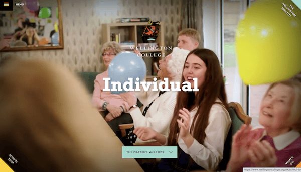
Wellington College has a responsive website that engages their visitors. Right when you first enter their site they provide a lovely slideshow of videos featuring students and faculty.
They have their events and news listed on the menu bar on the right as you scroll the page, along with a main message from the master of Wellington College, James Dahl.
Their navigation menu is located on the left hand side, and it only expands when you scroll over the menu. This helps keep the homepage uncluttered and easy to navigate.
2. Bright Horizons
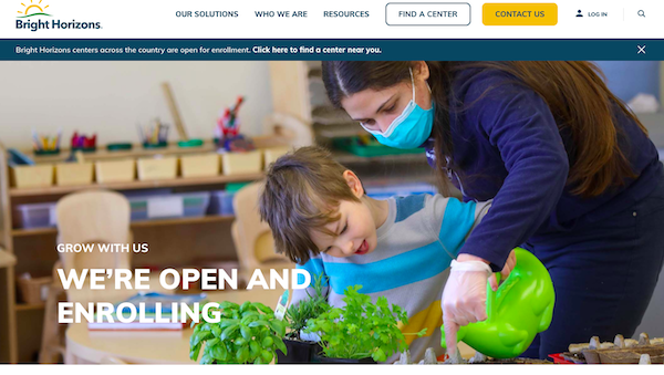
Bright Horizons has a lovely website that showcases their education mission. They have simple text that is informational and lets parents know that they are enrolling right away.
Their image also reflects the current state of education, and it relates to the copy on the left that says, "grow with us."
3. Typing Agent
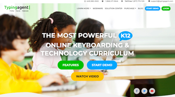
Typing Agent is an educational site that teaches children and teens how to code and type. They have a great site that is full of CTAs, so visitors can click on what they need and find information easily.
They also include their contact information at the top right hand corner of their site. This way, everyone can see their contact info without having to search for it.
4. Coding Dojo

This education site, Coding Dojo, is a cool site that helps people learn how to code to become software developers. They have an attractive design that draws their visitors in.
Coding Doja also showcases some of the top companies that their alumnus are employed by. And they proudly display their course review star rating below their hero image, displaying their value by using social proof.
5. Skillshare
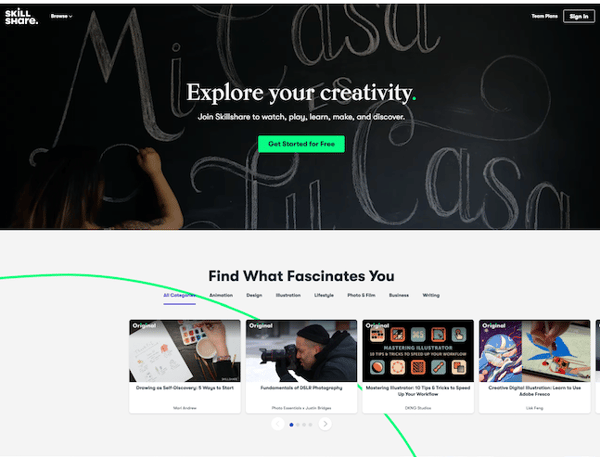
Skillshare is a site that allows people to share their art skills with others. They allow their users to watch videos, learn, make things, and discover new mediums. Their website automatically starts with a slideshow video and a CTA stating "Get Started for Free."
They also have a preview of their classes under enticing copy that states, "Find What Fascinates You." They also have gorgeous pictures with demo screenshots of how their programs work.
6. I Memorized That
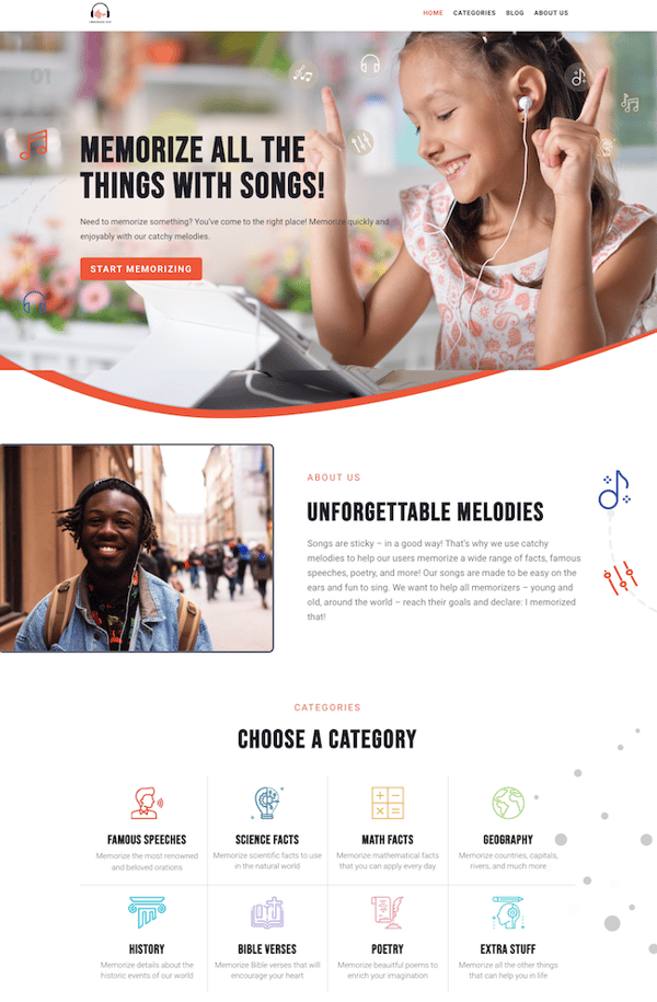
I Memorized That (IMT) has a colorful site that is beautifully designed. They have their content categorized with attractive icons, making it easy for users to pick what they want.
They also make brilliant use of their images with their copy so it's uncluttered and easy to understand.
7. The Bronx Charter School for Children
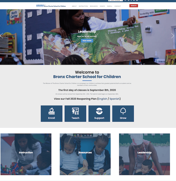
This website starts off with a slideshow of hero images that showcase children and teachers in the classroom. Their text explains what is important to the school. Visitors can click on the CTAs related to each word to show them how it relates to the school.
The Bronx Charter School For Children's website navigation is intuitive, and it allows segmented users to click on exactly what they need, like enroll, teach, support, or grow. The site also stays consistent with the brand colors in their logo.
8. Hope Academy
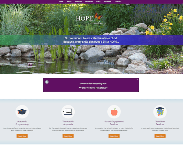
Hope Academy has a simple site with one beautiful image of a pond. They also include pertinent information regarding current events that users will likely want to know.
The icons below the "Reopening Plan" feature important resources that allow users to learn more about the school and the services they provide.
9. Lessonly
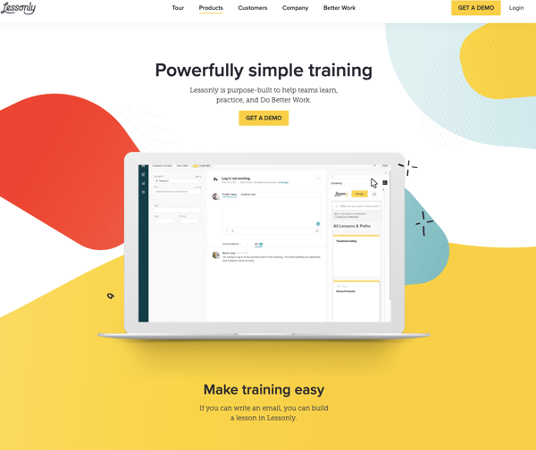
Lessonly helps companies build lessons and training courses for their team members. And it is one of my favorites on this list because of how bright their website is. It adds to the excitement of learning something new.
They also feature a video on their homepage that shows you how to work their platform. The navigation menu is simple, and the site is highly intuitive.
10. Hyper Island
Hyper Island captures visitors' attention immediately with their bold headline and creative hero image collage. They also include three CTAs right below their copy to help direct their audiences in the right direction.
Creating a website is essential to the success of your educational organization. You should aim to design your site in a way that draws them in and invites them to learn more.


Erika Giles
Erika is a Marketing Copywriter at Bluleadz. She is a huge fan of houseplants and podcasts about conspiracy theories. She spends most of her free time reading, writing, and enjoying the outdoors.