
The term modern can be subjective. Maybe you consider interactive content to be a modern element; or having a responsive design lets you know that the website owner is current on SEO best practices. If you’re in an industry that relies on cutting-edge technology (such as SaaS), then you’re definitely expecting a site to incorporate modern components.
However, something most people can agree on is that a website that looks like it was designed in the late 90s/early 2000s will never give off those much-sought "state-of-the-art" vibes. This is also the case if a site loads slowly or it’s difficult to navigate (prompting you to go to a competitor’s site instead).
If you’re wondering whether your site needs updates, you’ve come to the right place. Get some coffee, play some nice background music, and start reading.
How Website Design Affects User Experience
User experience (UX) is a non-negotiable consideration for modern website design. This refers to how easy or intuitive it is for website visitors to interact with your site. If it’s a pleasant experience, they’ll stay around longer, clicking where you want them to click and taking other desired actions.
When your UX strategy is effective, you reap the following benefits:
It Captures Their Attention.
What happens above the fold really does affect the entire user experience. It only takes 0.05 seconds for a visitor to decide whether or not they'll stick around on your website. Therefore, that first impression counts and you have to grab their attention!
It's important to include high-quality imagery and easy-to-read typography to create a simple but cohesive experience in your design. Clutter will only distract or exasperate a visitor into wanting to leave your site.
It Guides Them Down the Page.
A well-designed website will know how to keep the reader scrolling. Often, this means breaking up content into smaller chunks, creating a visual hierarchy with banner images, fonts, and supporting elements, and utilizing white space effectively to make your content feel less cluttered.
It Increases Functionality.
How your website functions is also a huge factor in the overall user experience. Responsive web design ensures that your website looks and functions consistently no matter what device a website visitor is on — desktops, laptops, tablets, or smartphones of any size.
It Showcases Professionalism.
Outdated and tacky websites won't cut it anymore. A great website design will present your business as professional and reliable to customers. It proves that you know what you are doing and you can present your business in a clear, concise, and professional manner.
It Promotes Trust.
81 percent of people will think less of your business if it has an outdated website—and 39 percent will think twice about using your products/services. Therefore, it’s crucial to consistently update and refine your design and content to retain your customers' trust.
21 Modern Website Design Trends
Here are some of the elements of great website design with examples to help inspire you to create your own beautiful modern website design.
1. A Strong, But Limited, Color Palette
Color schemes and usage are essential when it comes to modern web design. A strong color palette helps create cohesiveness.
Companies that have both primary and secondary colors have more wiggle room when creating new elements for their website — whether it’s the homepage, landing pages, blogs, or a resource database.
However, the number of colors you incorporate in your design is also an important aspect. Having too many colors becomes visually distracting and muddled-looking, so most modern website designs opt for only two — or at the most three — major colors in their primary design elements.
Check out sites like Apple and Amazon. You won't find a rainbow of colors; just one background color (white or black) and one major accent color on their pages—outside of product pictures and other elements that change on a regular basis, that is.
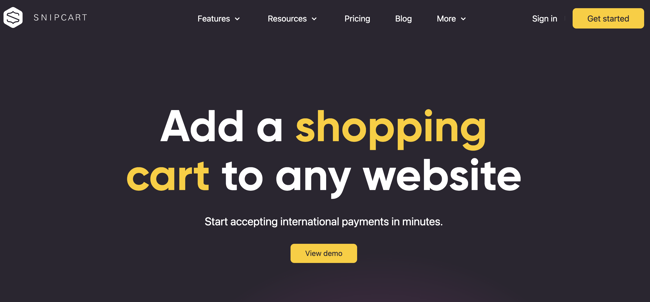
Simplifying the color scheme of your site makes it easier for web visitors to focus on your message, which is why there are minimal color combinations in modern website designs. For example, Snipcart's website has a simple and attractive dark gray, white, and yellow color scheme.
Bonus tip: If you struggle with everything starting to look repetitive on more content-rich pages, you can experiment with different shades and tints of your current colors. This will add a little variety to your designs while keeping consistent with your brand. Just make sure to provide your design team with your brand guidelines to remain consistent across all of your marketing materials.
2. Plenty of White Space
White space is attractive and keeps your site clean and easy to read. But don’t feel limited by its name. It doesn't necessarily have to be white.
White space is a term used for the amount of empty space that acts as a buffer between all the elements on your page — including copy, sidebar, margins, etc. Things should have room to breathe. If your website is crowded, visitors will feel overwhelmed and won’t know where to focus their attention.
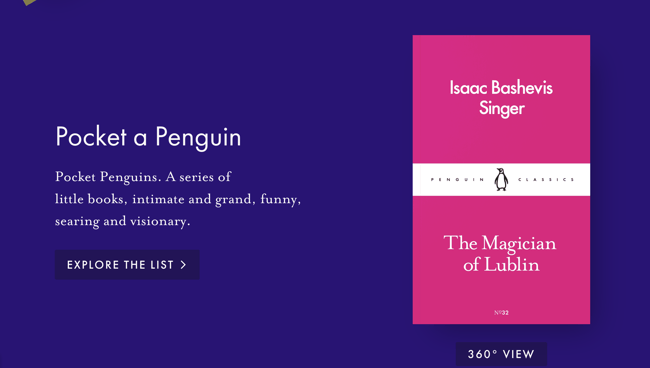
Pocket Penguins uses whitespace that is aesthetically pleasing and provides organization. Further down on the homepage, they introduce the books they sell using quotes from some of their classics. In this example, the space may not be white, but it is aesthetic!
Purposely designing your website with white space makes for a clean design that is easily digestible and organized. As websites are adopting a more minimalistic style, keeping space open on your page will allow your reader to navigate their way around the page with more ease.
3. Responsive Images
A good website should provide a consistent experience across different types of platforms. Whether your users are on mobile devices (tablets & smartphones) or on a more traditional PC or laptop setup, the UX for your site should be similar. Responsive site design elements, such as responsive images, can help keep your website friendly to both mobile and desktop visitors.
This is important because over 55 percent of website traffic comes from mobile devices. So, designing your content to be responsive to a variety of screen sizes and orientations can be an excellent way to ensure a positive experience for every visitor your site gets.
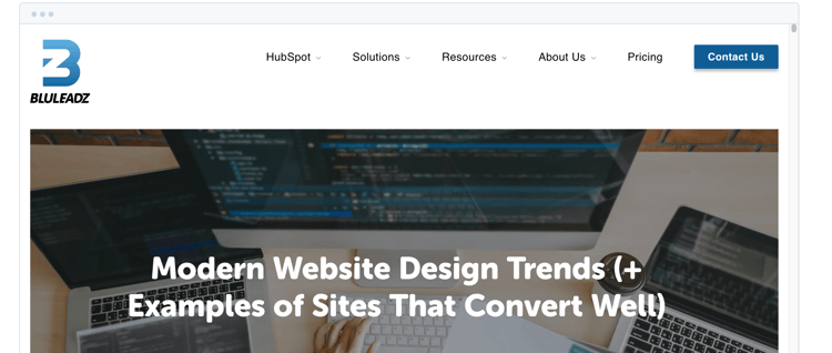
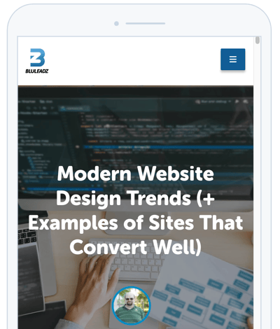
Some content management systems make this easy. For example, here's a screenshot of the preview tool from the making of this very blog showing how the hero image (that's the image at the top) would be displayed on both a desktop and on a mobile phone held in portrait mode:
Incorporating visually appealing images throughout your website can ensure that visitors will keep looking around. Using responsive images helps ensure that your images don't end up looking funky on different platforms.
4. Hero Banner
The hero banner is that prominent visual element you first see when you visit a website page. Some pages incorporate beautiful imagery, a carousel of images, or a video showcasing the technologies they’re most known for.
There are several things you should keep in mind, regardless of the format of your hero banner.
- Make sure it’s visually appealing.
- Use your brand colors and incorporate text that’s easy to read.
- Use high-resolution images that are responsive to all screen sizes — you want to make sure the website looks attractive regardless of whether a person is visiting from a 16” MacBook Pro or a smartphone. Avoid using stock images.
- Be sure to include a call to action (CTA) to entice readers to engage with your site from the first moment they visit it.
That last one can be especially important, as it gives your visitors an immediate "Next Step" that they can take once they hit your website and see that hero.
5. Layering
So, you have a website that doesn't have a lot of text. How can you make it still have a TON of impact? One method is to use layering. putting layered colors, images, shapes, and other elements into a module on your site creates a lot of depth and texture without the need for a bunch of copy.
When used effectively with your brand's colors, it can also help you get across your brand's story and personality in a way that words sometimes can't.
Here's an example of a layered design from Webflow's community-built templates (Credit to Lionize for the design):
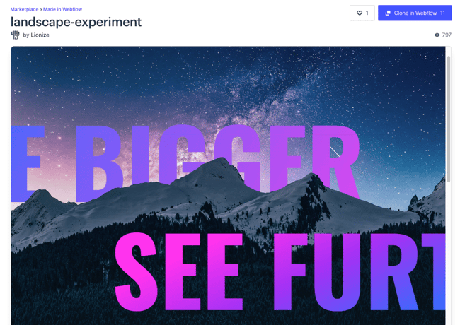
In this example, you have the text on two separate layers over an image—some of it behind the summit of the mountain in the picture, some of it in front. The font uses a consistent gradient color scheme to be eye-catching and to help pick the text out from the image as well—helping make it a bit easier to read.
6. Cinemagraphs (GIFs/Videos)
The human brain is pretty much hard-wired to pay attention to movement. In a Harvard News article, postdoctoral researcher in the Harvard Medical Neurobiology Department Grigori Guitchounts noted that "the brain somehow needs to coordinate perception and action... You need to know when a sensory input is caused by your own action as opposed to when it's caused by something out there in the world."
So, when we see something moving that we didn't cause, we all tend to pay a bit more attention to it.
Cinemagraphs (high-quality videos or GIFs) leverage this tendency of ours by using moving images on the screen to really draw attention to something on the site. In our blogs, we often use images from GIPHY to help animate the reading experience with something fun and interesting or to highlight a point and draw attention to a specific section of content in the post.
For example, this GIF:
You're looking at a cinemagraph. Were you scrolling down the page and just stopped at this GIF image because it was moving when other images on the page were static? Congrats, you now have an example of why this can be a great tool for modern website design!
7. High-Quality Product Videos
As video marketing continues to grow in popularity among both B2C and B2B businesses, many companies have started adding product videos to their website.
Doing this can help highlight your brand's personality and show off what your business has to offer to your customers.
In addition, 92 percent of B2B customers watch online videos, and 43 percent watch online videos when researching services and products for their business. Therefore, it’s clear that this format has a significant impact on customers’ decision-making process.
Shorter videos allow for your top-of-the-funnel prospects to quickly understand value without watching a really long, in-depth explanation.
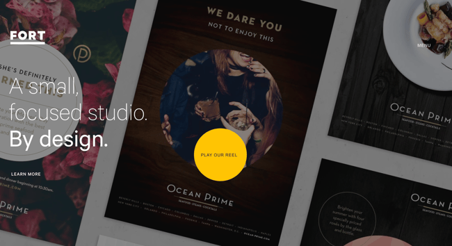
Fort has an intuitive video that starts going through various slides with attractive product pictures on it. You can slide your cursor over the Play Reel CTA to stop or play the video. It doesn't quite capture the effect of seeing the page live, but here's a screenshot showing the "Play our reel" button.
Place videos strategically around your website. For example, you could place them on your pricing page to talk about your options, on your product page to showcase their features, or on your About Us page to introduce your team to everyone.
8. Clean Backend Coding
This modern website design element is one that you might not notice visually, but it’s probably the most important when it comes to the functionality of your site.
Behind every website is a great deal of coding in the backend that will dictate how your site performs.
You want to hire highly-skilled designers who know how to code a site to function flawlessly, load quickly, and navigate effectively for converting visitors into leads and customers.
Dedicating the extra time for clean backend coding will make it easier to write, read, and maintain how your site functions. Why? Because, a clean, simple code that is properly annotated is easier for future coders to review and edit.
Clusters of spaghetti code make it harder to find the things causing errors on the site and fix them. Think of it like a cluttered closet—if your closet is a cluttered mess, you might be able to find where you have your jackets in the pile, but if you ask your friend to bring you your favorite letterman, they'll struggle to find it at the bottom of a pile of laundry that isn't sorted.
9. User-Friendly Design
This element of modern website design is exactly what it sounds like: You should build your site for the user; not just to boost your rankings. Companies, out of a sense of desperation to get better rankings, tend to do things that are “good” for Google but bad for the user.
However, this shouldn’t be the hierarchy of importance for website design. A site should be user friendly before a company should concern itself with ranking higher on a search engine results page.
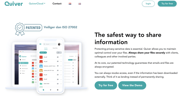
For instance, Quiver is an incredibly well-designed site that is effortlessly user-friendly and easy to navigate.
Also, Google’s algorithms are pretty smart: They can tell when your users are getting good value from your website because they keep coming back and spending more time on it. Place your content above SEO (although, by all means, do incorporate search engine optimization practices). But prioritizing value and ease for your readers is what will keep them on your site, and coming back for more.
10. SEO Boosting Elements
While we’re on the topic of SEO, there are modern website design elements that can greatly improve the search engine optimization (SEO) of your site. A lot of these are invisible to the naked eye—or, when done right, are practically unnoticeable—and also appear in the backend coding of your pages and posts.
Design tricks like meta tags, title tags, heading tags, and other HTML coding go a long way in helping your site climb the ranks of Google's search engine. So can resizing images before uploading them to your site, ensuring they have alt text, and doing what you can to minimize their file size so they load quickly!
Make sure you fill out, tweak, and optimize HTML backend elements so they are relevant to your site and improve your search ranking.
11. Speed Optimization
Optimizing for speed is an imperative design element that should never be overlooked. In fact, it’s also part of any effective marketer’s SEO best practices list.
With today’s technology, people expect things to load immediately, or they’ll probably throw in the towel three seconds later and go to a competitor’s website instead.
As a business, you don’t want leads and prospects to think negatively about your brand just because your website is slow.
To make sure your site is fully optimized for speed, follow these tips:
- Always optimize a photo, no matter how small it is.
- Enable compression so files will be smaller and open quicker.
- Minimize HTTP requests in Google Chrome’s Developer Tools.
- Choose the proper hosting options, whether it's shared hosting, VPS hosting, or a dedicated server.
You also need to consider your mobile site speed. Most people today visit websites from their mobile devices, and you want them to encounter a good UX while doing it.
12. Scannable Formatting
Nobody likes to read blocks of text — especially on websites. If your web visitors want to read a novel, they will do so (however, do keep in mind that all good writers break their text into paragraphs).
When it comes to visiting a business site, 79 percent of people simply scan the pages. While some do read it word-for-word, they're in the minority and you want to cater to as many people as possible in your target demographics.
In addition to making it easier for readers, using a scannable format earns you proverbial SEO points; so incorporate headings and subheadings and bulleted lists whenever it makes sense to do so. Remember to insert a few keywords in those H1s and H2s, too.
13. Minimalist Design
Minimalistic designs remove all unnecessary distractors. While they can seem pretty basic, they are an effective way to get web visitors to take a desired action. This design philosophy often takes the concept of whitespace to the extreme—eliminating everything that could be a distraction to the buyer's journey.
One way some sites accomplish this is to be so minimalized that they become text-only for large sections of content. Take, for example, B14, a website whose initial homepage screen is just text:
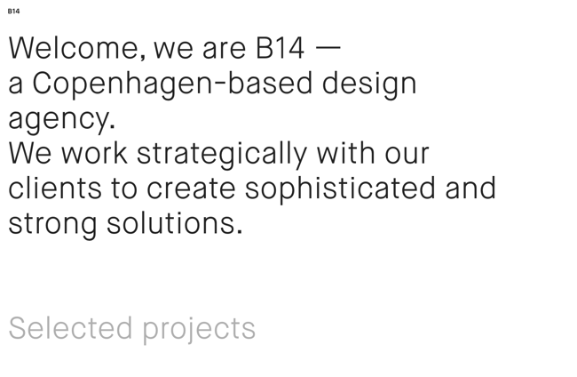
Of course, once you scroll down, you start seeing images showcasing the studio's work—complete with layering, grayscale examples, scrolling text, and more. However, that first screen being so minimalist really makes an impact.
14. Interactive Elements
Modern websites often provide interactive elements. This can be done in the form of quizzes, calculators, polls, maps, webinars, and ebooks. In addition to keeping web visitors engaged, it also lets you gather useful information to provide a more personalized experience.
If you decide to go for lengthier elements, such as having them enroll in a webinar or download an eBook, make sure to ask for their email address in exchange for the lead magnet. This helps you grow your email list while at the same time providing them value.
15. Personalized Content
Someone who’s at the bottom of your sales funnel doesn’t need to see the same content as a first-time website visitor. In fact, personalizing content is a more effective way to drive conversions. It also lets readers see that you’re doing everything within your power to provide them with value.
A good way to do this is with a smart content load. This tool tracks users’ circumstances to display content that’s relevant to them. This includes factors such as their geographical location, device type, their history interacting with your site, ads they have clicked on, etc…
This saves them time and guides them along their buyer’s journey in a more effective way.
16. Chatbots
People love instant gratification. And while most websites include a Frequently Asked Questions section, sometimes, web visitors either don’t have the time or desire to browse through it, or they have a unique query. Instead of making them wait a few days for an email response, chatbots lets them get their answer straight away.
This element also makes things easier for your team, since it frees up their time to focus on more complex issues. If it turns out someone is indeed asking a terribly complex question, it can be routed to one of your customer service reps for a more detailed reply.
Granted, this is possible if you use a good customer support platform that integrates with your site. For example, in HubSpot, you can set up chat tools with automated responses that allow you to forward conversations to your marketing and sales team. This allows you to use both live chat for when reps are available and automated chatbot responses during off-hours or when all reps are busy.
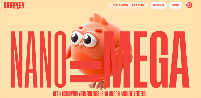
17. 3D Designs/Artwork
Traditionally, most website illustrations would use either real photos of people/objects or two-dimensional drawings to showcase concepts or accentuate the page. With 3D modeling software picking up in popularity and computers becoming more powerful to the point where home computers are becoming capable of rendering 3D images more easily, 3D design elements are becoming more commonplace on modern websites.
Many of the "3D" designs on websites are cutesy in their appearance for simplicity's sake or to reinforce a friendly look and feel. However, more realistic or complex 3D models can be used by studios that want to show off their design chops.
Here's an example of a "cute" 3D design from Chirpley featured on their homepage:
18. Dark Mode
You’ve likely seen the dark mode feature on popular platforms like Google, Reddit, and Facebook. It makes reading more comfortable by reducing blue light and enables web visitors to modify the interface to their preference.
Some websites allow users to set it to dark mode any time they visit it, while others automatically switch to it at night. Either way, they get to relax their eyesight while they consume your content, so it enhances the user experience.
This feature is even more useful for website visitors using their mobile devices, as it requires less energy, thus reducing its drain on the battery. It's also a good accessibility feature for those who may have sensitive eyes that might get hurt by brighter lights.
Dark mode can also up the coolness factor on websites for businesses whose brand colors pop even better against the black backdrop.
19. Web Textures
The term web texture refers to background images that make a webpage look three dimensional. The purpose of doing this is to evoke a certain emotion from the reader. Think of how visiting a website with a background of crumpled paper for a company that creates wireframes or gives the impression of having spiderwebs when showcasing them at close range to emphasize its details.
Web textures are also a great way to guide a users’ attention to a specific point on the webpage. While this trend looks good and makes your site stand out, keep in mind that overdoing it may look distracting or slow down your page loading times.
20. Scrolling/Parallax Effects
Parallax refers to when the background of a website seems to move at a much slower pace than the content you’re scrolling through. It really is an optical illusion to give the impression that objects in the background are further away.
This is an effective way to showcase a product in 3D, or simply make your website look more fun or interactive. The Bite toothpaste’s website does this halfway down their homepage
However, just as with web textures, this type of design could slow down your page loading times if not used sparingly. Make sure to work with highly experienced web developers when implementing this concept so that you get your modern website look without having it affect your SEO.
21. Gamified Design
Want to take interactive website design to a whole new level? Consider using gamified website elements to really engage your target audience. This is fast becoming a trend for encouraging engagement with websites of all kinds—typically B2C-focused ones.
Incorporating gamified elements encourages audiences to actively intreact with the site and creates a more memorable experience. It's fun, playful, and engaging—but maybe not the best for creating on-the-spot conversions since it can distract from filling out forms and moving down the sales pipeline. At least, in the short term.
Companies that use this web deisgn element may be able to leverage it to remain top-of-mind through memorable experiences. Google's Chrome web browser has had an example of this for years for whenever a user isn't connected to the internet—that game where you try to help a dinosaur run through an obstacle course by pressing the spacebar. Fun fact, the game doesn't pause when capturing a screenshot:
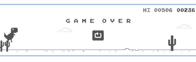 In this case, Google was giving users something fun to do whenever they aren't connected to the internet. This fun little Easter egg is a great way to keep people interacting with the software when there would normally be no point using the browser.
Modern Website Design Must Haves
While all of the elements listed above are fun and effective, you can pick and choose whichever ones you’d prefer — or leave most of them out of the page if it better suits your needs. However, there are certain components every single modern website must implement:
SSL Certificates
Users who come to your website should have the peace of mind that comes from knowing that their interactions with you are secure. After all, landing pages ask for full names and contact information, and eCommerce pages require entering sensitive data, such as credit card numbers and mailing addresses.
A Secure Sockets Layer (SSL) certificate secure online transactions by encrypting information—both at rest and while in transit. This prevents unauthorized third parties from intercepting or accessing any user data.
Accessibility for Disabled Users
You want to ensure that you eliminate any barriers that would make it difficult for a website visitor to navigate through your site. This includes those who may be visually or hearing impaired. It also takes into account users with diminished senses due to age.
You can do this by incorporating alt text for images. Include a description of all photos, so that people using e-readers can know what’s displayed on your webpages. You can also add subtitles to video content and allow for font resizing.
Another good practice is to create content in HTML to make it easier for screen readers to scan your webpages.
Mobile Optimization
Let’s go over this one again, so that you truly understand its importance. Ensuring that your website displays well on smaller screens accomplishes several purposes — all of them affecting your conversion rate.
- The site will load faster.
- It’ll keep users on your page.
- It increases user engagement.
- It improves user experience.
- It increases your chances of ranking higher on search engine results pages (SERPs)
So even if you have a small budget, make sure to prioritize this element. It’ll increase your ROI from your website greatly since, as noted earlier in this article, the majority of web traffic comes from mobile sources.
10 Examples of Companies With Good Modern Website Design
Here are 10 companies with the best modern website designs that include many of the awesome elements mentioned above.
1. Brit + Co
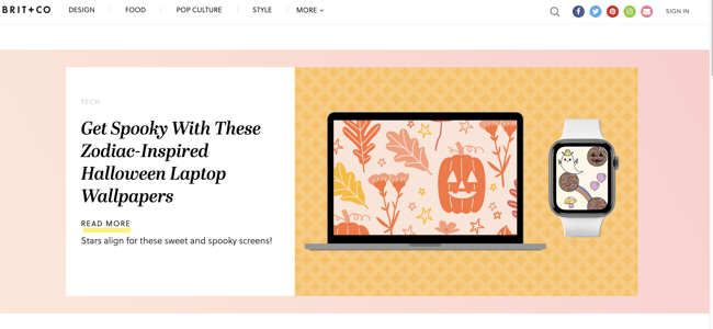
We've talked about Brit + Co in the past – and for good reason.
Brit + Co is a "media company that inspires, educates and entertains real women with a creative spirit." And it seems their website does just that for us!
Their website is full of bold yet muted colors and clean lines. They section off their pages well, which helps bring your eye down the page, and they let their strong imagery speak for itself.
A lot of white space comes flooding in from the sides, so nothing looks cluttered and everything is easy to read.
2. Bose
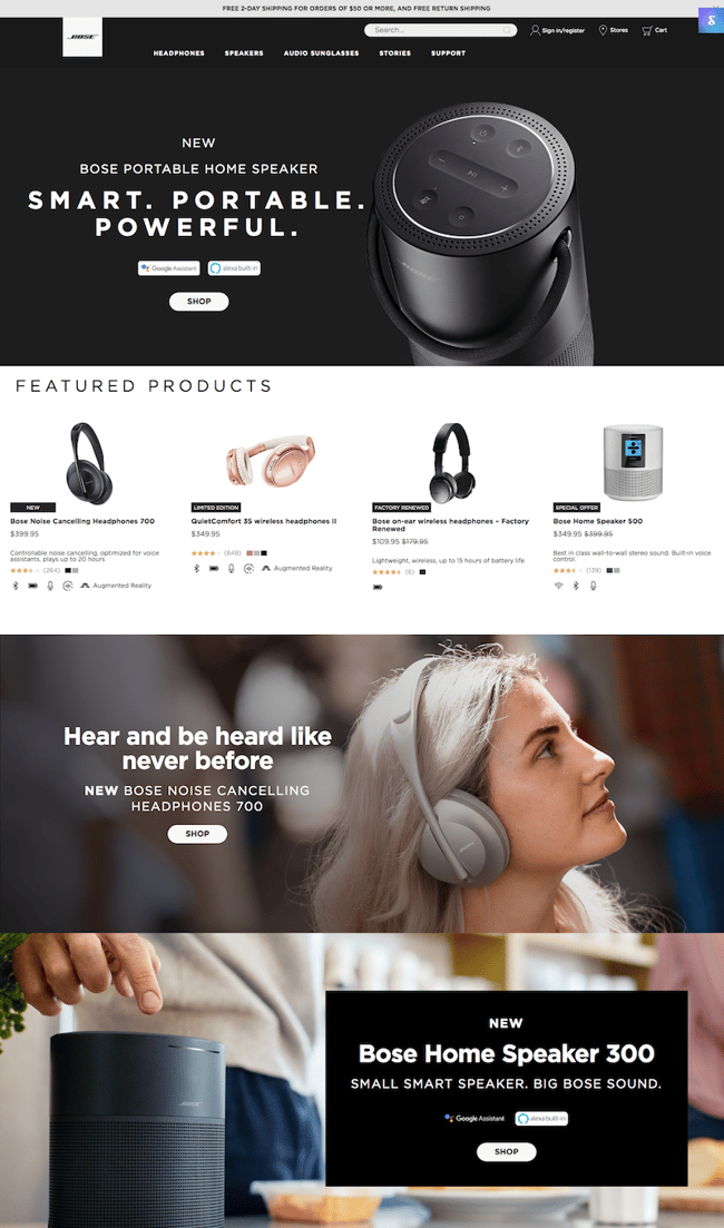
Bose is a well-known audio equipment company, and their website screams sophistication and functionality.
The large hero images are eye catching yet highlight their products perfectly. Bold typography with a lot of visual hierarchy keeps you attentive to the page. The featured products section right under the fold is a great way to bring in some white space after the dark black hero image.
3. Oak Street Bootmakers
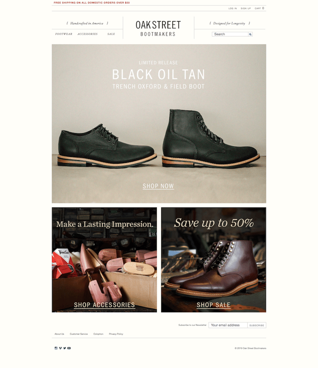
Simple and refined are the two words that immediately come to mind when looking at the Oak Street Bootmakers website.
The more natural-tone colors are very calming to the eye, and the images of their products are very clean and direct. To keep with the calming look, they opted to place white text over their images rather than making a bolder statement with black.
Since their homepage is pretty short and simple with only three main sections, they chose to get a little more creative with their header and navigation, using a more sectional design rather than just placing a straight navigation on top of the page.
4. Londonist Textile Agency
Speaking of feature videos in modern website design, the Londonist Textile Agency nails it.
The second you land on their homepage, you're drawn into the panning video of an individual looking at a bunch of design sketches. The video is simple yet has a lot of textural and visual elements that keep your eyes looking around.
The rest of their homepage combines white space with angular dusty blue elements and image overlaps. The complete design is bold yet professional and simple.
They utilize super bold headers to point out major elements of their business, and keep the rest pretty standard and refined to contrast nicely.
5. Land Rover
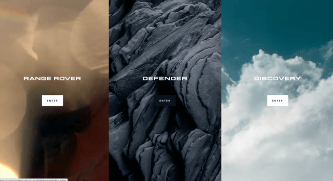
Not only does the Land Rover USA website have a beautiful and captivating hero image to greet the visitor when they first hit the site, it does a great job of filtering traffic based on which product they're most interested in.
The visitor is presented with three images with distinct color palettes to choose from, and can enter one of three subdomains from there depending on whether the visitor prefers the Range Rover, Defender, or Discovery line of automobiles.
The colors in their images are what pull you in, and they opt to keep the rest of their site pretty clean and simple. The grid style really works here because it allows for optimal white space to separate their vehicle details and specs.
6. bthere
bthere knows how to steal your attention. Their website is full of bright colors and animations that make you want to reach the end to see what else is in store.
While it might be a little busy in terms of color, it actually works here. All the colors are cohesive and mesh well together. Almost all of the visual elements move in some way or another, which is a great tactic to entertain visitors while they're skimming your site.
7. Muse
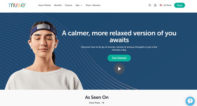 Muse has awesome product pictures and clean website copy that is easy to understand and contributes meaningfully to their site. They have testimonials and "As Seen On" segments right on the homepage, with several CTAs near some of their photos and descriptions of how Muse headbands can help you meditate and sleep better.
They offer inside looks into their app that connects to the headphones to track your brain waves by including screenshots of what the app can do.
The hero image at the top of the woman fastening her headband pulls the user in and makes them want to know more about this new piece of technology.
8. Litter-Robot
The Litter-Robot website has plenty of white space and a great color scheme that is easy on the eyes. The top of the homepage is dominated by a video showing the company's litter robot in action, giving visitors a clear idea of what the tool is, how it fits into their home, and how their furry feline friends will use it. All of this is communicated without the need for extensive text beyond "Never scoop again"—that's reserved for all of the CTAs and robot bundle info found further down the page.
The website is selling cat litter pans, but the experience of the website makes it appear more glamorous and exciting than it is. Their pictures and awesome layout help showcase the fact that this particular litter pan for cats is extremely high-tech!
Their headlines are catchy and engaging, which fits seamlessly into the rest of the branded information and general theme of their website.
9. Tallyfy
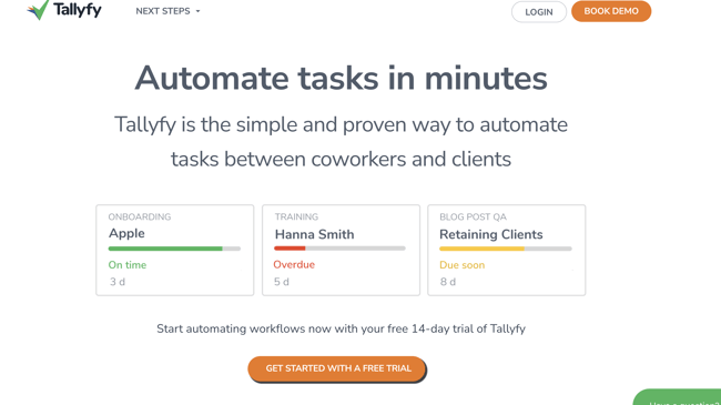
What's great about Tallyfy is that it is a simple no clutter website. They have one simple dropdown menu at the top of the webpage for next steps and a very clean design that showcases what the tool looks like—helping set expectations right from the start..
The headline provides a quick statement of what the solution does. Namely, it helps you "Automate tasks in minutes" between coworkers and clients. As you scroll down the page, you'll find more information about the solution, how to use it, and the potential ROI it creates for users.
It's an intersection between good website design and great website copy.
10. Absurd Designs
A new modern website design trend involves line-drawings or artistic illustrations drawn out across a website. It is a whimsical and attractive way to include artistic elements on your site in a way that isn't overbearing.
Absurd Design's website uses these line-style drawings to tell a story in an imaginative and creative way that still leaves plenty of white space. This modern website shows users that a black and white color scheme on a website is anything but boring.
With these tips and examples, your company can create a kickass website design that will help you attract new visitors, generate leads, and convert prospects into customers.


.png)
Comments