
The legal industry is competitive, which means you need to make sure you stand out. A great way to ensure your law firm remains a top contender in your field is to design a great website that generates leads.
Your website should show your future clients that you have the knowledge and expertise to work on their cases and win.
We're sharing some inside information into the exciting world of web design for your law firm with best practices, the make up of a great site, and 10 of the best examples to get you started on your website design journey.
6 Elements of a Good Law Firm Website
A good law firm website is essential to gain potential clients. Your site should be informative and aesthetically pleasing to your visitors.
Here are six elements that make up a good law firm website:
1. They Display Achievements and Awards.
Displaying your achievements and awards on your law website allows you to promote your skills and expertise to your site visitors.
This helps you to build credibility and encourages your potential clients to put trust in you.
2. They Share Customer Testimonials.
Testimonials from former clients let your site visitors see the ways you’ve successfully won cases similar to theirs in the past.
You can choose to display your testimonials on your homepage, or you may display them on your attorney profiles page and list testimonials by the attorney who won the case.
Social proof is essential in engaging your site visitors and enticing them to reach out to you.
3. They Include Attorney Profiles.
If your law firm includes multiple attorneys, it may be a good idea to include a picture of each attorney along with their accomplishments and practice areas. This helps your site visitors to know which attorney to get in touch with directly.
It also showcases your talent and provides your potential clients with a more human approach because they’ll be able to put faces to the names they see on your site.
For instance, Jones Foster has an attorney profile page that shows a professional picture of each attorney and provides potential clients with their education, affiliations, biography, admissions, and insights.

4. They Follow SEO Best Practices.
For your law site to benefit from organic search, you need to adopt some search engine optimization (SEO) tips and tricks. This means you must target relevant keywords, add alt text, follow proper formatting, and earn quality backlinks to help boost your search ranking.
Consider hiring an SEO specialist if you want to drive more organic traffic in less time, or outsource through a marketing agency to handle all your digital marketing needs.
In some cases, your content management system (CMS) host may have SEO features and plugins to help you.
5. They Appeal to Their Target Audience.
Optimizing your site for search is a good practice to get in the habit of, but repetitive use of overly optimized phrases can hurt your site. People don’t like to read repetitive phrases that seem like cheap advertising.
Focus on your audience, and write to them instead of to search engines. If you write thoroughly around one topic with helpful tips, the keywords will be added naturally. Quality content always wins big, for humans and search engines alike.
6. They Display Their Logo and Legal Specialty.
You don’t want visitors to land on your law firm page and think that they are on a generic law page that could belong to any lawyer in your town. You want them to know it’s your law practice.
Make sure you have a branding strategy that showcases your unique logo and displays your specialties right on the homepage.
People are more likely to remember your site when they see an image or logo of some sort. So don’t forget to make your site memorable!
Law Firm Website Design Best Practices
Check out these six awesome tips that you can apply to your law website design.
Use a Variety of CTAs.
CTAs help guide your visitors to move forward through your sales funnel. The goal of your law website is to encourage your visitors to get in touch with you to setup a consultation.
Some good places for CTAs are on your hero image, throughout your homepage, and on other pages, such as your about us page and attorney profiles page. Make sure each CTA is unique to the page your visitors are own.
Make Contact Forms Simple.
Only ask for necessary information on your contact and consultation forms. You can always collect more information later during discovery when you email them or call them after they submit the contact form.
You don't want your forms to be too long because it may overwhelm your visitors and cause them to back away from your site completely.
List Your Services.
It's important to clearly showcase your services on your homepage so your visitors know what you offer right away. People come to a law firm's site to see if you can cover their case, and if you can, it's best they know that upfront without having to search your site.
This way, they know whether you have the appropriate skills for their needs. If your firm offers multiple services, you can list them on the homepage and provide more information on a different page.
Keep Your Content Current.
Nothing is more frustrating to your potential clients than receiving incorrect or outdated information on your website. Make sure your blog, contact information, attorney profiles, services, and other content are up to date.
Use social listening and data collected from keyword research to make sure your content is consistent with new trends that your audience is interested in to boost your SEO.
Use a Responsive Design.
Almost everyone uses their mobile devices to access websites. Make sure your site is mobile responsive so it doesn't take a long time to load or cause them to have to scroll in every direction just to navigate it.
If your site isn't responsive, users are more likely to bounce from your site and never return.
Write Easy-to-Understand Copy.
Law terms and jargon can be very confusing for the average person to understand. Keep your copy simple and easy to understand so your site visitors know exactly what you are talking about. There's no need to get into details just yet.
Wait until your potential client reaches out to you so they can ask more detailed questions about your services.
10 of the Best Law Firm Website Design Examples
Here are 10 law firm website examples to help inspire you when you design or redesign your law website.
1. FootAntsey
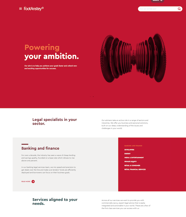
Footanstey has an excellent color blocked website design that is clean with simple web copy. They list all of their services along with the industries they work with most often.
The site is easy to navigate with a search bar at the top and several options to read more as you scroll through the site.
2. Bronstein & Carmona
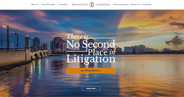
Bronstein & Carmona's site starts out with a gorgeous hero image of the city where they are located. They have a simple CTA that invites users to learn more about the law firm and its services.
The site is easy to navigate with a simple menu bar that is located horizontally across the top of their webpage.
3. C.A. Goldberg
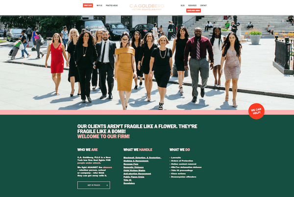
C.A. Goldberg adds a personal touch to their website design with a hero image of their whole team. They have simple copy that outlines what they do seamlessly with categories and bullet points that state who they are, what they handle, and what they do.
This way, site visitors know if they are in the right place right away. They also have several CTAs that stand out and encourage their potential clients to get in touch with them.
The victim rights firm also includes their contact information in the upper right hand corner of their homepage.
4. Ylaw Group
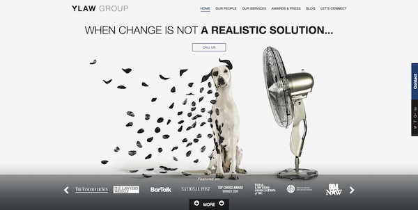
Ylaw Group has a creative slideshow with pictures that match their creative copy. They also showcase their mentions in the media to emphasize their expertise.
Their simple website design is clean and offers plenty of whitespace to reduce clutter. Ylaw doesn't have a typical law firm website. They stand out with their unique design that visitors are sure to remember long after they exit the site.
5. Tremain Artaza
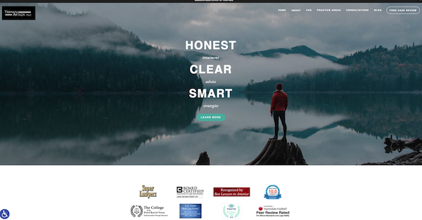
Tremain Artaza is an accessible site that showcases their awards and achievements right under their hero image. This encourages trust in site visitors because they'll clearly see that your firm has reached intermediate or expert level in working with clients and winning cases.
They have two prominent CTAs that invite visitors to get a free review or to learn more about what they do. Their homepage is very simple, only including necessary information about how they work for their clients.
They take it down to the basics and invite interested ones to learn more.
6. Jones Foster
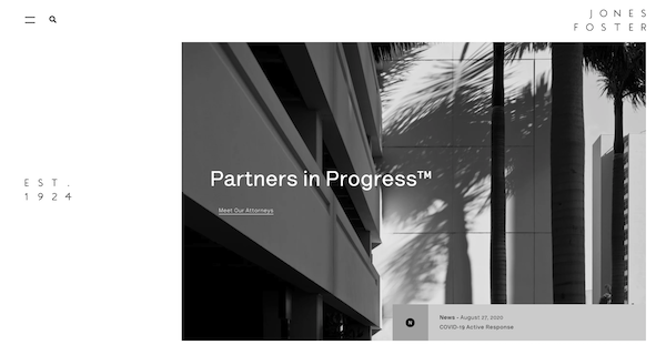
Jones Foster has a clean and modern design with a gorgeous black and white color palette. They are a large firm that starts their website off with allowing their visitors to click the "Meet Our Attorneys" link.
This tells visitors what each attorney specializes in and gives them insight into the attorney's education and awards.
The site is easy to navigate with a responsive design that encourages users to scroll and click on more information.
7. Foundd Legal
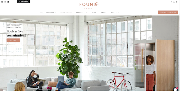
Foundd Legal does a great job of appealing to their target audience with a bright and airy website design that appeals to startups. They mention a free consultation right away with a CTA right on their hero image.
They keep their brand consistent throughout the site with their unique logo design and color palette. Below their hero image, they also offer their "Startup Business Checklist" for gated content in exchange for visitor information, along with other lead magnets like downloadable templates and guides.
8. Taylor Janice

Taylor Janice law firm offers segmentation options on their hero image that allow users to go to different pages based on their needs. This gives targeted information to the two different types of potential clients they work with.
They also offer a few paragraphs about what Taylor Janice does and how they work with their clients.This clean design has a simple menu with two options for visitors to get in touch with them in the upper righthand corner.
9. HopgoodGanim Lawyers
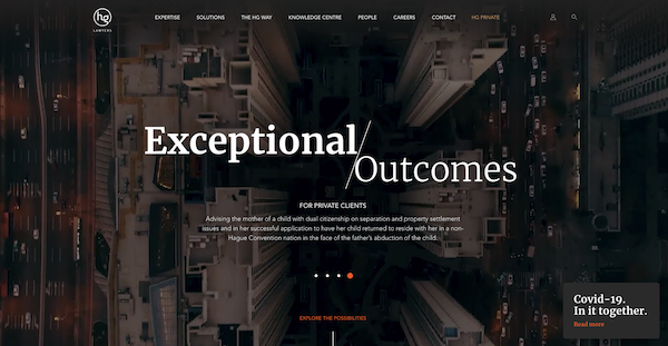
HopGgoodGanim is one of my personal favorites because of their striking hero image and their headline "Exceptional/Outcomes." Their site shows the strength and capability of their law firm as soon as their visitors enter the site.
They also lead their visitors to "explore more" about the firm and their services. Right below their hero image, they let their visitors know how many lawyers they have along with their wide-array of disciplines.
They then invite visitors to search for what they need, which contributes to a great user experience.
10. Bick Law LLP
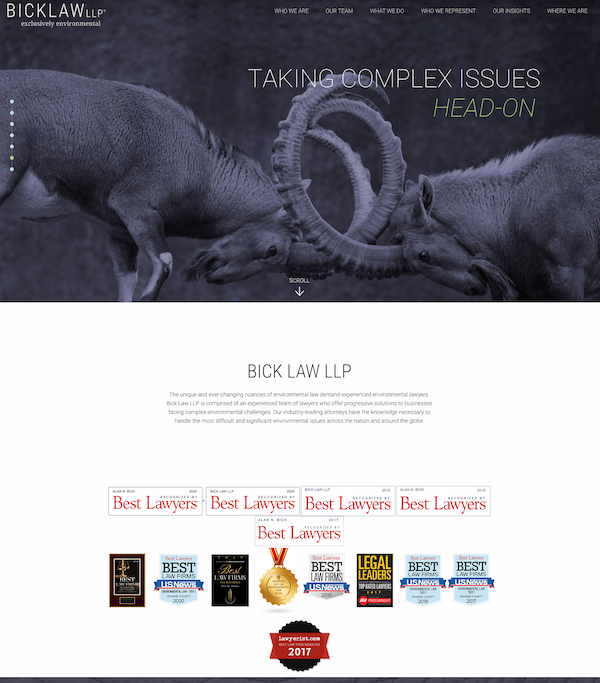
Bick Law LLP introduces site visitors to a cool image that directly relates to what they do, with meaningful copy that entices users to stay on their site and explore more.
They display their many awards and media mentions along with a simple description of what they do. If visitors want to know more, they can click on one of the menu items.
You don't have to have a boring website for your law firm with the typical sections, pictures, and copy. These awesome law firm website examples demonstrate how great your site can be.
All you have to do is make your site unique and showcase the services you provide in a creative way that guides your visitors to take a desired action.


.png)
Comments