
Healthcare websites are often the first impression a person has of your medical group or practice. Potential patients research your site and compare it to others before they make a decision about submitting an appointment request.
They want to make sure that they will get professional care from the doctor they choose and that they will get friendly service from other office staff. Health is a sensitive topic with most people. Your site can let them know they are in good hands if you make sure to follow along with website design best practices.
Medical Website Design Tips and Best Practices
People who visit healthcare websites are searching for information. These sites must be easy to use, navigable, and have an aesthetically pleasing design.
Follow along with these best practices to make your medical website the best it can be to attract new patients.
Highlight Your Featured Services on Your Homepage.
This may seem like a given when you create a medical website, but some medical web designers may not include any services on their homepage because of how many services they have.
But you don't have to list all of your services. All you have to do is determine which services your patient base is most interested in.
Place three to four of those services on your homepage so your potential patients can get a general idea of what you do and how you can help them.
Keep Your Content Up to Date.
Content marketing is important, even in the medical field.
Make sure your website has content that is accurate, valuable, and current. If you have a blog, keep it active. Keeping an active blog is great for SEO and can help drive traffic to your website.
Include a Staff Page.
Add a human approach to your medical website by adding a provider profile page. About 50 percent of patients search for information on specific medical professionals before they schedule their initial appointment.
Include a professional picture of each provider along with information about their specialties, medical degrees, and any other relevant information that potential patients might want to know.
This can also boost your SEO because when people search for a doctor, your provider profile page is likely to pop up and include an internal link to your homepage.
Feature Patient Testimonials.
Placing patient testimonials or reviews on your site encourages trust in your site visitors. Many people feel anxious or nervous about finding a new doctor, and seeing testimonials can help them to feel at ease.
They may also find details in the reviews about a problem they are dealing with, which will make them feel like you can care for their specific issues.
Use Lead Forms for Easy Appointment Requests.
A well-designed medical site makes it easy for people to provide their personal information so they can schedule an appointment. If you have forms that are too long and require extensive information, your site visitors may decide to leave your site.
You may consider adding a prominent CTA that is no more than a quick scroll away on any page to encourage visitors to schedule an appointment.
Another aspect you may consider is making your appointment request forms a pop up so your potential clients don't have to wait for a new page to load.
Encourage Potential Patients to Sign Up for Email Newsletters.
Newsletters are a great way to keep in touch with potential patients and current patients. In the newsletter, you can add in new blog posts, office news, general healthcare information, and even remind patients to come in for checkups.
An easy way to grow your practice's email list is to allow your patients to sign up on your website using a clear CTA.
Select a Good Color Scheme.
Color schemes are important to the design of your website. Medical websites need clean and sterile colors that give provide users with the sense that the site and medical practice are credible.
White color is a great design for medical websites because it doesn't detract from the content on a website. Blue is another great color for medical websites because it is typically the color of a doctor's scrubs.
You may choose to add other colors to your site, but remember that they should create a calming effect on your patients. This means reds and oranges are not a great idea for a medical site because these colors are typically denoting emergency or caution.
Optimize Your Site for Local SEO.
Local SEO is essential for medical websites since most of your patients will likely be from your general area.
You can do this by including your address along with a map of your location, by publishing locally focused content, and by making sure your site is listed on online directories.
Add Engaging Images.
Medical stock images may seem too fake or impersonal for your site visitors. Try hiring a professional photographer to get pictures of your practice and your office staff for your website to add a personal touch.
This adds to your site's professionalism and overall modern design. Make sure your copy matches any pictures you include on your website to provide value for your site visitors.
Make Sure Your Site Is Mobile Friendly.
Most people search for information they need on their mobile devices. Your site should be able to adapt to a variety of screen sizes without sacrificing functionality.
If your site isn't mobile friendly, it may cause you to miss out on new patients. Not only does it hurt your SEO, but it also gives your competitors who have a responsive website a leg up on you.
The 15 Best Medical Website Design Examples
Here are 15 great medical website designs for you to spark some inspiration for your own website design.
1. Rush
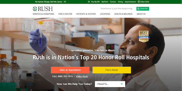
Rush has a professional medical site that displays some of their top accomplishments for visitors to see right when they enter the site. The hero image is visually interesting and contributes meaningfully to the rest of the site.
Rush also has prominent CTAs with bright colors that entice the user to click them.
Site visitors can easily conduct a search for a doctor in one of their 11 different specialties. They also include information about events, classes, and current medical news.
2. Northwestern Medicine
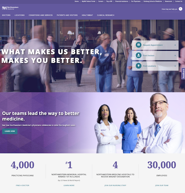
Northwestern Medicine has a beautifully designed website that is easy to navigate. Everything is laid out in a way that leads site visitors to take desired actions such as requesting an appointment or searching for a doctor.
Their CTAs are well placed, and they provide two options on the homepage for finding a doctor. They also display their rank at the bottom of the page and list how many practicing physicians they have.
Further down on Northwestern's homepage, they also have a newsletter sign up to help them capture the emails of their site visitors.
3. Split Rock
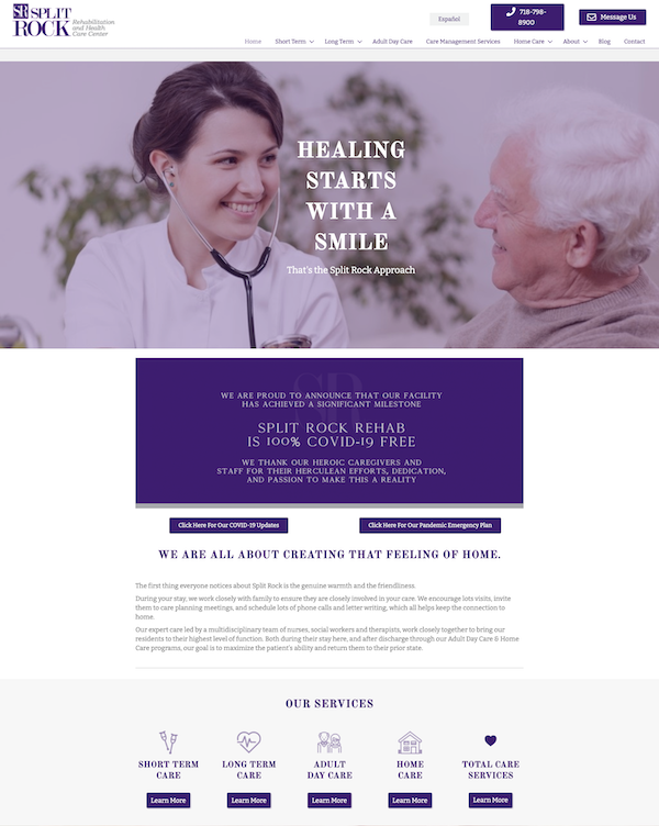
Split Rock kicks off their awesome website with a friendly hero image that displays a clever headline describing their approach. Their friendly website encourages potential rehab patients to trust in their abilities right away.
They also have a couple of paragraphs of copy that describe Spit Rock's care. And they list their services with nice icon graphics and invite their potential patients to learn more about them.
Their color scheme is simple and doesn't distract from their overall site content.
4. Adventist HealthCare
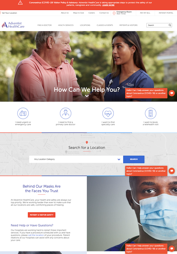
Adventist HealthCare features a well-branded site that has custom location pages and engaging provider profiles. Their site is highly user focused with several options for users to receive help. They even have a chatbot to help out with COVID-related questions.
They provide clear options, which makes it easy for users to navigate their site.
5. Concord Hospital
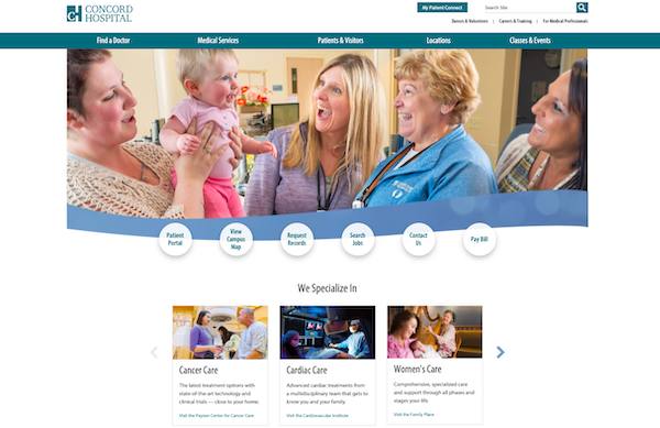
Concord Hospital has a great website that features a host of great images that gives the user a sense that the providers involved with this hospital would be happy to help them. They have clear CTAs and a navigable site that is equipped with a search bar.
They also list their specialties with preview text that provides value to the user with the option for them to learn more.
6. Firelands Regional Health System
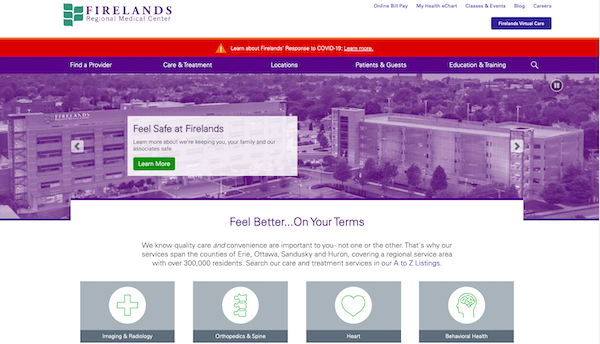
Firelands Regional Medical Center in Ohio has a user friendly website that is simple and easy to navigate. They list their services right below their hero image with animated icons that relate to the service they are assigned.
There is also a search bar to help users find the right doctor for them, along with an option to find a location nearest to them.
Firelands also does a great job with their content. They have an active blog and even a section for classes and events.
7. Altru Health System
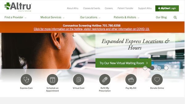
Altru is an award-winning website that is highly responsive with a slideshow hero image and flyout menus that contribute to their website's overall message. They also integrate their blog feed into their homepage and provide a variety of options for potential patients to learn more.
For instance, they have options for express locations, virtual care, and walk-in pediatric care. Their variety of useful CTAs stand out from the rest of the content on their page.
8. Children’s Hospital Association
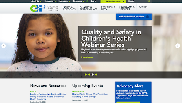
The Children’s Hospital Association website provides valuable resources to providers and patient families regarding children's healthcare. Their site is highly informational and provides several ways to search for children's hospitals around the U.S.
Their website has a great color scheme that doesn't distract from their web copy, and it matches their fun logo that contributes to the overall feel of the site.
9. Office of Mental Health
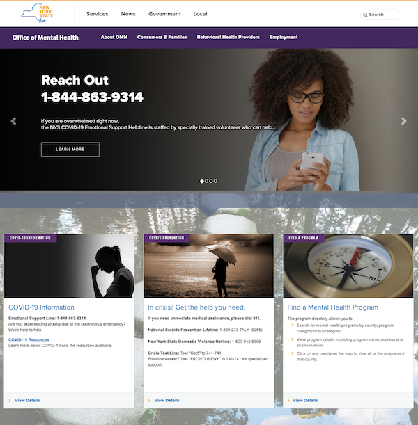
The Office of Mental Health has one of their contact numbers for individuals that need immediate help in bolded text right over their hero image. This encourages site visitors to reach out and get in touch right away. This can soothe their frustration because they won't have to go searching for vital information.
They also display their categories in an easy-to-understand way, with each category displaying a preview of what the category is about and the contact number for that category.
10. UT Southwestern Medical Center
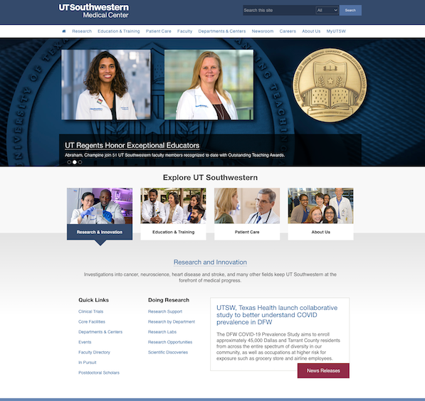
UT Southwestern Medical Center keeps it simple by only providing necessary information on their homepage.
They include two images of real medical professionals on their team in their hero image along with the award they received. This provides a human approach to healthcare for their potential patients and helps them to build trust in their medical group.
They also have a clean site design with simple colors and a decent amount of white space. UT's categories are easy to understand, and users can click to learn more.
11. Mount Sinai
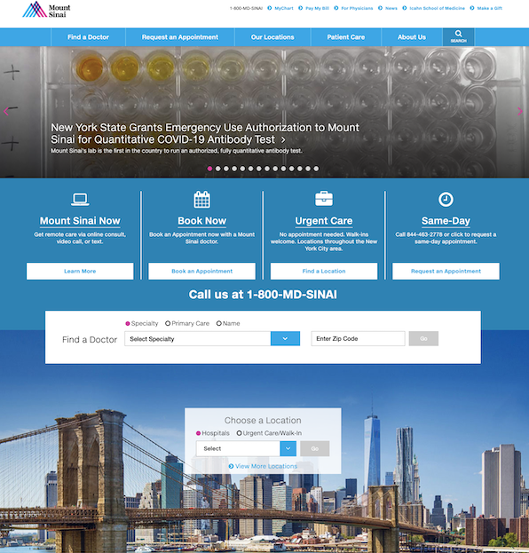
Mount Sinai's website is a personal favorite of ours because it has a professional and unique medical site design with a bright splash of color.
It prominently displays an informational picture slideshow that discusses important health topics, and below the hero image, there are several CTAs that address a variety of interests relevant for their site visitors.
They can easily book an appointment, find locations for urgent cares, and learn more about virtual visits. They also include a dropdown menu below their carefully placed phone number that lists the specialties they provide, along with the location nearest to their user.
12. Memorial Sloan Kettering
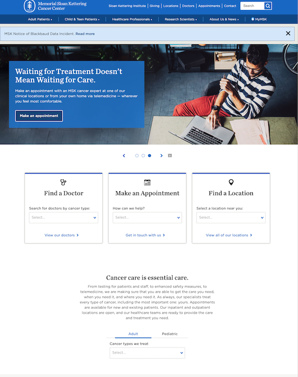
Memorial Sloan Kettering Cancer Center has a clean and functional website design that lets its site visitors make appointments, search for doctors, and find treatment locations easily.
They also have a dropdown box under the subheading "Cancer care is essential care" that displays the specific types of cancers they treat, This way, potential patients can make sure that Memorial Sloan Kettering can take care of their needs.
Their appointment submission forms are responsive, and one question must be answered before another question pops up on the screen. This helps MSKCC capture all of the necessary information they need the first time they convert site visitors into leads.
13. Spartanburg Regional Healthcare System
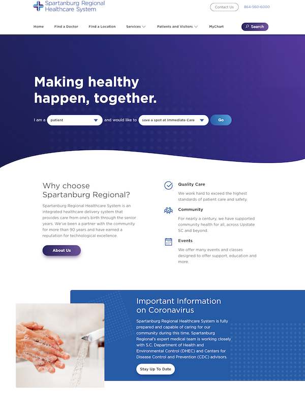
Spartanburg Regional Healthcare System gets right to the point with their beautiful homepage. Their hero image allows site visitors to select who they are and what they need right away with a button they can click that says "go."
This allows them to get information on what they need without needing to search the whole site.
Their site also includes a simple paragraph about who they are and how they've helped their community stay healthy, which fosters trust with their future patients.
14. Freudenberg Medical
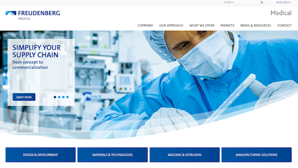
Freudenberg Medical is a company that provides doctors offices and clinics with the devices and technology they need to carry out expert care.
The best thing about this site is its segmented design and responsive menus. When users scroll over the areas of expertise that Freudenberg Medical includes, a picture and preview text pop up before the user clicks to learn more.
They also have a section of success stories for their potential clients to view so they can see Freudenberg's expertise.
Another awesome feature of the site is their cool contact us page that features a map you can click on to find their locations across the U.S.
15. Cigna
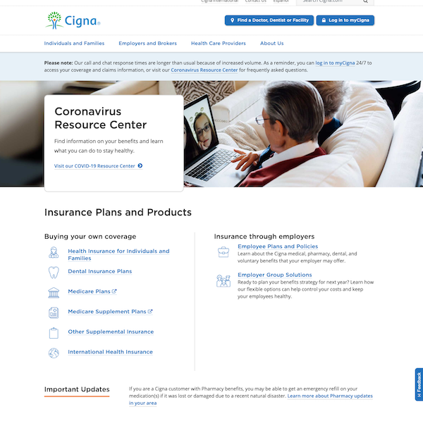
Cigna is a medical insurance provider with a site that is easy for users to navigate. They provide different choices for each of their clients. For instance, they have a "build your own coverage" section, employee plans, and employer solutions.
Each of these groups has different needs, and Cigna does a great job addressing their needs simply on their homepage.
They also have two clear CTAs at the top of their page: One entices returning users to log in, and the other CTA guides new or returning users to search for a healthcare provider.
A professionally designed website can set your practice or health group apart from your competitors. The design and content you choose to add to your site should represent your healthcare brand and specialty well to provide value to your site visitors and potential patients.
Use these examples as medical website design inspiration so you can build a beautiful, conversion friendly site. Then, you can start to gain returning patients that meaningfully contribute to your medical practice.


.png)
Comments