
When was the last time you went an entire day without technology? Even when people want to go “off the grid” for a few days, they still make sure to take pictures with their mobile devices, then upload them to social media when they get home. And a day without using a computer still likely means using Netflix, Hulu, Spotify, a Kindle, GrubHub, or Tinder at some point.
By the same token, in today’s uber connected world, your website is often the first contact a customer will have with your brand. Therefore, it’s crucial to create a digital presence that accurately represents who you are, what you do, and why a prospective client should choose your business over your competitors.
The stakes are even greater if you have an information technology business. After all, would you order food from a restaurant with unappealing food images on their site?
Need help optimizing your website right now? Get a Free HubSpot Audit from Bluleadz.

What Is Information Technology?
Information technology (IT) refers to pretty much everything you can do with a computer: Creating, storing, and sending information; cybersecurity, troubleshooting issues with your computer, and ensuring fast and efficient processes so that you can do your job (or anything else you need to do).
Even within the IT field, there are several subspecialties that require significant skills, such as having a bachelor’s degree in a computer science field, being knowledgeable about hardware and software, designing and building networks, programming, database management, network monitoring, and data security.
In a nutshell, information technology encompasses everything that makes your electronics and applications work.
What Makes a Great IT Website?
A great IT website is visually appealing, intuitive, and user-friendly. And pay close attention to that last element. A lot of old-fashioned companies are still offering a toll-free customer service number as the only way to reach them. A good IT website provides multiple ways to reach out to them — click-to-call numbers, emails, contact forms, social media handles, and/or live chat. People are busy. Make things easy for them.
Great IT websites also understand how to provide content for both humans and search engines. At the end of the day, you want to be helpful, but you also want Google to list you as an option when people search for your services. Enter good search engine optimization (SEO).
A great IT website makes it easy to find and share content. This involves using keywords your target audience is searching for, using relevant page titles and meta descriptions on every page, and linking to reputable sources. If you’re telling people you can make their website shine, you better make sure yours shows that you know how to do it.
Why You Should Care About Designing a Great IT Website
You only have one chance to make a first impression. And having bad UX or aesthetics on your site is costing you money. Why? Let’s look at the reasons, shall we?
1. Capture Your Audience's Attention.
People now have an attention span that’s shorter than a goldfish’s, so you have a very limited timeframe to impress them. Failing to do so means they’ll leave your site and hire someone else to do what you can do.
2. Build Trust.
A poorly designed IT website makes you look untrustworthy. Think about that for a minute. People want to leave, not because they doubt the content, but because elements on a website makes it difficult for them to read and/or find information.
3. Improve Access Across Devices.
Gone are the days of having a site that looks nice on a computer screen. Designing a great website also means optimizing it for any device users may try to access it — desktops, tablets, or from their phones. Screens have different ratios. Mobile devices are often used while being held with only one hand, so you have to think about that when designing its navigation.
Also, if you offer information technology services, your website is your presentation card. While certain services may not be obvious by how your website looks — such as cybersecurity, systems administration, and the ability to migrate data – your field is one that’s full to the brim with computer science professionals. Your website should reflect that.
Information Technology Website Best Practices
IT best practices are those that make your web design as effective as possible. While they’re not by any means required in the IT field, they certainly ensure a better user experience. Specifically, keep in mind the following:
Fast Loading
Your website should load within two to three seconds — on any device. Not only is this good to keep visitors happy, it’s also an important feature to rank better on search engine results pages.
Granted, the faster, the better. Fifty percent of websites load in less than three seconds, so really make it a priority to beat that timeframe. Tips to do so include compressing image sizes, caching your web pages, eliminating plug-ins you’re not using, and defer loading of JavaScript and non-critical CSS files. If you’re not sure how fast your website loads, you can use test tools, such as Google’s Page Speed Insights or Pingdom.
Good UX Design
User experience (UX) is how website visitors perceive your site. Is it visually appealing? Is it easy to navigate? Are elements consistent enough to inspire familiarity and trust?
A smooth and intuitive design wins the game. While you may want to toot your own horn as you showcase to users how much of an expert you are, they’re not really interested in your accolades. Make it all about them.
What would they find most comfortable? Helpful? Compel them to reach out to you? Be strategic about this by following website navigation best practices.
Consistent Branding
Apple. Samsung. IBM. Tata Consultancy. All of these companies have many common denominators; but the most important one is brand consistency. Logos, fonts, colors, layouts, images, voice, and quality content are all part of a good website branding strategy.
When done right, this eventually creates brand recognition and builds trust. And in an age where every single business has so much competition, you want your buyer persona to immediately gravitate towards you — and become a loyal customer.
Strong CTAs
Strategic design and content are essential, and so are effective calls to action (CTAs). These are interactive elements of a website that guide the user towards taking a desired action, such as filling out a form, subscribing to your newsletter, scheduling a call, downloading educational content, enrolling in a webinar, RSVP for an upcoming event, or making a purchase.
Make sure they include specific, actionable directions, such as subscribe, contact us, download eBook, Buy Now, etc… so that the user knows exactly what will happen when they click on it.
Mobile Design
Remember that whole bit about optimizing websites for any device? Listen to this: Nearly three quarters of the world will access the internet exclusively through their mobile devices by 2025.
You may not be marketing to everyone on the planet, but considering that most of the planet's population cares about this, there’s a good likelihood that a significant portion of your ideal customers will do so, too. So get familiar with mobile optimization best practices as soon as you’re done reading this blog.
Simplicity
When it comes to creating a great IT website, it'll be in your best interest to keep things as simple as possible. This includes your domain name, imagery, navigation, and more. If your domain is easy to remember, searchers will be more likely to visit your page.
Also, users are drawn to websites that are easy to maneuver through, so anything that gets too complex can make them ditch your website and go to a competitor's site instead.

13 Information Technology Website Design Trends
In addition to best practices, you want to be well-acquainted with current website design trends. They’re popular for a reason, and you want to make sure that your own site is as attractive as possible for your target market. Hot trends right now include:
1. Heavy Use of White Space
Many people underestimate the power of simply having some empty space in your website design. However, for many years, top-tier web designers have understood how including this practice in their website design strategy is an effective way to draw attention to the most important content on a website.
2. Dark Mode Presentation
For the last few years, many IT websites have begun to use a dark mode presentation.
This is when a website uses darker background colors with lighter-colored text and images. This is especially popular with cybersecurity sites, as dark backgrounds help establish a sense of dread.
Additionally, dark mode sites tend to be easier on mobile device batteries — making them more mobile friendly to an extent.
However, to stand out, some websites have gone in the opposite direction, creating websites that are even brighter than before for the sake of differentiation.
3. Larger Type Sizes
Accessibility is a major issue for many websites. One thing that some web designers have been doing relatively recently is to enlarge the text on their websites to make it easier for people with impaired eyesight to read.
Even for people with healthy vision, large fonts help catch the eye and make it easier to understand what the site is about.
4. WCAG Compliance Modifications
The Website Compliance Accessibility Guidelines (WCAG) are standards that call for text alternatives for all non-text content (such as having alt text for your site's images), captions for pre-recorded audio, contrast ratios, and more.
Following these guidelines is a good idea for a few reasons.
First, it helps you meet compliance guidelines, so you can avoid penalties. Also, it helps you expand your audience by making your website more accessible.
Second, we know that Google favors sites that are user friendly, so focusing on your website's accessibility features might give you a boost in SERPs.
Finally, it can help improve your reputation by showcasing your company's awareness of the challenges faced by those who need accessibility aids.
5. Solid Color Separation
Some websites try to create a bold, but simplistic, look by using blocks of solid color with simple text in them.
Such designs tend to draw the eye, so they are significantly useful for highlighting or sectioning off important copy on the site.
6. Moving Images and Slideshows
People are practically hardwired to pay attention to movement. Video and animation in online advertisements and web design is nothing new. As a matter of fact, it's been a consistent part of IT website design for many years.
From background videos to slideshows that quickly transition between different copy and image combinations, GIFs, on-hover effects, and more, motion is a key element in website design, and that isn't likely to change soon.
7. Interactive Animations
Some websites take their animations to the next level by creating interactive animations that respond to user inputs. While complicated to implement (relatively speaking), these custom animations can be incredibly engaging for website visitors.
However, remember to always exercise caution, as the interactivity of the animation may be distracting for visitors. Also, an over-complicated interactivity feature may take a while to load — negatively impacting page speed, site performance, and user experience.
8. Exposed Grid and Windows
Lines and straight-edged shapes, such as rectangles, make for an easy way to guide the eye around a page and separate content sections for easy skimming.
Because of this, many website designers use an exposed grid and windows type of design to provide users with straight lines they can follow.
9. Shadows and Layered Elements
Some web designers like to help their modules and fields stand out a bit more by adding a subtle shadow or layer effect to their website designs. This can create a faux 3D look that helps draw the eye.
Additionally, using layers to compact images, text, and other content can help to make a site page look less cluttered while preserving the content itself. However, be mindful of avoiding over-compacting things. Users probably don't want to tab through a dozen content layers to see everything a webpage has to offer.
10. Easy, Full-Page Forms
Form submissions are a crucial means of capturing contact information to turn website visitors into leads. However, getting people to fill out forms has always been a bit of a challenge for many companies in the IT field (as well as many other industries).
Making forms stand out is a sound strategy for ensuring that website visitors see them and fill them out. A good way to do so is to use page-sized forms in their content. By making the form larger, it's easier to see and feels more impactful.
However, full-page forms should be presented at the right time and in the right context to maximize their effect. A good place for a plus-sized form might be on a dedicated landing page. Or you could have a form expand after a specific interaction, such as a CTA click for a demo or other offer.
11. Data Visualization
Let's be honest — not everyone is a numbers person. That's why many IT websites are adding a bit of visual assistance to reframe complex data in a way that is easy for users to understand. Infographics, maps, and charts can help viewers make sense of data instead of presenting it in a list of numbers.
Plus, visualization of this information might make your webpage visitors want to learn more about your business and engage further on your site.
12. Chatbots
In the realm of making webpage navigation as easy as possible, chatbots have quickly become a commonality in website design trends. Chatbots make finding information simple by using an AI tool to answer a user's question or put them in touch with someone from customer support.
Thanks to advancements in AI, chatbots have become incredibly smart and are able to provide detailed responses to most queries.
If a visitor on your site needs help with troubleshooting, for example, the chatbot can provide steps to walk them through the process and fix the issue on their own. If the issue is a bit more complicated and the bot can't provide a solution, it can always connect the user with a representative instead.
There are tons of resources available to help you get started with a chatbot for your IT website.
13. Organic Shapes
Organic shapes seem to be popping up all over IT websites. They tend to be pleasing to look at and they're a great alternative if your company doesn't have high-quality images to use. Plus, soft edges can help to break up blocks of text or information without being too harsh.
If your design team already has high-quality images, try sprucing them up with a playful shape to add some fluidity to the page. This will add some visual interest and keep viewers engaged when navigating through your website.
26 Best IT Website Design Examples
You can see some of the above referenced design examples in these nifty websites:
1. HYAS
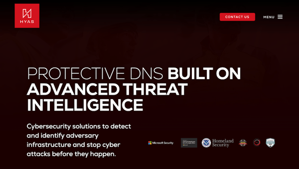
HYAS is a cybersecurity company that collects business intelligence to gain actionable insights to prevent attacks. Their website is uncluttered, and tells you in white lettering on a dark background exactly what it is they do. Straight to the point. Simple. With larger fonts that make it easy to read.
2. Credera
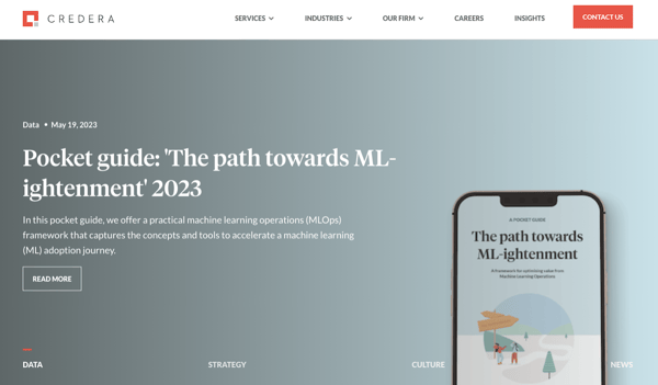
Credera is an IT company that implements and showcases the effectiveness of a heavy use of white space. It keeps website visitors focused on their services, without distracting bells and whistles that may confuse the user. They also have an easy-to-find CTA button right on their navigation bar in a bright color that draws attention.
3. Safeguard Cyber
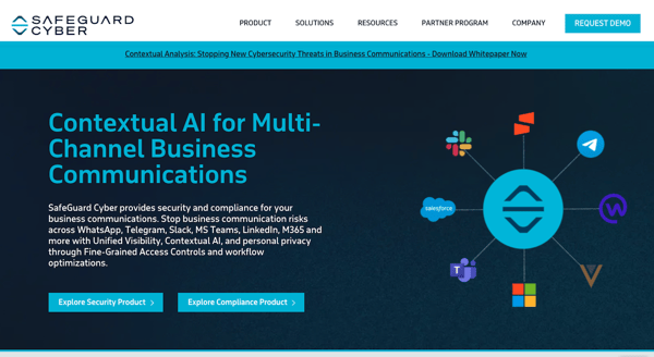
Safeguard Cyber also markets their IT services effectively by incorporating moving images right on the homepage, drawing the eye to their promise to protect organizations from communication-based threats. Their solid color blocks also help the reader immediately recognize crucial content, such as threat statistics and how to manage risks.
4. Limelight
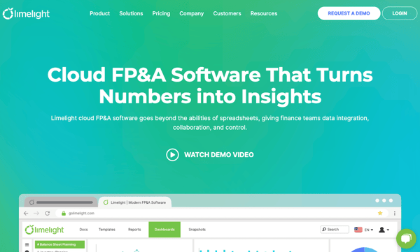
The lime green color on Limelight’s website — juxtaposed with white — is another example of effective solid color separation. The pop of green guides the eye to the navigation bar, product tour, and integration capabilities; while the white spaces display the long list of finance customers who trust their services. Including a demo video right on their homepage is another way to help website visitors easily understand their products’ key features.
5. Chimera Prime
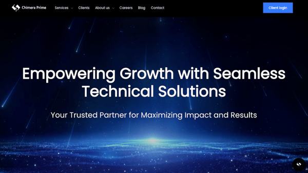
Chimera Prime beautifully demonstrates how well white spaces and a grid format helps provide a great user experience. Clients, services, related news, and case studies are easy to find, despite the fact that it’s a lot of content; and their Connect With Us call-to-action button is always visible, regardless of how far down the page you scroll.
6. Align
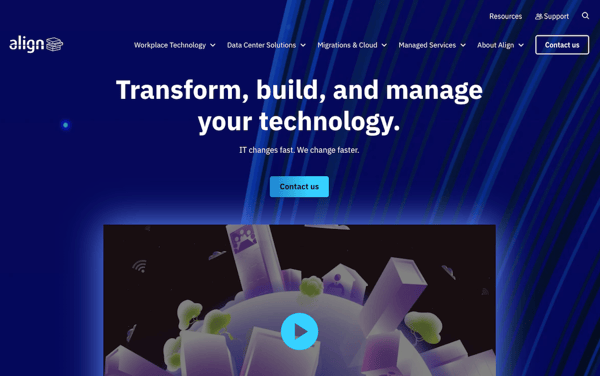
Align is a managed IT services company that offers innovative digital solutions to businesses like cybersecurity, managed IT, and data center solutions. Their website instills a sense of being on top of their game through the use of a clean and simple homepage that provides a quick overview of their key services.
The design supports their brand message of creating infrastructure support and optimization services with its excellent user experience. Information is easy to find and understand while being concise.
7. Rapidops
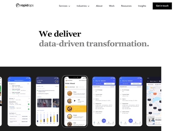
Rapidops is a software development company that develops digital products, platforms, and experiences for their clients that engage users and scale on demand. The homepage hero cycles between several messages just quickly enough to give visitors a clear understanding of the company's value proposition.
The first screen you see when you visit the homepage is extremely minimalist (in appearance, at least), but can send a powerful message. As you scroll through, you'll learn more about Rapidops and glance at some case studies and testimonials.
8. Cisco
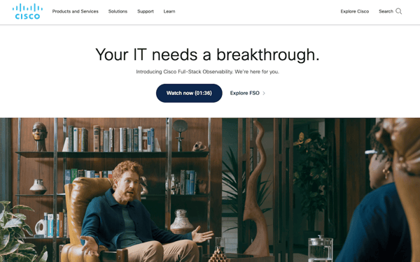
Cisco is a network solutions company with extensive product offerings that connect people, devices and networks. Their website offers a ton of information in a simple navigation design that makes finding the information you need easy and fast.
Their homepage, while crammed with detail, makes it easy to access the latest information on current company activities happening around the world. It's a great example of organizing complex information in an accessible way.
9. Intuit Mint
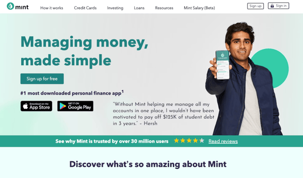
This is a great example of how to say a lot with few words and how images can strengthen your design. Mint is a free financial management app that helps you to track and pay bills, manage your credit score, and set up budgets. The design is easy to digest, just like the app!
It's also a great example of how speed can make your site shine! Because the site is a clean design, it loads in under three seconds.
We all know faster speed means a lower bounce rate and better SERP ranking, since page speed is a major factor.
10. Hewlett Packard Enterprise (HPE)
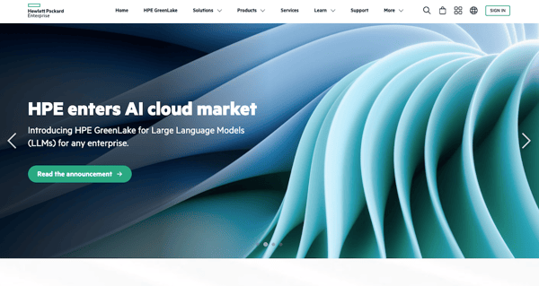
HPE offers companies enterprise solutions for managing the cloud, including hybrid cloud, mobile, and analytics. Their website is clear and concise in terms of information, keeping navigation broad.
Additionally, Hewlett-Packard cycles in different featured images from time to time to keep their homepage fresh without having to do a complete redesign.
Simple graphics help to get their service offerings across to visitors, and visible CTAs offer actionable links for more information. This makes for a well thought-out design.
11. Insight
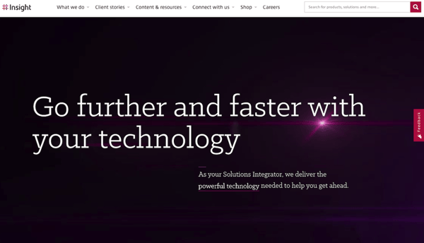
Insight offers smart, cutting-edge tech solutions to businesses worldwide. Using concise information followed by CTAs that are clearly visible as you move through their website, navigation is intuitive.
Images show users working on the products they offer to subtly connect the user experience to the company. This site also clearly defines the benefits of working with them.
12. TechData
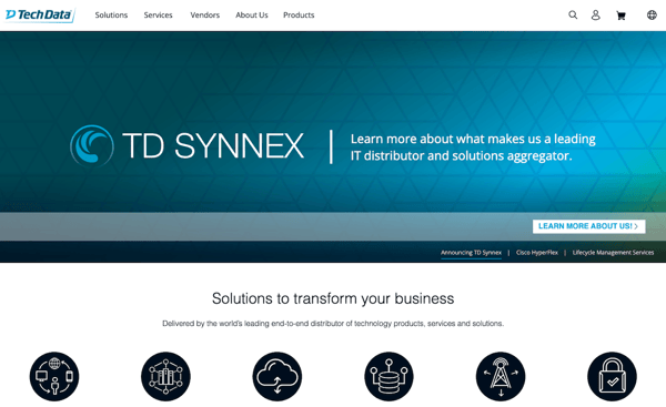
TechData's homepage is a perfect example of using a simple, uncluttered interface to draw visitors deeper into the site. With several simple headlines that cycle and a CTA to Learn More, the initial homepage message is simple and direct.
As you navigate through the site, the subsequent pages offer more in-depth information as you learn the TechData story. This is one of the better IT website examples of how to deliver complex information in an easily digestible manner.
13. VMware
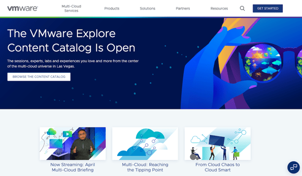
VMware is a cloud host provider offering software as a service (SaaS). Their website features news about product releases and updates, dates of upcoming conferences, and a great user experience with easy navigation and search.
Simply put, this is a great example of establishing authority and providing thought leadership through information sharing.
14. DocuSign
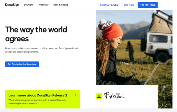
DocuSign offers options to help your office go paperless. Their homepage includes a really great app for calculating the savings your office can reap from going paperless and, in a fun twist, how many trees you'll help to save in the process.
Such messaging is a great way to establish relevance and show your product's value in an easy-to-understand way.
15. Dropbox
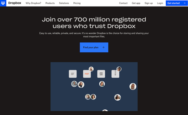
Collaboration and centralization of information are what Dropbox offers its clients.
With a minimalist homepage design featuring a headline that establishes value immediately and a CTA to Sign up for Free, it's a simple approach that offers immediate value while establishing who Dropbox is and what they do.
16. ConnectWise
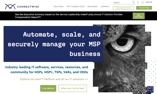
Business management is what drives ConnectWise. They offer business management solutions and customer service support for other technology businesses that improve the efficiency of their clients' business.
With over 160 tools, their website clearly shows their offerings and is easy to navigate. By putting services front and center, visitors can quickly determine if there is value in their products.
17. Dropsuite
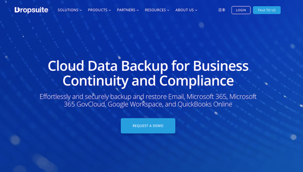
Cloud based data backup, storage, and disaster recovery are critical in today's online world. Dropsuite offers innovative solutions and tools to meet these needs.
Their website relies on simple design and offers key information in an opening slide show that offers visitors an immediate understanding of who they are, what they do, and why you should utilize their services.
With a simple and uncluttered design, Dropsuite's site is one of the better IT website examples showing how negative space can draw the eye to important information and CTAs.
18. SkyKick
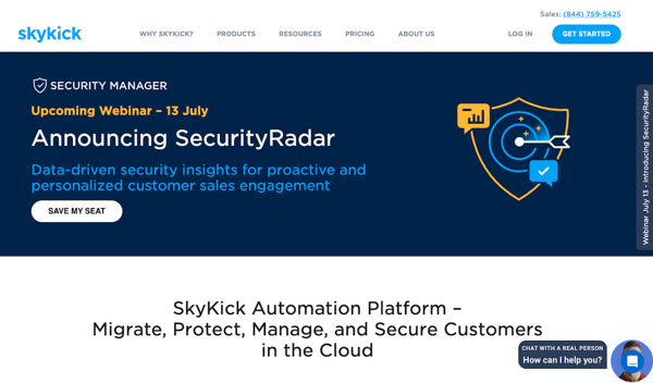
SkyKick offers companies that provide IT services a powerful suite of management tools to help them migrate, manage, and backup their customers on the cloud.
The website features the logos of their many clients, which is an excellent way to establish trust and authority. Including customer logos and testimonials is an excellent strategy for showing value.
19. Workspace 365
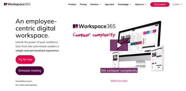
With a growing number of companies relying on mobile workers or telecommuters, collaboration solutions are critical. Workspace 365 offers businesses a cloud-based workspace that makes collaboration easier for any size of business.
Their homepage is a great example of the effective use of video. The Workspace 365 homepage provides a quick explanation of how their solution helps IT managers, businesses, and people.
20. Axcient
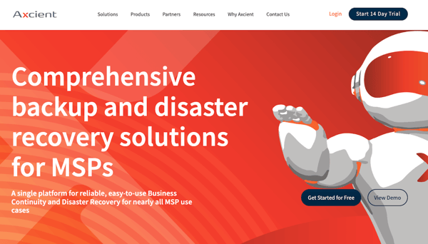
Axcient offers disaster recovery services, and their website is the perfect example of using lead magnets to convert visitors.
When you visit their website, you're greeted by a hero image that quickly explains what Axcient's services are while the page content provides more detail about each solution and their benefits.
21. DeliverySlip
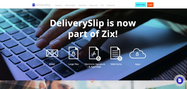
This cloud based encryption service allows you to send secure encrypted email and encrypt files up to five gigs. It also offers real-time tracking all from your mailbox.
Their website features business oriented images that immediately convey a sense of professionalism and trust. The text used is concise and simple giving you an immediate understanding of their services.
22. Dun & Bradstreet
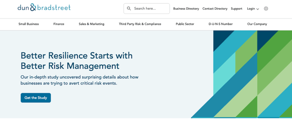
The Dun & Bradstreet website is a great example of using minimalist design and limited text to convey a message.
The homepage clearly displays their logo, along with a search option, business directory, contact button, and online live chat and email options that make it easy to get in touch with their customer service team. It's basically an extended invitation to engage with the company.
23. PandaDoc
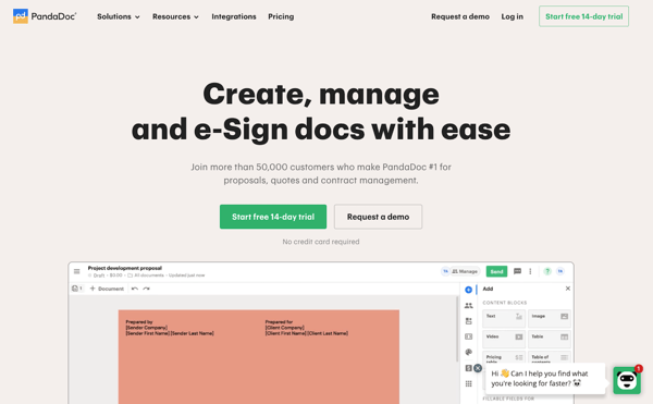
PandaDoc's website design is a great example of the use of negative space and color.
The headline clearly states the value proposition for the company: “Crush your quota from propose to close.” And the free trial CTA button is green, which is a symbolic representation of the money you'll make streamlining your new business process using their product.
The homepage CTAs are clear and concise: “Start free 14-day trial” or “Request a demo.” There's also a live chat feature that you can click to get immediate information about their product.
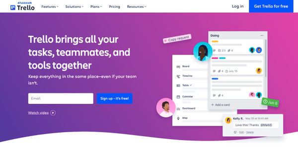
24. Trello
 Trello uses several design trends to create an engaging IT website. From colorful gradients to interactive slideshows, this website is checking off several of our design boxes.
When viewers come to this website, they'll know exactly what Trello is able to provide for them, and they shouldn't have any issues finding what they need.
Overall, their website is incredibly easy to navigate and it's not too cluttered, thanks to the intentional white space.
25. PayPal
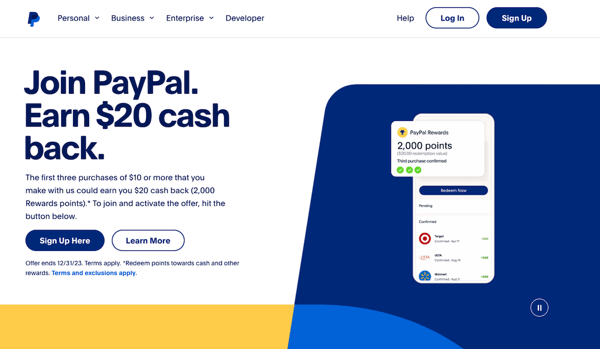 PayPal's homepage emphasizes white space and animated graphics to help customers see their services in action. As you scroll through the site, different graphics appear and the viewer feels as though they're being taken on a journey through everything that PayPal has to offer.
The design is sleek, the navigation is organized, and the overall website is highly user-friendly.
26. Linktree
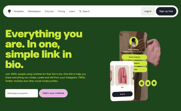 With the emergence of social media marketing, Linktree has paved the way for sharing links in one location. This website combines playful colors, negative space, animations, and image slideshows to highlight their product and some notable accomplishments. At the end of each section, you'll be met with a simple CTA, prompting website viewers to learn more or get started right away.
One of their features is data tracking, so instead of listing out numbers, the web designers have showcased important statistics in charts, maps, and graphs to show customers what analytics they'll be able to access with Linktree.
This website does an excellent job of holding the audience's attention while walking them through the many advantages of using their product.
Draw Some Inspiration For Your IT Website
These IT website examples all share some similarities. They are all clear, concise, and brand focused. Many of these designs feature plenty of white space to keep the important information front and center, and they all use strong imagery to support their brand identity.
All of these examples are effective at delivering their message in an engaging, user-friendly way, and can serve as inspiration as you create your own brand identity.
Whether it's through the use of video, strategic placement of CTAs, using multiple conversion paths, or prominently displaying corporate identifiers and contact information, these websites offer users fast access to the information they're seeking and work to draw visitors deeper by creating an engaging user experience.


.png)
Comments