Product pages may be the last stop on your customers' journey—especially when you take the time to optimize them correctly for higher conversion rates. They're an essential component of digital marketing for all kinds of businesses in various industries.
B2B product pages take on many forms, but you may wonder what it takes for visitors to be fully convinced of your product's value so they make a purchase. After all, unlike B2C businesses, you often have to contend not just with the buyer, but a bevy of advisors, experts, and controllers of finance.
Find out what techniques and components a successful B2B product page uses to grab attention to increase a company's customer base.
What Makes a Good B2B Product Page?
B2B product pages need some essential elements to be user-friendly and properly optimized for success. Here are five elements that make up good B2B product pages.
They Include Concise Copy.
B2B product pages shouldn't dive into the deep end of product details. Your product page should simply introduce your products to your site's visitors and entice them to learn more about your products. Providing too much information at once can overwhelm your prospects and cause them to lose interest.
Think of your product page as an elevator pitch that showcases your products. Any good elevator pitch should be quick and enticing—you don't want to put off readers with an enormous wall of text.
The best way to keep it simple is to add a few bullet points, sentences, and corresponding visuals to communicate your main points.
If your prospects want to learn more, you can give them avenues to do so through FAQs, guides, and even direct "contact us for more information" style CTAs and links.
They Demonstrate Value.
Product pages are supposed to encourage visitors to take action. Most often, this requires offering them some sort of incentive. The incentive is typically the value your product or service can provide your prospects.
This means that your copy should focus on the benefits and pain points it resolves rather than features and functionality.
Another great way to generate product value is to include testimonials or case studies. People tend to trust what their peers say over what your company tells them.
They Answer Common Questions.
You have likely heard the same questions asked over and over again in the sales process if you work in an established organization. Address some, if not all, of these questions on your product page.
Of course, the standard is to get your B2B leads and prospects on the phone with a sales rep, but many customers will exit your site if they can't quickly find answers to their questions.
This is why it is important to answer your customers' questions right on the page. Work with your customer service and sales team to determine which information the customers are the most interested in. These can be turned into a small FAQs section on the page—and then you could cap that off with an invite to contact your company directly if they have any other questions.
They Include Visual Images.
Your prospects want something nice to look at while they consume content. Visual images can add something extra to your product page content to keep visitors engaged.
Everyone processes and responds to information differently so it is best to combine text, images, video, and other interactive elements on your product page. The idea is to get your target audience to imagine what it would be like to use your products or services.
They Make CTAs Visible.
CTAs are one of the most essential elements of your B2B product page. As we mentioned earlier, your product page should prompt action by your customers.
Create CTAs your users can't help but click. A good practice is to include CTA copy that focuses on gratification instead of copy that conveys commands that indicate parting with money. For instance, CTA copy that conveys gratification includes words like, "Reserve," "Get," or "Receive."
Place your CTAs somewhere noticeable without distracting your page visitors from the central message of your product page.

How to Build an Effective B2B Product Page
Here are some steps you can take to build an effective B2B product page that is sure to convert more visitors.
1. Conduct Consumer Research.
Conduct user testing to find out how your visitors navigate your website and product pages. Ask them questions about the actions they take on the pages to see why they make certain decisions. This helps you see how your prospects consume your content.
Some elements to consider include:
- Do my users understand what I am selling?
- Where do users go to learn more about my company or its products?
- Can users easily define what my company does after exploring my website and product/service pages?
Get to know what your visitors' expectations are and if they understand the content included on the page.
Product pages should nurture your prospects and answer these central questions for them:
- What is it you are selling?
- Will it make my life better? Why?
- Can I afford it?
- How do I use it? Is it easy or convenient?
- Who else uses it?
- How do I know it's worth purchasing?
2. Position Your Product.
Something that should be abundantly clear on your product pages is your product positioning. It should be the first thing your page visitors see.
The most common types of product positioning are benefit-based or feature-based. Feature-based types tell what the product does, while benefit-based positioning lets consumers know what the product can make possible for them.
Regardless of the position you choose, it should remain simple and avoid tired and overused jargon phrases such as "revolutionary" or "best-in-class." If you do use jargon or specific claims, make sure you have proof further down the page to back it up.
Modern consumers are constantly inundated with trigger words that have been uncovered over decades of marketing research. While these phrases can trigger a response (hence the name trigger words), savvy customers in a B2B setting are well aware of them—after all, they've probably used them in their marketing materials!
3. Create a Product Video with Context.
Including a product video can be a great enhancement for your product page (when it's done right). Product videos should not be a mere showcase of your product or products. Instead, they should provide some context that makes a prospect feel like the product will fit into their lives.
Product videos like this place your buyer at the center of the story and allow them to effectively picture themselves using your product or service. Remember, it's not "Here's what our product can do," it's "Here's what you can do with our product/service." This kind of hero messaging can resonate with B2B audiences.
4. Include Product Comparisons.
Include product comparisons that don't attack the competition. This means you must include highlights about how your product or service differs from others. Prospects seek out this information so they can compare their options side-by-side.
Try to isolate the aspects that are most important to your customers about your product or service that can be compared and analyzed against a competitor's offerings to make it easier for your prospect to make a decision.
Keep in mind that these product comparisons should be simple. An easy way to present comparisons is in an infographic or a table of some sort.
5. Showcase Testimonials or Case Studies.
Social proof is a powerful tool you can use to capture your target audience's attention to get them to convert faster. Social proof can come in a variety of formats. The most popular formats for B2B businesses are testimonials and case studies.
Using testimonials on your product page can stir up more interest than if you had them on a different page altogether.
The testimonials or case studies you select should align well with your product positioning. For instance, if you claim your product is the easiest to use as a benefit, then you should find a testimonial that talks about the product's simplicity.
6. Direct Your Visitors.
Make sure your site visitors know what the next steps are in your sales process. It would be great if every visitor on the product page clicked on your CTA and made a purchase, but they often navigate between pricing pages and case study pages before they make their decisions.
Although core conversion CTAs should be displayed, make sure you include other CTAs too. Direct your visitors to pricing pages, case studies, or other decision-making resources.
7. Check Your Analytics.
Once you complete your product page, track your analytics data to ensure your product page is as effective as possible. Track these key metrics:
- Bounce rate
- Time on page
- Pageviews
- Conversions
- Organic traffic
- Conversion assists
These metrics can tell you a lot about how visitors are using your site. For example, are people coming to a page, but leaving almost immediately 90% of the time? Tracking bounce rate can help you find that out.
If bounce rates are too high, it could be a sign that the content on the product page doesn't line up with what your visitors are expecting when they hit it. Or, maybe your page load speed is too slow, so visitors close the tab before it even finishes loading.
The 12 Best B2B Product Page Examples That Boost Sales
Here are 12 B2B product page examples you’ll want to borrow ideas from.
1. Salesforce
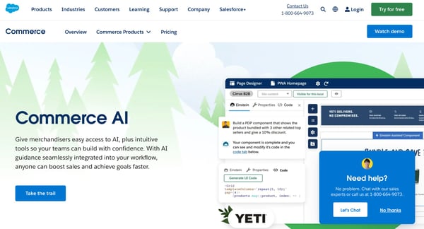
Source: Salesforce
Salesforce consistently makes the customer the hero of the story throughout the Salesforce Commerce AI product page. Every section extols how users can save time, innovate, and customize experiences by using the Salesforce Commerce AI.
They also do a great job of including a variety of visible CTAs throughout the page, positioning them close to related text or pictures. embedded videos provide further visuals for how the product works and a set of FAQs help to answer common questions about the product.
2. Adobe Creative Cloud
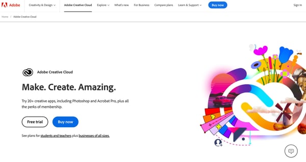
Source: Adobe
It’s no surprise that a company famous for its design software would have amazing visuals and colors on its Creative Cloud Suite product page.
They do a great job of keeping their page focused on all of the tools they offer within the Creative Cloud. Their copy doesn't over-explain each product. Instead, they invite visitors to learn more about each tool. It's a very minimalist page when it comes to text, but includes a lot of eye-catching and colorful visuals.
Further down their product page, they also answer commonly asked questions and provide a quick pricing overview for single apps versus all apps.
3. Cisco
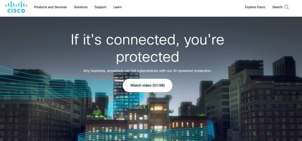
Source: Cisco
Cisco starts its page with a prominent prompt to watch a quick 1:08 video to learn more about its cybersecurity offering. Then, Cisco introduce the major components of its solution with a quick series of cards that invite readers to learn more about each component in detail on different pages.
The true capstone for this page is the inclusion of a CTA to a "Security Outcomes Report." Utilizing research and data to your advantage like Cisco does here can help you attract potential customer interest. Cisco offers this information to visitors for free in exchange for their information—which can be useful for future marketing efforts such as lead nurturing drip campaigns targeting security-conscious buyers.
Cisco also does a great job of describing the benefits of its products to users and offering many options for exploring product information in further detail.
4. Intuit
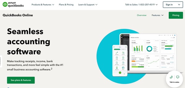
Source: Intuit
Intuit includes relevant images and videos that show visitors how their products work. They also include easy-to-understand pricing information for each of their common product users so they don't have to search for it.
They provide an incentive for new customers and use simple copy to explain it with a CTA that offers them the chance to learn more, which is a great conversion tactic.
5. Capital One
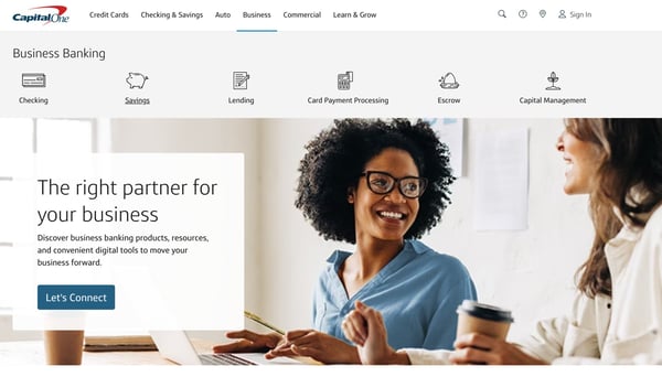
Source: Capital One
Capital One keeps its small business banking product page simple and to the point. They offer some images along with text and CTAs that entice visitors to connect or learn more.
They also include a section where their products are listed in a simple layout, with concise text that explains each product. Along with their products, they have a section that calls out different goals, such as "I want to Invest in My Business" or "I Want to Manage Cash Flow" with information mapped out showing how they support each goal.
A quick highlight of their J.D. Power & Associates award helps round out the page with some quick social proof that helps establish their reliability and quality to any potential new customers.
6. Hootsuite
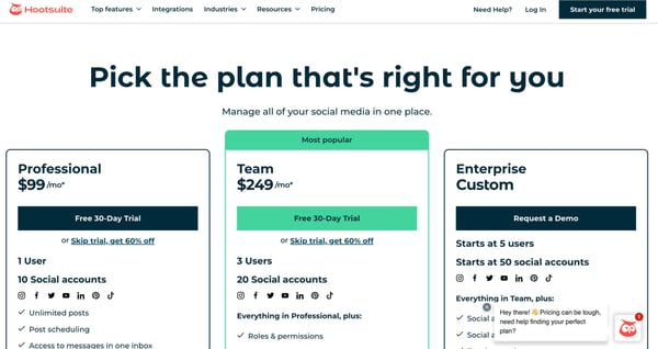
Source: Hootsuite
When visitors are more invested in learning about a company, they want to make sure they get the best value for their money by comparing plans on B2B product pages.
A table breaking down Hootsuite's plan options and costs like this one lets visitors know which features belong to which plan and the maximum number of social profiles and users, giving organizations a better idea of which plan suits the size of their company or needs.
It's a very simple, but effective, way to communicate necessary information to customers.
7. Dropbox
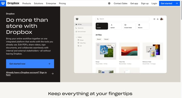
Source: Dropbox
Dropbox's landing page clearly defines the company's product offerings. The Dropbox Business page states what it does – “secure file sharing and storage” – at the top of the page so visitors know in seconds whether this product is for them.
They differentiate between their business and personal use customers on the page by having dedicated links to "for work" and "for personal use." This helps customers self-identify as being for their B2B or B2C department.
The page also has customer testimonials highlighting how their clients use the platform to do more than just store files. This social proof helps to reinforce the quality and value of Dropbox to new customers.
8. Price API
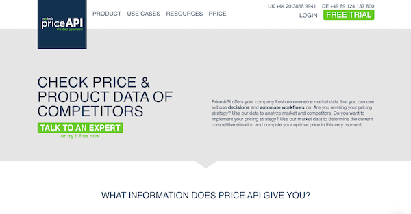
Source: PriceAPI
The Price API product page uses CTA buttons like “Contact Us” and “Send Message” to engage with visitors and convert them into leads. Their overview also gives a clear outline of the information that the tool provides and helps potential customers identify ways to use that information to increase their business.
In addition to CTA buttons, you can add chat boxes with CTAs, such as “Get Help” or “Chat with Experts” that pop up after a visitor has spent a few minutes on a landing page. This can spur visitors who were initially in the stage of gathering information into taking action to become a lead or customer.
9. WeWork
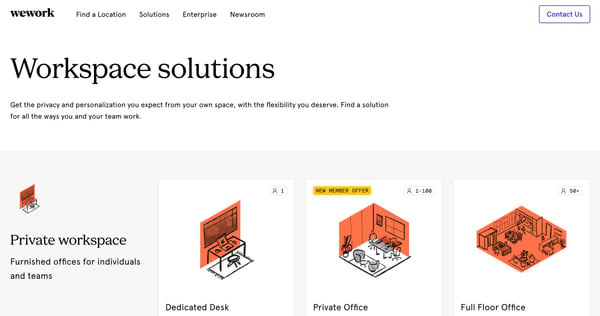
Source: WeWork
WeWork's main page immediately picks up the location of its visitors and places it in the search bar so visitors can find workspaces in their areas right away. Meanwhile, their solutions page (linked below the image) quickly outlines their different workspace and work solutions with simple images that don't distract from the UI.
They make special effort to highlight their app for mobile devices to help customers achieve the goal of reducing their real estate costs. They also provide some social proof via a "meet our clients" section that links to articles featuring WeWork's other clients.
10. Slack
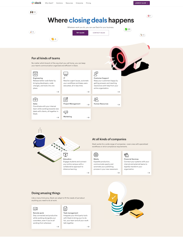
Source: Slack
Slack does an excellent job of introducing what kinds of teams can benefit from using their platform. This way, site visitors immediately recognize if this is the right option for them. They go on to list some popular teams that utilize the platform, where they include one sentence about why Slack is beneficial for that team.
They go on to list industry types that benefit from Slack and what visitors can do with the platform. They make sure their value is known by listing a few customer stories at the bottom of their product page—followed up by a simple FAQ section that answers some common questions.
11. Shopify
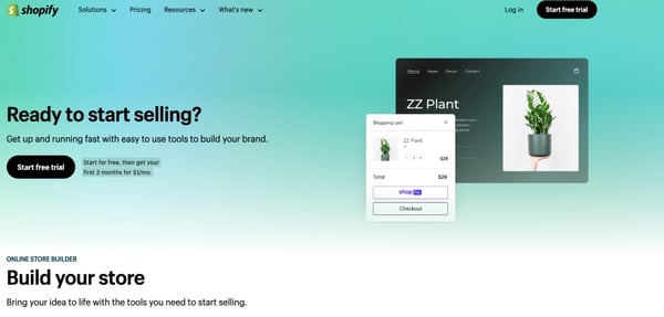
Source: Shopify
Sometimes, simpler is better for a product page. Shopify provides users with a platform to help them build their online business with digital storefronts where they can create web pages and sell their products and services.
On their product page for starting businesses, they keep the copy simple and use images to capture visitors' attention and guide them through the benefits of using their platform.
Near the top of the screen, they offer a free trial to help incentivize customers to try the platform out. Shopify also provides links to other resources such as online courses, podcasts, blogs, and guides to help new users learn how to leverage the platform and find success with their online business.
12. HubSpot
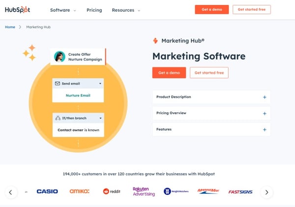
Source: HubSpot
Okay, we might be a little biased since we're HubSpot partners. But, this list wouldn't be complete without a mention of at least one of HubSpot's product pages.
For HubSpot's Marketing Software page, the company keeps the amount of copy visible on the screen to a minimum. However, visitors can get more information by clicking on the dropdowns for the product description, pricing overview, and feature boxes.
The messaging laid out on the page focuses on how the Marketing Hub helps users streamline their marketing efforts, drive revenue, and save time. They even include cards showing off the different tiers of the Marketing Hub subscription to give visitors a quick idea of what it would cost them.
As you're planning the design and development of your B2B product pages, remember – you got your visitors to your product page, which is huge. But it isn't the end of the line.
They still have to make a purchase for you to ramp up your sales and revenue. Make sure your product page is optimized for conversions so you can nudge your buyers in the right direction.
Use some of these examples as inspiration for your new product page to get the results you desire.


.png)
Comments